shape
carat
color
clarity

Another parti sapphire thread--advice?

lovedogs

Super_Ideal_Rock
Premium
Joined
Jul 31, 2014
Messages
19,648
I am curious what other PSers think about some parti sapphire options.

Basically, I am looking for the following:

1. Very obvious and clear zoning (as opposed to bicolor/parti color that ends up blending together).
2. Darker color around the outside (blue, purple ,green, grey) with golden yellow or orange either in the middle or as a stripe down the center.

Any shape or size is fine since I know the above is pretty restricted.

Here are some options I like, but curious what others think.

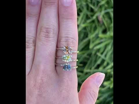
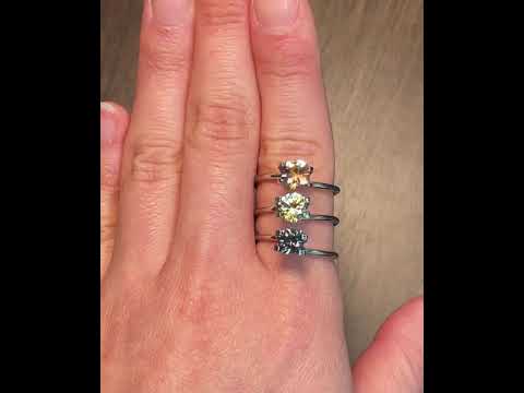
3 choices on one hand, indoor video 1st then outdoor. The stone on the bottom is out bc the multiple colors arent clear enough.


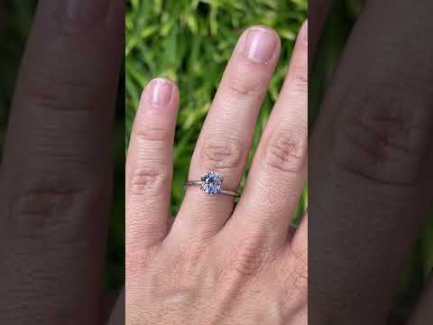
A 4th option, indoor then outdoor video:
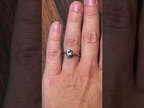

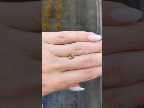
5th option, indoor then outdoor:


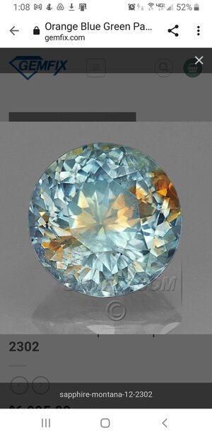
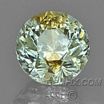
For reference, here are some options I think are ideal, but are sadly far out of budget (preferably 1500 or less but could go a touch higher)
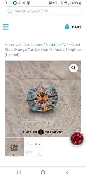
Screenshot_20211001-091332_Chrome.jpg
Screenshot_20211004-130819_Chrome.jpg

What do you all think?
 
I say number 5, no question. It's the only one where you can clearly see two colors distinctly. It looks bright and attractive both indoors and out. That's my vote!
 
I say number 5, no question. It's the only one where you can clearly see two colors distinctly. It looks bright and attractive both indoors and out. That's my vote!

Totally agree. It’s a really beautiful parti stone

Thanks, both!

Do you think it's weird that the colors are kind of in an "X" shape rather than a "blob" in the middle or a stripe? Or is that me being overly obsessive?
 
Another vote for option five. I actually like the X pattern!
 
I definitely prefer the symmetry of the X to a blob or a stripe, especially in a round stone. I like the fact that the stone has two contrasting colors that are clearly delineated with no muddiness.
 
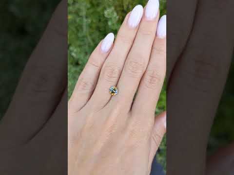
I was trying to avoid posting anything with an identified vendor, but here's a last option:


Thoughts @pokerface @Cerulean @Rfisher @maru8888777 ? I really like the stripe, but worry that the body isn't quite dark enough to make the orange/yellow stand out

I actually really like this. I think what makes the color difference so obvious is the stark contrast in warm vs cool tones. That coppery bronze stands out against the cooler, greyish green. It reminds me of how some people have yellow-flecked green eyes and it is a beautiful color combo IMO.

I suspect that it is frequently the dark tones that make parti stones look muddy and swallow up the lighter tone. Or, I will see two cool tones or two warm tones together that sort of bleed into each other. I am not certain, but it's a guess.

Just wanted to mention that Adamant Gems has some pretty partis too, but non stand out as having a sharper contrast than this one.

Thanks! What do you think of this gemfix one vs the other one in the video (option 5)? The gemfix one is more expensive (approx $700 more), but also an entire 1mm bigger (6mm vs 7mm).
 
If you want maximum color contrast, I’d do option 5. It has sharp, obvious zones. I think the Gemfix one will be subtler IRL
 
I think the gemfix one kinda hinges on what it looks like when the green shifts to silver.
 
Both are lovely. I think option five seems sparklier and the contrast is more striking, but the gemfix option is also beautiful, and the grey/green should also work in most light environments (though I'd check to see how you like it indoors).
 
Oh, oh, oh! Please oh please get option 5! Partis are not my thing, but if the photos are truly representative, that is one of the most beautiful stones I've ever seen! There is no bleeding of colors (so no muddy looking as sometimes happens), and each respective color is light enough in tone and saturated enough in hue to be quite visible and absolutely lovely!

Okay, I'll stop gushing now...
 
IMO the yellow stripe in the latest option looks like a stain, rather than a purposeful parti stone. Plus, both the green and the gold tones lean towards brown. I think stone 5 is a better choice in every way.
 
But dang that ET stone :D

You might also reach out to Laura at Tatum Gems to see if there’s anything blue/yellow that might split in a way that appeals.
 
In Sri Lanka these are called antique colour sapphires. Try Googling that terminology as well?
 
Option 5 by a huge margin. I like the defined X, rather than something that looks like a stain.
 
GET 3 FREE HCA RESULTS JOIN THE FORUM. ASK FOR HELP

Featured Topics

Top