Chasiu
Shiny_Rock
- Joined
- Jun 23, 2010
- Messages
- 345
Last fall, I purchased a 2.27ct emerald cut grey spinel from IG vendor Naturedecolours that I totally fell in love with. In direct sun, it's pure medium gray, and the purplish undertones come out slightly in indirect sun + even more in incandescent lighting. I wasn't sure what to do with it for a while, but I knew I wanted to emphasize those beautiful clean facets.
After simmering on it for a few months, I was browsing CRD's site and saw that she had some super cute baguette pink spinels on sale. I immediately thought, "This would make some gorgeous sidestones if I did an Art Deco style setting!" so I snapped up 8 and started mocking up layout ideas.
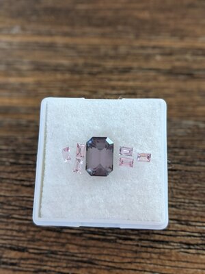
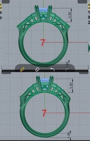
I finally reached out to David Klass a little while ago to get started on this new project, and he has sent through 2 CAD iterations and a model of the 2nd version.
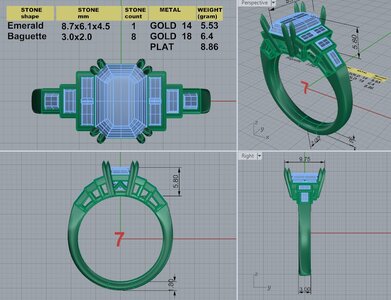
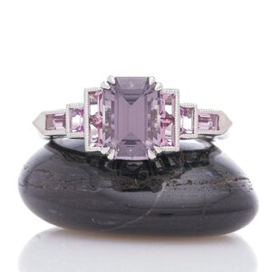
Version 1 - In my initial vision, I wanted the center stone set with double claw prongs, with an ogee detail in the gallery. The baguette sidestones are all bezel set & will be milgrained.
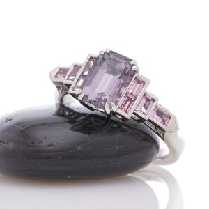
Version 2 - Horizontal bezel is now Bullet shaped and angle tilted to face up more; the shank is knife edged where it meets the cathedral shoulders but flattens to a more dome shape as it goes down. Again, the bezels will all be milgrained.
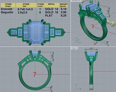
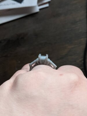
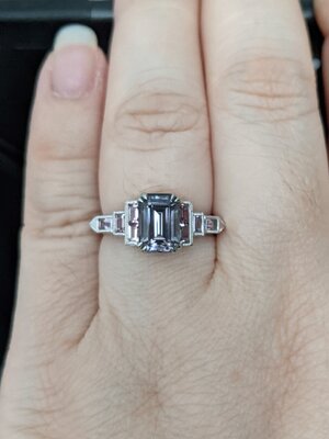
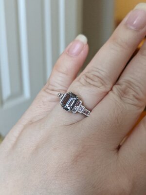
When I received the 2nd CAD, I immediately though "Yessss finger coverage" but then also thought that (1) the triangle corners on the shoulders might start to bother me and (2) I don't like that proportion of the open area under the bullet bezel compared to the other baguettes. The ring is a little over 23mm wide from tip to tip! Obviously the E-W baguette will be wider than if it were set N-S, but it's making me rethink the bullet bezel. The gallery view makes them seem like wings lol.
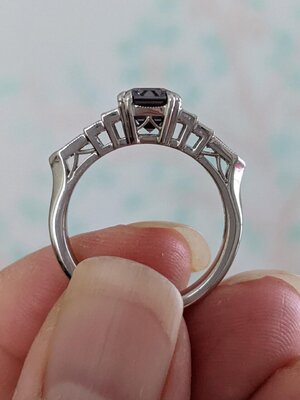
Perhaps I should keep the angle tilt but switch it back to a straight edge bezel? I'm not sure about the ogee detail either, but wasn't sure what else I could put in the gallery to keep the clean lines but not as boring as an open boxy basket.
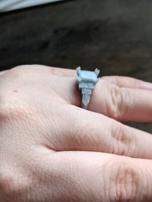
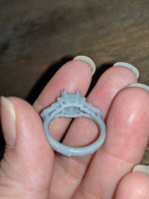
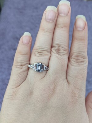
David was also kind enough to send me a plastic model of the ring so that I can try it on. The pointy bits don't bother me all that much, but those wings still do!
Model of v2 - love the horizontal finger coverage
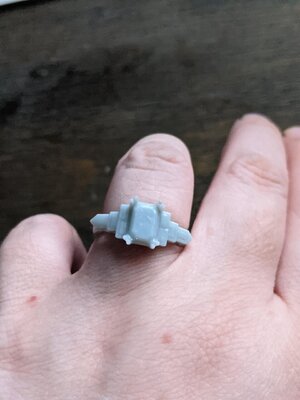
Wings
Ring butt!
So I humbly ask your opinion, what do you think of the shoulders? Do you think they look better with the straight edge bezel or the bullet bezel? And any ideas for an interesting gallery design?
After simmering on it for a few months, I was browsing CRD's site and saw that she had some super cute baguette pink spinels on sale. I immediately thought, "This would make some gorgeous sidestones if I did an Art Deco style setting!" so I snapped up 8 and started mocking up layout ideas.

I finally reached out to David Klass a little while ago to get started on this new project, and he has sent through 2 CAD iterations and a model of the 2nd version.
Version 1 - In my initial vision, I wanted the center stone set with double claw prongs, with an ogee detail in the gallery. The baguette sidestones are all bezel set & will be milgrained.

Version 2 - Horizontal bezel is now Bullet shaped and angle tilted to face up more; the shank is knife edged where it meets the cathedral shoulders but flattens to a more dome shape as it goes down. Again, the bezels will all be milgrained.

When I received the 2nd CAD, I immediately though "Yessss finger coverage" but then also thought that (1) the triangle corners on the shoulders might start to bother me and (2) I don't like that proportion of the open area under the bullet bezel compared to the other baguettes. The ring is a little over 23mm wide from tip to tip! Obviously the E-W baguette will be wider than if it were set N-S, but it's making me rethink the bullet bezel. The gallery view makes them seem like wings lol.
Perhaps I should keep the angle tilt but switch it back to a straight edge bezel? I'm not sure about the ogee detail either, but wasn't sure what else I could put in the gallery to keep the clean lines but not as boring as an open boxy basket.
David was also kind enough to send me a plastic model of the ring so that I can try it on. The pointy bits don't bother me all that much, but those wings still do!
Model of v2 - love the horizontal finger coverage


Wings

Ring butt!

So I humbly ask your opinion, what do you think of the shoulders? Do you think they look better with the straight edge bezel or the bullet bezel? And any ideas for an interesting gallery design?





300x240.png)