shape
carat
color
clarity

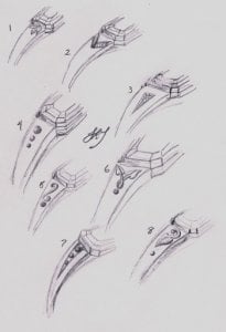
Asscher Grossular Sketches from Julia! What do you think?

Status
Not open for further replies. Please create a new topic or request for this thread to be opened.

LaurenThePartier

Super_Ideal_Rock
Joined
Mar 2, 2004
Messages
10,100
So, I just got my sketches from Julia, and because I'm hoping to go with a pretty streamlined look for the grossular asscher, I'm sort of digging #7 without diamonds or gold shot.

What do you guys think? The setting will be a bezel setting in 18k yellow gold. I could use gold shot where any of those "dots" occur. If I were to go with the diamonds, there would be 2x .02 ct, 2x .015 ct. and 2x .01 ct. Thoughts?
1.gif


As a bit of a reminder, here's my Grossular.
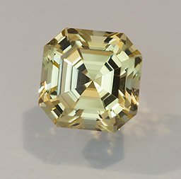
1.38ct.GrossularGarnetAsscher6.61mm2.jpg


LaurensGarnetRingSketch.jpg
 
Lauren what colour gold are you going for? The reason I ask is that the two sketches that jumped out at me as being soooooo individual are the ones with the leaves numbers 6 and 8 and I wondered if you could do those bits in green gold? Your stone has a real organic feel and the leaves just look "right" somehow. However, if you've decided to go with diamonds as accents no worries!
 
Is #1 supposed to have some sort of a flower motif?

I also think that #7 is my favorite.
 
oh boy. lots of sketches, I actually like 7 and 8 but they both have completely different feel.
 
LovingDiamonds - thanks for that! It''s supposed to be in 18k yellow gold, so sort of a version of my engagement ring that''s not my engagement ring.
3.gif
I''m just wondering if I''m considering diamonds for the sake of having diamonds included.
2.gif


Szh07 - Yes, it looks like leaves, and as much as I seem to love them on other people''s pieces, I''m not sure it''s working for this asscher cut garnet.
 
Date: 11/9/2009 4:14:30 PM
Author: D&T
oh boy. lots of sketches, I actually like 7 and 8 but they both have completely different feel.
LOL, D&T. That''s how I felt. I have 2 personalities - one loves pave and halos - the other loves super simple streamlined and clean settings. Halp!
9.gif
 
I like 5 and 7. Five looks so Julia to me, and nothing wrong with letting a designer put some signature touches on the piece. Seven is a more classic look.
 
I like #4 and #7 for no particular reason other than they appeal to me the most. Actually, all of them are pretty cool!
 
I love 5 and 7!
 
Thanks for your input Fly Girl, MonkeyPie, and Cind - I actually really like 5, too. Perhaps with a thinner shank. . .?

I'm wondering if she could do some sort of flowery/organic design in the split shank . . . hmmmm . . .

This is why I love posting these questions, you ladies all have such varied opinions.
9.gif
 
Date: 11/9/2009 4:16:39 PM
Author: LaurenThePartier

Date: 11/9/2009 4:14:30 PM
Author: D&T
oh boy. lots of sketches, I actually like 7 and 8 but they both have completely different feel.
LOL, D&T. That''s how I felt. I have 2 personalities - one loves pave and halos - the other loves super simple streamlined and clean settings. Halp!
9.gif
ok- I think I changed my mind
3.gif
and vote #7 because your asscher to me speaks streamline and simple and I love the graduated feel of sidestones (even though it might be minimal)
 
I like 7 and 8 :)
 
4, 5, 8 are the ones that jumped out at me right away!
 
I love Julia''s leaves, but I think the asscher goes better with a more angular geometry. So I pick 7.
 
i like 3 and 7
it has got to flow....
 
I like 3 and 7 . . . so it looks like 7''s the winner so far.
1.gif
 
I like 3 and 7 best too. And kind of love Julia.
 
I like 4, 7, 8

Not really sure as to preference between those though.
 
I like 3 and 7 as well. I was wondering if, instead of diamonds, you could use analagous colours (tsavorite) or complementary (purplish blue). I love combining colours!
 
Alot of choices!!
23.gif
I like #3 and #7. More modernish feeling, but I think your assher can stand alone without the design on the side. It''s just so pretty!!!
 
I like 1, 5, 6, and 8. That does nt really narrow it down I guess- I just like the ''nature'' feel of those designs!
 
I''m also digging #7. It has such a lovely and streamlined, yet unique look to it.
 
4
 
5 or 7. I think those would work well with your stone.


-A
 
I *think* that #1 would very pretty as the flower/leaves have a van craeynest look to me, but the picture needs to be a bit larger to see the details clearly. The details look more delicate than the other designs (except 7).

Initially, my vote was going to be #7 without diamonds or gold dots as I like the simplicity of the split shank and bezel with the asscher cut. However, I''d like to see what #1 looks like executed, hence, the vote for #1
28.gif
 
I like 7, but they are all lovely depending on the look you are going for.
 
Well, I seem to be not like the rest of the crowd as I like 1, 2, & 3. I think that this stone would look amazing with a simpler setting. Frankly, my ideal would be to have something like the side design on #3 but placed in the same location as the triangular piece on #2. Basically, have a longer design on #1 or put a more delicate design on #2, or put the design on #3 closer up. Does that make sense?

Though I have to admit, I kind of like Lady Disdain''s idea of putting some purplish-blue stones for #7.
 
Thanks for your votes everyone! Lady Disdain, I''m digging on your idea of using tsavs or something complimentary with #7. I think I''m going with the split shank of #7. As of now, no beads or gold, but she can drop them in and take a pic of them at the last minute, so I''ll decide then.

Not sure what the basket is going to look like, but she''s drawing up another sketch expanding on the split shank idea. Thanks again!
9.gif
 
I vote for 1, 7, and 8!
 
Lauren,
Well, it''s a tough decision, but I see you''ve made up your mind and looking forward to more sketches and the basket design.
1.gif
 
Status
Not open for further replies. Please create a new topic or request for this thread to be opened.
GET 3 FREE HCA RESULTS JOIN THE FORUM. ASK FOR HELP

Featured Topics

Top