shape
carat
color
clarity

CAD Help - antique repro setting

unsettled

Shiny_Rock
Premium
Joined
Jan 6, 2015
Messages
384
I have been away for a long time, but I think I am ready to try to design the forever home for my diamond.


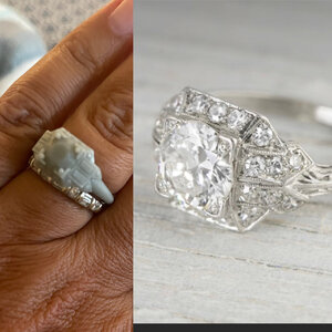
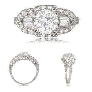
This is my inspiration.....I would just like to use two baguettes on each side of the halo.
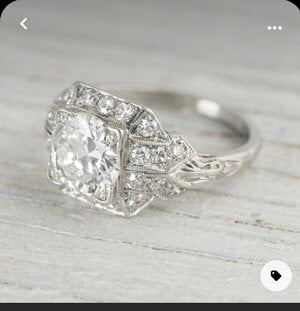
Image (1).jpeg

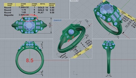
This is the CAD I received from David Klass. For me, I quite like it, but I am not an expert with CADs. Is there anything I am missing?
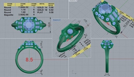
DK 82870-QUAD.jpg
 
Replying to bump this for you and to say the inspiration ring is beautiful and I love the idea of having baguettes so I think it’ll be stunning. Will there be milgrain too? I have very little experience with CADs to weigh in on what I’m seeing, though.
 
Replying to bump this for you and to say the inspiration ring is beautiful and I love the idea of having baguettes so I think it’ll be stunning. Will there be milgrain too? I have very little experience with CADs to weigh in on what I’m seeing, though.

Thank you! Yes, there will be very fine milgrain just like the inspiration. And probably some engraving on the shank. I haven’t decided that yet. I’ve asked for a wax mold so I can see it in person.
 
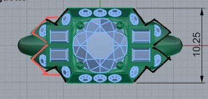
My first thoughts are that the melee stones in the halo (circled in red) need to be a larger diameter to fill up the whole side of the halo more proportionately like the inspiration ring

DK 82870-QUAD~2.jpg
 
My first thoughts are that the melee stones in the halo (circled in red) need to be a larger diameter to fill up the whole side of the halo more proportionately like the inspiration ring

DK 82870-QUAD~2.jpg

That's a good point. I don't know if they need to be bigger or spread out more? I ordered the wax mold, so I will see how it looks when I get it in.
 
Beautiful!!
 
Bear in mind, the mold won’t have the miligrain detail. And the final cast needs a bit of extra metal that will be knurled (basically squished up or down via the application of force) during the application of the miligrain. That said, will you have miligrain detail around the baguettes and between them?
 
I like the CAD as it is, I wouldn’t make the melee bigger.
I think it would look less like the inspo if they were bigger -

Does the original have a tiny diamond in each of the fishtail prongs? If so - I still wouldn’t bother with them.

Being the silly person I am - I might ask about the baguettes being bead set like the rounds instead of bezeled. I don’t know if I’ve ever seen that tho?

Cannot tell from cad - and hate to assume - make sure all melee have access to cleaning from underside.

IMO the bench’s hand at setting of the baguettes in bezels and how it’s constructed (millgrain too) is going to be the key in the overall look of the ring between pretty and killing it gorgeous.
 
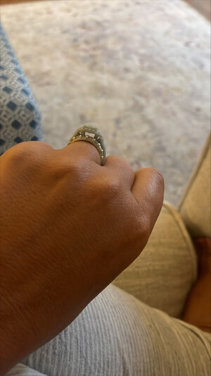
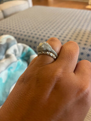
I received my wax mold. And I have asked for a few changes. Bigger round stones on the halo, less tilt of the halo, and lower to the finger. Image (3).jpeg
 

Attachments

  • Image (2).jpeg
    Image (2).jpeg
    150.2 KB · Views: 34
  • Image (1).jpeg
    Image (1).jpeg
    213.4 KB · Views: 35
Bear in mind, the mold won’t have the miligrain detail. And the final cast needs a bit of extra metal that will be knurled (basically squished up or down via the application of force) during the application of the miligrain. That said, will you have miligrain detail around the baguettes and between them?

Yes, I will have milgrain around the baguettes.
 
I like the CAD as it is, I wouldn’t make the melee bigger.
I think it would look less like the inspo if they were bigger -

Does the original have a tiny diamond in each of the fishtail prongs? If so - I still wouldn’t bother with them.

Being the silly person I am - I might ask about the baguettes being bead set like the rounds instead of bezeled. I don’t know if I’ve ever seen that tho?

Cannot tell from cad - and hate to assume - make sure all melee have access to cleaning from underside.

IMO the bench’s hand at setting of the baguettes in bezels and how it’s constructed (millgrain too) is going to be the key in the overall look of the ring between pretty and killing it gorgeous.

I am not sure how baguettes can be set. The bezels will have milgrain, so I think I am ok with that. I was trying to decide if they need to move closer together. But I think that may look weird.
 
I agree with both changes you've identified for the halo: size of the rounds getting bigger and also decreasing the slope of it angling down toward the finger.

Along the shoulders where the baguettes and the end triangles meet there are some minor details that I would get changed as well.

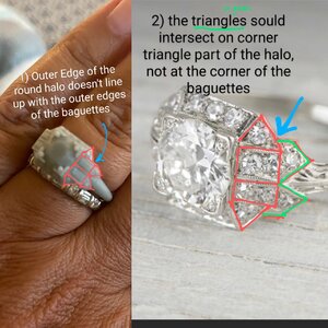
#1: The outer edge of the round should meet up with the outer edges of the baguettes part. This detail may require playing around with the size of the baguettes (less long) in order to achieve the correct alignments even after the above changes are made to the round stones and the angle of the halo.

#2 in the CAD and in the wax the shoulder "end" triangles that transition the baguettes into the shank are different from the inspiration. The CAD shows a diamond or kite shape that lines up pretty close to the corner of the baguettes (black line). In the inspiration the north and south edges of those parts are not lined up to the rectangular part, but instead come up onto the triangle segment of the round octagonal halo. Also note that in the CAD those parts are diagonal, but I'm the inspiration they are parallel to the larger halo and parallel with the shank (red line or CAD). Making them parallel will follow the Art Deco vibe better.


Image (1)~2.jpeg
DK 82870-QUAD~3.jpg
 
RE: comment about making the setting lower:

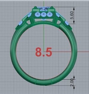
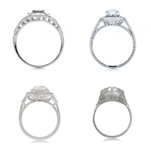
Your centre diamond looks like it is already set nearly as low as possible in the CAD. But the halo is up high, in line with the girdle of the stone.
DK 82870-QUAD~4.jpg


This is causing that blank gallery to be prominent in profile view. Lots of art deco rings will drop the halo portion lower to the finger. The center diamond stays where it is, as low as possible, and now the girdle of the stone sits above the halo making it look (relatively) protruded.

Here is an example similar to your inspo, but with the baguettes https://www.estatediamondjewelry.com/product/lienz-ring/
20220808_144011-COLLAGE.jpg


Doing this would make the whole ring appear lower set, and it would also decrease the size of that empty gallery on profile view. I would consider adding some small details to the gallery for visual interest (straight lines? Circles? Half moons? Rhombus shapes?). My pick would be the tiny circles :). Some ideas below:

20220808_144056-COLLAGE.jpg
 

Attachments

  • DK 82870-QUAD~4.jpg
    DK 82870-QUAD~4.jpg
    30.4 KB · Views: 4
I agree with both changes you've identified for the halo: size of the rounds getting bigger and also decreasing the slope of it angling down toward the finger.

Along the shoulders where the baguettes and the end triangles meet there are some minor details that I would get changed as well.

#1: The outer edge of the round should meet up with the outer edges of the baguettes part. This detail may require playing around with the size of the baguettes (less long) in order to achieve the correct alignments even after the above changes are made to the round stones and the angle of the halo.

#2 in the CAD and in the wax the shoulder "end" triangles that transition the baguettes into the shank are different from the inspiration. The CAD shows a diamond or kite shape that lines up pretty close to the corner of the baguettes (black line). In the inspiration the north and south edges of those parts are not lined up to the rectangular part, but instead come up onto the triangle segment of the round octagonal halo. Also note that in the CAD those parts are diagonal, but I'm the inspiration they are parallel to the larger halo and parallel with the shank (red line or CAD). Making them parallel will follow the Art Deco vibe better.


Image (1)~2.jpeg
DK 82870-QUAD~3.jpg

Yes!!! I have been trying to figure out what is "missing" because something wasn't flowing quite right.
 
RE: comment about making the setting lower:

Your centre diamond looks like it is already set nearly as low as possible in the CAD. But the halo is up high, in line with the girdle of the stone.
DK 82870-QUAD~4.jpg


This is causing that blank gallery to be prominent in profile view. Lots of art deco rings will drop the halo portion lower to the finger. The center diamond stays where it is, as low as possible, and now the girdle of the stone sits above the halo making it look (relatively) protruded.

Here is an example similar to your inspo, but with the baguettes https://www.estatediamondjewelry.com/product/lienz-ring/
20220808_144011-COLLAGE.jpg


Doing this would make the whole ring appear lower set, and it would also decrease the size of that empty gallery on profile view. I would consider adding some small details to the gallery for visual interest (straight lines? Circles? Half moons? Rhombus shapes?). My pick would be the tiny circles :). Some ideas below:

20220808_144056-COLLAGE.jpg

This was my original CAD, and I asked for it to be raised just a bit so my wedding band could fit. And I think we just raised it too much. And I agree that the sides need some detail.
 
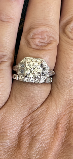
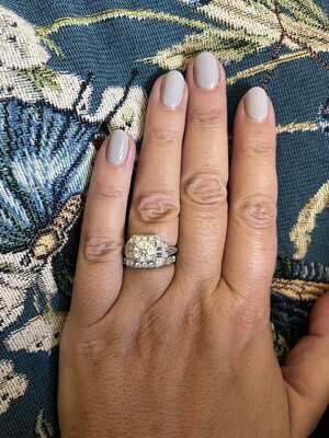
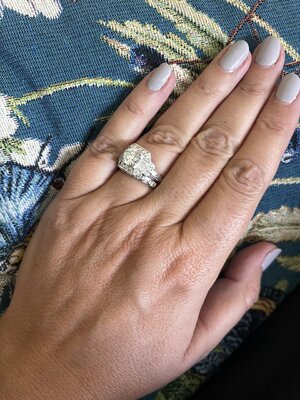
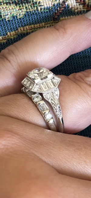
It’s here! It’s here! And I couldn’t be more pleased! 8A54FDEA-A3C2-460D-9825-E691A6924194.png
 

Attachments

  • 7944B2EF-939D-4CDB-AF9C-89D2C884A27E.jpeg
    7944B2EF-939D-4CDB-AF9C-89D2C884A27E.jpeg
    374.9 KB · Views: 27
  • EAC23F3B-E75F-4E52-84FB-EF26C85A44E9.jpeg
    EAC23F3B-E75F-4E52-84FB-EF26C85A44E9.jpeg
    344.5 KB · Views: 31
  • 878A10B9-E9C9-4BCB-BD62-F67C778A1E36.png
    878A10B9-E9C9-4BCB-BD62-F67C778A1E36.png
    1 MB · Views: 31
Looks fabulous!! I love the shoulder/shank details and the engraving!
 
This is gorgeous! I love Art Deco! Especially baguettes!
 
This is gorgeous! I love Art Deco! Especially baguettes!
Thank you! I’m so glad that I added the baguettes on the side. I think it gives it so much character!
 
It’s gorgeous! Your vision is beautifully done… I love the baguettes…enjoy!
 
I love the angles! You get the best of both worlds — antique looking face-up without the giant clunky vertical part.
 
It turned out really nice!
 
Beautiful!
 
Love it! Looks exactly like what you were envisioning. Got any gallery views? <3

I will update later. But I ended up keeping the gallery totally plain.
 
GET 3 FREE HCA RESULTS JOIN THE FORUM. ASK FOR HELP
Top