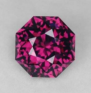
shape
carat
color
clarity

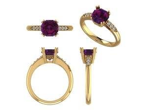
CADs for Stone Hunter's Umbalite Garnet

Stone Hunter

Ideal_Rock
Premium
Joined
May 12, 2006
Messages
6,487
This is going to be a stunning ring. :appl:
 
This is going to be a stunning ring. :appl:

THANKS It’s my first custom ring. So I am a bit nervous because the whole process is different than picking a stock setting.
 
That looks gorgeous! The yellow gold and the purple is stunning!

I love your side design. Do you mind if I steal this design should I ever go custom?
 
That looks gorgeous! The yellow gold and the purple is stunning!

I love your side design. Do you mind if I steal this design should I ever go custom?

Thanks. The stone isn’t really that color, I couldn’t get any accurate photos of it and the jeweler couldn’t either. It’s more red purple, but not pink.

By “side design” do you mean the bar of the basket or the diamonds and arrow?
 
Not a CAD expert but think the setting looks perfect for the stone...I love the combination!
 
Not a CAD expert but think the setting looks perfect for the stone...I love the combination!

Thanks I appreciate your input! It’s nerve wracking to try and pull elements from multiple rings into one setting. I had no idea how it would all look together. I almost gave up and bought my favorite vintage inspiration ring. It has a round diamond in it so it wouldn’t work as a setting for this stone.
 
Thanks. The stone isn’t really that color, I couldn’t get any accurate photos of it and the jeweler couldn’t either. It’s more red purple, but not pink.

By “side design” do you mean the bar of the basket or the diamonds and arrow?

The basket with the milligrain (is that what it's called?). So pretty!
 
This is great! Such a classic vintage design. I loove prongs that continue down over the bottom donut. It is one of those simple things that adds so much extra visual interest and flair.

I see no "problems" per se with the CAD. From a purely personal aesthetic standpoint, I might like to see the prongs start out closer together at the base to angle up more steeply and better match the angle of the pavilion of the stone (more of a V or trapezoid shape rather than square). Right now the basket is a bit "boxy" for my own personal taste, especially for such a beautiful octagonal-shaped stone! I wouldn't want to totally obscure that beautiful shape! (tbh, I would probably put that baby in a milgrained bezel to show off the shape, but I don't want to throw you off entirely here ;P )

BUT that being said, the boxier look is very typical of old crown style solitaires. So totally up to you!

And congrats on the first custom project! It's going to be beautiful!
 
Last edited:
This is great! Such a classic vintage design. I loove prongs that continue down over the bottom donut. It is one of those simple things that adds so much extra visual interest and flair.

I see no "problems" per se with the CAD. From a purely personal aesthetic standpoint, I might like to see the prongs start out closer together at the base to angle up more steeply and better match the angle of the pavilion of the stone (more of a V or trapezoid shape rather than square). Right now the basket is a bit "boxy" for my own personal taste, especially for such a beautiful octagonal-shaped stone! I wouldn't want to totally obscure that beautiful shape! (tbh, I would probably put that baby in a milgrained bezel to show off the shape, but I don't want to throw you off entirely here ;P )

BUT that being said, the boxier look is very typical of old crown style solitaires. So totally up to you!

And congrats on the first custom project! It's going to be beautiful!

THANKS for you input!! I am a novice at reading CADs. I did ask them if the prongs could separate a bit sooner, but not as far down as you mentioned. This jeweler did design a STUNNING ring that is a milgrained bezel. BUT I didn't want to block any light with the unusual color and sparkle of this stone. I also wanted totally different sides and basket detail than that ring.

Ah the joy and suspense of cobbling together a design by taking sections from at least 4 different rings. I scoured the vintage/antique sites for a couple of weeks. :whistle:

ETA: I posted Acinom's lovely claw prongs in this thread but didn't give that photo to my jeweler since her ring was made by a current designer. I stuck to vintage photos to avoid any copying issues.
 
I don’t have anything helpful to add because it looks gorgeous! The yellow gold with your stone is scrumptious :P2 And I’m a little jealous because I’m in round three of CADs for a ring and you nailed it right out of the gate!
 
I don’t have anything helpful to add because it looks gorgeous! The yellow gold with your stone is scrumptious :P2 And I’m a little jealous because I’m in round three of CADs for a ring and you nailed it right out of the gate!

Thanks! I didn't go to CAD until I knew what I wanted for the most part. I gave the jeweler photos and she gave those photos to the CAD people. Still I couldn't "see" how some of the parts would come together. :cool2:
 
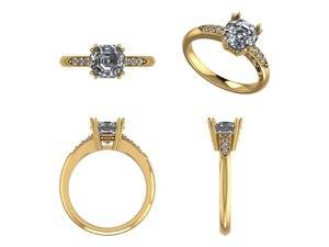
Second CAD. The double prongs are slightly farther apart.
Victoria - Parker V2-a.jpg
 
The top of the stone to my finger is 6 mm. Since the stone is 5 mm deep I think that's as low as it can go. Thoughts on the height and prongs?
 
Umbalite CAD.jpgVictoria - Parker V2-a.jpg

Both in one post for comparison. The grey stone is the second CAD.
 
I love the slight split between the prongs. It’s adds an extra bit of refinement. :)
 
I agree that the change you made adds just that bit of extra needed!
 
Thanks for your input @elliefire99 , @Keeliamira , and @amoline on this holiday weekend. I am going to give the go ahead for casting.

Excited and nervous but with your input and that of @mellowyellowgirl , @lilmosun ,and @LisaRN I feel that I haven't missed anything in my first attempt at reading CADs. Thank you all!!
 
Last edited:
That looks gorgeous! The yellow gold and the purple is stunning!

I love your side design. Do you mind if I steal this design should I ever go custom?

I love your collection, and would be flattered if you copied my design. I took the idea from a 1930s ring that wasn't by a design house. So the copyright has long since expired! =)2
 
UPDATE

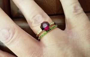
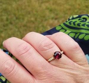
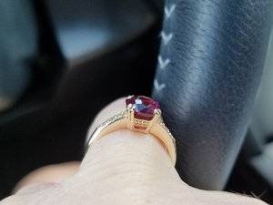
My Umbalite Garnet ring has been finished and I'm very happy with it. I have been unable to get photos that show what the stone looks like in "real life." These two photos show the setting well though. I am happy that I went the custom route and will use this local jeweler again. The CADs were a very accurate translation of the photos I gave them and the ring looks like the CAD.

Umbalite Inside stacked with a Demantoid Garnet band

Umbalite inside.jpg

Umbalite Outside I'm holding an umbrella so it's probably overcast

Umbalite outside.jpg
 
Oh wow, that turned out beautifully!
 
Love love love it @Stone Hunter I’be been waiting to see the final result. I have three stones of the same cut that i wish to set. The proportions really work on your finger. I love all the design details like the double prongs and the knife edge It pairs beautifully with the eternity band Please share more pics, especially from different angles
 
Love love love it @Stone Hunter I’be been waiting to see the final result. I have three stones of the same cut that i wish to set. The proportions really work on your finger. I love all the design details like the double prongs and the knife edge It pairs beautifully with the eternity band Please share more pics, especially from different angles

Thanks! I am having a hard time getting good photos of the stone. I couldn't ever get a decent photo of the loose stone, and the jeweler couldn't either!!:eek2:

I will try to get a few better photos.
 
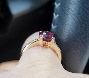
The side view. Partly cloudy. In a parking lot in my car. Sorry about how large it is. This sort of distorts the side details but it's the best side photo so far.

20190620_183026.jpg
 

Attachments

  • 20190620_181240.jpg
    20190620_181240.jpg
    115.1 KB · Views: 59
Last edited:
Congrats, it's a really pretty ring!!!
 
The side view. Partly cloudy. In a parking lot in my car. Sorry about how large it is. This sort of distorts the side details but it's the best side photo so far.

Thanks @Stone Hunter for posting this profile shot. I like the horizontal lines in the basket. Are they milgrained?
 
Thanks @Stone Hunter for posting this profile shot. I like the horizontal lines in the basket. Are they milgrained?

I am really loving the profile of this ring. It confirms how important to me ring profiles are.

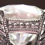
There really aren’t horizontal lines. There is milgrain and then dots between them. The above photo shows it looking like horizontal lines. From a distance perhaps it’s the same look. I will try for better photos.

Here is the photo I based the profile on. HTH

basket vintage style - Copy (2).jpg
 
GET 3 FREE HCA RESULTS JOIN THE FORUM. ASK FOR HELP

Featured Topics

Top