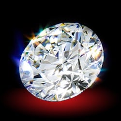
shape
carat
color
clarity

CADs Take 2

redroze

Shiny_Rock
Joined
Jul 15, 2013
Messages
405
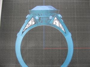
Any other thoughts are welcome! Mine:

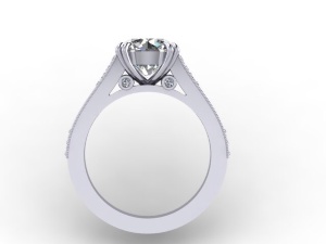
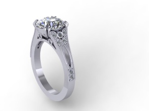
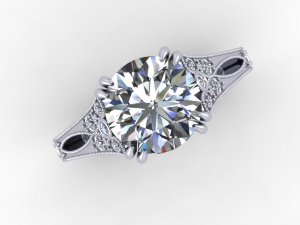
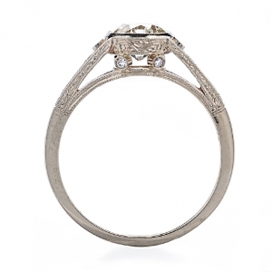
1) Shorten navette cutout so 1 melee can be seen on other end of cutout from the top down view.
2) Increase milgrain and pave to 3/4 of the shank (my own preference, not like the original).
3) To make taper more dramatic, make shank below the cutout 1.8 mm rather than 2 mm, and show very little gold on either side of melee.
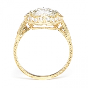
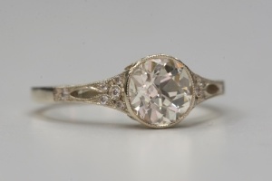
4) they can hand engrave a design I like so I'm showing these two samples.

First version:
https://www.pricescope.com/community/threads/cads-are-in.199707/
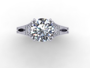
image_1457.jpg
image_1458.jpgimage_1459.jpg
image_1463.jpgimage_1464.jpg

image_1461.jpgimage_1399.jpgimage_1462.jpg
 
Hi Redroze! I think your second CADs look much closer to your inspiration ring and it looks beautiful. I love the profile! If you want it to look a little closer to your inspiration ring, the only thoughts I have is that the shank could be thinner starting from right above the cutout down to the bottom of the shank (just a little bit though). It seems like the inspiration ring has a more dramatic taper inward, which you have already called out, but again, I think it needs to start above the cutout versus below it. But, it is also hard to tell with a CAD (from personal experience)! :D
 
You're right Tweet! I also noticed the cut out has barely any gold around it which helps to narrow the shank.
 
Much better! It looks really nice. I think the cut outs especially look great!

I think I'd personally like to add something to the cross bar on the profile. Maybe milgrain on it, or some pave? What do you think?

Do you like this profile at all?
 
Oo that's pretty. I asked them to engrave it like the pHoto above, so that will make it less plain.
 
I definitely looks a LOT better! But looking at the side view, the top piece with the design is still way too thick. Look again at the SS CAD for backwardsandinheels.

_16092.jpg
 
I also do not like that third profile view with the way the prongs are. I think the prongs need to be spaced more at the base.
 
DS - I know what you're saying about the shank "height" or thickness off the finger, or the cathedral arms. If they thin it then the two surprise diamonds have nowhere to attach to...they would have to move outwards. Would that look odd? I do like them there as it looks a bit different.

I based the prong stems and how they meet on a JBEG design. I quite like it but it may not be a look you like. ARe you saying the point below needs to be thinner? Or you just don't like it?
 
Hmmm I see what the issue is. So I'll ask them to go back to the rounded shape of the first CADs, with the rounded shank (rather than tulip shaped) and do the struts straight down rather than meeting at a point, then put the two diamonds on either side of the struts/stems so the culet of the diamond shows. Then thin it all around. Thanks DS!
 
I think that will work! I wouldn't quite say straight down, though. Even when you look at backward's CAD, the head is angled, so just picture prongs angled on the sides of her head. Gosh, it is a wonder if anyone can understand what we are saying! :lol:
 
GET 3 FREE HCA RESULTS JOIN THE FORUM. ASK FOR HELP
Top