shape
carat
color
clarity

Calling all Pad Experts…

natasha-cupcake

Brilliant_Rock
Premium
Joined
Nov 16, 2017
Messages
1,237
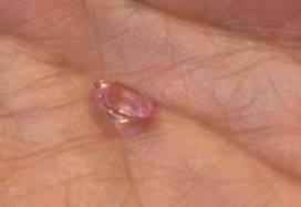
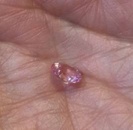
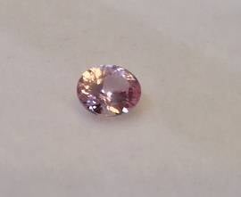
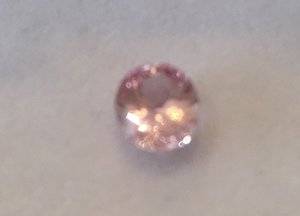
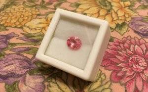
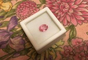
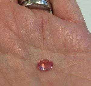
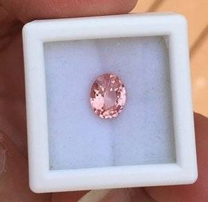
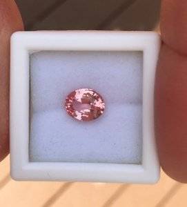
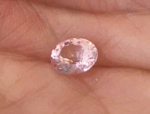
…I’d love some input from you. Sapphires are my birthstone and have always had meaning for me. The first piece of nice jewelry I ever had was a blue sapphire ring my mother gave me. I was always a classic blue fan, but I’m now fascinated by padparadschas. I know—me and a gazillion others! Just my luck--I love sapphires and I love pinks above all other colors, especially in peachy, coral, salmon, watermelon, ballet and, of course, lotus blossom hues. I’d love to have a pad but can’t afford the huge prices for the really nice ones. So, to satisfy my curiosity, if nothing else, I ordered a smaller pad to get a look at what I might see in a price I could live with. The stone I found is really pretty. It’s very pastel, but super bright, sparkly and lively. The color is pretty, mostly pink with beautiful almost coppery flashes of orange. It is GIA certified as “Padparadscha”, but to my eye, it seems to have too much of a lavender cast to the pink. Lavender is not a direction in which I like my pink hues to go. And according to everything I know about pads (I'm no expert, but I can read), lavender in any form does not jive with a “true” pad pink. Please take a look at my pictures and tell me if I’m right about the lavender cast. As I move the stone around, the color appears pink, then orange, then lavender pink and sometimes clear. It’s really pretty, but I don’t think it’s what I want. Please take a look at my pictures. The colors in the pictures are a good representation of what I see in person, at least on my monitor. Opinions and advice are welcome and desired! Return policy is excellent, so I’m not worried about having to do so, if I decide not to keep the stone.
Pad 2.jpg
Pad 8.jpg
Pad 9.jpg
Pad 13.jpg
 

Attachments

  • Pad 10.jpg
    Pad 10.jpg
    13.4 KB · Views: 21
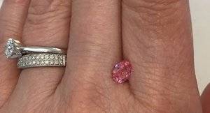
Wrestling with this issue, too, in my own little world. It's very pretty against the white background but it's almost the same tone as your skin. Different hue (but not by much). I think you'd need to set it off with a halo of decent-sized diamonds and then that's a less versatile ring and more of a "statement," imo.

I'm sure I'm an outlier on this forum but I like the more saturated, richer ones. They look more like lotus blossoms to me. And I think skin tone matters.

I'm not really seeing the lavender -- but it's just a few photos, plus monitor calibration, etc.
 
Very pretty. Is that a bit of blue at the 7 o’clock position (1st photo)?
Personally I think it’s a bit too pale for your skin tone, it’s sort of “disappearing”. I think you need a more olive complexion to wear any pale pastel pink gem.
Because you’ll be paying a decent chunk of money, make sure whatever you buy you absolutely love otherwise.... maybes I should have.....set in.
 
I'll be honest, you can probably get this colour and saturation in morganite and spend much less money.

Is the window a tilt window?
 
Thanks for your comments, everyone.

@LilAlex I was thinking a halo of some sort, and I agree that a more saturated stone would work better for my skin tone.

@Bron357, there is no blue in real life, just lavender/purplish/pink that permeates the stone, primarily in indoor light (nighttime in my kitchen that has LED bulbs and my walk-in closet/dressing room with incandescent bulbs). This morning in strong daylight/sunlight I see more pink with the coppery pinky-orange. I still see lavender pink, though. I do have fairly light skin and I agree that there isn't a lot of contrast between my skin tone and the stone. Go figure--I'm of 100% Italian/Sicilian descent, yet I have dark blonde hair, green eyes and light skin! No olive tones here.

@theredspinel, yes, as far as I can tell, it is a tilt window. I also think morganite is beautiful, so it's on my very long wish list of stones I'd like to acquire. But I would just love to have a slightly more saturated, more orangy-pinky-corally-lotus flowery-watermelony pad sapphire.

This stone, while pretty, is just not the one and will be going back. I don't think I can afford what I really want, though. I'll probably keep looking at pads, but I'm open to other types of stones with that color. I'm looking for an oval with the long axis about 5.5 to 6.5mm. I'd spend around 2k for a pad sapphire of that size (which is probably not going to happen), but would adjust the budget downward for other stones. If any one has suggestions, please let me know.
 
Have you looked at JupiterGem? I’ve never bought from them and they’re not on the vendor list, but I corresponded with them recently, and they were friendly and responsive. They have pads in that size and price range, but you’ll compromise on the color, windows, etc.

https://jupitergem.com/gemstones/padparadscha-sapphire/
 
I see nothing wrong with the color; I have a similar one myself. It really looks nothing like morganite to me. Plus sapphire is a much harder stone.

The only problem is see is in the first photo. It looks like there's a substantial window. I had to send a pad back because of a window. It was such a shame, it was a lovely color.
 
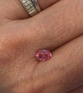
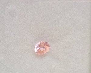
I stared at the stone a lot more today. It definitely has a window. I can't tell how large it is, though, because it seems to disappear or get a lot smaller as I move the stone around. It's still a very pretty stone, but I can't get over the lavender cast. I also think the color needs to be at least a little more saturated to deal with my skin tone. This picture shows the lavender a little more. Sorry it's so blurry.

Pad 3.jpg

Thanks, @bcandy, I'll check out Jupiter Gems before giving up. I could up my budget by abandoning another project I'd like to do, or I could just wait and save up more money if I can't find something suitable.

How much of a window is reasonable? Would setting a somewhat windowed stone in a yellow or rose gold bezel help?

@doberman, do you have a Doberman? We have one who is turning 3 tomorrow. Sweetest dog I've ever known!
 
None of the pictures are straight on. What you’re seeing is a tilt window which is to be expected.
 
Any opinions on this stone?
126pad8.jpg

126pad10.jpg
126pad11.jpg

126pad13.jpg

Pavilion side up

126pad6.jpg
 
Lovely stone. Slightly on the pink side, but clearly a pad, in my opinion.
What's the ct weight?
 
It's 1.26 carats and measures 7.46 x 5.97 x 3.58. It has a tilt window at some angles, but for the price point, I thought it was a really pretty stone. It's more saturated than the first one I looked at, and is better with my skin tone--really pastel just doesn't work for me (although I like the pastel look). It's a teeny bit less sparkly than the other one (that one had amazing sparkle!) but it's still a very sparkly, lively stone. It's GIA certified as pad, so I felt reasonably assured. I like the color a lot. I agree it's little on the pink side and I'd love more orange-y, but I also know I can't get a truly amazing pad for my budget. I'd have to save for years to get a really exceptional one.
 
Last edited:
That all sounds pretty good to me. Is it unheated as well?
In any case, if you love it and the price is right, I think that one is a winner :kiss2:
 
I like it. Having a basket with a bottom design should help with the tilt window.
 
That all sounds pretty good to me. Is it unheated as well?
In any case, if you love it and the price is right, I think that one is a winner :kiss2:

It is heated, but I'm not terribly bothered by that. Unfortunately, I can't afford to be too much of a purist. I figured at this price point, I have to accept either a small window, less pad appropriate color or heated; or some combination of all three. I want to compromise the least on color.

I like it. Having a basket with a bottom design should help with the tilt window.

I love intricate baskets, so I'm glad one would help with that issue. Please feel free to post some setting/design ideas!
 
I love it! :love:
 
I think the color is lovely. I like it a lot.
 
That's wise. Color should definitely be the top priority when looking at pads.
 
Here's a couple of pictures taken outdoors in bright sunshine. I think it looks more salmon pink orange-y in this light.

126pad15.jpg
126pad16.jpg
 
Here's a couple of pictures taken outdoors in bright sunshine. I think it looks more salmon pink orange-y in this light.
126pad15.jpg
126pad16.jpg

The outdoor pictures really nailed it. That color is supersaturated and perfect. It will be gorgeous. You have a winner.
 
The outdoor pictures really nailed it. That color is supersaturated and perfect. It will be gorgeous. You have a winner.
Thank you @suzanne2 . Your comment gives me confidence. I haven't seen a lot of these in person so it makes it hard to trust myself. When I look at this stone, I definitely like what I see. It's great to get a little confirmation from others. Thanks again!
 
natasha-cupcake, the saturation and color of your pad is so gorgeous! Who was the vendor? I have been looking at pads on jumpiter gems but have never been brave enough to pull the trigger.
 
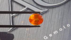
I would recommend sending it out to a place like AGL or GIA. Pad coloring is thrown around a lot I have a orange yellow sapphire with a cert saying its a pad when its clearly not. Also with the introduction of B.E treatments a lot of cheap Pads or on the market that are heavenly modified. Below is a sapphire I bought it came with a cert from the 80's that called it a pad but It was clear it was not. Sent it to AGL and got the right call golden. DSCN2239.JPG
 

Attachments

  • DSCN2236.JPG
    DSCN2236.JPG
    194.2 KB · Views: 42
If I understood natasha-cupcake correctly, the stone in question has a GIA report already. So she should be on the safe side re treatments. Otherwise, I'd always worry about potential BE in 'pads'.

@Kevin Bryant an amazing example of the 80s BE look :eek2::mrgreen:
 
If I understood natasha-cupcake correctly, the stone in question has a GIA report already. So she should be on the safe side re treatments. Otherwise, I'd always worry about potential BE in 'pads'.

@Kevin Bryant an amazing example of the 80s BE look :eek2::mrgreen:

Not B.E treated, B.E treatment in sapphires did not start tell 99-00 time frame. Sent it to AGL to get it checked for B.E just to make sure.
 
So what treatment has AGL identified on that one? Heat 'only'?
 
natasha-cupcake, the saturation and color of your pad is so gorgeous! Who was the vendor? I have been looking at pads on jumpiter gems but have never been brave enough to pull the trigger.

I did get it from Jupiter Gems. @bcandy suggested I look there earlier in this thread. They were very pleasant to deal with and helpful in giving me information on which stone was the closest to meeting the criteria I set for myself. The one I returned was from Mark Sarosi of Africa Gems. He was also very nice and extremely easy to deal with.

@Kevin Bryant, thank you for the suggestion. The stone did come with a GIA cert stating heat treatment only. I was under the impression that GIA tests for beryllium, as well. Am I incorrect in assuming that?
 
GET 3 FREE HCA RESULTS JOIN THE FORUM. ASK FOR HELP

Featured Topics

Top