shape
carat
color
clarity

Color/hue of spinels

agc

Shiny_Rock
Joined
Apr 16, 2008
Messages
151
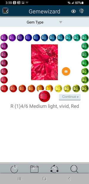
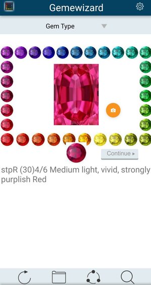
I posted a "jedi" spinel a while back (erroneously said it was 2.5 ct, it is 3.5 ct) discussing color of it. Forgive my long winded post but giving some background. I had the opportunity to show it to a gentleman who was a geologist and gia gemologist at a well know show. He said it was red but people would call it pinkish red. I asked him to explain. He then had me download my gemewizard and took a video with his iPhone. Took a capture of stone when it was straight face up and entered it in gemewizard. Well, he was right. It showed R 4/6 red medium light, vivid. He then showed me "jedi" spinels and did the same thing. Jedi's all came out red, purplish red. All had a 4 or 5 tone and a 6 for saturation. He added that this gemewizard did not specifically look at fluorescence which you find in jedi's due to chromium content and low iron(typical of stones found in marble). He said what we are calling pink is a lighter tone pure red or a purplish red and sometimes an orangish red. Apparently the color system does not have "pink" in it. It had me look at color/hue differently and gemewizard has been helping understand color better. Any thoughts?20220712_110656.jpgScreenshot_20220707-151045_Gallery.jpg
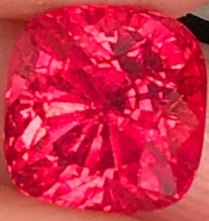
 
Is pink a lighter tone red or a less saturated red actually?
 
Pink is just a lighter toned toned version of red. The lighter the tone, the less the saturation as well.

Red either has a purplish or blue component, or an orange component. For example, fire engines are orangey red, and find Burmese rubies are often bluish red. That’s my take on red. Others may differ.

ETA: It’s hard to compare a stone to a computer screen, as it should be calibrated to the exact color of the gem color set, whether it’s gemewizard or munsell, panatone, etc…
 
For red a saturation of 6 (vivid) can only occur with tones of 4, 5 or 6(medium light, medium and medium dark).
 
  • Like
Reactions: T L
I am kind of confused how would pink be classified as vivid if it’s a less saturated red…?

I don't think gemewizard has a specific "pink" grouping/classification, it's just "red," and lighter tones are just seen as "pink."
 
Pink is not a colour. Its nowhere in the EM spectrum. Red is a colour. It is arround 630 nm - 720 nm in the spectrum. We often perceive lighter tones of red as pink.

If you are going to do an analysis of the recorded light frequencies/wavelengths and then classify something by these numbers alone then you would end up labeling everything in this bandwidth red (meaning I dont think youd ever classify something as pink based on the numbers). I think the app is indeed doing something like this -- although I haven't checked.

Interestingly we also interpolate mentally, when we get given photons from two different frequencies simultaneously we somehow blend the colours to percieve a third colour that wasn't present in either of the two incoming photons -- this would probably be a neuroscientists domain of expertise as it is qualia (the subconcious experience of something that isn't actually there in real life but is reconstructed in your head). Pink is percieved when we see both violet and red photons. These are the two extreme ends of the visiable EM spectrum -- the top and the bottom of the visiable band in the EM spectrum. We should interpolate these two simultaneous inputs to the midway point in the spectrum which is green light. But I think the neuroscientists have a theory that it was evolutionarily advantageous for us not to mix up 'actually green stuff like plant leaves which are green due to clorophyll in the leaves and the photosynthetic complex' with stuff that 'interpolated to green but was actually emitting a mixture of violet and red light'. Ergo we experience the colour pink in our heads. Its not actually there though -- this is a purely imagined phenomena).

All colours are in the mind.

What’s in objects is the spectral reflectance curve (for opaque diffuse reflectors) or the spectral absorption curve (for transparent things like most gemstones). The colour we perceive depends on the spectral reflectance/absorption of the object, the spectrum of the illumination, the surrounding objects, our expectations, and much else. But to the extent that the perceived colour depends on the physical properties of the object, it’s through the spectral reflectance/absorption.

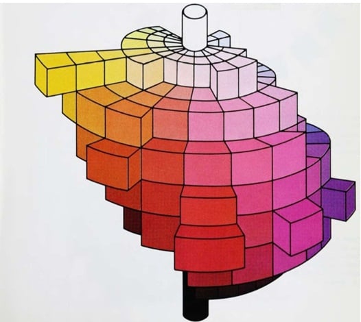
Pink, brown, gold and olive (for example) are just as much colours as red, orange, yellow and yellow-green. They all have their place in (for example) the Munsell colour tree (or in any other 3-D colour model). It’s true that if we classify colours by the equivalent pure spectral colour, or by the hue angle in an HSB-type model, then pink and red have the same hue, but they are different and equally legitimate colours. Similarly for gold and yellow, etc.
 
People get tone and saturation mixed up or blended all the time. Saturation is not how dark a stone is, but how pure the color is, or the absent of gray or brown.

This first image is all the same saturation, just different tone. The hue is the same in all the images. Just because a tone gets lighter, doesn't mean the saturation is less.

Saturation.png

This image is all the same Tone, but different Saturation.

Tone.png

Yes, very true. Saturation is purity of color. Tone is how light or dark the color is. :)
 
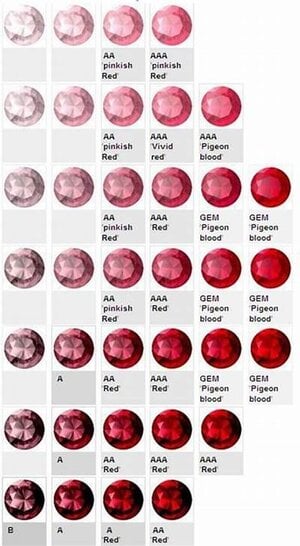
But if a stone is too light in tone, it can’t be very saturated. Tone and saturation are separate things, but they are still related to each other. If a stone is also overly dark in tone, some say it’s over saturated in color.

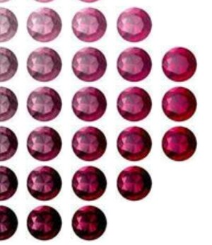
This is why some saturation levels (columns) fall off the hue chart for very light or dark tones (rows). See attached chart.
 

Attachments

  • 480ED7A9-22CA-4A75-8272-ED976966314F.jpeg
    480ED7A9-22CA-4A75-8272-ED976966314F.jpeg
    56.2 KB · Views: 175
All colours are in the mind.

What’s in objects is the spectral reflectance curve (for opaque diffuse reflectors) or the spectral absorption curve (for transparent things like most gemstones). The colour we perceive depends on the spectral reflectance/absorption of the object, the spectrum of the illumination, the surrounding objects, our expectations, and much else. But to the extent that the perceived colour depends on the physical properties of the object, it’s through the spectral reflectance/absorption.

Pink, brown, gold and olive (for example) are just as much colours as red, orange, yellow and yellow-green. They all have their place in (for example) the Munsell colour tree (or in any other 3-D colour model). It’s true that if we classify colours by the equivalent pure spectral colour, or by the hue angle in an HSB-type model, then pink and red have the same hue, but they are different and equally legitimate colours. Similarly for gold and yellow, etc.

To be fair everything you experience has to be in your mind.

Objectively seeing something is just a measurement on a collection of photons. Spectral absorption or reflectance causes the photons hitting your eyes to be predominantly one wavelength -- or from a narrow wavelength band. (I guess the names are one to one with the mechanism by which this one wavelength gets selected).

I actually had to go away and look it up but it seems like we can directly measure these wavelengths/frequencies based on which (length) cones in our eyes react. This will explain all the colours which are in the EM spectrum.

I actually don't know how we reconstruct an image, but we clearly use other properties such as distribution and relative intensity which I assume cause us to experience things such as gold differently where delocalised electron clouds on the surface of the metal interact with the incoming electric field, I assume this changes the distribution of the reflected photons.


Pink is something else, sometimes your just perceiving a mixture of different frequencies simultaneously -- and you reconstruct pink. I assume olive is the same as its also not in the spectrum.
 
If a stone is also overly dark in tone, some say it’s over saturated in color.

Some people say this, but it isn't technically correct. Many people use saturation when they should be saying tone. I don't think you could ever be over saturated. That would mean there is no gray or brown, and just pure color.

In rough you hear 'open color' all the time to mean the stone will cut a bright gem, not overly dark in tone.

I agree with you that tone and saturation are used interchangeably and they shouldn’t be, but they are still related. Only medium tones can have the highest saturation levels.

For example, you will never have a very light toned sapphire that is vivid blue in saturation.
 
Last edited:
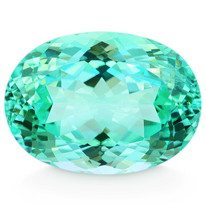
Here is a perfect example why tone and saturation are two different things. This Paraiba is a light tone bluish green. It's GIA Gem Set is b/G 3/4. The 3 means light tone. The 4 means moderately strong saturation. This is a bright stone. Just imagine what a 6 = vivid saturation would look like.

Again, two different things.

1657904020446.png

I never said saturation and tone are the same thing. They are related. That’s a bright stone, but not vivid.
 
I never said saturation and tone are the same thing. They are related. That’s a bright stone, but not vivid.

I did not write the stone is "vivid." I wrote - "This Paraiba is a light tone bluish green. It's GIA Gem Set is b/G 3/4. The 3 means light tone. The 4 means moderately strong saturation. This is a bright stone. Just imagine what a 6 = vivid saturation would look like."

Two different things. One is color, the other is how light or dark the stone is and the only relation would be that each stone with a different saturation and tone will look different, if you can call that a relation. :)
 
My understanding of what you see or perceive is that as saturation goes down in warm colors it begins to look brownish. As saturation goes down in cool colors it begins to look grayish.
 
  • Like
Reactions: T L
Just imagine what a 6 = vivid saturation would look like.

Can you (or anyone else), explain or link to GIA's official technical description of saturation. I've been searching without success.

In particular, how is it scaled? What defines 6? (Note that for many hues, there seem to be no actual examples of 6s.) I'm guessing that it may relate to the theoretical maximum chroma (this is a technical term in colour theory) that a reflective object of the given hue could have. But I have not seen any explicit statement.
 
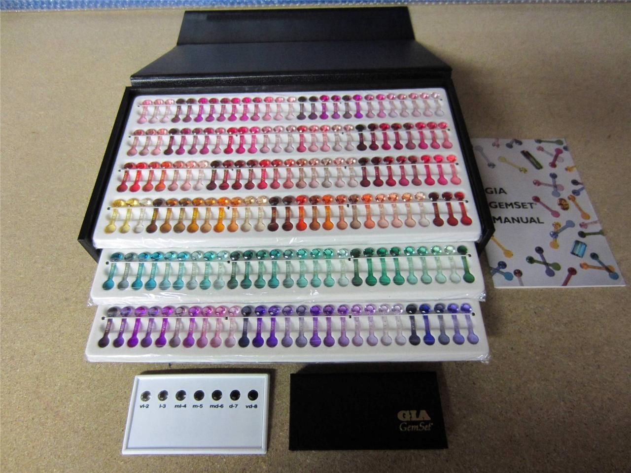
I think there’s way more nuance to the levels of saturation and tone out there, but GIA used to use a plastic gem set to analyze color. Software (Gemewizard) replaced it.


There’s also an article linked in the above URL that goes into deep analysis of gemstone color grading, but you need to be a member to read it.

Some gemologist use the Munsell color grading system which is similar to GIA gemewizard, but I think it’s more nuanced and has more hues.

 
Last edited:
I think there’s way more nuance to the levels of saturation and tone out there, but GIA used to use a plastic gem set to analyze color. Software (Gemewizard) replaced it.


There’s also an article linked in the above URL that goes into deep analysis of gemstone color grading, but you need to be a member to read it.

Some gemologist use the Munsell color grading system which is similar to GIA gemewizard, but I think it’s more nuanced and has more hues.


Thank you. I had actually found these pages, but was still puzzled…

Having thought about it a bit more, things are a bit clearer. GIA gemset was an object-based standard. There was no doubt a fair bit of theory behind it, but once the procedure for making the objects was settled, the objects became the standard. So the background theory became irrelevant.

But I’m still a bit worried about the word saturation. The problem comes in this quote from the second page: “Also called chroma, saturation…” (with a link to a gated article). Saturation is not chroma, at least according to CIE definitions. Loosely, chroma is the absolute ‘colourfulness’, saturation is colourfulness relative to the brightness. So a darker object with the same hue and saturation would have lower chroma. It’s explained here: The Dimensions of Colour, saturation (huevaluechroma.com)

The columns in GemeWizard hue pages look to me to have roughly constant chroma (not saturation). Note also, Munsell columns are explicitly labeled by chroma, not saturation.
 
Last edited:
I just found the above link (if I inserted it correctly) that is quite old but has a lot of info by Richard Sherwood. I don’t know that saturation can be used in the strictest of scientific terms when using GIA color sets and gemewizard but probably uses it in a more generalizable reproducible way with limited combinations and not an infinite number of combinations of possible hue, tone and saturation if using the strictest scientific definitions. I may be completely wrong.
 
Thank you. I had actually found these pages, but was still puzzled…

Having thought about it a bit more, things are a bit clearer. GIA gemset was an object-based standard. There was no doubt a fair bit of theory behind it, but once the procedure for making the objects was settled, the objects became the standard. So the background theory became irrelevant.

But I’m still a bit worried about the word saturation. The problem comes in this quote from the second page: “Also called chroma, saturation…” (with a link to a gated article). Saturation is not chroma, at least according to CIE definitions. Loosely, chroma is the absolute ‘colourfulness’, saturation is colourfulness relative to the brightness. So a darker object with the same hue and saturation would have lower chroma. It’s explained here: The Dimensions of Colour, saturation (huevaluechroma.com)

The columns in GemeWizard hue pages look to me to have roughly constant chroma (not saturation). Note also, Munsell columns are explicitly labeled by chroma, not saturation.

I think Chroma and saturation are loosely the same thing. I think the Munsell system is just more complex. The GiA gemset is a simplistic device that helps give one an idea of what color, saturation and tone the gem is. I’ve seen it subjectively used however, and what is one person’s vivid is not necessarily another’s opinion. Some gem labs have higher standards, and some well, they just want to sell lab reports.

In the end, I think the best determination of a colored gem is to take it to a reputable gem lab, and get a scientific/unbiased report determining its color. Avoid metaphors to describe gem color (ie “pigeon blood”). Finally, look in person at various hues of high quality gems at an institution like the Smithsonian or a high end gem show, to see for yourself what truly vivid color is about.
 
Here is another link that may help some people understand hue, tone, saturation.
T L I need you to help me out on my other question on thread Gia colored stone grading question.

 
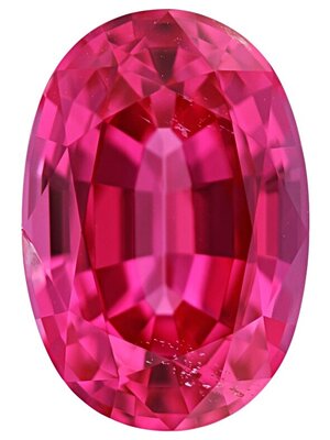
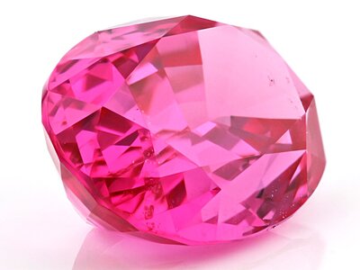
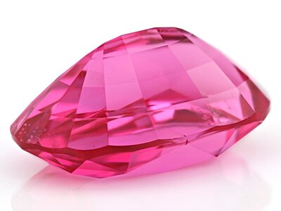
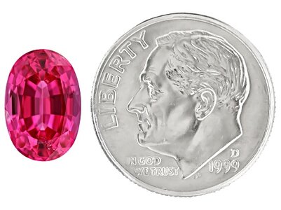
This is a tricky one... I wouldn't consider all pinks to be a less saturated or lighter-toned red. Some, certainly, but not all. For instance, here is my 3.5ct. Mahenge pink spinel. It is a medium tone and vivid (x10) saturation. I don't think anyone would say it's less vivid than a true red of the same tone and saturation. But, as you noted, neither the GIA nor Gemwizard's colored grading systems recognize "pink" as its own color. Yet, I have plenty of GIA reports stating "pink" as the gem color. Go figure.

JTV-XTP1695-1-zoom.jpg
JTV-XTP1695-2-zoom.jpgJTV-XTP1695-3-zoom.jpg
JTV-XTP1695-4-medium.jpg
 
I think the best education in color is to go look, in person, at top gems. It’s not the easiest thing to do, but over the course of collecting many years, I feel that no one can teach color through a photo or gemset or software as much as seeing the real thing in person. Once you see truly vivid gems, it gives you a whole new perspective.

By the way, the Smithsonian has some top gems, but beware, many museums carry unattractive specimens as well (including the Smithsonian). I find it hilarious that the most famous gem in the world is a gray stone, called the Hope Diamond. Hype can truly add to a price tag and worth. ;-)
 
Last edited:
20220716_153731.jpg

Beautiful spinel. Love it! Has the medium light tone of 4 and the vivid saturation of 6. I think because of the strongly purplish secondary hue it gives it a "richness" of hue that some people can confuse with saturation in less saturated stones of that hue or with a darker tone. Obviously your spinel is as saturated as it gets with 6(vivid).
 
20220716_155317.jpg

Here is stpR with various tones and saturation. You can see the subtle differences when they are all sitting next to each other but if a tone 6 (medium dark) saturation 5 (intense) was sitting alone i think it could easily be mistaken for vivid. That is why we have labs/experts.
 
20220716_153731.jpg

Beautiful spinel. Love it! Has the medium light tone of 4 and the vivid saturation of 6. I think because of the strongly purplish secondary hue it gives it a "richness" of hue that some people can confuse with saturation in less saturated stones of that hue or with a darker tone. Obviously your spinel is as saturated as it gets with 6(vivid).

That's really cool! Thank you for sharing it!! :geek2: I'd say it's probably more of a medium tone in person, and I'd probably call it (simplistically) a reddish-pink. But, of course, Gemwizard does not use the term pink to describe hue. Conversely, the AGL simply called it pink on my report, when they get really fancy (and annoying) with hue designations sometimes (brownish-pinkish-orangish-vermillionish-chartreusish-YELLOW). But color is so nuanced. I remember reading an article that humans didn't really interpret colors as blue until modern times. It was just considered another shade of green (though blue is a primary and green is a secondary). Several years back, the University of London conducted a study with the Himba tribe in Namibia, and they couldn't decipher a green square from a blue one. Crazy!
 
  • Like
Reactions: agc
GET 3 FREE HCA RESULTS JOIN THE FORUM. ASK FOR HELP

Featured Topics

Top