S
shelovesinclusions
Guest
Hi everyone! I'm new to posting on the forums, but have been reading them for a while. I've been interested in finding a sapphire to have a piece of jewelry made for myself, and spent months looking (online). I decided on a very pale purplish one ("light lilac") because I didn't want anything too bright or deeply colored- so I was looking for something pastel.
Well, the stone came in today and there are a couple concerns I have, and would so much appreciate feedback. Firstly, I think that I'm seeing a window (it's a step cut), but I don't mind too much because I like the clearness in the center, and that I can see the cut at some angles. Does it appear to be a tilt window or a true window? And, once it's set (in a ring probably), would that possibly overpower the sparkling from the outside of it? Or does it get better with setting?
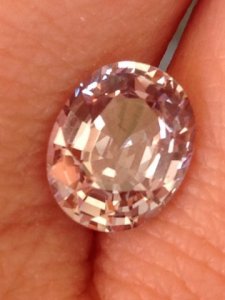
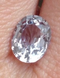
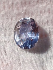
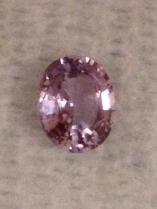
Secondly, is the color- it is this very pale lilac color indoors (which I can't capture), but in some lights it looks pinker inside. Outside, it varies from goldish to bluish to white depending on how direct the sunlight is. In the shade it looks like a deep brownish wine color. It's just all over the board & I really like that. However, when I set it, would it tend to favor one color over another? Is this shift relative to what the sapphire is near? Is it all a trick of light on my eyes?
Attached are pictures to illustrate the colors I'm seeing. They're pretty true to how it's looked as I've played with it- except the pink is paler and cooler.
Thank you for any assistance and answers you can provide!




300x240.png)