shape
carat
color
clarity

CvB Sneak Peek and help with stone orientation

acv123

Shiny_Rock
Premium
Joined
Sep 28, 2017
Messages
303
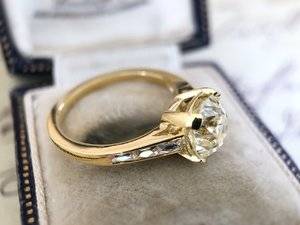
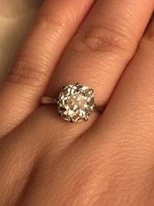
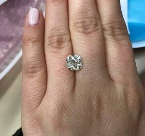
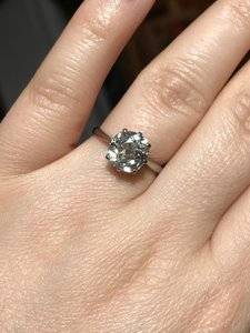
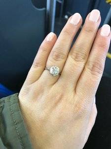
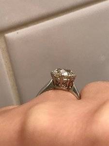
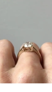
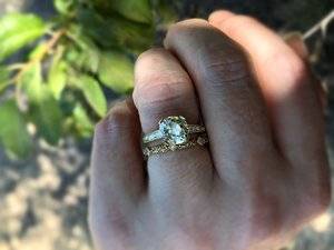
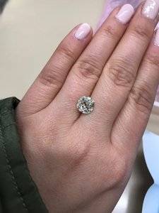
hey all, I hate to preview my engagement ring this way... BUT..I need your help. I'd originally asked for my center stone to be set N/S (the stone measures 8.26 x 8.09mm) but the setter set it E/W since there is one corner of the stone that is a little bit less than symmetrical and it was easier to make up for this with an E/W orientation. Anyway, I'm told it can be set N/S but the head will need to be remade which is all fine. My question is--should I just leave it as is? I thought I wanted in N/S since that's how it was originally set and that felt more engagement-y to me. In truth the stone is not too far off from being square so it may not actually make that much of a difference to set it N/S vs E/W. Maybe in the E/W orientation there will be less of a gap between the engagement ring and wedding band?

Let me know what you think!
IMG_4462.JPEGIMG_4666.JPGIMG_4668.JPG

IMG_4664.jpg
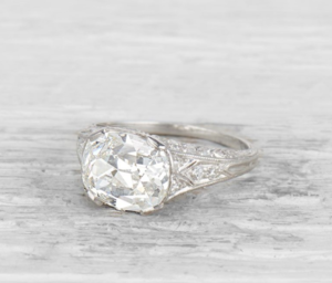
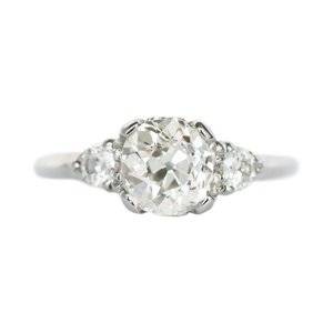
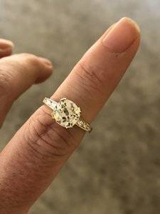
Previous setting, I think the bottom right corner is the one that doesn't quite match the rest.

IMG_4116.jpg
Loose in N/S orientation


IMG_4114.jpg
Loose in E/W orientation
 
I prefer it north/south looks prettier and 'right' to me that way (your new setting is :love: btw)
 
Its lovely! I'm no expert, but personally I really like it set E/W. Its so close to square as you say. How do you feel about it? (You can see how my OMC was set e/w in my avatar and I loved it!)
 
Is the first photo how it is set now? That photo bugs me, but the second one doesn't. I'm not really sure what I would do. Which way are you leaning?
 
Is the first photo how it is set now? That photo bugs me, but the second one doesn't. I'm not really sure what I would do. Which way are you leaning?
the first 3 photos are all E/W, how its currently set.
It's so hard for me to say without seeing it N/S, also I'm blinded by excitement of the ring being done, so its hard to be critical.
 
I don’t know if it’s the settin or what but it looks much larger in its original setting I wonder if that’s in part to the orientation
 
I don’t know if it’s the settin or what but it looks much larger in its original setting I wonder if that’s in part to the orientation

could be! I hadn't thought of that, that might also be due to the original thin shank or maybe the height of the old setting.
 
I prefer the N/S orientation as well. I think it gives your stone greater presence, and also just looks “right” to me.
 
I like it north south in the original setting. It just looks "right" to me on your finger. My vote is to decapitate the setting and turn it North South.
 
Tbh I think it's lovely in either orientation but I do think it looks prettier in the NS.
Actually the more I look at it, the more I think NS is "right" and EW looks very square.
I would also ask if the prongs are finalised? They're oddly intrusive in the EW setting which I didn't expect given how delicate the prongs from CVB usually are.
 
I would ask them to change it to NS.
 
I don't know if it's the N/S original orientation, or the 6-prong setting style that makes the stone look prettier and more balanced in its original setting. And because you went with a yellow gold CvB setting, I understand how the diamond is picking up that color from its setting. I am not a huge fan of "white" diamonds at all 'cause I love old cuts, OECs, Old Mines, cushions, etc. However the diamond is nice but to me but it looks brighter in the original 6-prong setting. Sorry but it looks a bit "off" and lop-sided, or un-balanced in its new setting. Also, the prongs overwhelm that beautiful diamond, IMHO. I also understand how hard cushions can be to set with delicate prongs due to their nature, thus so many folks bezel-set cushion cuts. So, I get this is the nature of some cushion cuts, or old mine cuts but the stone looks off in the new setting. I'm not sure if this is the N/S vs E/W issue or the setting itself. :(2
 
Last edited:
I don't know if it's the N/S original orientation, or the 6-prong setting style that makes the stone look prettier and more balanced in its original setting. I also cannot tell if it's the lighting, or if you went with a yellow gold CvB setting; however the diamond is nice but to me, it looks much whiter and much more brilliant in the original 6-prong setting. Sorry but it looks a bit "off" and lop-sided to me in its new setting. I understand this is the nature of cushion or old mine cuts but the stone looks off in the new setting. I'm not sure if this is the N/S vs E/W issue or the setting itself. :(2

Haha don’t feel bad @tlfiore
I appreciate any and all input!
I was always going to put it in a gold setting and white metal was never an option for me personally so I’m ok with the stone looking warmer in its new home. I do think the original setting helped cover up some of the assymetry but that style head wouldn’t have really worked with French cuts. So how to move forward from here? Perhaps trying n/s and then one day getting the stone ever so slightly recut to be a bit more symmetrical? I’m ok with the wonkiness for now, it’s just a question of how best to mitigate it in the current setting.
 
@acv123 THANKS for not taking offense to my input and trust me, I do not know a whole lot about diamonds...just what I like and what my eye sees. Also, I edited my post to specifically include comments about the new setting's prongs, which I think if refined somewhat could make a huge difference. You are a good person and your level-headedness is appreciated by me!

As an aside, I'm currently contemplating a new custom project and I'm TORN between posting here for help, or not. I personally like, prefer and want input 'cause I'm all alone IRL and I have few folks who I can pass ideas by. I value ideas and input. The PS community would be a huge help for me & I respect the folks here a whole lot. But I'm not sure I have the "stomach" for some of the pile-ons...we'll see. Not sure actually if I have the stomach for a new custom project-smile.

Best of luck, your diamond is beautiful and your setting will work out! Most importantly, be happily married!

I totally get it! It can be hard to define your own tastes and preferences once others start chiming in but thankfully this is a pretty simple issue and I’m not starting from scratch. Sometimes I wish I could see posters kitchens just to make sure we have the same taste lol :lol:

Yes re: prongs hoping that if I get the stone reset the prongs can be a little flatter/thinner.
 
Another vote for N/S and different prongs. Perhaps double claw can look nice with this setting? I am not loving the wide tab prongs, they do not match the stone nicely imo and that beautiful diamond deserves to have complimentary prongs ;)
 
Another vote for N/S and different prongs. Perhaps double claw can look nice with this setting? I am not loving the wide tab prongs, they do not match the stone nicely imo and that beautiful diamond deserves to have complimentary prongs ;-)

Thank you! Gotta stick with tab prongs, claw prongs just don’t do it for me for some reason! Maybe too Victorian looking? I’m not sure. Hoping to have the tabs refined a bit though.
 
hey all, I hate to preview my engagement ring this way... BUT..I need your help. I'd originally asked for my center stone to be set N/S (the stone measures 8.26 x 8.09mm) but the setter set it E/W since there is one corner of the stone that is a little bit less than symmetrical and it was easier to make up for this with an E/W orientation. Anyway, I'm told it can be set N/S but the head will need to be remade which is all fine. My question is--should I just leave it as is? I thought I wanted in N/S since that's how it was originally set and that felt more engagement-y to me. In truth the stone is not too far off from being square so it may not actually make that much of a difference to set it N/S vs E/W. Maybe in the E/W orientation there will be less of a gap between the engagement ring and wedding band?

Let me know what you think!
IMG_4462.JPEGIMG_4666.JPGIMG_4668.JPG

IMG_4664.jpg
Previous setting, I think the bottom right corner is the one that doesn't quite match the rest.
IMG_4116.jpg
Loose in N/S orientation


IMG_4114.jpg
Loose in E/W orientation

I love it set either way. I believe the visual difference is the setting, not the orientation of the stone.
I think the tab prongs draw attention to the wonkiness to the shape of the stone. Can Caysie bezel the diamond to help to make the shape appear more uniform? Those tab prongs need to go!
 
Oh mine! It is so pretty! I maybe the only one, but I like the CVB E/W just the way it is. The tab prong, the light yellow setting. The whole package. Beautiful.
 
Beautiful stone, congrats on your gorgeous new ring!

I prefer the N/S orientation for an elongated stone, but your stone is so slightly out of square that I am not sure that it matters. I agree with other posts, I think it it the the prongs that are throwing off the setting. I know that you said you do not like white metal or claw prongs, but I have to agree the stone looks substantially bigger in the original setting. Maybe just changing the color of the prongs so they do not distract from the stone?
 
@Octo2005 @Matthews1127 @SimoneDi @foxinsox

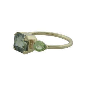
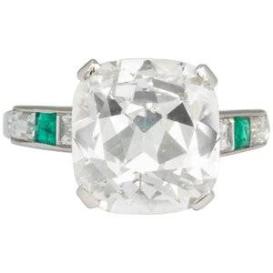
definitely agree the tab prongs could be slimmer, but i do want to keep them as tabs and not split or single prongs. I think i'm going to ask for it to set NS and for the prongs to look a bit more like these examples, more rounded off, and flatter to the stone. 100316-3.jpg 3339263_master.jpg Screen Shot 2018-08-13 at 11.19.24 PM.png VEG_1177_FD_1282_1_master.jpg

this was my original inspiration (sorry about the screenshot quality!)
IMG_4685.PNG
 
Are you milgraining the shank? If so, maybe she could also milgrain the tips of the tabs to soften their appearance a bit.
 
i prefer the NS setting..:-)
 
What a beautiful ring! As much f a pain as it's going to be, I would have it changed to N/S orientation. I prefer it that way & think it looks bigger.
 
I too prefer the N/S orientation and agree with flatter/thinner tab prongs that are all the same size (could be the pic but 2 seem a bit shorter).

Also, is there any concern about removing the existing head? It's very incorporated into the rest of the setting and not like a peg head that you could just lop off so I'd double check that there won't be any issues with those lovely frenchies popping out in the process or down the line since they've already been set.
 
GET 3 FREE HCA RESULTS JOIN THE FORUM. ASK FOR HELP
Top