unpolished
Rough_Rock
- Joined
- Jan 6, 2022
- Messages
- 1
Let me just start by saying David is wonderful, and his renderings have been sketched out completely by our own requests. So my request to have input here is not a reflection on him whatsoever. I just don’t have the Pricescope experience or touch, and I can see myself making mistakes in what I try to “dream up,” and I’d like to make this special. I see myself taking this in a very rudimentary direction because of my lack of creativity and knowledge, and I could really use some help.
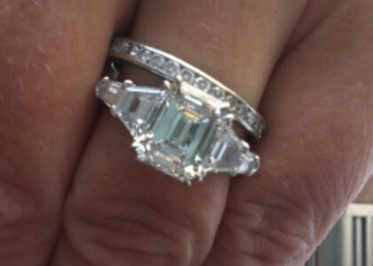
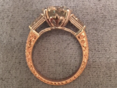
We are upgrading my wife’s engagement ring from the modest original 10 years ago to a (still modest by PS standards) 2.2ct emerald cut diamond. My wife likes the 5 stone design that has traps and bullets like below, I believe it is originally by Leon Mege. Several PSers have a version of this beautiful ring.
What I’d like to do is take that design concept and add some “finishing touches” so that it looks like a custom piece and reflects some of our shared story from the past decade. Mainly, I’d like to add something interesting to the side gallery and possibly some hand engraving or something of interest in the ring shank. I like small bezel work.
Here are the stones we have:
Details: Platinum. Center diamond: 2.2ct 8.5mm x 6.28mm (E/VS1)
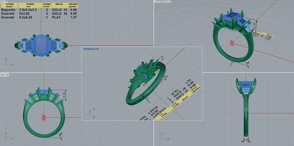
We also have: (2) 5 x 3.85mm emerald cut diamond (F/VSI) purchased from CvB for another project we could add instead of traps. Our CADS right now are based on that design, using those stones. But they don’t quite achieve finger coverage.
Small 2.8mm carre cut paraiba tourmaline from DesertRose that could be used as ”surprise” stone.
We’d like full finger coverage for the top portion of her finger, a US8, which looks approximately 18mm across.
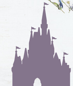
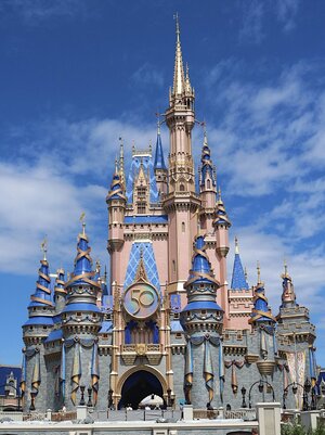
Don’t hate me, but we fell in love at a Disney park many years ago and my wife has asked to incorporate the castle from the park into her ring somehow. David has put it under the main stone based on a design another PSer had here, who was using a fleur de lis, at our request and showing that very pretty ring as an example.
I don’t know enough about rings to steer them in a more adult, polished, cohesive design and can’t help feeling I might make this look a bit...juvenile...without help of people more experienced. (I promise I know the irony of expressing the intentions to add a children’s theme park to a design and then saying I might force my design to be too juvenile.)
Could anyone help us?
Beyond anything you see here that you’d like to give pointers on, what I’d also like some ideas about are:
-Any way to better incorporate the castle she’s asked for, or suggestions about creating a ‘castle-like” side gallery. Maybe a metal silhouette rather than a stamped out image, that spans all of the side? Or some recognizable feature of the windows of the castle? If the castle in the center, how do I add interest to the other dead spaces around the other stones? Would making the castle shape a bezeled silhouette look more polished?
Is there something I can or should do to the ring shank or arms as they meet the bullets/baguettes? Is there a way to merge these ideas nicely?
Here are the CADs, inspiration photos and things we are trying to start with.
I think this is emeraldcutlover’s previous ring, this is one of our main top-view inspiration photos. That ring had a 2.8+ center stone on a size 6, so we have more space to cover with less main stone.
The image/shape/silhouette she’d like incorporated unless I can think of another design:
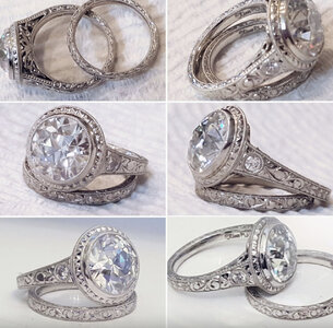
 Engraving examples she liked from DK’s previous work.
We are upgrading my wife’s engagement ring from the modest original 10 years ago to a (still modest by PS standards) 2.2ct emerald cut diamond. My wife likes the 5 stone design that has traps and bullets like below, I believe it is originally by Leon Mege. Several PSers have a version of this beautiful ring.
What I’d like to do is take that design concept and add some “finishing touches” so that it looks like a custom piece and reflects some of our shared story from the past decade. Mainly, I’d like to add something interesting to the side gallery and possibly some hand engraving or something of interest in the ring shank. I like small bezel work.
Here are the stones we have:
Details: Platinum. Center diamond: 2.2ct 8.5mm x 6.28mm (E/VS1)
We also have: (2) 5 x 3.85mm emerald cut diamond (F/VSI) purchased from CvB for another project we could add instead of traps. Our CADS right now are based on that design, using those stones. But they don’t quite achieve finger coverage.
Small 2.8mm carre cut paraiba tourmaline from DesertRose that could be used as ”surprise” stone.
We’d like full finger coverage for the top portion of her finger, a US8, which looks approximately 18mm across.
Don’t hate me, but we fell in love at a Disney park many years ago and my wife has asked to incorporate the castle from the park into her ring somehow. David has put it under the main stone based on a design another PSer had here, who was using a fleur de lis, at our request and showing that very pretty ring as an example.
I don’t know enough about rings to steer them in a more adult, polished, cohesive design and can’t help feeling I might make this look a bit...juvenile...without help of people more experienced. (I promise I know the irony of expressing the intentions to add a children’s theme park to a design and then saying I might force my design to be too juvenile.)
Could anyone help us?
Beyond anything you see here that you’d like to give pointers on, what I’d also like some ideas about are:
-Any way to better incorporate the castle she’s asked for, or suggestions about creating a ‘castle-like” side gallery. Maybe a metal silhouette rather than a stamped out image, that spans all of the side? Or some recognizable feature of the windows of the castle? If the castle in the center, how do I add interest to the other dead spaces around the other stones? Would making the castle shape a bezeled silhouette look more polished?
Is there something I can or should do to the ring shank or arms as they meet the bullets/baguettes? Is there a way to merge these ideas nicely?
Here are the CADs, inspiration photos and things we are trying to start with.

I think this is emeraldcutlover’s previous ring, this is one of our main top-view inspiration photos. That ring had a 2.8+ center stone on a size 6, so we have more space to cover with less main stone.

The image/shape/silhouette she’d like incorporated unless I can think of another design:


 Engraving examples she liked from DK’s previous work.




300x240.png)