shape
carat
color
clarity

E-ring potential stones: opinions please

sapphirehuntress

Rough_Rock
Joined
Apr 16, 2020
Messages
3
Hello all! After lurking here for months, I've finally created an account to ask for opinions (please) on my potential engagement ring stone.

My preferences:
  • Unheated sapphire
  • Padparadscha OR color-change (blue to purple/violet) sapphire
  • Oval shape, possibly round. Vision is to set the stone in a diamond halo.
  • Probably platinum ring
Stones I'm considering after ruling out many, many others...
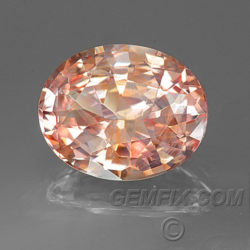
  • This pad from gemfix: https://gemfix.com/gems/sapphire-pink-13-532
    • I instantly loved this one, but after watching the video what feels like a thousand times, I worry the stone might be closer to a pink sapphire with spots of yellow. :confused: Not seeing a ton of orange in the video, but maybe it's the lighting? My guess is the stone will be more saturated in person, but obviously we can't visit for probably a long while. Even with their 7-day return policy, I would just like to hear from experienced buyers what your impressions are.
    • Another concern was that the report is from GIA instead of AGL, while it seems like the consensus on PS is that AGL should be considered source of truth for gemstone classification -- would you have any concerns buying a gemstone with a GIA report instead of AGL?
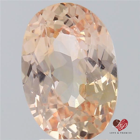
    • I found this similar-ish pad on Enhoerning that seems to at least photograph the same, looks very light in photographs, and was classified as pad by AGL, so perhaps my concerns with the gemfix pad are unfounded.
  • This color-change sapphire from FWG: https://www.finewatergems.com/store/p462/2.05_ct_Unheated_Color-change_Sapphire.html
    • My main concern is that the sapphire looks to have color zoning and is predominantly purple in all lighting. It looks like the stone is mostly purple with a streak of blue. Is anyone else seeing that? My "ideal" coloration for a color change sapphire would be distinctly blue to distinctly purple, like this from gemfix -- which sadly sold while fiance and I were waiting for our travel schedules to align so we could visit SD together...it was my first choice before it sold ;(
At this point neither my fiance or I are optimistic that we'll be able to visit any showrooms soon, so we might as well buy online... but just want to source some opinions first.

Any and all opinions, suggestions, etc. are appreciated and welcome! Thanks in advance :wavey:
 
I'm not drawn to either pad, because I prefer a vivid saturation. I love the color change sapphire, but it doesn't sound like your cup of tea. I like gems that show multiple colors in the same lighting, instead of 100% purple to 100% blue, but it sounds like you're the opposite. I think that you should pass on all three.

Something's got to give. If you keep your criteria, I think it's best to wait until economic lockdown is over. Otherwise, expand the search to include heat-only sapphires, too.

It sucks to be looking for an engagement stone when every store is shut down. Good luck and congratulations on your engagement! If you can get through coronavirus together, there's not a lot in life you won't be able to get through together.
 
Last edited:
Can you get a video of the color change one?
 
Hello all! After lurking here for months, I've finally created an account to ask for opinions (please) on my potential engagement ring stone.

My preferences:
  • Unheated sapphire
  • Padparadscha OR color-change (blue to purple/violet) sapphire
  • Oval shape, possibly round. Vision is to set the stone in a diamond halo.
  • Probably platinum ring
Stones I'm considering after ruling out many, many others...
  • This pad from gemfix: https://gemfix.com/gems/sapphire-pink-13-532
    • I instantly loved this one, but after watching the video what feels like a thousand times, I worry the stone might be closer to a pink sapphire with spots of yellow. :confused: Not seeing a ton of orange in the video, but maybe it's the lighting? My guess is the stone will be more saturated in person, but obviously we can't visit for probably a long while. Even with their 7-day return policy, I would just like to hear from experienced buyers what your impressions are.
    • Another concern was that the report is from GIA instead of AGL, while it seems like the consensus on PS is that AGL should be considered source of truth for gemstone classification -- would you have any concerns buying a gemstone with a GIA report instead of AGL?
    • I found this similar-ish pad on Enhoerning that seems to at least photograph the same, looks very light in photographs, and was classified as pad by AGL, so perhaps my concerns with the gemfix pad are unfounded.
  • This color-change sapphire from FWG: https://www.finewatergems.com/store/p462/2.05_ct_Unheated_Color-change_Sapphire.html
    • My main concern is that the sapphire looks to have color zoning and is predominantly purple in all lighting. It looks like the stone is mostly purple with a streak of blue. Is anyone else seeing that? My "ideal" coloration for a color change sapphire would be distinctly blue to distinctly purple, like this from gemfix -- which sadly sold while fiance and I were waiting for our travel schedules to align so we could visit SD together...it was my first choice before it sold ;(
At this point neither my fiance or I are optimistic that we'll be able to visit any showrooms soon, so we might as well buy online... but just want to source some opinions first.

Any and all opinions, suggestions, etc. are appreciated and welcome! Thanks in advance :wavey:

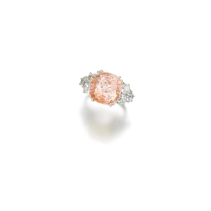
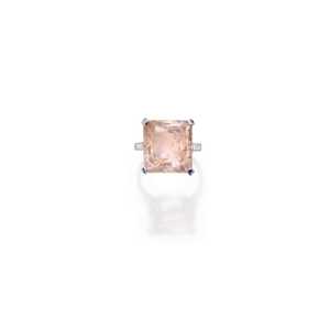
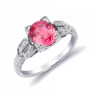
Hi not an expert on pads but I sure love the color of the 1st one rather than the 2nd one which seems a tad bit softer. But I like the cut on the 2nd one. If you’re worried about the colors not meeting pad classification I googled some rings from Christie’s and Sotheby’s with similar color. Graded by Gubelin and SSEF.

2975B1FA-CFD9-4227-99DA-A8BC6FF37B65.jpeg
From Christie’s by Cartier. report by Gubelin.

6DC02521-12F9-4652-B0D3-20A557B33577.png
From Sotheby’s by Chaumet. Report by SSEF and another Lab.

633818F9-FB94-490C-B43E-47A05C0C57EE.png
From Sotheby’s by Cartier. Report by Gubelin.
https://www.sothebys.com/en/auction...nificent-jewels-n09331/lot.153.html?locale=en
 
Whay's your max budget? Are you looking for pads in the 2ct range?

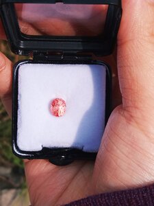
Also, could you post some reference pictures so we can get a sense of your color preferences? Pads encompass a pretty broad spectrum in terms of tone, color depth, and saturation. Are you looking for a very saturated, orange leaning pad like this one:

IMG_20200417_101705.jpg

Or are you looking for more of a pink-leaning, low saturation, and pastel shade like the GemFix one? The Enhoerning one is also nice, but it's very orange as opposed to pink which might be a pro or con.

For myself, I prefer orange-leaning, medium tone and saturation pads. My own pad (2.21ct,.unheated, Ceylon) as reference:

IMG_20200321_153951.jpg
 
Another concern was that the report is from GIA instead of AGL, while it seems like the consensus on PS is that AGL should be considered source of truth for gemstone classification -- would you have any concerns buying a gemstone with a GIA report instead of AGL?

This opinion fluctuates over the years, and varies between PSers: https://www.pricescope.com/community/threads/quick-question-about-sapphire-agl-vs-gia.212690/

While some may have a favorite, they are both equally well regarded.
 
I worry that the pad is a little insipid for lifetime wear -- you'd get tired of it. I like them more intense -- unless there is absolutely no window, it is well cut, and your skin tone is darker. I also like more pink than orange. I have one like Lilith112, above, but maybe 1.6 cts? Plan was to make a ring for spouse but kinda stalled on that.

At the risk of getting yelled at by someone -- like on my last posts -- why do you need color-change? They are generally not super-interesting IRL, just like alexandrites. Maybe consider getting a blue that just looks nice all around? If you haven't worn a sapphire, know that even a "plain" blue will exhibit plenty of color shift as you move from light to light and indoors to outdoors.
 
Thank you everyone for your thoughts! Going to respond to a few at a time to keep posts somewhat short:


I'm not drawn to either pad, because I prefer a vivid saturation. I love the color change sapphire, but it doesn't sound like your cup of tea. I like gems that show multiple colors in the same lighting, instead of 100% purple to 100% blue, but it sounds like you're the opposite. I think that you should pass on all three.

Something's got to give. If you keep your criteria, I think it's best to wait until economic lockdown is over. Otherwise, expand the search to include heat-only sapphires, too.

It sucks to be looking for an engagement stone when every store is shut down. Good luck and congratulations on your engagement! If you can get through coronavirus together, there's not a lot in life you won't be able to get through together.
Trying to hold off on expanding to heat-only sapphires, but who knows! We looked at some in person (already set in rings) before the pandemic and for whatever reason the heat treatments bothered me... I don't know that it would bother me for other pieces of jewelry, but for my (intended) one and only engagement ring I can't quite get past wanting it to be not heated :confused:

Thank you for your help & the well wishes, I appreciate it!

Can you get a video of the color change one?
I was curious about asking for a video too -- will continue to think on it over the weekend.

Hi not an expert on pads but I sure love the color of the 1st one rather than the 2nd one which seems a tad bit softer. But I like the cut on the 2nd one. If you’re worried about the colors not meeting pad classification I googled some rings from Christie’s and Sotheby’s with similar color. Graded by Gubelin and SSEF.

2975B1FA-CFD9-4227-99DA-A8BC6FF37B65.jpeg
From Christie’s by Cartier. report by Gubelin.

6DC02521-12F9-4652-B0D3-20A557B33577.png
From Sotheby’s by Chaumet. Report by SSEF and another Lab.

633818F9-FB94-490C-B43E-47A05C0C57EE.png
From Sotheby’s by Cartier. Report by Gubelin.
https://www.sothebys.com/en/auction...nificent-jewels-n09331/lot.153.html?locale=en
Not meeting pad classification is indeed one of my many worries :)) These examples are helpful - thank you! I also prefer the color of the first one rather than the second (seems very faint and pale, even in the video).
 
Continued:

Whay's your max budget? Are you looking for pads in the 2ct range?

Also, could you post some reference pictures so we can get a sense of your color preferences? Pads encompass a pretty broad spectrum in terms of tone, color depth, and saturation. Are you looking for a very saturated, orange leaning pad like this one:

IMG_20200417_101705.jpg

Or are you looking for more of a pink-leaning, low saturation, and pastel shade like the GemFix one? The Enhoerning one is also nice, but it's very orange as opposed to pink which might be a pro or con.

For myself, I prefer orange-leaning, medium tone and saturation pads. My own pad (2.21ct,.unheated, Ceylon) as reference:

IMG_20200321_153951.jpg
Max budget: ideally no more than $8K for the stone; yes, looking for sapphires around the 2ct range.

Some reference photos for color prefs:

Ceylon-padparadscha-cushion-sapphire-e1532724072248.jpg


sapphire-pink-13-534-2-250x250.jpg


ff418878-a599-49ae-bd13-760caa11f272.jpg


loose-natural-padparadscha-sapphire-gemstone-1-28-carats-oval-shape-6-9-x-5-24-x-3-93-mm-low-price-1.jpg


I like the "delicate" (but noticeable) pad colors of the first two. I would be happy with something like these, but a touch more saturated. I like the rich saturated color in the last two; my main concern with more saturated colors is the potential for brown or the possibility to lean into dark pink territory (3rd image is an example, and a bit too deep for me).

The last one is actually available here but it looks *significantly* paler and fainter in the GIA report, which I understand is a scanned/approximate image -- but even the gemfix one here looks more saturated in its GIA report...so I worry that the third stone isn't actually representative and that it might be extremely pale.


To give some anti-recs, I do *not* like the very pale, faint, almost colorless stones labeled pads on a lot of sites; my worry with the gemfix stone in my first post is that it's actually in this category --
image-0001.png


Also don't want something that is obviously just pink with only a whisper of orange, or could be considered dark/hot pink.

All that said, your pad is gorgeous! Perfect shape, too. Where did you get this?


This opinion fluctuates over the years, and varies between PSers: https://www.pricescope.com/community/threads/quick-question-about-sapphire-agl-vs-gia.212690/

While some may have a favorite, they are both equally well regarded.
Hmm, and here I thought I had found all of the PS posts mentioning padparadscha over the years. Thank you for the link - this is helpful.


I worry that the pad is a little insipid for lifetime wear -- you'd get tired of it. I like them more intense -- unless there is absolutely no window, it is well cut, and your skin tone is darker. I also like more pink than orange. I have one like Lilith112, above, but maybe 1.6 cts? Plan was to make a ring for spouse but kinda stalled on that.

At the risk of getting yelled at by someone -- like on my last posts -- why do you need color-change? They are generally not super-interesting IRL, just like alexandrites. Maybe consider getting a blue that just looks nice all around? If you haven't worn a sapphire, know that even a "plain" blue will exhibit plenty of color shift as you move from light to light and indoors to outdoors.
When you have time, I would love to see a photo of your pad if you're willing to share!

No yelling from me, at least! I don't know that I "need" a color-change, I only enjoy them. I don't have a good justification for wanting them or why I think they're beautiful. I find them interesting, more unique (perhaps in the world, not necessarily on PS!), and enjoy the complete transition between blue and purple, but I guess it ultimately comes down to that's what I find attractive. No deeper reason otherwise.

We have shopped in person a bit before the pandemic hit, including one that we kept for a trial period, so I have seen the colors shift for blue sapphires in various lighting. I enjoy this too for sure, so a blue sapphire is not off the table. Just more like third choice at the moment after I exhaust color-change options (or feel exhausted by them).

Could you elaborate on what makes them not super interesting IRL? Naturally I have the opposite impression! :bigsmile: Also, did you mean alexandrites are also not super interesting IRL, or that color-change sapphires are just like alexandrites?


Thanks everyone, again, for taking the time to respond.
 
Max budget: ideally no more than $8K for the stone; yes, looking for sapphires around the 2ct range.

Some reference photos for color prefs:

Ceylon-padparadscha-cushion-sapphire-e1532724072248.jpg


sapphire-pink-13-534-2-250x250.jpg


ff418878-a599-49ae-bd13-760caa11f272.jpg


loose-natural-padparadscha-sapphire-gemstone-1-28-carats-oval-shape-6-9-x-5-24-x-3-93-mm-low-price-1.jpg


I like the "delicate" (but noticeable) pad colors of the first two. I would be happy with something like these, but a touch more saturated. I like the rich saturated color in the last two; my main concern with more saturated colors is the potential for brown or the possibility to lean into dark pink territory (3rd image is an example, and a bit too deep for me).

The last one is actually available here but it looks *significantly* paler and fainter in the GIA report, which I understand is a scanned/approximate image -- but even the gemfix one here looks more saturated in its GIA report...so I worry that the third stone isn't actually representative and that it might be extremely pale.


To give some anti-recs, I do *not* like the very pale, faint, almost colorless stones labeled pads on a lot of sites; my worry with the gemfix stone in my first post is that it's actually in this category --
image-0001.png


Also don't want something that is obviously just pink with only a whisper of orange, or could be considered dark/hot pink.

All that said, your pad is gorgeous! Perfect shape, too. Where did you get this?

Hmmm....if you're looking for a more saturated pad, I would first ask Enhoerning or GemFix for pictures in direct sunlight and natural indoor lighting. These lightings should be best for showing off color shift as well as saturation/luster/color. While I don't think either really fits the bill- both look too pastel-- I usually ask for additional pics before moving on.

Regarding other choices, it looks like you prefer either a 50-50 ratio or slight orange lean. I would approach Enhoerning or Yvonne to source a pad of your choice and see what they can find.

Regarding my pad, it was only USD2500, but I bought from a wholesale vendor in Sri Lanka. I live in Asia, so shipping/returns ispretty fadt for me.
 
I think it might be difficult to find strongly saturated, 2 ct unheated padparadscha for $8K but I'll see what I can find.

ETA
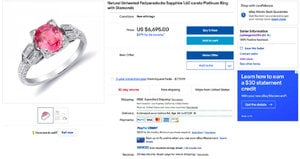
Can somebody please buy this already?
 
I admired this one a few years ago on eBay but can not vouch for this vendor. A little surprised it's still out there. GRS report says unheated Pad. I'm sure they would work with you on price. I don't think I would buy from eBay now but this was a couple years ago.


jupitergems2014.jpg
 

Attachments

  • jupiter2.jpg
    jupiter2.jpg
    146.3 KB · Views: 21
GET 3 FREE HCA RESULTS JOIN THE FORUM. ASK FOR HELP

Featured Topics

Top