shape
carat
color
clarity

Earring CADs are in!

alene

Brilliant_Rock
Premium
Joined
Apr 22, 2010
Messages
1,603
F49D1773-A200-43CD-940D-823E74C0024B.png CFCF0229-568E-400E-8F9A-0D839D93878C.png
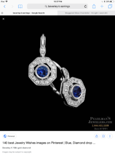
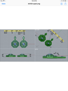
I started working on a pair of leverback sapphire earrings with David and just got the first cad drawings. Would love some feedback on these! Think the melee diamonds many need to be closer together. Anything else I’m missing? I’m attaching a picture of the inspiration earrings also (I requested the change to the marquise shape). The backs will be added manually, I’m having s little trouble picturing how exactly they’ll be look.
 
I like the CADs just some minor thoughts: 1) the milgrain in your inspiration photo look very chunky (especially on the bezel for the center stone...though this could be intentional and if its the look you're going for ignore me) maybe ask for smaller/more refined milgrain? 2) did you want such a large gap between the outside halo and your center stone? the inspiration photo looks like it's set a touch closer...but that could be because the little diamonds are smaller...depends on how you want the outside to 'hug' your center stone. 3) did you want the extra thickness from the inspiration photos? It looks like there is an extra bar....but it may be unnecessary to achieve the look you're going for.
 
Nice earrings, but I want your dog.
 
Lovely earrings, I totally understand the feeling of anticipation! ;-) I am with @metall that the bezel around the center stone can be a bit more delicate, unless you are going for the more sculptural/solid look.
 
I like movement with earrings. I would suggest a little loop between the marquis and the octagon so that the earrings can oscillate and have more light play as you move.
 
Beautiful! I would personally make the airline between the halo and center stone a bit smaller.
 
Thanks so much for all your thoughts and suggestions!
I definitely want a thinner bezel/milgrain. I was assuming it would be, but will make sure to clarify this with David. @metall, @Rubybrick, @Acinom - making the airline a bit smaller is a good idea! Will definitely ask for that.

@metall - really appreciate you taking the time for your detailed response! Not sure what you mean by the extra bar? I do wonder if the bars connecting the center to the halo can be made a bit thinner.

@PintoBean - thanks! I really like dangly earrings in general, I just want this to be an everyday pair that I don't have to take off, I think keeping them stationary may be safer/sturdier.

@MrsKMB -thanks! She's a handful, but I love her!

Any thoughts on rotating the bars that hold the bezel to 2,4, 8 and 10 o'clock? Not sure if they'll flow a bit better in those locations?

Thanks again!
 
@metall - really appreciate you taking the time for your detailed response! Not sure what you mean by the extra bar? I do wonder if the bars connecting the center to the halo can be made a bit thinner.

No problem. I'm terrible at picking stones but I am pretty good at reading cad, after being forced to take auto in school. So it's my way of contributing what I know best.

Though jewelry terminology is not my strong suit so please do best with me on that...i meant the profile or side view. In the inspo picture the whole thing is set in a basket type setting and the center stone is set lower. In the cad the earring is one flat piece with the center stone raised above the halo. I was wondering which profile you preferred: The thicker but lowered center stone or the thinner raised center stone...

Either orientation for the bars holding the center would look nice. However i think of you wanted sturdier for everyday I would go with the bars as is...thinner will put more pressure on it when you sleep (esp if you want the thinner setting mentioned above or if you're a side sleeper and/or roll around a lot in sleep) which could cause the bar to break with the potential of the center stone popping out.
 
Thank you! Now I see what you mean. I'm going to ask David if there's any structural reason for the basket-like think in the inspiration photo. Not sure if adding it would allow for thinner bars that support the center bezel. I don't think I mind the stone being raised above the halo a bit, I just don't want a thick bezel around it.

No problem. I'm terrible at picking stones but I am pretty good at reading cad, after being forced to take auto in school. So it's my way of contributing what I know best.

Though jewelry terminology is not my strong suit so please do best with me on that...i meant the profile or side view. In the inspo picture the whole thing is set in a basket type setting and the center stone is set lower. In the cad the earring is one flat piece with the center stone raised above the halo. I was wondering which profile you preferred: The thicker but lowered center stone or the thinner raised center stone...

Either orientation for the bars holding the center would look nice. However i think of you wanted sturdier for everyday I would go with the bars as is...thinner will put more pressure on it when you sleep (esp if you want the thinner setting mentioned above or if you're a side sleeper and/or roll around a lot in sleep) which could cause the bar to break with the potential of the center stone popping out.
 
EBA7407A-335F-44FE-93B9-EC2CE304C4C2.jpeg
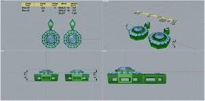
Revised CADs are here! They look great to me, but if there are any final tweaks you think are needed, please chime in!

@metall, would love to hear your thoughts! Your feedback was super helpful the first time around! Thanks in advance!
 
Hi @alene, thank you for your kind words, just glad i could help out a fellow pser...

This looks much closer to what was pictured, other than the raised stone, but thats probably the trade off for a thicker setting and thinner milgrain. I like it!=)2=)2=)2
 
Hi @alene, thank you for your kind words, just glad i could help out a fellow pser...

This looks much closer to what was pictured, other than the raised stone, but thats probably the trade off for a thicker setting and thinner milgrain. I like it!=)2=)2=)2

Thank you for taking a look at it! The only thing I can’t quite work out is how the gallery behind the kites will work with the leverback (its not in the inspiration pictures, though I actually like the look). I asked David, and he said he’ll make it work, so I think we’re ready to go with these!
 
EBA7407A-335F-44FE-93B9-EC2CE304C4C2.jpeg
Revised CADs are here! They look great to me, but if there are any final tweaks you think are needed, please chime in!

@metall, would love to hear your thoughts! Your feedback was super helpful the first time around! Thanks in advance!
Very nice! Looks so clean, I wasn’t sure about rotating the bars to 2,4,8,10 but I like it a lot! These will be great everyday pair!
 
Very nice! Looks so clean, I wasn’t sure about rotating the bars to 2,4,8,10 but I like it a lot! These will be great everyday pair!

Thanks, Rubybrick! I like the bars rotated too! I’m excited to see how they turn out!
 
I like your design even better than the Bev K version, great design and they came out so perfect!
 
They will be gorgeous
 
Cant wait to see the finished product!!
 
Gorgeous earrings!! Beautiful blue:love:
 
GET 3 FREE HCA RESULTS JOIN THE FORUM. ASK FOR HELP

Featured Topics

Top