shape
carat
color
clarity

FCD Setting Help Please!

blackprophet

Brilliant_Rock
Joined
Mar 13, 2013
Messages
531
So I'm working on my FI's wedding present. I have gotten a rendering of what the setter thinks might work. Something is off for me. SO I thought I would come ask the experts of PS their advice. This post will be a long one, so strap yourselves in.

The FCDs
A 0.15ct Fancy Grey RB
0.18 FIY (IGI) Radiant
0.26 FI yellowish-Orange Oval
A TBD ~4mm blue asscher from D.NEA (Awaiting completion)

This is the description of what I wanted that I gave the jeweller:
I want to create a pendant as a wedding gift to my Fiancé.
I have 4 stones to set in it. What I would want is this:
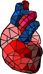
So the outline of the pendant would be of a heart, a real human heart, not the other kind of heart. But I'd like it to be abstract, reminiscent of a heart, not an actual heart shape (that would be kinda gruesome).

One side of it should be angular and geometric like this:
cache3.asset-cache.net/xc/452031661.jpg?v=1&c=IWSAsset&k=2&d=B53F616F4B9...
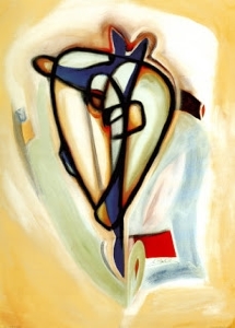
And the other side curvy and flowing like this:
4.bp.blogspot.com/_ZaHvHwPd8-Q/TQZfE23-h_I/AAAAAAAACf8/3V4CRxeu9zA/s320/...

The inside of the pendant would also be split into two sides, sort of like a ying yang symbol, sort of like the different sides of a heart. Could be millgrain or just a border/edge of some kind. Set in each side would be 2 of the stones (sort of like the dots on the two side of the ying yang symbol, top left/bottom right or something like that). The Yellow and Orange would be together on one side, and the Grey and Blue on the other.

I would consider two different metals for the two sides if it could work and look good. PD White Gold/Platinum maybe?


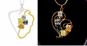
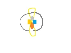
The jeweller suggested using wires to cut down on cost. Below is a picture of what she came up with. Something is just not sitting well with me, but I don't know what it is. Any suggestions would be welcome. If you think something else totally would work, open to inspiration pics as well. Thanks in advance!

alt_heart.jpg
 
I think it needs to be MORE abstract. Suggestions:

1. At the top, get rid of the things that look like veins -- the thin grey line, and the thick gold area that looks like the aorta, lopped off
2. The gold side -- less zig-zagging. More like an octagon or pentagon than a road map?
3. Maybe toss out the whole heart idea and go for different, but complimentary shapes that fit together to form a whole, pleasing gestalt.
4. I like the placement of the stones.

Congrats and best wishes

Kim
 
I agree with most of what Kim said above, but especially point 1.

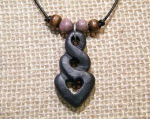
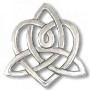
I'm not sure what her style is, but I found these and thought they might work well. Then place your FCD's wherever you feel most appropriate.

Sounds like a fun project! Lucky you (and her) to have such stones to use. :D Can't wait to see what you come up with.

il_197.jpg

brigids-heart-pendant-tk15.jpg
 
Does anyone else think the yellow and orange overpower the subtle colour of the grey and blue diamonds? I think they clash when so close, but I'm no setting expert.
 
The overall design is still quite feminine but stylized so it doesn't look cutesy.
The top half has cold FCD colours and the lower half has warm FCD colours.
The wire wrapping style is kind on the budget and allows you to do mixed metals; white for the top, yellow for the bottom.
I don't like the funky curl at the end on the left side, which I think can be easily removed from the design.

_27166.jpg
 
kimpnoth|1424195663|3833905 said:
I think it needs to be MORE abstract. Suggestions:

1. At the top, get rid of the things that look like veins -- the thin grey line, and the thick gold area that looks like the aorta, lopped off
2. The gold side -- less zig-zagging. More like an octagon or pentagon than a road map?
3. Maybe toss out the whole heart idea and go for different, but complimentary shapes that fit together to form a whole, pleasing gestalt.
4. I like the placement of the stones.

Congrats and best wishes

Kim

What shapes would you suggest?
 
Two separate parts of the abstract heart held together by the bail, perhaps?

abstract_heart.jpg
 
Sorry, but i am not a fan of the heart design. At first I thought it looked like two U.S.A. states bordering each other. What is throwing me off are the two square cuts with the two rounded cuts to be set in the same piece. If you can make it work somehow it would be amazing. With so many different stone shapes and colors you must be careful that a particular stone will not outshine (or diminish) the others. Can't wait to see the end result.
 
I'm also not a fan of the heart design, and having it in two halves also reminds me of a broken heart. I'd hate to have you put so much effort into such a meaningful piece of jewelry and have your wife/fiancé not love it. I liked Chrono's stylized heart better, or why not see about a yin and yang necklace after all? That sentiment is clear and I love the design, if you can get the diamonds to work in there. I also think the diamonds should be placed more apart (two on left, two on right) rather than all bunched up together. You could see about the yellowish diamonds on the darker side of the yin/yang design and the bluish diamonds on the lighter side. Or use two different colored wires/milgrain and place the diamonds within each half.
Good luck!
 
Black prophet,

I have been told I have great taste -- but I am not a designer. I stink at anything that requires art or design. I bumped a thread for you, titled "show me your favorite cs cluster style rings". There are some great ideas for inspiration. mariedtiger's ring and TL's might have some ideas for you and the jeweler to adapt. Mariedtiger's has engraving around the main bevel.

When I get mired down in an idea that just isn't working, I find it helps to go in a completely different direction.

If you are not working with a jewelry designer, I highly recommend it.

Go simple and elegant, let the stones be the center of the design.
 
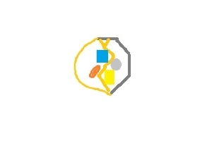
As I said above this is the design the designer came up with. This is actually the second revision. Its not working for me so I came here for other ideas. Need to give a bit more direction.

I have gotten a lot of good ideas here. And I kinda agree that it needs a total rework. So here's what I have come up with. Let me know what you think.

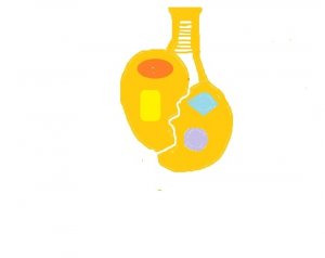
Option One
MORE ABSTRACT
It doesn't show well in my render but circle on one side, hexagon/octagon on the other side. Its overlaid on an infinity symbol. FCDs set on the infinity symbol. Placement of FCDs could be changed. It is somewhat heart shaped but very abstract.
design_1.jpg

Option Two
MORE HEART-LIKE
One side is again a circle, the other a pentagon. split join at the top to invoke the top of a drawing type of heart. Asymmetric point at the bottom invokes the bottom of a real heart. Line in the middle is curved on the top half, and pointed on the bottom half.
design_2.jpg

Thoughts? Suggested changes? Thanks for the help so far!
 
I dislike all the heart ideas because the end results look like a broken heart which is the very last thing you want her to think when she sees it.
 
Chrono said:
I dislike all the heart ideas because the end results look like a broken heart which is the very last thing you want her to think when she sees it.

+1
 
Jewelry - like art - is symbolic and if someone wants to work a heart design then that should be respected -- What it 'means' to anyone else doesn't matter..............In the drawing I was going for the bail being the connection (like marriage) between the two parts of the heart (two people). You don't become one person.......you are two, BUT you are in a relationship together. The boundary between the two heart parts can be changed as can the metals, etc. and I thought that was what the OP was asking for. It all comes down to what the symbolism is for the person who will wear it and give it. I want to say "go for it" blackprophet, sit with it, doodle, dream and pull idea's from wherever you find them........I wish you good luck!!
 
I respect the heart design - it's the line down the middle that's giving me a hard time. It seems like a separation. To one person, that may represent two individuals. To me, it's just not feeling harmonious or united enough. We can agree to disagree. :) I meant no disrespect.

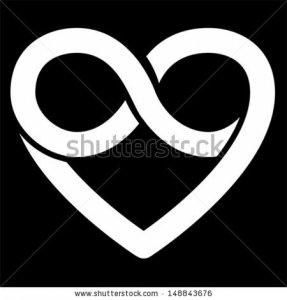
I know this is more of the heart shape but it also uses the infinity symbol quite nicely.

stock-vector-infinity-heart-symbol-forever-vector-148843676.jpg
 
With it being a wedding gift, I understand what he hopes to achieve but your guess is as good as mine as to how the recipient will "read" the design. Of course, it is his choice whether to continue with the heart design, which I respect, but I would be remiss if I did not point out the first thought that popped into my mind when I first saw it. She could well be different and see it the way it was intended.

ETA
I agree with SL that it is the line crossing the heart that is problematic to me. In essence, it is a divider between the chambers of the heart and could easily be misunderstood as a broken heart symbolism instead of the joining of two into a single heart. SL's latest suggestion of replacing the divider with the infinity symbol evokes the feeling of love and togetherness almost universally.
 
OOOh, SL that curvy heart is to my taste.

Here's another idea. The round/ovals could be at the top on the right and left sides. The square stones could be kite set at the top and bottom. This probably needs some reworking for the stones. The setting is a little too symmetrical for the stones. But it does have the center line denoting the separation -- maybe the curves need to curve inward to denote the coming together. I have seen some lovely asymmetrical variations of this type of design for stones more like yours.

I'm also wondering if maybe a new jeweler/designer might be in order? The jewelers with whom I work like to get an idea of what I want, and then they usually come up with 3 or 4 versions of ideas, I pick one and we go from there.

il_198.jpg
 
Thx Sparklieslover for your comments. BTW, I really liked the first picture you posted in the beginning....the progressive drop look. I'm keeping that one in my back pocket as it appeals to me!
 
A few more pictures of some inspirations -- not all all hearts, but maybe a theme of melding?

il_199.jpg

il_200.jpg

il_201.jpg
 
And a few more. I could see modern, more asymmetrical adaptations of these. That is, if more modern is what is desired.

il_202.jpg

il_203.jpg
 
And one more thought (as if you need any more). If it's close to the wedding and the design process starts causing anxiety and creative block, what about wrapping up the stones with note that says something to the tune of "a lovely start, lets make something beautiful together" . . . . .
 
No comments on the two designs I came up with? What about the first of the two with a circle and an infinity sign?

I'm trying to stay away from all of the designs that have an obvious <3 shape to them. I don't like that.

I will sit on some of these designs a little longer to see if there is anything I can pull from them.

I do want to invoke a heart shape. But as you can see from the circle and infinity one, I am willing to go way abstract.
I'm not sure if anyone looked at it, but let me post the abstract heart inspiration pic again so you all can get another look at the direction.
alfred-gockel-abstract-heart-ii.jpg
 
Do you have any three dimensional inspiration pic's? That's a hang up for me because most abstract art is one dimensional....... :?:
 
I like this one suggested by Kimpnoth as it looks similar to your inspiration picture.

alfred-gockel-abstract-heart-ii.jpg
 
I like the inspiration piece. I would think a designer could have a good time with it. (I'm a woman of modern, abstract sensibilities.)

The shape is nice. Whack off the veins/arteries outside the basic shape, except maybe the bottom one, if a stone will go there. It looks like part of the left side is solid (and maybe part of the right), with the rest open. I think that would make lovely texture. Keep the veins/arteries (ahem, gentle, flowing lines) running from bottom to top (they may need some design tweaks). Place a squarish stone, on the right side where a vein now appears to form a square. Place two other stones to the right of the square, maybe one just higher than the other, and one just lower than the square. Place another where the vein exits at the bottom.

Maybe keep it all one color gold -- and do the blue areas in another color.

Heck I could have some fun with this -- but I'd still a need a designer's help.

It would be more complicated and cost more, but it could be stunning.

Best

Kim
 
One more thought:

keep the shape, it's kind of leaf-like. Have veins, more like leaf veins, start from some point (top, bottom, where the aorta is) and spread out more like leaf veins. Position the stones off the veins. I still like the idea of having some portions between the veins filled in with gold, maybe textured. I think that would add interest and weight (cost, too, but oh, well). It might mean a cast piece, but then the veins could be carved into the more solid parts and gracefully extend to the frame.

Do you need time to digest this all? I would.
 
I'm just curious, but why do you want it heart organ shaped rather than heart symbol shaped?
 
digdeep|1424285228|3834443 said:
Do you have any three dimensional inspiration pic's? That's a hang up for me because most abstract art is one dimensional....... :?:

I Don't this was just an idea from my head. Probably not a great one as I can see! Maybe I should be looking for more actual jewellery pieces as inspiration. But a pendant is sort of 2 dimensional. in a sense.

Chrono|1424285693|3834446 said:
I like this one suggested by Kimpnoth as it looks similar to your inspiration picture.

Probably should've posted the other inspiration picture. It was supposed to meld the two inspiration pics.
452031661.jpg

kimpnoth|1424287186|3834452 said:
I like the inspiration piece. I would think a designer could have a good time with it. (I'm a woman of modern, abstract sensibilities.)

That is what I thought. The designer was given these pics. Not working out that way. And although I REALLY don't want to, I guess I may have to consider switching designers. I really like this designer and would like to continue to work with them. I haven't sunk any money into this yet. I will consider some of these ideas.

ElleW|1424292668|3834492 said:
I'm just curious, but why do you want it heart organ shaped rather than heart symbol shaped?

Because the heart organ carries more sentiment to me. And I though the overall outline would make for a more interesting piece. And I didn't want to just end up with a heart shape pendant (instead I just ended up with a heart organ pendant :lol:). As you can see from the flowy inspiration pic, you can have a heart organ shape that looks modern, abstract and elegant. That's what I'm trying to go for. And I'd kinda rather it not be apparent exactly what it is when you first glance at it.

Maybe my idea is too out there and I'm asking for too much.
 
I'd urge you to go back and sit down with the designer again and go over what you want........custom jewelry is never a bullseye the first time through--and that's for pieces that are less complicated than yours. Your idea's are definitely outside the norm so struggling with it for the designer and those here.....is perfectly acceptable. You seem to know what you are going for.........give the designer another go with the info you've gathered so far. In fact, I'd urge you to start with the background design shape that you want...... I'm sure people here will continue to contribute. I think it's a great idea........it may take a little while to work it out.......but Rome wasn't built in a day. LOL!!!
 
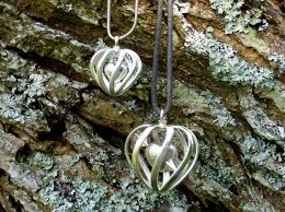
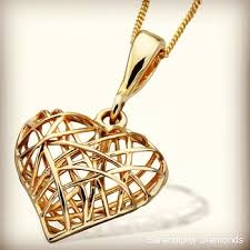
Another idea: Use your inspiration pieces to construct an organic heart as a wire cage within which are the suspended/attached/floating FCDs? The jeweler could make the cage flat on the back to sit flat on the skin but curve the wire on front and sides to get it closer to the real organ shape you're trying for?

_316.jpeg

_317.jpeg
 
GET 3 FREE HCA RESULTS JOIN THE FORUM. ASK FOR HELP

Featured Topics

Top