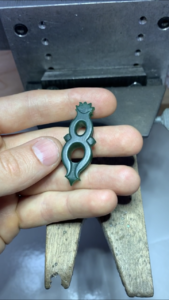
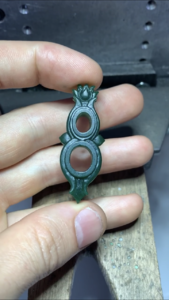
shape
carat
color
clarity

Garnet and moonstone pendant design help

MakingTheGrade

Super_Ideal_Rock
Premium
Joined
Mar 2, 2009
Messages
13,250
Just wanted some other opinions.
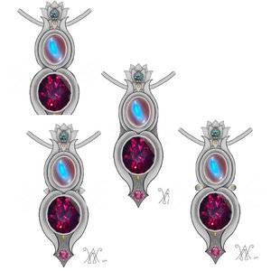
I commissioned a sculptural style pendant by a jeweler who does these kind of edgier pieces. I sent my large rhodolite supernova and moonstone both from barry. My only request was to somehow incorporate a lotus.

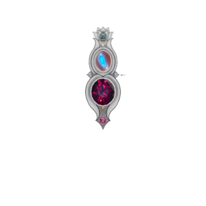
He just sent a sketch. I think the flow looks better without the side “blobs”. What do you think?
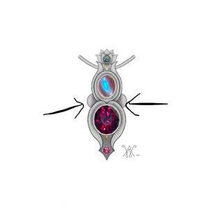
F1BC8091-12DD-4BFB-A92F-C65025411F54.jpeg
 
First of all- that’s gorgeous!
I agree about the ‘blobs’. I’d reduce them greatly, as I think that space needs something small there, or make it a small concave doohickey or mimicked lotus petal shape.
 
First of all- that’s gorgeous!
I agree about the ‘blobs’. I’d reduce them greatly, as I think that space needs something small there, or make it a small concave doohickey or mimicked lotus petal shape.

I think part of it is that it’s hard for me to envision since I’ve never commissioned a very 3D sculptural piece like this. Hmmm
 
Agreed about the "blobs", I'd get rid of them. Do you mind sharing the artist? I love the sketch and aesthetic!
 
I think if the "blobs" were replaced by something angular (like the petal shapes) it would look much better.
 
Ok. So I wrote back asking about either no side elements or more angular ones. I have no experience in sculptural pieces so I don’t know if not having them makes it seem too boring? I’ll see what he says.

Here’s a link to his site. Not cheap, but the pieces are such little works of art!

http://www.williamarthurjewelry.com/new-page-1
 
I think it might look better without the garnet part or the two lobes.
 
I like the little pointy petal thingies instead of the blobs. Maybe with a small melee diamond in each???
 
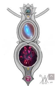
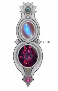
Just got this sketch back. Like it much better!
I think the little purple sapphires will be set into the sides for a little surprise bling from the side view.
6C888BD0-B620-4C3F-A83D-F3DE351A34FB.jpeg
 
^ YES, this design is beautiful and synergistic, thumb's up (fwiw).
 
I think it's a winner! It looks organic, fluid and lyrical. Very pretty!
 
Just got this sketch back. Like it much better!
I think the little purple sapphires will be set into the sides for a little surprise bling from the side view.
6C888BD0-B620-4C3F-A83D-F3DE351A34FB.jpeg

YES! that's perfect.
 
Yeah I love Williams eye for accent gems and over all design. He’s going to send me an updated sketch soon I think with what it’d look like with the small purple sapphires on the smaller side petals.
 
Beautiful pendant design, it's going to look great when it's done :-)
 
I think the design is very cool, but to be very honest--this still looks too much of 葫芦 and not enough of 莲花. The lotus motif is small and at the top and gets lost in where the eye gets drawn to the moonstone and garnet.

I would prefer something more like this. A big lotus on the top and its "reflection" in the water below. Of course this produces a more obviously floral look in a different style, but I would argue it's no less sculptural and produces a silhouette a lot less like a 葫芦.
6yYO3_NFdmbIGFUIM0LNAWEkQKWQdee3NjBNnzxHAIuRwkTcUDyCinScab7AF2RoRs6lR2jFxva2_hZvoIXJnu5uEQ-IqsvInCUKQQYQxg0QHrzLfFiWehj7i92oRQ-mqxgrMzK2pIkTpYtvWAjsVieBTAGLxy5X_C9oQAmh94rX7bPTD98fL0ZGYsLpw0S-xzyZ9wndjQRWj12hg3H-qv7wSv8ozRmtdbyRqNbsKLzH5-30ooMgk1CYuXb_mv_n0iFV7RPtc0lZDxbWZymqUY4NQy2pSm9bvvVwCgSsWm8OKCinUQFrk79qCqy17G93yMWk9Giy3yaakcLcHYq6gsn0Eva360LOQccHKrEuqKzpID85rmSm8lon5bkehEw6XPxgDIsopXk2drqlHj_3ghqrL5ZmIs1gSf_GGjtzszauVmWtW5IqkcEzEIApVg6WRAMzRrTsQRa28mi6Cr3CSjEw9f7YdPbKzihcAMDtV68SwUeITfDMfW4jyDqScodHtSVu3ZhBGgTBkxgO-uGjJf1uJRlYZx5ZmfqMEvNU5WYbs5oJzJxlqTVKyUS9c91-hpAGv02aYU0x5Zw9nte90VjaBiR6FKc628E_Gg887Jdd1weH8EqJF7YR6AkrPKzQAF4zfR5hAHKhMqtcG2LvzS_YssG-EI2ss6PH3i415nHx4pSxk9flzj7i=w690-h920-no
 
I think the design is very cool, but to be very honest--this still looks too much of 葫芦 and not enough of 莲花. The lotus motif is small and at the top and gets lost in where the eye gets drawn to the moonstone and garnet.

I would prefer something more like this. A big lotus on the top and its "reflection" in the water below. Of course this produces a more obviously floral look in a different style, but I would argue it's no less sculptural and produces a silhouette a lot less like a 葫芦.

That’s really cool!
I should clarify that I had also told him I wanted a pendant that read very vertical on silhouette (what can I say, I wanted some cleavage bling lol) which is probably why he went with a small lotus on top lol.
I also tend not to have very floral designs. Most of my jewelry is very minimalistic with emphasis on the colored gems.

This piece is going to be the most metal-centric and “floral” one to date lol

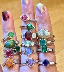
Pic of some of my colored stone rings.
57B4087F-C422-43D9-B280-BF51D81C3F8A.jpeg
 
I love the latest design! Really beautiful. You have a gorgeous collection @MakingTheGrade.
 
Haha once again my wallet is grateful I don’t wear earrings..
 
That’s really cool!
I should clarify that I had also told him I wanted a pendant that read very vertical on silhouette (what can I say, I wanted some cleavage bling lol) which is probably why he went with a small lotus on top lol.
I also tend not to have very floral designs. Most of my jewelry is very minimalistic with emphasis on the colored gems.

This piece is going to be the most metal-centric and “floral” one to date lol

Pic of some of my colored stone rings.
57B4087F-C422-43D9-B280-BF51D81C3F8A.jpeg
your new pendent is going to be right at home in your jewlery box !
i adore your love of colour
 
I think the design is very cool, but to be very honest--this still looks too much of 葫芦 and not enough of 莲花. The lotus motif is small and at the top and gets lost in where the eye gets drawn to the moonstone and garnet.

I would prefer something more like this. A big lotus on the top and its "reflection" in the water below. Of course this produces a more obviously floral look in a different style, but I would argue it's no less sculptural and produces a silhouette a lot less like a 葫芦.
6yYO3_NFdmbIGFUIM0LNAWEkQKWQdee3NjBNnzxHAIuRwkTcUDyCinScab7AF2RoRs6lR2jFxva2_hZvoIXJnu5uEQ-IqsvInCUKQQYQxg0QHrzLfFiWehj7i92oRQ-mqxgrMzK2pIkTpYtvWAjsVieBTAGLxy5X_C9oQAmh94rX7bPTD98fL0ZGYsLpw0S-xzyZ9wndjQRWj12hg3H-qv7wSv8ozRmtdbyRqNbsKLzH5-30ooMgk1CYuXb_mv_n0iFV7RPtc0lZDxbWZymqUY4NQy2pSm9bvvVwCgSsWm8OKCinUQFrk79qCqy17G93yMWk9Giy3yaakcLcHYq6gsn0Eva360LOQccHKrEuqKzpID85rmSm8lon5bkehEw6XPxgDIsopXk2drqlHj_3ghqrL5ZmIs1gSf_GGjtzszauVmWtW5IqkcEzEIApVg6WRAMzRrTsQRa28mi6Cr3CSjEw9f7YdPbKzihcAMDtV68SwUeITfDMfW4jyDqScodHtSVu3ZhBGgTBkxgO-uGjJf1uJRlYZx5ZmfqMEvNU5WYbs5oJzJxlqTVKyUS9c91-hpAGv02aYU0x5Zw9nte90VjaBiR6FKc628E_Gg887Jdd1weH8EqJF7YR6AkrPKzQAF4zfR5hAHKhMqtcG2LvzS_YssG-EI2ss6PH3i415nHx4pSxk9flzj7i=w690-h920-no

I love the design of the OP’s pendant, and looking at the designer’s website it is very much his aesthetic. But I just wanted to mention that I also think this design is super cool! And imagine if the “reflection “ was a different metal, or somehow textured...
 
Ok. So I wrote back asking about either no side elements or more angular ones. I have no experience in sculptural pieces so I don’t know if not having them makes it seem too boring? I’ll see what he says.

Here’s a link to his site. Not cheap, but the pieces are such little works of art!

http://www.williamarthurjewelry.com/new-page-1


Thanks for sharing! Now I have another jewelry designer to follow and hope to work with someday! :rolleyes2:

Can't wait to see this pendant completed!
 
GET 3 FREE HCA RESULTS JOIN THE FORUM. ASK FOR HELP

Featured Topics

Top