shape
carat
color
clarity

Good with colors? Opinion?

Status
Not open for further replies. Please create a new topic or request for this thread to be opened.

misysu2

Brilliant_Rock
Joined
Mar 14, 2007
Messages
822
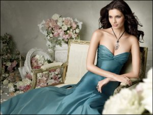
I saw this photo on the Knot and loved this contrast of the dress and flower color. I was planning on having Jasper-colored Jim Hjelm BM dresses, which are similar in color, but not exactly cornflower, more teal. Do you think you would get the same effect? Also, appropriate for spring wedding? Also, how would you decorate everything else?!
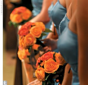
large_imageCAULEYCC.jpg
 
Here''s a pic of the Jasper color I planned upon.

jh5765.jpg
 
I think those colors would be very pretty for a Spring wedding. I love the dress and color you chose it''s great!
 
LOVE the combo!
 
I think the colors would be great! What kinds of decorations do you need?
 
Love that color combo....If you are unsure, you can also go with soft blush pink/ivory/cream flowers as well....

What other decorations are you asking about? There is no rule that says that everything has to coordinate color-wise, it just has to "flow" if you know what I mean. For example, my invitations were cream, blush pink, and chocolate. My bm's wore chocolate brown dresses, and the flowers were a combo of peaches, ivories, and creams. Sometimes its nice to mix it up!!!
2.gif
 
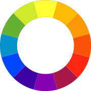
The color combo is a great one and it works because even though blue and orange are opposites on the color wheel, the hue and saturation of the blue and the orange are the same or similar. The jasper color looks darker to me than the blue in that pic you posted so ideally an orange that matches the jasper color in hue and saturation, so a little deeper and darker than pictured, would give you the same effect. I love the combo, great choice!
 
36.gif
 
i like your combo more then the knot version actually!!!
 
I LOVE the colors!!!

If you look at the color wheel... blue-green (@ 9 o''clock) is directly opposite red-orange (3 o''clock) which gives a complementary color scheme... these can be very vibrant or soft... just be sure to pick intensities/tints/shades that look good together. If going a bit more blue in the blue-greens, go a bit more orange in the orange-reds to keep it complementary. But it really comes down to go with what you love :)

color wheel.png
 
Sera- thanks for the color wheel-- I'm not artistically inclined, so it helps to see it in diagram form!

Gypsy- Hue and Saturation-- something a good florist would know about?


oobiecoo- I'm not sure what other decorations...haven't really got to that stage in planning yet. :) I guess anything could work!

Dani- you're right! I could use any of the above or anything that "flows". I'm sure it'll be easier than I'm thinking. These colors would look great on invites, too!

I have an artistic FI who will be doing the invites for us-- hope he can help with the flower colors too. I just love the pop of the orange. If I ended up making the BM bouquets orange, how could I make my bouquet stand out? I always loved the pop of color against the white/ivory dresses. Maybe some kind of jasper-colored accent, like ribbons or feathers?
 
Ooh! I could even wear a necklace with an accent of one of the colors! I''m getting excited!!
36.gif
 
Gorgeous...

now all you need is a nice spessartite!
18.gif
 
Status
Not open for further replies. Please create a new topic or request for this thread to be opened.
GET 3 FREE HCA RESULTS JOIN THE FORUM. ASK FOR HELP
Top