shape
carat
color
clarity

Help me choose which stones!

missyc

Rough_Rock
Joined
Mar 27, 2020
Messages
98
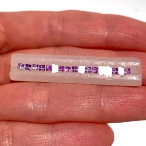
Hi all! I'm getting a channel-set half eternity made and need help on choosing 10 sapphires. I've only been given one photo, and some appear to have windows. I think I might ask the vendor for more photos, but in the meantime, which 10 stones would you choose?

1000087796.jpg

This is the colour scheme I'm going with.

1000087795.jpg

Thanks in advance!
 
I'm no expert but to me #10 looks too blue and #13 looks way too windowed so should be tossed out right away, unless other stones are brought in to tie #10 back to the others. I think #13 is a no go, period.

But I'm also wondering if these colors are really reflecting your inspiration and if they're different enough from each other to avoid just looking poorly matched.

Like these clearly are meant to be multicolored:
https://www.enhoerning-jewelry.com/made-by-enhoerning/476-unheated-mc-sapphire-band
1724470233900.png
But it seems like the stones you're being shown are more like this, which I personally think is borderline purposeful versus poorly matched:
1724470323690.png
Your inspiration color palette is more varied and to me seems closer to this view of a Faberge band, except with more deep purple instead of deep blue:
1724470618260.png

Or like a purplier version of this:
1724470803407.png

Or a cooler-toned and more saturated version of these:
1724471236914.png

Or like these, minus the red:
1724471519899.png

Or these:
1724471604174.png

Or this little Etsy band:
1724471704251.png

And this view of @yssie's stunning ring, with a little less blue:
1724471764526.png

I also worry about the size difference between the stones, but maybe a channel setting can accommodate that? Again, not an expert.

Now I don't know if you're happy with the color range you've been presented with -- maybe you are! And maybe getting well-cut stones in the full range of colors in your palette would put things way out of budget, which is obviously totally fair. I just wanted to point out that I didn't see the stones completely reflecting the colors you seemed to want.

Edit:

More!
1724472417709.png

1724472454860.png

1724472556108.png

1724472579678.png
 
Last edited:
I'm no expert but to me #10 looks too blue and #13 looks way too windowed so should be tossed out right away, unless other stones are brought in to tie #10 back to the others. I think #13 is a no go, period.

But I'm also wondering if these colors are really reflecting your inspiration and if they're different enough from each other to avoid just looking poorly matched.

Like these clearly are meant to be multicolored:
https://www.enhoerning-jewelry.com/made-by-enhoerning/476-unheated-mc-sapphire-band
1724470233900.png
But it seems like the stones you're being shown are more like this, which I personally think is borderline purposeful versus poorly matched:
1724470323690.png
I'm definitely leaning more towards a colour palette like this instead of the latter examples you linked. I don't want stones of the exact same colour, but I don't want them to be distinctly different. Ombre but not your traditional ombre, if that makes sense.

I also worry about the slight differences in size of the stones, which is something I'm going to ask the vendor. The stones presented are all that they have on hand. I am happy with the colours that appear on my screen, but like you pointed out, some have major windowing. These stones are about 2mm each, so not sure how the windows will look in real life perspective.

I am leaning towards #1-9 + #17, but not sure about the size of #8.

Okay, great! If subtle is what you want, then that's perfect :)

To me #6 reads a little grey. I wonder if #12 and #15 are worth trying to get a better photo of....
 
Okay, great! If subtle is what you want, then that's perfect :)

To me #6 reads a little grey. I wonder if #12 and #15 are worth trying to get a better photo of....

Now that you mention it, #6 does look a little grey. What do you think of #2 and #8's window?
 
Now that you mention it, #6 does look a little grey. What do you think of #2 and #8's window?

#2 looks to me like it might be a reflection rather than a window? It's also more tilted than its neighbors which makes it harder to compare.

I think, like you, my biggest concern with #8 is the size.

I wonder if the vendor can send you a video on the hand with the worst 4-5 removed and then you can go from there....

But hopefully one of the people who actually knows what they're talking about weighs in tomorrow!
 
This is going to be a pretty band! I picked 10 that I liked and tried to give you a little of everything in your color scheme. I marked out the others to give you an idea of what a grouping of 10 would look like, but this might not be the look you’re going for. I find it a little easier to make these kind of choices by first visually eliminating the ones I don’t want, to see what’s left to choose from.
732B135E-7325-4B9F-A9BD-1022899A87D2.jpeg
 
Can your vendor help with this? It seems to me that this should be a service a good vendor offers.
 
#2 looks to me like it might be a reflection rather than a window? It's also more tilted than its neighbors which makes it harder to compare.

I think, like you, my biggest concern with #8 is the size.

I wonder if the vendor can send you a video on the hand with the worst 4-5 removed and then you can go from there....

But hopefully one of the people who actually knows what they're talking about weighs in tomorrow!
I'll see if they can send me a video!

This is going to be a pretty band! I picked 10 that I liked and tried to give you a little of everything in your color scheme. I marked out the others to give you an idea of what a grouping of 10 would look like, but this might not be the look you’re going for. I find it a little easier to make these kind of choices by first visually eliminating the ones I don’t want, to see what’s left to choose from.
732B135E-7325-4B9F-A9BD-1022899A87D2.jpeg
That's a brilliant idea, and the colours you've picked out are quite to my liking. I'll see if I can get better photos, or even a video, of these stones.

Can your vendor help with this? It seems to me that this should be a service a good vendor offers.
I haven't asked them yet. They have previously said that they can provide a few combinations for me to choose from. I can also choose the specific stones if I wanted to.

We haven't gotten to the stage of choosing the stones yet (currently working on the CAD), but I thought I would get a head start so that I can really think through the colour scheme.
 
Here's a video that the vendor provided. I actually like the colour of #10 but do you think it's too different compared to the rest of the stones?


The vendor said the size of #8 has a variation of less than 0.3mm and shouldn't be an issue in setting.
 
Here's a video that the vendor provided. I actually like the colour of #10 but do you think it's too different compared to the rest of the stones?


The vendor said the size of #8 has a variation of less than 0.3mm and shouldn't be an issue in setting.

Wow, they all look so much better in that video than in the photo!

I think #10 is a really pretty color but I would want something else a little more similar to it personally or to have more variety overall. Alternatively, could you make it 11 stones instead of 10 and have #10 be the center?
 
Wow, they all look so much better in that video than in the photo!

I think #10 is a really pretty color but I would want something else a little more similar to it personally or to have more variety overall. Alternatively, could you make it 11 stones instead of 10 and have #10 be the center?

Oh, I forgot to mention! The vendor suggested 12 stones for full finger coverage instead of 10.
 
They look very pretty in the video! How are you planning to layout the colors? Scattered or gradient? I would eliminate #6 for its gray tones and #13 for its window. If you like #10, I think it could work and would try to include it while you’re narrowing things down.
Let me know if you want me to mark out any combinations of colors for you to see :))
8B9E5123-B54F-4895-A883-E4F9407CDCDE.jpeg
 
I'd eliminate the one that is smaller and the darkest one, in addition to the ones Neezers mentioned.
 
They look very pretty in the video! How are you planning to layout the colors? Scattered or gradient? I would eliminate #6 for its gray tones and #13 for its window. If you like #10, I think it could work and would try to include it while you’re narrowing things down.
Let me know if you want me to mark out any combinations of colors for you to see :))
8B9E5123-B54F-4895-A883-E4F9407CDCDE.jpeg

I think I want the colours to be scattered and not in a gradient. Even though I really like #10, I think I agree with @newtojewels in that there needs to be more stones of similar colour to make it work. The more I look at #10, the more of a sore thumb it appears!

I'm thinking of these stones. I hope #8 works out with its size.
 

Attachments

  • VideoCapture_20240828-035926.jpg
    VideoCapture_20240828-035926.jpg
    315.9 KB · Views: 10
So, I've chosen the stones. Now it's time to decide the layout! The vendor has come up with three different combinations for me.

What do you guys think? I'm tossing up between A and B.

1000089223.jpg
 
My instinctive reaction is B. I can see why you’re considering A. C is definitely out of the picture.

But B is really really nice.
 
So, I've chosen the stones. Now it's time to decide the layout! The vendor has come up with three different combinations for me.

What do you guys think? I'm tossing up between A and B.

1000089223.jpg

Just a thought: Look at them, or photograph them, in a light box set up for very even light. Then you will see the base colours more clearly, without the distraction of the sparkle.

Here is my very basic DIY setup, with an example pic:
LightBox.jpg
Note that the black areas in some stones are 'obstruction' i.e. reflections of the camera lens.
 
My instinctive reaction is B. I can see why you’re considering A. C is definitely out of the picture.

But B is really really nice.
My initial reaction was also B. It's not too gradient but not too random. A is nice because it highlights the colour of #10.

Just a thought: Look at them, or photograph them, in a light box set up for very even light. Then you will see the base colours more clearly, without the distraction of the sparkle.

Here is my very basic DIY setup, with an example pic:
LightBox.jpg
Note that the black areas in some stones are 'obstruction' i.e. reflections of the camera lens.
Unfortunately I don't have the stones in person. They are with the vendor who will set them straight into a ring for me.
 
I like B for a full eternity. I do like the contrast stones in the center of A and if it was a half eternity I might go with that. But for a full, B is more balanced all across the suite.
 
I like B for a full eternity. I do like the contrast stones in the center of A and if it was a half eternity I might go with that. But for a full, B is more balanced all across the suite.

It is actually going to be a half eternity. The stones are only 2mm each
 
It is actually going to be a half eternity. The stones are only 2mm each

Hmmm. Well then I might choose B.

I am still not crazy about that one smaller stone (fifth from left in C). I think it will be noticeable, and if you are using it, I would put it at the end.
 
Hmmm. Well then I might choose B.

I am still not crazy about that one smaller stone (fifth from left in C). I think it will be noticeable, and if you are using it, I would put it at the end.

I actually didn't choose the smaller stone (#8 ) but I think I see which stone you're talking about (#7). I think it's the way the stone has been placed in that particular photo because it seems to be the same size as the others in the different photos the vendor sent me.

I'll clarify this with the vendor.
 
@Dreamer_D I also wonder if the smaller stone will be noticeable in channel set.
 
I don't see how it won't?

There are two that look small. Circled here.IMG_3550.jpeg

I guess I'm envisioning them to be less noticeable in channel set vs prong set. I quite like the colours of those two stones, and my only other options are the remaining stones with windows :(
 
I guess I'm envisioning them to be less noticeable in channel set vs prong set. I quite like the colours of those two stones, and my only other options are the remaining stones with windows :(

I suppose this is where trust in the vendor comes in. I don’t know them so can’t speak on that. Maybe it won’t be apparent!
 
Screenshots from a video the vendor sent me. They have suggested option A, but someone convince me that option B is the one :whistle:

1000089347.jpg

1000089348.jpg
 
I actually like B better for whatever that's worth, though like @Dreamer_D I would want to try to find an arrangement that puts the two small ones on the ends....
 
GET 3 FREE HCA RESULTS JOIN THE FORUM. ASK FOR HELP
Top