shape
carat
color
clarity

Help me make my 3 stone AVC ring please

bling_dream19

Ideal_Rock
Joined
Feb 21, 2019
Messages
3,352
Hi lovely friends,
I'm thrilled to be the recipient of this gorgeous AVC bought from @marymm and she even found baby AVCs for me from GOG! Thank you again so much @marymm
This will be my first 3 stone ring.
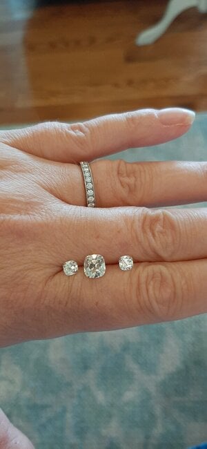
Center is 1.5 P AVC and sides are OP .8ctw baby AVCs.
I need some help designing this ring. This will be a lifelong ring so I really want it just perfect, if that's possible lol.
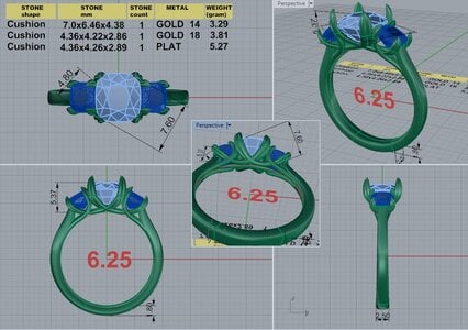
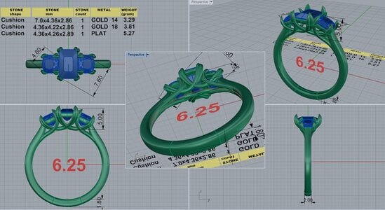
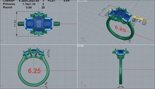
So, do I go classic 3 stone or a more elaborate setting? I love the open baskets and clean lines and heart prongs. I also love the design detail in the more ornate setting.
dk 69882-quad-2.jpg
DK 69882-QUAD-8.jpg

I'm open for suggestions and feedback. I love platinum so leaning towards platinum. I'm considering rose gold too but I just don't wear much rose gold. Thank you everyone!
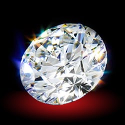
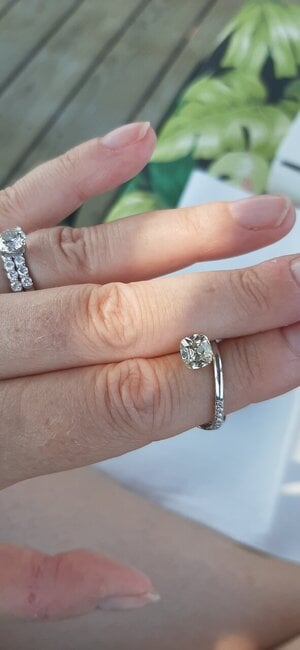
Oh and here are the diamonds...can't forget the bling!20210706_142015.jpg20210629_091032.jpg
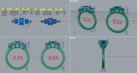
And we have a 3 stone halo option!
 

Attachments

  • DK 69882-QUAD-5.jpg
    DK 69882-QUAD-5.jpg
    162.4 KB · Views: 30
  • DK 69882-QUAD-3 (1).jpg
    DK 69882-QUAD-3 (1).jpg
    149.8 KB · Views: 30
Last edited:
What a beautiful trio of stones you have! :love:

I would have a hard time choosing between the two designs by looking at CADs because the more intricate one doesn’t reflect your centerstone shape/size.
Aside from that - my personal feelings on the intricate one- I would want some basket beefing up added under the fleurs/swirls instead of the way it currently is. I’d think I’d catch it on stuffs.

as for choosing something for the long haul - I’d lean towards classic clean lines over more trendy type details.
 
This. Is. Going. To. Be. INCREDIBLE! This is what dreams are made of! I looooooooove O/P colored stones. They are delicious. I cannot wait to see!!

I personally love the second CAD, the more simple design. I think these AVC’s will shine for themselves. But you have to follow your heart :)
 
What a beautiful trio of stones you have! :love:

I would have a hard time choosing between the two designs by looking at CADs because the more intricate one doesn’t reflect your centerstone shape/size.
Aside from that - my personal feelings on the intricate one- I would want some basket beefing up added under the fleurs/swirls instead of the way it currently is. I’d think I’d catch it on stuffs.

as for choosing something for the long haul - I’d lean towards classic clean lines over more trendy type details.

Oh my I've got a few projects going. I'm going to check the cads lol thank you.
 
That second cad is beautiful!! I love the swoops. I bet your impatient to get that on your finger!!
 
Oh my I've got a few projects going. I'm going to check the cads lol thank you.

I think its the trio and it looks like the listing of dimensions was cut off from the top, so 2 diamond listing are missing. I think lol. Cads are so challenging to read and understand and dream how they will look in real life. I'm so grateful to the designers. And now I'm grateful for my PS family to help me make decisions and get this done!
 
I think my heart is leaning towards the cad with open baskets and swoopy setting. 850712
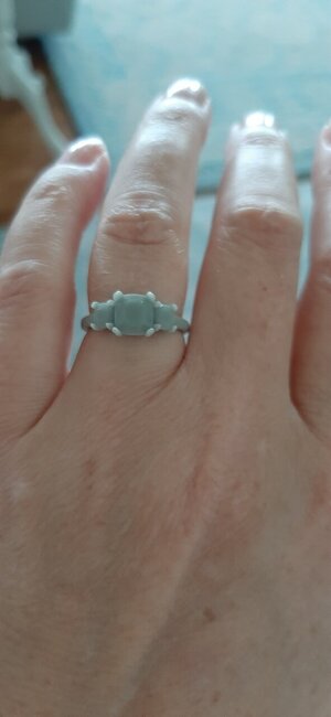
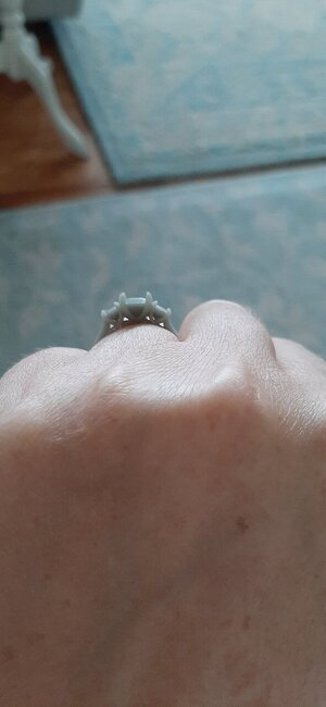
And I have a picture of my finger in the plastic model! I'm waiting for a plastic of the more ornate because I thought it would help me to see it on my finger. But here's the plastic of the swoopy open 3 stone with heart prongs. 20210821_141620.jpg20210821_141622.jpg
What metal? Thanks everyone.
 
I think my heart is leaning towards the cad with open baskets and swoopy setting. DK 69882-QUAD-8.jpg
And I have a picture of my finger in the plastic model! I'm waiting for a plastic of the more ornate because I thought it would help me to see it on my finger. But here's the plastic of the swoopy open 3 stone with heart prongs. 20210821_141620.jpg20210821_141622.jpg
What metal? Thanks everyone.

Definitely either rose or yellow! Show off that beautiful rich O/P color of those stones!
 
I think my heart is leaning towards the cad with open baskets and swoopy setting. 850712
And I have a picture of my finger in the plastic model! I'm waiting for a plastic of the more ornate because I thought it would help me to see it on my finger. But here's the plastic of the swoopy open 3 stone with heart prongs. 20210821_141620.jpg20210821_141622.jpg
What metal? Thanks everyone.

That is so elegant and lovely. It’s going to be a beautiful ring. What would you think about the swoops in platinum but the band in yellow gold (assuming that can be done!). I find sometimes when the basket is in YG it seems to add too much color to the stone, but a yellow band might gesture towards the color without overwhelming the diamonds’ own hue?
 
IMHO given the warmth of the stones the ring might look best overall if it has an antique-y vibe. So that would be the more ornate setting.

Re rose gold… it pairs really well with silver colored metal. So if you get RG you can still wear your ring with all your silver jewelry. Also RG looks great with warm diamonds.

That being said, sometimes you are just in the mood for silver and if you will be wearing this every day you might be happier with silver. Can you get a cheap RG plated ring off Amazon and wear it around for a few days?

Sorry to keep going with both sides! I think the ring would look best with ornate RG but tastes vary so that’s just one perspective.
Can’t wait to see the finished product.
 
for setting, if you want it to be a forever ring, from the CAD's I'd go with the more simple setting. But I could change my opinion once I see the plastic model.

I can't really see actual amount of the tint in the stones from your photos but I assume stones of that color have a fair amount of tint. If it's on the yellower side, then if you choose white metal, you need to be sure you are comfortable with that. I, personally, prefer warmer stones in rose or yellow gold and I base that on the tint. If it's a yellow tint, I'd use yellow gold. If there's any brown showing, I'd choose rose.

I'm not sure that a yellow gold shank with a white head will change the actual look of the color, meaning if you don't like the tint of the stone in a ring that is all white metal, putting it in a white basket and yellow shank probably won't change what you think.

I wonder if you could buy some silver nail polish, gold metallic nail polish, etc. and paint the plastic model and see which color metal you like with the stones the best?

I think either rose or yellow gold look fine mixed with white metal so I, personally, wouldn't pick the color of the setting based on that.
 
On the metal, do you have some rose gold, platinum or yellow to put the stones on/adjacent for viewing? I have a few low color old cuts. They are each very different, even if graded the same range. One looks great in 22kt yellow, another in platinum (and looks dingy next to yellow gold), etc. I think that you should play with the metal options next to the stones in various light conditions.
 
I’d second playing around with metal options next to your stone.

I have a N AVC, and to my eye, rose gold really didn’t compliment the stone—at all. Put a shiny penny next to your stones in various lighting environments & see what you think. I found gold foil from a chocolate bar wrapper for my gold metal color, tin foil for platinum etc. Looking forward to seeing your finished ring.
 
Sorry, I am late to the game. I love your stones!! Another 3 AVC ring!! I love both design but before you decide on a halo style, have you seen your stones next to melees? Before I found the AVC sidestones, I found a pair OECs sides and I did not like the AVC next to the OECs.... the way they sparkle was sooo different, it was crazy. I thought it was just me, so I handed it to my husband without saying anything and he said the same thing.... and he is not a bling person. It was worse when I tried it in a Tacori and Verragio halo semi mount. The AVC has big, wide facets and sparkles huge fire but slower and the halo melee is small busy sparkles....so different.
 
This. Is. Going. To. Be. INCREDIBLE! This is what dreams are made of! I looooooooove O/P colored stones. They are delicious. I cannot wait to see!!

I personally love the second CAD, the more simple design. I think these AVC’s will shine for themselves. But you have to follow your heart :)

Hi @Sprinkles&Stones thanks for your excitement - I'm super excited too! I think I will really wearing it. I'm leaning towards the simple CAD too.
 
That second cad is beautiful!! I love the swoops. I bet your impatient to get that on your finger!!

I love the swoopiness too! I'm wondering if it could get swoopier? Thanks for your input @MamaBear
 
Definitely either rose or yellow! Show off that beautiful rich O/P color of those stones!

I hear you on the rose or yellow....I just mainly wear white metals. I have barely anything rose gold and a little yellow gold. I'll need a necklace and bracelet and earrings of yellow or rose gold and then we're going down that train and I need to put on the brakes lol!! :lol: :D
 
That is so elegant and lovely. It’s going to be a beautiful ring. What would you think about the swoops in platinum but the band in yellow gold (assuming that can be done!). I find sometimes when the basket is in YG it seems to add too much color to the stone, but a yellow band might gesture towards the color without overwhelming the diamonds’ own hue?

That's a really good idea @ksluice I do love 2 tones. I like the idea of gesturing towards the warmth of the diamonds.
 
IMHO given the warmth of the stones the ring might look best overall if it has an antique-y vibe. So that would be the more ornate setting.

Re rose gold… it pairs really well with silver colored metal. So if you get RG you can still wear your ring with all your silver jewelry. Also RG looks great with warm diamonds.

That being said, sometimes you are just in the mood for silver and if you will be wearing this every day you might be happier with silver. Can you get a cheap RG plated ring off Amazon and wear it around for a few days?

Sorry to keep going with both sides! I think the ring would look best with ornate RG but tastes vary so that’s just one perspective.
Can’t wait to see the finished product.

Thanks for your input @oncrutchesrightnow you get where I'm coming from lol! I can see both sides too. I do have a couple of rose gold items but I just don't wear them so maybe I'm not a RG girl.
 
for setting, if you want it to be a forever ring, from the CAD's I'd go with the more simple setting. But I could change my opinion once I see the plastic model.

I can't really see actual amount of the tint in the stones from your photos but I assume stones of that color have a fair amount of tint. If it's on the yellower side, then if you choose white metal, you need to be sure you are comfortable with that. I, personally, prefer warmer stones in rose or yellow gold and I base that on the tint. If it's a yellow tint, I'd use yellow gold. If there's any brown showing, I'd choose rose.

I'm not sure that a yellow gold shank with a white head will change the actual look of the color, meaning if you don't like the tint of the stone in a ring that is all white metal, putting it in a white basket and yellow shank probably won't change what you think.

I wonder if you could buy some silver nail polish, gold metallic nail polish, etc. and paint the plastic model and see which color metal you like with the stones the best?

I think either rose or yellow gold look fine mixed with white metal so I, personally, wouldn't pick the color of the setting based on that.

Thanks for your input @Lookinagain the diamonds are with DKJ currently. I have this picture which shows the center with a platinum band and I like it. 850715
I embrace the warmth and it leans yellow and not brown in my eyes.
I think I'll see if they will take some pics with the diamonds against yellow, platinum and rose gold and see if that helps. Thank you!
 
On the metal, do you have some rose gold, platinum or yellow to put the stones on/adjacent for viewing? I have a few low color old cuts. They are each very different, even if graded the same range. One looks great in 22kt yellow, another in platinum (and looks dingy next to yellow gold), etc. I think that you should play with the metal options next to the stones in various light conditions.

That is so interesting! @elizat I think that's why I'm struggling. One never knows how the ring will turn out until it's set. I think I'll see if DK is willing to try out some metals against the diamonds. Thank you for your input!
 
I’d second playing around with metal options next to your stone.

I have a N AVC, and to my eye, rose gold really didn’t compliment the stone—at all. Put a shiny penny next to your stones in various lighting environments & see what you think. I found gold foil from a chocolate bar wrapper for my gold metal color, tin foil for platinum etc. Looking forward to seeing your finished ring.

Thank you so much @sarahb that is really helpful and very interesting! Each diamond is so different and the way it performs once set. Good idea for trying different metals, will keep the foil wrappers in mind!
 
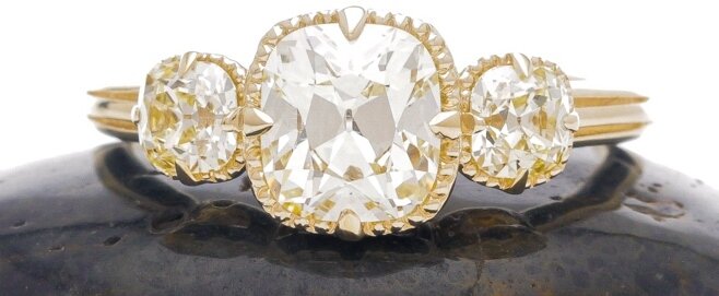
I put my M color AVC's in yellow as that seemed the best for my particular stones and I'm very happy with the result.

cropped avc.jpg

This is absolutely GLORIOUS! What a beauty in luxurious yellow gold! Thank you for sharing your gorgeous ring. I agree the Ms look great in the yellow. Do you think it made your M's more yellow or more white?
 
I think they look brighter. I don't know if I'd say whiter. But the yellow seems to make them just seem brighter to my eyes. The center was in a white setting when I bought it preloved and I think it looked warmer then. Here is a picture of it when it was in white metal
IMG_3670.JPG

The gold is DK's antique yellow. I'm going to tag @mrs-b as she has seen my ring in person and can probably give you more of an unbiased opinion of how warm or not they look in the YG.
 
@bling_dream19 - I've seen @Lookinagain's 3 stone and it's a beautiful ring. The yellow makes the M colored diamonds look clean and bright and takes away any slight muddy-ness you might see in warmer stones when set in platinum. Lookinagain's gorgeous 3 stone seems warm...but bright. It's a beautiful combination; the yellow is genuinely pretty, and the M's appear to be a soft white, as opposed to brown. I do think that 'soft' is the right word to describe the look of the diamonds. They aren't a blinding white at all - but they're not super warm, either. In the yellow gold they simply look soft. Just...soft. And the pretty yellow gold frames them beautifully.

All up, it's a great effect. (....and I'm sorry if that description is a tad subjective - it's hard to describe how colors appear to ones self!)
 
I would ask David for his opinion. I would let him know what you are trying to achieve and he will tell you the what's the best metal for the look you are wanting.
 
@Lookinagain that ring is beautiful!

FWIW I have 2 ks and a “cape” (n-z). The k set in yellow gold looks kind of golden in sunlight. It faces up white but would never pass as colorless. The k set in rose gold looks more peachy-beige than yellow. The cape set in 10k yellow gold looks exactly the same color as the 10k yellow gold, which is actually kind of cool.

IMHO that AVC set in platinum looks more attractive when it was set in yellow.
 
@Lookinagain that ring is beautiful!

IMHO that AVC set in platinum looks more attractive when it was set in yellow.
Thank you.
Yes, I'm much happier with my AVC now that it's in yellow. When it was in white metal it just wasn't very bright. Now, even though there is still warmth, it just looks brighter to me. It seemed a bit dull when it was set in white metal. I didn't realize it would look brighter when I had it reset into the yellow, but it definitely came out that way and I'm much happier with it. I never wore it much before and now it is one of my favorites.

Glad you found a setting that suits the diamond. It would be a tragedy if an AVC were locked up in a drawer somewhere.
 
GET 3 FREE HCA RESULTS JOIN THE FORUM. ASK FOR HELP
Top