shape
carat
color
clarity

Help me tweak my setting for a pink spinel :)

CBianco

Brilliant_Rock
Joined
Nov 25, 2021
Messages
701
Hello everyone!

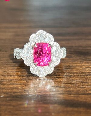
I traded in my 2.03ct Mansin pink spinel a while back for another ring but I never stopped thinking about it. This time around I got some extra funds and succeeded to buy it back and also had a setting done. However it didn't quite come out how I imagined it and I'd like to have them redo it.

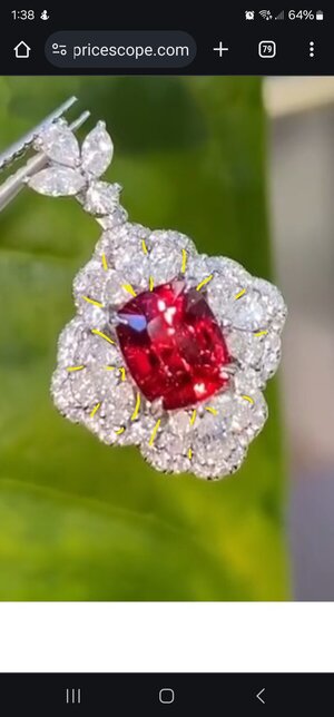
This is my inspiration pic
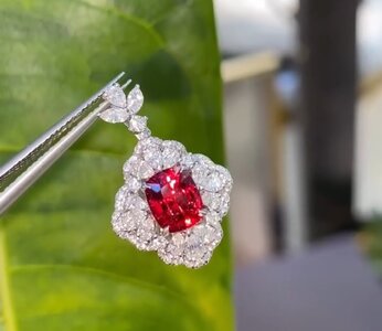
Screenshot_20240601_080331_Instagram.jpg

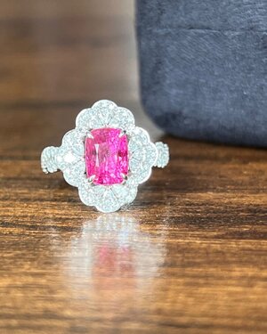
Finished ring
Screenshot_20240531_073111_Instagram.jpg

Now something doesn't feel quite right, I feel like my ring is too skinny and less fluffy like the inspo. I've asked about using bigger pears, but they said the gaps would be much bigger. So I played around using (poorly attempted) photoshop and came up with this solution so far, using marquise instead of pears in those 4 areas to give the ring more shape and a distinct look.
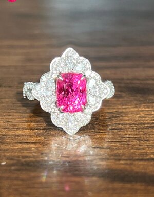
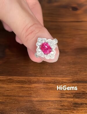
2024-05-31 12_01_17.978-0400.jpg2024-05-31 12_14_58.311-0400.jpg

I'd love to hear your opinions and creative ideas, thank you!
 
Lovely! :love:

Can’t tell because no side pics of your inspo - but my first impression it isn’t the size of the pears on your ring. It’s the angle and placement. The inspo placement looks to be varied, the planes / angles they are mounted on.
 
Lovely! :love:

Can’t tell because no side pics of your inspo - but my first impression it isn’t the size of the pears on your ring. It’s the angle and placement. The inspo placement looks to be varied, the planes / angles they are mounted on.

Thank you!

Unfortunately I can't find more pictures of that pendant, it's from a large volume IG seller and if it isn't sold already I'm not even sure they have it in hand:(2 And you're right the angle of the pears seems to lean more outwards in the pendant.
 
There appears to be a harsh metal edging around your ring whereas the inspiration pic is more relaxed and the frill around the pears is built with the tiny diamonds without any metal lines for guidance.

Your ring pears are also pushed together more tightly too.
 
As I scrolled down, I was amazed how spot-on your version is! I think it's just perfect!

I think "your" (well, vendor's) photos overexpose the diamonds to correctly expose on the colored stone and consequently show less contrast in the diamond areas. Since you don't have both items in hand, it's hard to compare your reality to someone else's idealized photo.

It's possible that your center stone sits a little higher -- but that's just a guess and I don't think it's a bad design decision and I certainly would not re-do the ring for that.

I agree with others that your version perhaps has more metal visible around the perimeter vs. the "infinity pool" design of the original; however, this can just be a function of the focal length used in the photos. (If you don't believe me, look for the helpful IG videos that zoom through the same portrait shot at various focal lengths and you can see ears go from invisible to prominent without moving the camera or the subject!)

All-in-all, you have great taste (as usual) and I would not change a thing.
 
There appears to be a harsh metal edging around your ring whereas the inspiration pic is more relaxed and the frill around the pears is built with the tiny diamonds without any metal lines for guidance.

Your ring pears are also pushed together more tightly too.

That would explain what I'm seeing as well, thank you for narrowing it down=)2

As I scrolled down, I was amazed how spot-on your version is! I think it's just perfect!

I think "your" (well, vendor's) photos overexpose the diamonds to correctly expose on the colored stone and consequently show less contrast in the diamond areas. Since you don't have both items in hand, it's hard to compare your reality to someone else's idealized photo.

It's possible that your center stone sits a little higher -- but that's just a guess and I don't think it's a bad design decision and I certainly would not re-do the ring for that.

I agree with others that your version perhaps has more metal visible around the perimeter vs. the "infinity pool" design of the original; however, this can just be a function of the focal length used in the photos. (If you don't believe me, look for the helpful IG videos that zoom through the same portrait shot at various focal lengths and you can see ears go from invisible to prominent without moving the camera or the subject!)

All-in-all, you have great taste (as usual) and I would not change a thing.

Thanks for your feedback! The stone sits high partially because it has a very high crown (that I love) and it doesn't bother me at all. I asked the vendor to send me more pictures of the ring so I can gauge better if its the picture's perception problem or it's really a design problem. I'm very glad you like my version as is!:kiss2:
 
Oh I'm going to be no help at all... IT'S STUNNING!!! :mrgreen2:
 
IMHO, the cushion Spinel in the inspiration ring is more curvy whereas your own Spinel has straighter sides and does not provide the same visual aesthetics, if you know what I mean.

However, I am not an expert by any means.

DK :))
 
Ok now that I'm staring at the 2 pics and specifically looking for differences, it looks like hi gems tried to minimize any gaps between the pear stones, whereas the original vendor kept some gaps in, which gave it a "fuller" look vs "streamlined"
 
Here's a crappy mark up showing where I see gaps in the original (yellow lines) that yours doesn't have (or barely has).
Screenshot_20240601_133808_Chrome.jpg
 
Honestly? I prefer yours. I like the lines are better, I think it's beautiful.
 
Oh I'm going to be no help at all... IT'S STUNNING!!! :mrgreen2:

Thank you!!:kiss2:

IMHO, the cushion Spinel in the inspiration ring is more curvy whereas your own Spinel has straighter sides and does not provide the same visual aesthetics, if you know what I mean.

However, I am not an expert by any means.

DK :))

You have a point there, mine is basically a rectangle with no curves at all :lol:
 
Ok now that I'm staring at the 2 pics and specifically looking for differences, it looks like hi gems tried to minimize any gaps between the pear stones, whereas the original vendor kept some gaps in, which gave it a "fuller" look vs "streamlined"
I think gaps are a pet peeve of his lol. I've done multiple projects with him and he always tells me it'll be ugly if they're too big:lol-2: And thank you:kiss2:

Honestly? I prefer yours. I like the lines are better, I think it's beautiful.

So glad to hear that, thank you!:kiss2:

I was going to say the same thing. I think it's beautiful as it is.

Thank you so much!:kiss2:
 
@CBianco I have the perfect solution for this little conundrum... give this ring to meee and just start from scratch. Problem solved!
anotherdancyguy.gif
 
Got a couple more videos, I think the ring looks better in these

Screenshot_20240601_230806_Instagram.jpg

Honey... it's perfection!
encore.gif
Listen, we're all fussy 'round these here parts, so I know how it is, and the decision, of course, is ultimately yours (you deserve to be 100% happy). But I would gleefully add this ring to my collection today and consider it a treasure.
1901755u4wkyfydjk.gif
 
Geez, I come back to admire your new bauble again and see my own comment.
Honestly? I prefer yours. I like the lines are better, I think it's beautiful.
:roll:

* Is our Mainely learning?:lol:
I'm a garble marvel!

Stop worrying. Your ring is loverly lovely.
 
Count me in as one who prefers your ring over the original. I, too, think it's stunning.
 
@CBianco, add me to the list of those who love it as is...I think the sparkle of the diamonds just somehow blurred everything together. It looks fabulous in the videos and extremely close to the inspo to me. The only slight difference I can see is the thin rim of metal around the ring and honestly imo it's a subtle difference and does not detract at all from the beauty of the piece.
 
Got the ring today, but not without fedex giving me a heart attack firsto_OThey delivered it to the wrong address but thankfully were able to go and take it back. It was too late for them to deliver again at that point so I went and picked it up at their location 5 minutes before closing lol!

Anyways, because of that I didn't get to see the ring in daylight but I really like it so far! There really isn't much if anything I'd want to change about the setting.
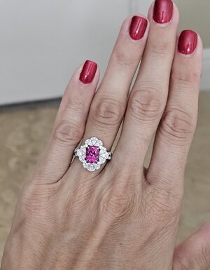
Here's a poor pic of it in white-ish bathroom lighting, will take more tomorrow if I get a chance. Can't wait to see it during the day!:kiss2:

20240606_200030.jpg

It's SOOOOO pretty!!!!
 
Honestly it's so pretty... That colour pops :kiss2:
 
So gorgeous. I can see why you had concerns based on the very first pictures but the videos absolutely showed how lively it is and your pictures are so lovely. You have had a few rings in this theme of vibrant pink stones and interesting patterned white diamond surrounds, and each has been truly stunning, but I do think maybe this is my favourite so far! It looks perfect in your hand.
 
GET 3 FREE HCA RESULTS JOIN THE FORUM. ASK FOR HELP

Featured Topics

Top