shape
carat
color
clarity

Help needed for NSEW Compass prong ring setting please!

e2the3rd

Brilliant_Rock
Joined
Oct 13, 2018
Messages
548
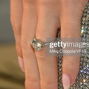
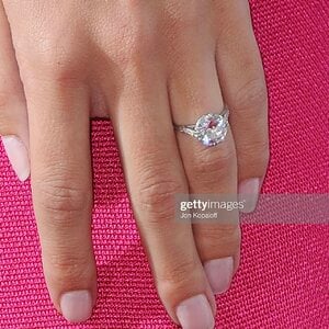
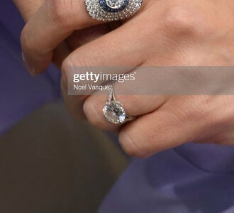
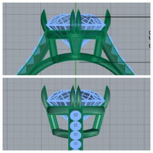
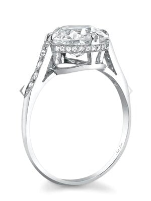
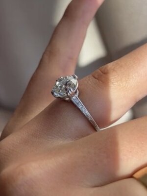
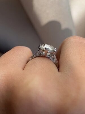
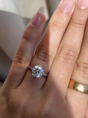
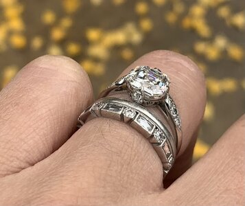
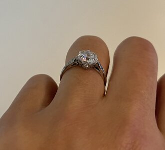
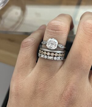
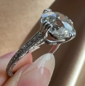
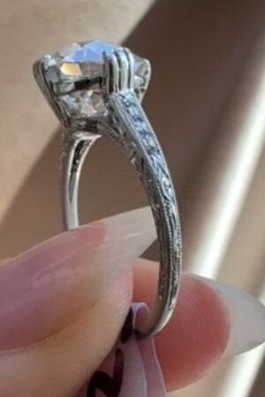
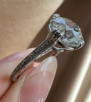
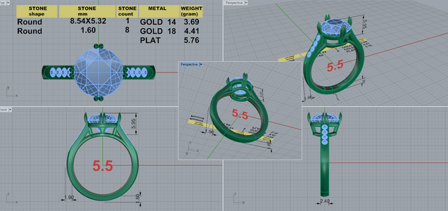
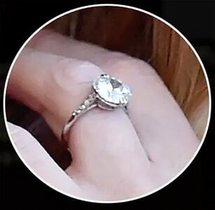
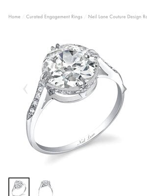
Hi all, I’m quite excited for this new ring - it’s based off of a celebrity Art Deco ring (with a much larger diamond).

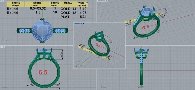
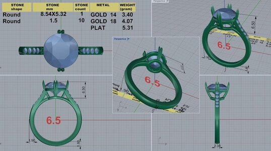
I would love any input to make sure I get this looking fantastic! I always have trouble picturing how the finsihed ring will look from the CAD. And I only had a few inspiration photos to go by.

My main question is regarding the point where the prongs begin / attach at the gallery rail — Will this look ok??

I’ve searched photos of a gazillion other compass set rings and many of them have the prongs begin from the bridge, but they aren’t double claws and they can look pretty clunky or bulky. I want delicate. (And simple and open, no swirly or scrolling designs etc.)

If anyone has any other ideas for the prong attachments, I’d love to see them! Or any thoughts on the rest of the design… I’m also wondering if 1.5mm accent diamonds are the right size, should I go smaller like 1.3mm?

Thanks!!
235360B5-777C-4429-949E-D7D6647941D9.jpeg9554A557-402D-4FE8-AE4F-A4FB318B5736.jpeg8CB514E0-C616-45FC-915B-4F3EB50199AE.jpegAFDDCC78-154E-4B42-B8BA-5CC76282F484.jpeg
E0BDF933-3BBE-4E1E-8AD1-3BE5AB723127.jpeg3BF6C83A-37AE-464D-A85D-37CCBDE982E0.jpeg
CF4FD787-4A98-4D60-B01F-69E6C91D49D3.jpeg

These images above and below I think are illustrations of the redesigned version by Neil Lane - from what I can tell from the photos of the ring on the hand, the original ring doesn’t have that hidden halo and the head isn’t as tall 495213D5-749B-450A-BEB4-0D0603030AEA.jpeg
 
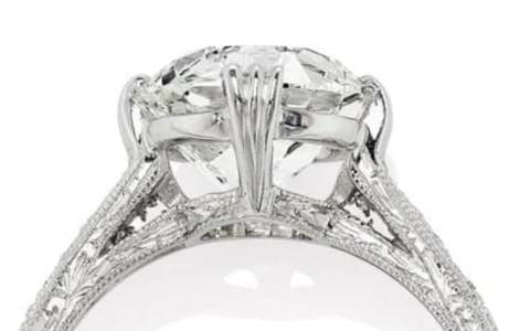
Here's an alternative way to do them (triple prong shown, but could be adapted to double prong): taper the prongs toward the bottom and have them split at the top

Original: VB Chelsea

1666391704605.png
1666391816886.png
 
Here's an alternative way to do them (triple prong shown, but could be adapted to double prong): taper the prongs toward the bottom and have them split at the top

Original: VB Chelsea

1666391704605.png

No way - I was just about to post asking for opinions on exactly this image !! I sent this to him asking if it could be double claw and still keep it delicate looking, or if he has any other ideas. Thank you!
 
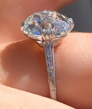
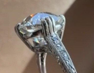
Wish we had a side view of the shank prongs for the above ring that @emmy12 posted. It flows so well and I like everything about the prongs and gallery area.

This is going to be lovely @e2the3rd !
 
Oh good! Ok I’m even more excited now to see the new drawing.

I had actually been kind of wanting a very similar bezel set version of the inspiration ring, which would be so much easier to figure out… but something about this one I *really* love, I guess it’s the NSEW prongs!

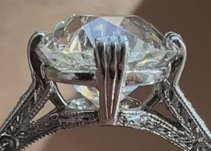
I took screenshots of the video of the ring emmy12 posted, not the clearest side view though
E0C1B4EE-8821-4E78-B51E-72F9876116E2.jpegBB8F4B23-B5BF-4AF5-9D2B-F1371A78A91B.jpeg57005E4D-9920-4363-9290-85F175AA9C76.jpeg

Was just in the process of doing the same. Ask a PS'er and ye shall receive!

The oval version of the Chelsea currently available had a good side view. I'm on my phone so the quality is probably potato compared to the one above on my computer.

Screenshot_20221021-223947_Chrome.jpg

And some more from the round video
Screenshot_20221021-223741_Chrome.jpg
Screenshot_20221021-223808_Chrome.jpg
Screenshot_20221021-223813_Chrome.jpg

Screenshot_20221021-223832_Chrome.jpg
 
My ER is Art Deco inspired and the prongs are set NSEW. These are a more like a pointed tab prongs but I think it can work with double/tripe claw prongs. 06912DF3-4E10-4C4C-B842-D13307F7AAA5.jpegEA72BA37-37BC-48C6-A46D-35ABA6471F11.jpegA8F46795-ED8E-4F62-87A3-BAA04C70FEB8.jpeg

@Muluver your ring and stone are stunning!!! just found your thread on the necklace reset, also stunning
 
Was just in the process of doing the same. Ask a PS'er and ye shall receive!

The oval version of the Chelsea currently available had a good side view. I'm on my phone so the quality is probably potato compared to the one above on my computer.

Screenshot_20221021-223947_Chrome.jpg

And some more from the round video
Screenshot_20221021-223741_Chrome.jpg
Screenshot_20221021-223808_Chrome.jpg
Screenshot_20221021-223813_Chrome.jpg

Screenshot_20221021-223832_Chrome.jpg

thanks again, @emmy12 !

I'm sure I'll post back here with the new drawing asking for more input. I so hope he can make the prongs more subtle, like my inspiration ring. If the split into double prongs can still start down below the girdle like the current drawing, and then have that barely-there look over the top of the stone, that would be my dream!

Looking forward to seeing the new CAD!
 
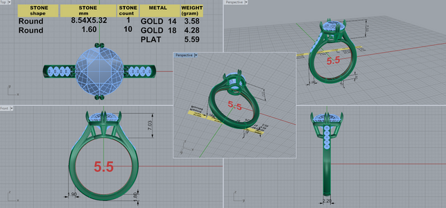
Here’s the new CAD. I just don’t know now!? Something about the previous one - more character or something? What do you all think?

latest cad with prongs starting from the bridge and more tapered head:
935AD4C1-932F-4D9D-ADFB-BC5996E88B22.jpeg

previous cad:
7A5560E0-755F-4197-9433-D66F70EEAF3F.jpeg
 
I like the new CAD and think it flows better but it’s really what you prefer!
 
I like the new one better. I'd consider some sort of gallery decoration, even if it's just some more struts, unless you like the empty look.
 
I like the new one better. I'd consider some sort of gallery decoration, even if it's just some more struts, unless you like the empty look.

Thanks! It does look a lot more open with the new version. I'm not loving that and/or maybe the more cupped side view of the prongs - from having them go over top of the gallery rail - though that might not be so noticeable on the finished product.

The stone in the inspiration ring is huge and set really low, so I think it's not such an open gallery. The first cad I got was set lower at 5.95mm so it looked a little closer to the inspiration, but I'm afraid of going that low. I had a different bezel ring with a smaller 7mm stone at a 5mm height once, and I couldn't stand it, I felt like it looked so odd on my finger
 
maybe the more cupped side view of the prongs

I agree that the "swoop" of the prongs has a curvature to it instead of being straight (more art deco).

In the reference and inspiration rings I would describe the prongs as flat, triangular tab with engraved grooves on them, and then the grooves split into prongs only once they come over the girdle of the stone.

I also like the donut over the bridge to be a little smaller so that the prongs go out at a more of an angle (rather than straighter up), but YMMV.

I think the shank looks a bit skinny to be proportional to the size of your center stone. I would consider going to a 2.5mm shank or adding in a reverse taper like on the VB Chelsea.

thank you for all of this!

I usually prefer the smaller donut / prongs at more of an angle as well, but for this particular one I do like it wider. to me it looks a bit less like a typical solitaire style and I'm trying to do something a little different

I've been back and forth about the shank width, it started at 2.4 and I requested it to be slimmer, trying to make the center stone jump out more? Then there was a 2.2mm shank cad before I asked to see 2mm. Also wondered about tapering it a bit wider as it reaches the stone.

this is the very first CAD with 2.4mm shank and lower set center stone. perhaps the closest version to the inspiration ring photos on the hand
DK 85968-QUAD 2.4.png

here's the 2nd CAD with a 2.2mm shank and I had asked for the stone to be a lot higher. to me the higher set stone and smaller donut looked like a more typical solitaire so then I requested it be set a little lower / wider donut again..
DK 85968-QUAD 2.2.png
 
I think the wider donut/lower set looks more period appropriate. Was there a specifically reason you didn’t like the lower set look on your other ring? My ER is set very low with a bigger donut and I think it goes well with the NESW prong look.
 
Last edited:
I think the wider donut/lower set looks more period appropriate. Was there a specifically reason you didn’t like the lower set look on your other ring? My ER is set very low with a bigger donut and I think it goes well with the NESW prong look.

Yeah gosh I'm starting to really like the first cad again with the lower/wider set center. I'm not really trying to do period appropriate replica or anything, but I do love it as-is!

The low set ring I had before was a reset. It started out at 6.5mm high in a modern open bezel, and when it was reset to 5mm high it suddenly looked so odd and really tiny on my finger, I just couldn't get used to it. Maybe this very different setting and and much larger stone than I had then will look great at 5.95mm high, like it does in the CAD. I'm going to see if I can get a plastic model (or two) to try on.

Yeah, maybe it being a bezel + being lower set made it look smaller on the hand. I think with this setting being more airy and the larger stone, it’ll look great lower set!
 
RHW first engagement ring was my first obsession while searching for the perfect ring. So fun to see somebody actually trying to replicate it! I chickened out and got the Margot from EW instead. Please post the end result!
 
RHW first engagement ring was my first obsession while searching for the perfect ring. So fun to see somebody actually trying to replicate it! I chickened out and got the Margot from EW instead. Please post the end result!

Oh wow! I was planning to go with a cathedral solitaire until I saw this ring on her hand! I looked at SO many rings and kept coming back to this one, so it’s the one!

I definitely will share the end result - if I don’t chicken out myself! I really dislike this custom process and usually get it wrong. Yet I keep coming back because I can never find the stock settings of what I want.
 
this is the very first CAD with 2.4mm shank and lower set center stone. perhaps the closest version to the inspiration ring photos on the hand
DK 85968-QUAD 2.4.png
Oh man! I really REALLY like this original CAD too! Wide donut and squatty with just the right angle to the prongs and the transition between the prong below and above the gallery rail flows nicely.... Is this just more proof that DK is very good at his job??? :lol:

For shank widths, I like the both 2.4mm and the 2.2 mm shanks you posted much better than the 2.0mm. They hold their own and compliment the center stone nicely without drawing attention to it. Were you concerned about the comfort of the wider shank? If so you could do a gradual reverse taper from 2.0 at the palm side going up to the 2.5 at the shoulders (like the VB ring).

Also, there's a shoulder detail on the original 2.4 CAD that got lost in the skinnier versions: he has a flat plane cut over the shoulder where the melee would be set. Where it transitions into the 10 and 2 o'clock positions (at the end of the 4th melee) there was space for engraving/other details as the shoulders transition to the shank. In the narrower versions that space got filled in with an extra melee (5 instead of 4).

Don't chicken out! I think this will turn out beautifully! Can't wait to see it :)

Thank you, again!

The first one does look the closest to the ring I want.. I'll just have to get over my fear of the low setting, because that's clearly what is making it look so right.

So you think the way the prongs originate at the gallery rail will look fine this way? I definitely prefer the basket like this (vs the bowed prongs starting from the bridge), and I like that triangle detail between the bridge and gallery rail at N & S. I was thinking I'd ask if there's a way to start the prongs as a single grooved piece of metal at the gallery rail and then split before they go over the stone, but probably not enough room for all that..

I'm going to ask to see it with a 2.2mm shank. After that with the shorter head, I'll see if I want to try the taper or not... I know it would look great with a little taper like the VB ring and others I've seen, I'm just afraid to deviate from the inspiration ring since I love it so much.

I did notice those details missing after the newer versions. It was originally supposed to be 5 accent stones on either side, and I was going to request again to have that triangle shape (engraved?) added at the bottom of the side stones
 
like that triangle detail between the bridge and gallery rail at N & S. I was thinking I'd ask if there's a way to start the prongs as a single grooved piece of metal at the gallery rail
I have a feeling that DK could have just have some engraving/filing done on the bottom part where it meets up with the prongs so that it looks continuous. I would just ask him about this and say what you said above about wanting it to have a little groove on the bottom part to echo the prongs

I was going to request again to have that triangle shape (engraved?) added at the bottom of the side stones

I would! Great idea!
 
GET 3 FREE HCA RESULTS JOIN THE FORUM. ASK FOR HELP
Top