shape
carat
color
clarity

Help us pick a FONT!

Status
Not open for further replies. Please create a new topic or request for this thread to be opened.

Independent Gal

Ideal_Rock
Joined
Nov 12, 2006
Messages
5,471
We're drafting up the invites and getting ready to print 'em. (Printed the RSVP's today and it was FUN! And I didn't even wreck them when I cut the sheets into pieces. Yay!).

Trouble is, we can't seem to find a sufficiently awesome font in MS Word. I was down with "Bodoni SVTY Two" but it just doesn't look that great except for when it's big, bold, and italicized (our names look great... the rest of the invite doesn't!)

So my q's:

1) Can we mix fonts for invitations?
2) Do you have fave fonts? Or if you DIY'ed, what font did you use?
 
I''m not DIYing anything since I''m not crafty at all but I''ll tell you what font I love. We had our save the dates printed in Bernhard Fashion BT: Here''s what it looks like:

berenhard fashion bt save teh date.JPG
 
I said this in another thread but for some reason, some of the letters look a tad faded or something on the computer. It doesn''t appear that way at all in real life. We wanted something that looked really nice but somewhat casual and not frilly. This seems to fit us very well. I''m kind of hoping we use it for our invitations as well, if it doesn''t look TOO informal.
 
I think, if done correctly, mixing fonts can be BEAUTIFUL on invites. I intend to try it myself. Check out the invites on Whiteaisle.com-- they mix fonts amazingly well! :)
 
mixing fonts is DEFINITLY AOK. :D I love how mixing fonts gives a great contrast. I am DIYing our invites, infact I just did up a whole bunch today! I should take some pics and post.

But we used Copperplate Gothic (i think that''s what it''s called) for the wording and then for our names we used Scriptina, bolded and a larger font size.

Originally we were going to have the names in a different color as well, but then it''s bad luck apparently to write your names in red (or shade of red...i.e. pink - one of our wedding colors) apparently so I just did made it the same (chocolate) as the rest of the invite, but with the bolding, different font, and different font size it came out great.

Hmm i will go take some pics and post!
 
I used Edwardian Script ITC, which I assume means "italic." I just like the scripted look it gave my DIY invites.

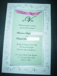
Here is a picture of ours...

DSC02950-PS-11.JPG
 
I agree that mixing fonts is fine, as long as you don''t try to mix in too many different things. One for the names and another for the rest of the text looks great IMO.

I found this free font site when trying to make a card for a friend the other day, its worth a look if you don''t like any of the options already in word: http://www.dafont.com/
 
Yes, you can mix fonts BUT (like was mentioned) don''t overdo it. Also, make sure they work well together... not two different ornate fonts or casual with formal, etc. Keep in mind different fonts have different spacing between letters and lines... differences could work or throw it off. Maybe stick with a font family for a little safer choices- like going with Donna Bodoni for your script or use swashes... or just post a mock up and we can help decide if it works or not.
 
Date: 10/14/2007 5:03:33 PM
Author: April Diamonds
mixing fonts is DEFINITLY AOK. :D I love how mixing fonts gives a great contrast. I am DIYing our invites, infact I just did up a whole bunch today! I should take some pics and post.


But we used Copperplate Gothic (i think that's what it's called) for the wording and then for our names we used Scriptina, bolded and a larger font size.


Originally we were going to have the names in a different color as well, but then it's bad luck apparently to write your names in red (or shade of red...i.e. pink - one of our wedding colors) apparently so I just did made it the same (chocolate) as the rest of the invite, but with the bolding, different font, and different font size it came out great.


Hmm i will go take some pics and post!
Love Scriptina. I also like Freebooter and Belphebe.
 
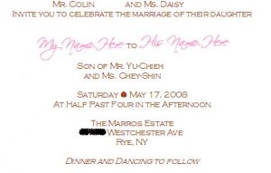
I took photos of my invites last night but forgot to upload them!!! Doh! But I found an old version of our invites on my computer here that shows the different fonts we used. The spacing and colors are all TOTALLY off but you get the idea in terms of mixing fonts. The real invites actually look totally different because we changed the spacing...I'll upload the real pics tonight.

The colors will be all chocolate, with our names slightly larger and bolded. It stands out really nicely I think.

AD_invite example.JPG
 
Status
Not open for further replies. Please create a new topic or request for this thread to be opened.
GET 3 FREE HCA RESULTS JOIN THE FORUM. ASK FOR HELP
Top