shape
carat
color
clarity

Help with David Klass CAD's (pretty please). :)

elle_71125

Ideal_Rock
Premium
Joined
Jan 29, 2012
Messages
6,266
I've got a new project in the works and I need some help. :D
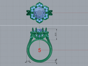
David Klass just sent me my first CAD's so I need your trained eyes. :mrgreen2: The ring is currently planned as 14k white gold and will have small diamonds in the halo.
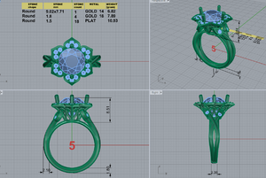
flower halo ring.png

- Does the halo look good? Any changes you'd recommend?

- The side (shank) looks a little thick to me. I will ask if he can thin it a bit.

- The profile is definitely not for me. I didn't have any ideas for it so David made this one up. The stone is deep at 7.71mm. Please help me come up with something else. This one just feels kind of bulky to me.
 
No suggestions - stunning design!
 
Sorry I'm useless with the finer details!

Only butting my nose in to say "Squeeeeeee!!! Can't wait to see it and see the pretty colours!"

I love the twisty bit on your shank!!!! So pretty!
 
No suggestions but pretty design, love how it looks like a flower with the petals all open and on display.
 
Ooh! So pretty! What center stone are you using?
When you say that you don't like the profile- what part?
The concave basket
The design in the basket
Or the buds and vines on the shoulders?
At a minimum I would have him thin down each side bud stem to make the bottom of the shank no more than 2mm
It will be lovely no matter what though!
 
Are you looking to:
1. Lower the height by 0.5 mm?
2. Simplify the gallery or just something different?
3. Tilt the leaves or flattish?
 
hehehehe This looks familiar! ;) I think it's a great start. I have a fair amount of thoughts so bear with me.

1. Are you good with where the prongs are and the number?
2. From lower left view, it looks like the stone could be lowered a bit. But from the lower right view, it looks like it's as low as it can go. I'd confirm it's as low as it can go. Like Chrono said, even .5mm can make a difference.
3. To mimic the pear shape on the shoulders, you could do pear shapes on the profile, all the same orientation or flipped (one up, one down, one up, etc.). I'd potentially even play around with mimicking the halo petal shape - these guys " } " - turn them N-S and see how that would look.
4. Does the shank fully come together toward the bottom as one band or is it two all the way around?
5. I almost want to see a version where the pear petal shoulders come up higher on the profile or even to the underside of the halo. I'm curious how that would change the profile view and the top-down view.
6. I think the halo design looks good. Just be sure to have him angle it downward slightly when they make it (so to avoid the flying saucer look).
 
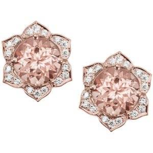
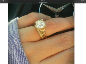
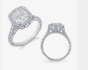
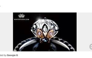
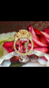
I was hunting for inspiration online yesterday and came across this. I think it's a similar petal halo. Gorgeous and something I'd like myself.8655278ae40cbdb517710213e9394a46--gold-diamond-earrings-diamond-studs.jpg

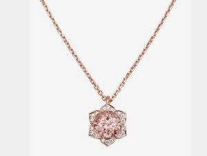
Great eye! This is the inspiration pic I gave him (but it was in necklace form). :lol-2:
 
2nd to Sparkliesluver's suggestion on angling the halo down a bit.
My engraved halo is flat. The initial drawing I did had it angled and TGP talked me out of it.
 
@Rfisher I don't like how tall the profile is. The concave basket seems ok but I don't know about the design. I'm also a little uncertain about the bud placement. Thank you for the input. I agree that the shank needs to be thinned down (2mm is my preferance). ;)2

@chrono Yes, I do think it needs to be lowered (as much as it can be). I'd like to change the gallery altogether. I just don't love it. I will ask that the halo be tilted a bit. Thanks! :D

@SparkliesLuver you're the best. Thank you for the notes. It's very helpful. :mrgreen2:
1. If I change the prongs, the only other idea I can think of would be to have 6 prongs (1 at the base of each petal).
2. I will definitely be asking if it can go any lower.
3. I like the idea of pear shapes on the profile. I can't visualize the "petal" idea.
4. The shank shows as two bands (even though they are connected into one). Would it look weird if I asked for the bottom to be one smooth section or should I just ask for each of the "vines" to be thinned out so that the bottom is thinner (~2mm).
5. I actually really like this idea. I don't want the little buds to get lost in there. I'll see if he will make up two CAD's so I can see both ways.
6. Will do.

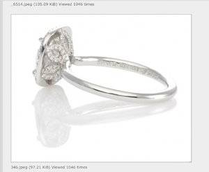
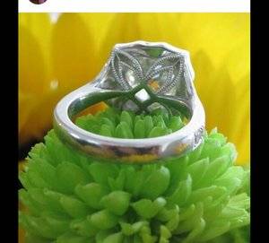
I'd love to see some pics on what I could do with the profile / gallery. Something that fits into the floral design.
 
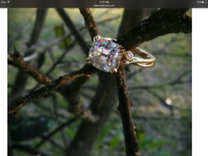
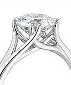
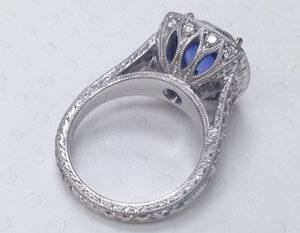
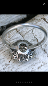
Here are some pic ideas. I don't know if they're feasible but I'm posting them anyway.

IMG_1994.jpg IMG_1993.jpg IMG_1990.jpg IMG_1988.jpg IMG_1987.jpg IMG_1989.JPG
 
Exciting project!!!!! Your stone is gorgeous and so will be the outcome.
I love the first 2 inspiration pics you posted for the gallery.
 
I like #2
 
Love the stone and inspiration!
1. The prongs would bother me. I would want 6 prongs so they are all in the center or on the sides of the petals. But, this is a personal choice.
2. This is a deep stone and I like the curve of the basket better than DK's. (This is an old JOTW so there should be lots of pics).
IMG_5373.JPG
3. I prefer the petal basket elements you posted above to the elements he is using bc they coordinate with the petal halo. His swirls also may look like hearts from certain angles.
 
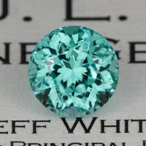
No feedback on the CADs - I'm not good with that sort of thing - but just wanted to say how gorgeous this project is going to be! That tourmaline is to die for and I love the petal design of the halo. In fact, the necklace version of this is pretty much exactly what I've been wanting for a 6mm round tsavorite. I may have to copy this theme for a pendant :evil2:
 
Omg that tourmaline is so divine. I can't wait to see your ring!!

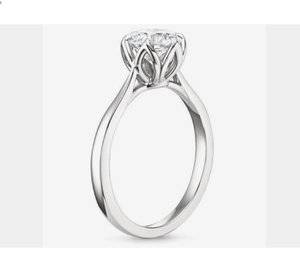
Here's a couple pics I had saved that may work or at least give you some ideas.

IMG_0293.PNG


IMG_3601.PNG
 
I love the petal design! :love: I second the idea of using six prongs. You posred some nice basket designs that look more like leaves underneath. What an inspired project! Your ring is going to be spectacular!
 
I really like the ones Arabella posted. Open enough to clean but enough fine touches to make it interesting.
 
No feedback on the CADs - I'm not good with that sort of thing - but just wanted to say how gorgeous this project is going to be! That tourmaline is to die for and I love the petal design of the halo. In fact, the necklace version of this is pretty much exactly what I've been wanting for a 6mm round tsavorite. I may have to copy this theme for a pendant :evil2:
That would look stunning! I hope you do it and then post oodles and oodles of pics. :Up_to_something2:

Omg that tourmaline is so divine. I can't wait to see your ring!!

Here's a couple pics I had saved that may work or at least give you some ideas.

IMG_0293.PNG


IMG_3601.PNG
Yes! This is exactly what I had in mind (without actually knowing quite what it was). :kiss2: The petal/leaf look on the first one is perfect!!! Thank you!!! :dance:

I love the petal design! :love: I second the idea of using six prongs. You posred some nice basket designs that look more like leaves underneath. What an inspired project! Your ring is going to be spectacular!
Than you. I will definitely ask for 6 prongs.

I really like the ones Arabella posted. Open enough to clean but enough fine touches to make it interesting.
Agreed 100% :D
 
Thank you guys for all of your help. You are all awesome!!! :D

So I emailed David and asked for several changes.
- Lower the tourmaline as much as possible.
- Thin out the sides so the bottom is only 2mm.
- Angle the halo downward a bit.
- Add in 6 prongs instead of 4.
- Change the profile / gallery to the one @arabella suggested.
- I also asked for a secondary CAD with the side leaves going up higher to just under the edge of the halo (I want to see how this affects the top view).

I asked for the prongs to be placed between each petal. Do you think it would look better there or at the middle of each petal (like the top prong in the existing CAD).
 
If you like bezels, could the tourm sit lower if you did a bezel instead of prongs? Don't mean to complicate things, but wondered if bezeling gives you any more mm.
 
All your changes sound great. I can't wait to see the new CADs! :)

As for the prongs, I'd personally want them between each petal. It seems too disruptive (to my eye) if they're in the middle of the petals.
 
IMG_2009.PNG
IMG_2010.jpg

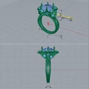
Here are the new CAD's. David said that the center stone is already as far down as it can go so that didn't change.:boohoo:
What do you think of the new gallery/profile? Also, the leaves, on the shank, were moved up higher. It doesn't change the top view but does affect the sides. What do you think?
 
I do like the changes better than the original, which was already really pretty to begin with.
If it were me- because I think the petal angle/curvature is so important I'd pay extra to have a wax/3D printed model sent to me. That and also the shank shape would be something so different than what I am used to.
 
It’s so pretty, Elle! I love the changes.
 
The petals of the original design are proportionally smaller than the petals of your design.
 
I really like this revision a lot, even if the petals are larger than the inspiration earrings / pendant set.
 
GET 3 FREE HCA RESULTS JOIN THE FORUM. ASK FOR HELP

Featured Topics

Top