shape
carat
color
clarity

Invitation font color?

Status
Not open for further replies. Please create a new topic or request for this thread to be opened.

Sabine

Ideal_Rock
Joined
Aug 16, 2007
Messages
3,445
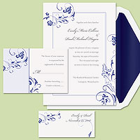
So I think we've picked our invitations. Our colors are navy blue, dark purple, light blue, and lilac. The navy blue is the dominant color (bridesmaid dresses are this color), so we really wanted that to be the main color in the invitations. We also really didn't want anything too formal since that just isn't our style. These invites are from exclusively weddings, and are pretty cheap too! The only thing we can't decide is what color we want the wording to be. We like the navy blue for the envelope liner, but we're thinking that if the font is navy blue that is too much. The sample that we got came with gray font, which I don't particularly like. Would a dark purple font be too much of a contrast? Would a light font like light blue, lilac, or even silver be too light and therefore hard to read? Any other suggestions?

Oh and while I've got the invites posted...the sample and the pic. have the font right justified...do you think this looks good, or would it be better centered?


Edited: Sorry the pic is so blurry, it is pretty small, so when I tried to make it bigger it got blurry
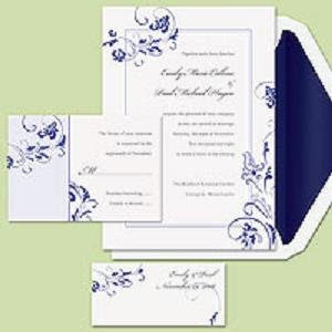
Invitationsize.JPG
 
Here is the smaller, less blurry pic:

Invitationcolor.jpg
 
I think it would look good with black writing and I like it right justified
1.gif
 
My old eyes have trouble reading light color print. I think the dark purple would look fine with the blue on the envelope.
 
Ditto Robbie! Though if you''re not feeling the black, I think you''d be safe with a different dark color (like the purple you mentioned). The lighter colors are risky for anyone whose vision isn''t 100%. Besides, you want people to want to read your invitation, and not to strain to have to do that
2.gif
, and that''s ever-so-slightly more important than the color coordination (but you know that already)
 
Thanks Robbie, Oshinbreeze, and Musey! Okay, so light colors are definitely out. Do you think navy font would be too much blue?
 
Those invites are really pretty!
I love the navy liner, and think that for a font you should go with either dark navy (i don''t think it would be too much),or black- it''s a classic.

I wouldn''t think a dark purple would look right, but that''s just me

Definitely not a light colored font- you want the wording to be the focus!
 
I''d go Black or Navy blue wording and center the wording. They are very pretty.
 
Date: 10/7/2007 11:55:33 AM
Author: Sabine

Do you think navy font would be too much blue?
If you went navy, it would be a monochromatic look, right? There''s definitely nothing wrong with that!
1.gif


The more I look at your invites, the more I LOVE them. The final product is going to be absolutely beautiful!!!
 
What about a fine black instead of a blue? That shoud definitely work. If not, I would try a dark purple. I think that would work within the colour scheme and still provide a nice contrast from the blue/white.
 
Thanks Labbie, WTNLVR, Musey (again) and Sha! They are all good suggestions. Now I''m torn...should I do classic with black, a nice monochrome with the navy, or contrast with extra color with the dark purple. I wish I could set up a poll to see what you would pick if it was you.

Also, anyone else want to ring in on the right justified or centered text?
 
I vote for the classic black text
and the right justified text
 
Status
Not open for further replies. Please create a new topic or request for this thread to be opened.
GET 3 FREE HCA RESULTS JOIN THE FORUM. ASK FOR HELP
Top