shape
carat
color
clarity

Invitation help

Status
Not open for further replies. Please create a new topic or request for this thread to be opened.

zoebartlett

Super_Ideal_Rock
Joined
Dec 29, 2006
Messages
12,461
I was just playing around and I came up with an invitation I like. Our save the dates feature a lighthouse that was designed by the person doing our invitations. I came up with two versions -- one prinited on navy blue paper (or a shade lighter) with white lettering, and one on white paper with navy (or a shade lighter) lettering. My save the dates were the latter and they look great. I posted pics of them on another thread but they didn''t look great because the cards are white and it looked funny posting it on the white background space here.

Here''s one of the versions. I couldn''t figure out how to post the other one (the one with the blue background) for some reason. What are your thoughts on the look and the wording?
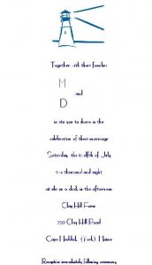
invitationwithwhitebackground.JPG
 
For some reason, the lighthouse image and the lettering isn''t the same. In real life, the lighthouse and the lettering of the save the dates is navy. Also, the lettering is hard to read on the computer but in real life it''s clear (I''m not sure why some of the letters looked faded on the computer). I like the idea of doing the contrasting/opposite of what we did for the save the dates (blue paper with white lettering), but I have no idea how to post that.
 
I like it with the white background! The only thing is... what do you think of a more wedding-y other symbol instead of using the lighthouse again? Just for variety... and maybe to make it a titch more romantic?

But I think it''s classy just how it is too!
 
Hi Indy!

Thanks for your input. I went with the lighthouse because it was on the save the date and it''s where my FI and I got engaged. I''m not set on using it again but I thought the save the date cards and the invitations "had" to match. Since we''re getting married at a restaurant that''s also a bird sanctuary, using a bird could work. I''ve thought of using something else but I''m not sure what...a dragonfly, cherry blossoms... but my mom (who''s paying for the invitations) isn''t crazy about those things. Hmmm, now I''m not sure. The printer we''re using has a line of simple drawings (www.albertinepress.com) that love, and the simplicity of some of her work was the inspiration for the look of our save the dates.
 
Hi zoe,

They look great, but I am confused by the "eleven o''clock in the afternoon"

Am I missing something?

Just thought I should point that out as I believe 11 can only be in the morning or the evening...

Sorry if that''s how it''s supposed to be!
 
Oops, you''re right Harleigh. I meant to type "eleven o''clock in the morning."
 
Yay! I got something right today! Do I win a prize or anything for that???
9.gif
 
Sure, Harleigh...would you like to pick from my prize box at school? I have some really cool Shrek erasers, Halloween erasers, a few glow in the dark Casper puzzles, koosh balls, book marks, and stickers. What''ll it be?
9.gif
 
Harleigh...go for the koosh ball. As you were on the BALL!!

Love the lighthouse...and the metaphor it expresses!! I am sure it looks far more elegant than it appears here. Too cool that that is where you were engaged. The simplicity of the image and just the two colors...I think I would lean more towards the colored paper. Only if the envelope or package matched though.

I see Indies point about having a wedding type touch somewhere...What about imposing a Script letter of your last name in the background say in a shadow or watermark? Or a letter of both of your first names and the & sign? That may add an element of elegance that I think Indie was suggesting. And if that is not what she meant...I like the idea.
2.gif
Using colored paper the watermark could be a pearlized faint touch that shimmers when the light hits it. Not sure if that is in your budget or available through your printing process.
I like how you tied the engagement theme onto your wedding theme.
36.gif


DKS
 
Date: 10/13/2007 2:42:53 AM
Author: door knob solitaire
Harleigh...go for the koosh ball. As you were on the BALL!!

Love the lighthouse...and the metaphor it expresses!! I am sure it looks far more elegant than it appears here. Too cool that that is where you were engaged. The simplicity of the image and just the two colors...I think I would lean more towards the colored paper. Only if the envelope or package matched though.

I see Indies point about having a wedding type touch somewhere...What about imposing a Script letter of your last name in the background say in a shadow or watermark? Or a letter of both of your first names and the & sign? That may add an element of elegance that I think Indie was suggesting. And if that is not what she meant...I like the idea.
2.gif
Using colored paper the watermark could be a pearlized faint touch that shimmers when the light hits it. Not sure if that is in your budget or available through your printing process.
I like how you tied the engagement theme onto your wedding theme.
36.gif


DKS
Thanks for the suggestions DKS! I never would have thought of the ideas you had. I guess that''s why we''re not doing it ourselves. I''ll check with the person doing our invitations and see what she''d recommend. I''m having a little trouble visualizing it but I *think* I know what you mean. You''re talking about a faded image as the backdrop to the words and the picture, right?

It''s sad that the picture of the lighthouse (and the save the date that I posted in another thread) doesn''t come across the same on PS as it does in real life. The save the dates look really great! No, they''re not overly romantic with flowers or anything, but they''re very nice. I like the simplicity of the drawing. I''ll probably begin to talk about invitations within the next few months, so I''ll see what our invitation person can do.

Is it expected that the save the dates and the invitations will match (or at least coordinate)? Will it look really random to have one thing have a picture of a lighthouse and another have say, a bird or something, without connecting the two?
 
I''m definitely more nontraditional than some of the brides here, but I think the only link needed between the save the dates and invites are you and FI! The only thing that matches with ours is that our invites are white and navy blue, so I used some navy blue lettering on the save the dates. They were a photo of us though, so nothing else really matches. I think the lighthouse idea is neat, so it would be cool to have it on your invites as well, but even if you don''t go with it, I think having the same color scheme would help them coordinate too.
 
Date: 10/12/2007 9:48:25 PM
Author: zoebartlett
Sure, Harleigh...would you like to pick from my prize box at school? I have some really cool Shrek erasers, Halloween erasers, a few glow in the dark Casper puzzles, koosh balls, book marks, and stickers. What''ll it be?
9.gif
I don''t know, the koosh ball sounds great, but I''m am freakishly drawn to the glow in the dark Casper puzzle...could be the fever talking, but there you have it!
31.gif


By the way, all wording aside, I love DKS''s suggestions and think that will add just the bit of class you''re looking for!
 
Status
Not open for further replies. Please create a new topic or request for this thread to be opened.
GET 3 FREE HCA RESULTS JOIN THE FORUM. ASK FOR HELP
Top