shape
carat
color
clarity

Invitation time!

Which do you like more?

  • Who cares about your crummy invitations? I just wanna see results! ;)

    Votes: 1 100.0%

  • Total voters
    1
  • Poll closed .
Status
Not open for further replies. Please create a new topic or request for this thread to be opened.

alli_esq

Brilliant_Rock
Joined
Mar 18, 2008
Messages
909
Hi, ladies!

I was wondering if you could give me your opinion on which invitations you would choose.

Some background facts:

--I loooove letterpress and found two vendors that are A LOT more reasonable than anything else I''ve found.

--My wedding "colors" are chocolate brown, burnt orange, and other autumnal colors (my wedding is the week before Thanksgiving).

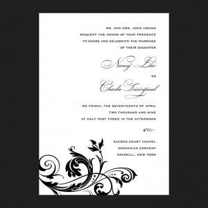
--#1 would have both the text and design elements in the same color (which is a chocolate brown on ecru paper).

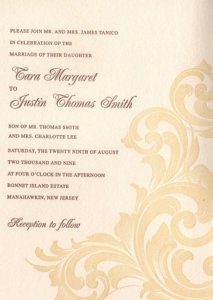
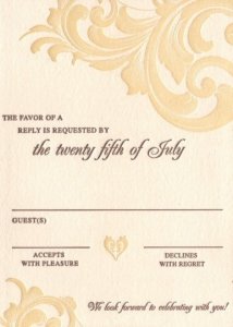
--#2 would likely be the colors shown (text in chocolate brown, design element in gold, paper in ecru), or I might decide to have the text in chocolate brown and the design element in blind letterpress.

--#2 is about $250 more expensive than #1 altogether, but if I got #1, I would be getting RSVP postcards and not RSVP regular cards.

--#1''s paper is a little (barely perceptibly) thicker than #2, and the letterpress is a little bit deeper. But both letterpress designs are pretty deep.

Okay, let ''er rip! I have to decide by today, though, because #1 is on sale and I have to order by today if I''m going to do it!
 
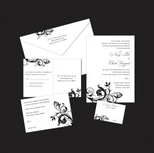
#1--all of the elements (though I''m only using the invitation, reply postcard and thank you note)

fleur-lg-1.jpg
 
#1, just the invitation

fleur-lg-2.jpg
 
#2, just the invitation

001esq.jpg
 
#2, the reply card

002esq.jpg
 
Thanks in advance for your responses!
35.gif
 
I LOVE #2! It looks so warm and autumny.
18.gif
 
I second the vote for number 2.
 
I voted for #1, because $250 is a lotta money! And I like the sharpness of the flourishes. Very pretty!
 
I love number one...love, love, love it.

To me, #2 looks so traditional, the colors look more peachy than autumn to me, overall they are just "so-so" in my opinion. #1 is more modern, which I''m always more drawn to. I feel like you could make #1 more custom post-production with a couple autumn colored crystals...it would just be a really lovely invite. Plus it has a thicker paper, deeper imprint...these are tiny details that I
30.gif
 
I voted #2 because it sounds like it goes well with your wedding theme. #1 is also a beautiful choice. You can''t go wrong with either one!
 
I voted for #1-I like it better, plus you save money too
 
I voted #1 because I like the idea of having RSVP postcards. But, they are both beautiful!!
 
I voted for #1. The colors in #2 don''t really remind me of autumn...I think it''s the peach that I don''t like. #1 has a more modern feel which is what my personal taste is drawn to...also I like the flourish details beter...and then on top of all that it saves you money! Never a bad thing.
 
I like them both but I voted for #2 based on the facts that it goes with your color theme of the wedding and it''s in the fall. Otherwise, I like #1 because it is very classy with black/white but it just doesn''t seem like it goes with your theme...
 
Thanks so much everyone for your opinions so far! I don''t know if I was clear--but #1 would be text/design in chocolate brown on ecru paper--NOT the black & white shown...

Does that make sense?
 
Oh, well then in that case #1! lol
 
I prefer number 1.

Can I ask where they are from? I''m also looking for letterpress invitations without blowing my budget. I did find one gorgeous set on Etsy but I''m still hunting around a bit. My FI isn''t convinced that invitations need to be so expensive. Men!
 
Sure--#1 is from Ajalon

#2 is from JazyRain

The customer service from both have been extremely accommodating so far, so I would recommend both based on my interactions with them!
 
Thank you all for your input! I have to say, I''m a little surprised, since I like the design of #2 more!

But I think I might go with #1, based on a few things:

1. The paper and imprint
2. The price
3. There seems to be something about #1 that most of you (and my bridesmaids) like it more!!!
 
I chose #1 for a few reasons. It is cheaper, way important IMO. It looks cleaner, crisper, and the design is more defined. And as others have said, #2 looks too peachy to me. I am absolutely in love with #1, they are just gorgeous!
 
I think they are both equally beautiful, so I chose the cheaper option!
3.gif


You honestly can''t go wrong with either, they are so pretty!
 
I prefer #2, but I almost always prefer things that look a little more vintag-ey as opposed to modern.

That said, it sounds like you are going with #1, and that is perfectly fine, those are gorgeous invitations.
 
I do not feel the two fonts used in option 2 go together at all, so I have a very strong preference for option 1.
 
I really like both of them! That''s a hard decision! I like #2 for November, but a lesser price is pretty sweet!
 
I love them both, but #2 stands out more. It has more personality. But if you''re the traditional type, then #1 is the one for you.
 
I love number 1. #2 is lovely, but they seem more plain than #1.
 
I guess I''m in the slight minority because I love #2! Both will be gorgeous, but the text on #2 really wins me over. Plus I love the colors as is.
 
No, thing2, I agree with you. If the paper and imprint had been as great as it was on #1, I would definitely order #2...I really do love the design so much more... but I can''t justify the cost if the letterpress just isn''t as luscious.

(did I really just use the word "luscious" for stationary? I think I did. oh dear, wedding planning has me crazy.)
 
Status
Not open for further replies. Please create a new topic or request for this thread to be opened.
GET 3 FREE HCA RESULTS JOIN THE FORUM. ASK FOR HELP
Top