shape
carat
color
clarity

Invite help!

Status
Not open for further replies. Please create a new topic or request for this thread to be opened.

karasue91

Brilliant_Rock
Joined
Aug 27, 2007
Messages
904
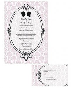
So, I have to run off to a training all day, but I need some help with my invites. The proof I received is very close to what I want, but I think the few things that are bothering me are:

1. The frame looks a little too hand drawn. I asked her for a frame-type oval, but I think this might be a little too ornate with the pattern in the background.
2. I think the pattern should be taken out of the oval where the info is
3. The pattern in the background - maybe it should be made a little bigger? I think I might like it better if the pattern weren''t so small....but I''m not sure why.
4. I think I would prefer the oval to be centered on the RSVP, rather than off the page and off-center...

Please feel free to critique!!

invite proof #2.JPG
 
Aw man. I really want to critique, but pic didn''t work.
 
crap why didn''t the picture work? lets try again

invite proof #2 ps.JPG
 
ugh..again

invite proof #2 ps1.jpg
 
what is going on? think i got it this time....so picky with the file names!!

invite proof 2 ps1.jpg
 
These look so much more like what you wanted than the first draft! Personally, I think the pattern on the background looks perfect as is - I don''t think I would like it bigger, but I''m not sure why. I agree that the frame looks a bit hand-drawn and I would center the oval part, too.

They look really nice!
 
Hi Kara! Oh I looooooooooooooove these so much better than the first proof.

I agree with the hand-drawn quality of the oval frame. Ask the designer to make it less hand-drawn. I think she was trying to give it a vintage feel, but I think that can be accomplished even if the oval is not hand-drawn. She can keep the shading...that''ll help to maintain the vintage quality of the frame.

As for the pattern in the background...I would keep it as it is. It''s beautiful, and the scale is perfect. Any bigger or smaller and it will be distracting to the text. It is well proportioned as is. And I like the fact that it is slightly opaque in the center of the oval frame. It looks awesome. The invite looks like a glass oval frame hanging on a wall. I think it would be too harsh to have the background of the oval be totally white.

If you want the inside of the oval to be white, you may consider toning down the pink shade of the pattern on the rest of the card. Just so it''s not such a glaring contrast between the part with the pattern and the part without the pattern. When I think vintage...I think soft or muted colors. That''s why I would avoid anything being too contrast-y.

I think the off-centered oval on the RSVP is very cute and whimsical. I would leave it off-centered. Maybe she can make it a little less so, but I would keep it still off-center. It''s unexpected and gives it a fun personality.

Overall, it''s gorgeous. BTW, I commented in the bustle thread that the latest issue of Martha Stewart Weddings reminded me of you. It has a ton of pink and black ideas, along with silhouettes. It''s the issue with all the engagement rings on the cover.
 
Ok, maybe decrease the opacity of the part where the text is inside the oval. Don''t make it completely white, but ask her to make the pattern a little lighter in there.
 
I agree with the hand-drawn frame needing to look more polished, but I wouldn''t make the pattern bigger or the pattern take out the pattern inside the frame, although maybe making it a bit lighter would help. I actually really like the off-centeredness of the response card!
 
Beautiful! Okay. Hmm. Honestly, I like them a lot the way they are. However, the hand-drawnness does kind of bother me as well. As for the RSVP, yeah I would prefer that that was centered as well. I am a symmetry-prone kind of gal. Off-center drives me nuts personally, but if you decide you like it and it stops bothering you then go for it it is very artsy! I like the pattern the way it is and as for the BG of the oval, maybe decrease the opacity a bit I totally agree with CrownJewel on that.
 
Yay, I''m glad you guys agree with me about the frame needing to be a little neater. Maybe she can just smooth out the lines a little to make it look cleaner. I''m starting to like the decoration of on the top, bottom, and sides, at first I wasn''t too crazy about it.

I think the pink needs to be a little lighter too, I''ll ask her to lighten that up. I''ll have her leave it the size it is, sounds like the consensus is that it''s nice as-is.

Thanks everyone!!! Keep the suggestions coming :)
 
Karasue, I agree with the frame edges needing to be meater, and I agree with CrownJewel that the RSVPs frame can be a little more centered, but just a little. I tend to like very symmetrical things but in this case I think off-center really works.

ETA - I'm not sure how I feel about the background showing in the oval. I think I would want to take it out and do a different color in there...maybe like a cream...not sure...
 

FSIL just had a great idea, what if we reversed the colors on the frame so it is filled in black, with the "shadow" lines white? Then it would look like a shiny black frame instead of being white how it is. I think I like the idea of the frame being darker....to balance out the silhouettes a little more, and make the info inside the oval stand out a little more.


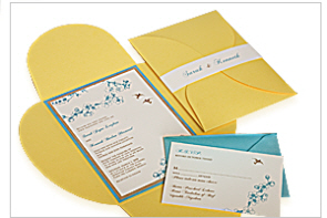
Also, the invite is going to be in a black pochette, like the one shown below so a little more black on the invite itself might balance it even better.


claud - yeah, the plan was for the inside of the oval to be ivory....


Starting to wish I had just taken on this project myself....the girl "designing" the invites really hasn''t offered much in the way of creativity, she''s basically just doing whatever I ask her to. Also hasn''t told me how much they are charging me per proof....this is proof #3!!! I really wish I could just sit down with her and change these little things so I can see it as we do it on her computer. Not sure if they will let me do that though....


Oh well, I know I''m going to love them when they are done :)


pochette_folder.jpg
 
I agree with what''s been said about the frame.

I think it might look really nice in black, especially since it''s going to have all the black around it. Where are the yellow invites from???

I would think 3 proofs would be pretty standard... not something you should be charged for. When it goes beyond what is standard is when you start getting charged for proofs and design changes.

The only thing is that if you reverse the colors, then the shadow becomes white and would look like the "light" was below the frame. A highlight would naturally be on "top" of the frame.
 
Date: 4/10/2008 1:30:31 PM
Author: sera
I agree with what''s been said about the frame.

I think it might look really nice in black, especially since it''s going to have all the black around it. Where are the yellow invites from???

I would think 3 proofs would be pretty standard... not something you should be charged for. When it goes beyond what is standard is when you start getting charged for proofs and design changes.

The only thing is that if you reverse the colors, then the shadow becomes white and would look like the ''light'' was below the frame. A highlight would naturally be on ''top'' of the frame.
Good point about the shadows/reflection off the frame, thanks!

the picture is from www.paperpresentation.com which is basically just a stationary store. i know they do invites in their store in nyc, but i don''t think they do them over the website.

argghhh this proof thing is frusterating, the first proof she sent me was TOTALLY not what i described to her. oh well, we''ll see what the bill is and i''ll dispute it then if it''s outrageous.
 
I just got WHAMED with an unpleasant surprise with fees (with my ring repair not with wedding stuff)... so I''m thinking you should ask them to give you a RUNNING TALLY of charges. So you know where you stand. Stuff adds up.
 
You didn''t have to repair your e-ring, did you?
Date: 4/10/2008 7:10:50 PM
Author: Gypsy
I just got WHAMED with an unpleasant surprise with fees (with my ring repair not with wedding stuff)... so I''m thinking you should ask them to give you a RUNNING TALLY of charges. So you know where you stand. Stuff adds up.
14.gif
 
Date: 4/10/2008 7:19:09 PM
Author: isaku5
You didn''t have to repair your e-ring, did you?

Date: 4/10/2008 7:10:50 PM
Author: Gypsy
I just got WHAMED with an unpleasant surprise with fees (with my ring repair not with wedding stuff)... so I''m thinking you should ask them to give you a RUNNING TALLY of charges. So you know where you stand. Stuff adds up.
14.gif
https://www.pricescope.com/community/threads/melee-replacement-cost.82887/ I broke one of my melee, yup.
 
Status
Not open for further replies. Please create a new topic or request for this thread to be opened.
GET 3 FREE HCA RESULTS JOIN THE FORUM. ASK FOR HELP
Top