shape
carat
color
clarity

Invites - what do you think?

Status
Not open for further replies. Please create a new topic or request for this thread to be opened.

NuggetBrain

Shiny_Rock
Joined
Mar 20, 2009
Messages
206
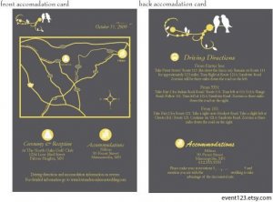
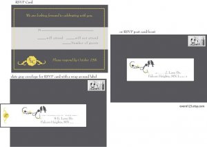
So we are having our invitations designed (since we couldn't find anything we both really loved). Anyways, here's some examples of what they will look like (the colors are the same, but the wording is stock). We don't have the actual invite yet, but it will pretty much look the same as the rest - the border and the birds and the monogram. It will pretty much look like the back of the accomodations card, with the birds on top and across the bottom the monogram centered with scrollwork on either side.

What do you guys think? Anything we should change? We are thinking of getting rid of the monogram but don't know what to replace it with. Suggestions?
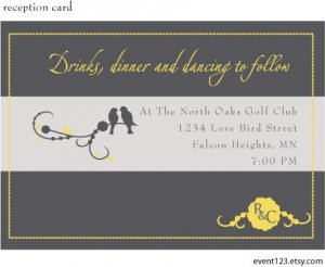

Reception Card:


NuggetReception.jpg
 
Directions and Accomodations card:

NuggetDirectAccom.jpg
 
RSVP Card:

NuggetRSVP.jpg
 
i really like them, nugget!
36.gif
 
Love em, love em, love em.

the colors are gorgeous.
 
They''re beautiful. Love them.
 
Nice! I love the birdies.
 
Beautiful! And while I am guessing that the RSVP envelopes will be more expensive, that wraparound label is gorgeous!
 
I love those colors nugget!! they look great!!
 
Love those invites! And the colour combo is so hot right now (...Hansel)!
 
Thanks! We are thinking of getting rid of the monogram, and adding some detailing that looks like the branches the birds are on instead only longer. FI has an issue with how "flat" the cards look, so we''re thinking of adding a little rhinestone to the center of the biggest bud on the branches.
 
Nice!! Wow! I love it!! The colors definitely complete each other!!
 
They''re adorable!
 
Very nice! I think they''ll make a great impression on your guests!
 
I love the colors, the fonts and the art. I wouldn''t change a thing, it''s just delightful.
 
I love it! Love the artwork, and the colours! Are they the main colours of your wedding?
 
Love the colours, they are lovely
1.gif
 
Kama - yep, they are the main colors. We are going with a slate gray and yellow, with accents of white. We''re trying to figure out how we''re going to do that with the reception without looking depressing (too much gray), or like the sun exploded in the room (too much yellow).
 
These are really nice invitations. Beautiful.
 
those are so unique... love the color scheme!!
36.gif
36.gif
36.gif
 
Date: 7/30/2009 9:48:28 AM
Author: NuggetBrain
Kama - yep, they are the main colors. We are going with a slate gray and yellow, with accents of white. We''re trying to figure out how we''re going to do that with the reception without looking depressing (too much gray), or like the sun exploded in the room (too much yellow).
I don''t think you have anything to be worried about - the gray, yellow and white would be beautiful together. Can''t wait to see pics of your decor after your wedding!
 
Beautiful! I like the colour scheme.
 
They look gorgeous, and the colours go really well together.
1.gif
 
I love those colors together and I think all the pieces look great!
 
those are really nice! gray and yellow are such a pretty combo.
 
Status
Not open for further replies. Please create a new topic or request for this thread to be opened.
GET 3 FREE HCA RESULTS JOIN THE FORUM. ASK FOR HELP
Top