shape
carat
color
clarity

Need help with CADs for my paraiba 3 stone

elle_71125

Ideal_Rock
Premium
Joined
Jan 29, 2012
Messages
6,266
I’m starting a new thread in the hopes that I’ll get more input.
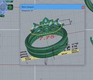
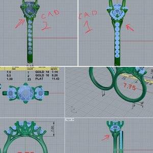
A couple weeks back I ran a poll on what to set. My mahenge won based on the numbers but most of the comments were voting for the paraiba three stone. So, here we are. Now I need help with the CADs. I’ve never done a three stone before and I have no freaking idea what I should be looking out for. Please point out anything that seems off to you.
AD9A8104-D892-4D98-8B10-50FD15E74D67.jpeg
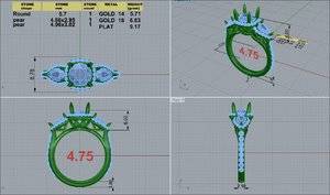
1. Do you think the shank can go down to a 2mm?
2. The profile seems a little busy to me. I want it to be beautiful but not over the top. Please give me ideas. :pray:
 
I'm no help with the CAD because I have no experience with them at all and think it looks beautiful. I can't wait to see it finished! So, so gorgeous.
 
are you using vtips on the pears?

FYI, I kinda suck at cads...:lol-2: But I agree with you on the profile, it looks busy. and really if you had to get in there to clean, that could be a nightmare. Maybe remove some of the bars there. Also how big is your finger again? is that going to be too big? is that why the sides are stacked under the main stone?
 
I don't consider the side profile busy per se- but could well hamper cleaning if the underside isn't totally open.
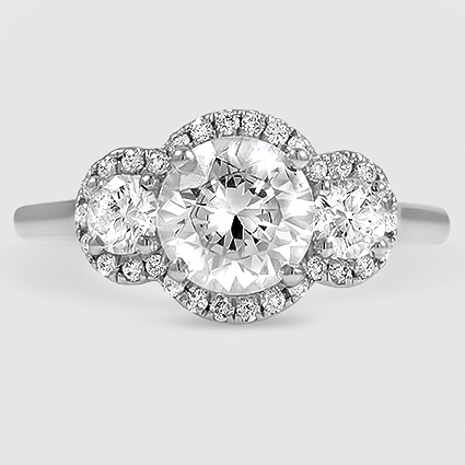
Then there's the oft asked question- do you not want the halos tilted any? Doesn't look like the inspiration ring is tho.
My last thought would to be make sure the actual ( outline) shape of the pears was scanned before the cad is cast. It would bug me to no end if the shape of the halo didn't match the uniqueness that pears can have.
It will be lovely!
 
I'm no help with the CAD because I have no experience with them at all and think it looks beautiful. I can't wait to see it finished! So, so gorgeous.
Aw, thank you. I’m hoping it’s as beautiful as I’ve imagined.
No worries. Despite having done this many, many times, I still suck at reading CADs. :shock:

are you using vtips on the pears?

FYI, I kinda suck at cads...:lol-2: But I agree with you on the profile, it looks busy. and really if you had to get in there to clean, that could be a nightmare. Maybe remove some of the bars there. Also how big is your finger again? is that going to be too big? is that why the sides are stacked under the main stone?

I’m a 4.75. I have no idea how pears are set, since these are the first I’ve had. Is a V-tip a good idea?
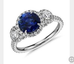
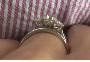
As for the sides, I didn’t specify how they should be placed. He just went off my inspo ring pic. Having said that, I definitely prefer this....
681346C7-952D-4971-91F7-22CF152C8D5D.jpeg
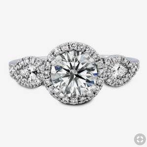
To this....
023E72EE-B4B6-44EC-8506-CAA77A16F5C4.jpeg


I don't consider the side profile busy per se- but could well hamper cleaning if the underside isn't totally open.
Then there's the oft asked question- do you not want the halos tilted any? Doesn't look like the inspiration ring is tho.
My last thought would to be make sure the actual ( outline) shape of the pears was scanned before the cad is cast. It would bug me to no end if the shape of the halo didn't match the uniqueness that pears can have.
It will be lovely!

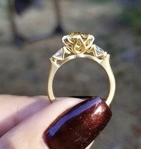
I asked for the underside to be like this one because I liked how it was a bit open under there. I thought that might help with cleaning. I didn’t specify how the profile should look so that’s all David. It looks beautiful but just a hair busy.

Ok, work with me on the halo. Do you mean each halo should be tilted? Like on an angle?
Great tip about the pears. I’ll bring that up with David. :mrgreen2:

00F414A6-BC65-448F-985D-B6E79122B3D5.jpeg
 
V tip can help protect the points of your pears as with any stone that is considered a weak area. Of course if the person making your ring can work it in to the ring where its not super obvious is even better But you're also doing halo, so if you halo the stone, just make sure that they protect the points, a prong with a mele hiding it well as in one of your other images. (I'm having issues quoting with reply, probably my stupid computer....:angryfire:)
 
Both of my inspiration rings have v tips,I didn’t even realised until now. Doesn’t look bulky.
 
I second, third, or whatever V tip the pears.
 
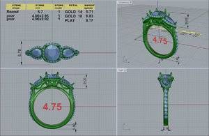
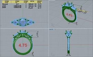
New CAD's. What are your thoughts? I lightened up the profile and asked him to tilt the halo a bit. I also asked that there be limited metal around the halo (because I like that blindingly blingy look). :cool2:
BTW, I'm planning on doing inverted v-tips on the ends of the pears.
Paraiba cads.jpg
 
Last edited:
so excited to see the final product! I am garbage at CADS and think it all looks good until some points out an issue haha. But this is going to be so stunning!
 
I like a lot better!
First one was by no means ugly tho.
 
My only comment (other than the fact that I love it and it will be beautiful!) is that I find the non-matching side stone baskets mildly distracting. The concave main basket vs convex side stones (or did I mix terms up) appears less homogeneous to my eyes.
 
I can see the observation that the gallery is a bit busy. While I love the center gallery design, with a stone of this size, I'm not you can will be able to see the fine wire inside the petal spaces and it might just look metaly.

This is @2ndchance ring by DK. Her center is 1.16 AVC (~6.2 mm), so its probably about the size of your center with the halo added. With your double petals, I'd fear they will get lost in the design.

upload_2018-11-4_6-3-56.png
Thread. https://www.pricescope.com/community/threads/1-16-k-avc-w-traps-here-and-sized.222599/
 
My only comment (other than the fact that I love it and it will be beautiful!) is that I find the non-matching side stone baskets mildly distracting. The concave main basket vs convex side stones (or did I mix terms up) appears less homogeneous to my eyes.

Ah! Thank you for putting into words what I couldn't quite put my finger on. The tilted halos make a huge difference (they look great!), but for whatever reason, the contrast between the center and side baskets is drawing my eyes away from the center stone.

Sort of a combination between @molecule 's and @rockysalamander 's comments. The different cup shapes draw my eyes to the side stones, and I think all the negative space around the side stones does as well. So maybe either lighten the center basket or add more to the side baskets or both? Just something to visually harmonize the two.

But super excited to see it in full blown paraiba color. I'm sure it will be gorgeous!
 
What about a triple halo without stone between each of the stones? This would draw the eye to the color and centers, but gain you the halo and sparkle...

3%20Stone%20Halo.jpg
 
Thank you for all the help @molecule @elliefire99 & @rockysalamander :D
This ring means a lot to me and I want it to be perfect but it’s been a struggle. It’s my first three stone and I’m finding that’s harder than I expected. :confused2:

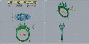
Here’s my latest CAD. I asked David to adjust the petals for the sides. Are these any better.

5F0BA021-669D-43AD-ABE7-B9816262FC66.jpeg

I asked DK to squeeze in the sides a little bit but it left me with a weird donut from the side. I’m going to ask him to fix that.
 

Attachments

  • 9D19F166-A2F6-421E-946F-716A590F7408.jpeg
    9D19F166-A2F6-421E-946F-716A590F7408.jpeg
    197.3 KB · Views: 35
I like your CAD as-is, and I like the gallery view of the two sidestones. I think the basket of the center stone should be simplified a little to better match the gallery of the sidestones. Right now, the basket is an 8-petal flower design, and I would prefer to have the number of petals go down to 6 or 4.
 
Wow, such a fast turn around from DK!

The change to the side baskets is very slight, but it makes a difference I think. If you like the 8 petals on the center basket and are happy with it, go for it, but I agree with @voce that fewer petals may give you a lighter look that harmonizes better with the side baskets.
 
I like your CAD as-is, and I like the gallery view of the two sidestones. I think the basket of the center stone should be simplified a little to better match the gallery of the sidestones. Right now, the basket is an 8-petal flower design, and I would prefer to have the number of petals go down to 6 or 4.

Thank you for putting this into words for me. I couldn’t see how to lighten up the center basket until you pointed out the 4, 6, 8 petal thing.
Do you have any pictures of a 6 petal design?

Or should I be doing a totally different profile like @rockysalamander suggested?
 
Each petal is a "point" on the basket. Like each little pear shaped ring that comes to a point at the top. The petals can overlap like yours, or not, more as a matter of personal preference.

I am inferring that this gallery has 8 petals, because there are three points/petals visible from the profile view in the CAD. I assume there are also 3 on the other side (that brings us to 6), and of spacing is consistent, there would be 2 more on either side, where the side stones are. Even if these two side petals don't actually exist (due to the side stones), the petals are SIZED as if to fit 8 around the basket. Does that make any sense? Haha

In a 4 petal basket we would likely just one full petal/point in the side view. So you have one petal on each side of the ring. But they could still overlap if you want.

In a 6 petal basket, you would maybe see 1.5-2 petals/points in the profile view (like 1 full petal, and one half of a petal on either side of that petal).

The fewer the petals, the bigger each one has to be to make it around the circumference of the stone, which means less metal and more open space. :)

I will see if I can find good pictures, because I'm not sure I explained that very well. Haha
 
Thank you @Lovinggems :D This made sense to me. After staring at the CADs for far too long, I think there are 8 petals there too. Reducing that seems like the way to go.

@elliefire99 Thank you for this detailed explanation. Super helpful! :D
I'm going to try going down to 4 or 6 petals. I definitely still want them to overlap. It's just a nice look in my opinion.
 
I'm so excited to see this piece finished!!!!!
 
GET 3 FREE HCA RESULTS JOIN THE FORUM. ASK FOR HELP

Featured Topics

Top