shape
carat
color
clarity

New Entertainment Unit...Needs Assistance!

Status
Not open for further replies. Please create a new topic or request for this thread to be opened.

Mara

Super_Ideal_Rock
Joined
Oct 30, 2002
Messages
31,003
Slow morning and I know how PS''ers love to shop and decorate so lets see what you gals think...

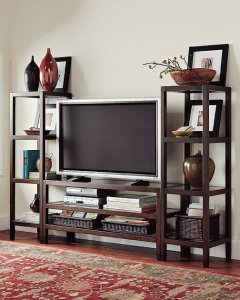
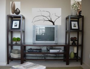
here is our new entertainment center from Pottery Barn..we adore it but it still needs a little bit of work as you can see from this picture. I ordered 2 long dark baskets from PB for the bottom shelf (they are shown in the catalog page if anyone has it or you can look online, they fit perfectly in the bottom there for cd''s etc)...and those are arriving today I think. The wires and cables, Greg bought a bunch of 1/2 length cables that he will switch out over the weekend so those will finally go away and we are going to velcro the plug in surge protector to the back of the EC on one of the rails so no one can see it.

So that said, there is still alot of wall space behind the TV and also on top of the two end etagere''s. Our ''cutout'' is pretty bit, it was about 95" wide and 108" tall and we couldn''t find anything that looked ''open'' like this and was taller so we figure now we have to kind of build up using the wall space etc.

I have seen catalog pages in PB etc where people are starting to put pictures and frames etc behind the TV in these types of TV configurations. So I am thinking of carrying through the picture ''theme'' from the family room walls to behind the TV to kind of bring it all in. Problem is that the frames I bought from RH are sold out and they aren''t getting more so I will have to improvise and find something similar OR track down something the same or have it custom made.

For the tops of the etagere''s I am thinking tall funky vases in browns and woods to go with the rest of the room, maybe greens if I can find something cool in textured glass or similar. The family room is natural woods and browns/chocolates with green for accents.

Anyway another idea occured to me which Greg didnt LOVE but I am still thinking about it, we always complain that our fam room is really dark at night because there is only one light over by the kitchen on a table, I was thinking of getting some funky wood ''paper lantern'' kind of things (CB has some that I will post) that I could use on top of the etagere''s to add some height AND light to the room. But does this sound too funky? Should I just stick with vases?

So anyway that''s where I''m at now, trying to figure out the top two etagrere shelves and the space behind the TV. Next picture will be of the whole small family room to get a better idea of what''s on the walls etc.

Ideas welcome!!
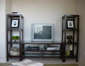

new ec 2006 c.jpg
 
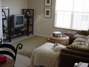
Here's the overview of the room itself...also our kitchen 'flows' into this room (that is where I am standing to take the picture) in case that makes any diffrerence..the colors in the kitchen are tans and blacks and neutrals with green accents (rugs, towels etc) so it all works together pretty well.

As you can see the pictures on the wall are taller than the EC area, that's because the wall goes up significantly higher which is why I am thinking of tying it all together with some similar images and frames as the thin black with white matte behind the TV. Maybe a collage of some various types of sizes and shapes behind the TV? The top of the 'cutout' for the TV area is actually almost aligned perfectly with the top of the top black/white wall picture. If that helps.

Oh and one more thing, it's really hard to convey 'room warmth' in these pictures but we are VERY happy with the EC so far, it looks so much better than our old unit and this fits more with our house style and our couch and all that, but I just want to do the few 'extra' things to make it really be 'part' of the room.


new ec 2006 b.jpg
 
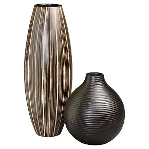
Here are two vases I like from CB for the top of one of the etagere''s...

BarrelVertStrBlkRippleVases.jpg
 
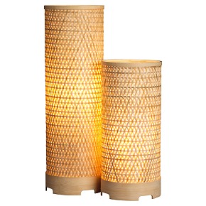
and here are the 'lamps' i thought could maybe work for the other etagere to give us some light when needed.

but do these look totally 'off' and not go with the rest of the room? i also feel like they almost look a bit cheapy...it's so hard to say. i am really about coordinating and matching but not being obvious about stuff. i thought about doing 2 sets of these one on each etagere but Greg said that would look way too symmetrical.

Thoughts?


TaikadoLampsLitS6.jpg
 
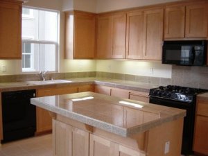
and obviously it does not look like this anymore but this is our kitchen before we moved in to give an idea of colors etc. part of why i went with black on the picture frames in the FR is i wanted to draw some of the kitchen into the fam room but without making it obvious. it works really well together, using brown and black together in the FR. our chairs for the island are black iron scrolled bar chairs from Pier1. ETA you can see the scrolled iron bar chair in the picture up above of the fam room.

kitchenc.jpeg
 
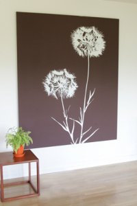
I've been seeing these cool linen wall hanging kits showing up in magazine layouts lately. It doesn't suit my current home but would have looked great in my more mod old Brooklyn pad.

Check 'em out ...

http://store.txtlart.com/trflle.html


ETA: what about painting the wall behind the unit a dramatic color. Choc brown or burgandy or even a subtle sophisticated dove grey. There's a similiar discussion going on on

http://designsponge.blogspot.com/

Scroll down & see this gal's apartment photoshopped with multiple different color schemes & people are voting.

smallgreen.gif
 
ok and last one...here is the new EC in the PB catalog...to see how they decorated it. my two baskets that are coming are the ones on the bottom shelf on this picture.

OH and in case an eagle eye notices, yes this is an LCD wall unit and we don't have an LCD!! yet. we're getting one sometime this year but our TV seems to fit okay on it (it's heavy though) and it looks good so hopefully we can hold out til summer or so to get an LCD. i was afraid the TV would look silly on it but it actually works out okay!


gayleECb.jpg
 
Oh those are cool Deco...do you have any images of magazines or rooms where they show how they are used? I have never seen them before.

Funny thing is that I don''t consider ourselves ''modern''...but we totally lean that way I guess in certain ways. My ''style'' is so all over the place, it''s hard to say that I even have one! This EC is a little too modern for me but we wanted something that was open and airy and would not darken the room since it''s small, and this worked perfectly with the taupe couch we have and I have the CB salon lamp in the room too which is a dark espresso bulby base and a linen textured shade.

Another idea could be to get something like this linen hanging and actually frame it in one of the thin black frames to kind of tie it in together...hmmm ideas ideas.
 
Date: 1/25/2006 2:16:39 PM
Author: Mara
Oh those are cool Deco...do you have any images of magazines or rooms where they show how they are used?


I first saw ''em before X-mas and then I started noticing them in so many layouts! You''d think they were just cool art if you weren''t familiar with the patterns from visiting the site. The latest time I saw it was this month''s DOMINO mag. They come on these stretching canvas things & just hang like a painting. But are BIG ... so big bang for less $$.


There''s also THESE ... amenity''s version of similar ... found here ...
http://www.velocityartanddesign.com/amenity_prints.html
but they are pricier ($375)


amenity_print_driftwall.jpg
 
Mara--Your new TV unit is great. I love the openness--so different from the usual bulky ones. I think the vase idea is good...maybe with some branches in them to add even more height? The large wall hanging idea behind the TV is good too. I have seen some design shows lately where people blew up a photograph really large until they were a bit grainy then stretched them over canvas. I could see that done with a leafy picture from your wedding or honeymoon.

Another idea--how about uplighting the vases or plants? You could use small lights that would virtually be hidden. It would lend some interesting shadows on the ceiling if you do branches in the vases.
 
Congrats on the new addition...I actually think you should leave the space around/in back of the TV. Mybe if you want, but something small next to it. But pix/prints around it might distract me. I say leave it and you can fill it up if you go lcd. Although I could see a tall slender vase with some twigs in it...on the side/rear of the tv to add some height/take up space

I like the idea of the lamp and also a vase on the other shelves...

oh, I agree that two sets of the lamps is too much. Symmetry is nice to a certain extent...and I have urges like that two...there is enough symmtry on the unit...more matching and it won't look right imo
 
I agree with painting the wall behind the unit a color. Maybe a shade of green. Also I like how in PB they have several small groupings instead of one large item on each shelf. It gives it more interest/texture. You could always hang a long floating shelf a foot above the unit and arrange pictures, vases, ex... on it (the same brownish/black the unit it). It would give it a more built-in feel. I do like those vases from CB you posted. They would look great in your place!

ETA: I really like the stacked book look. Maybe you could add some and see how it works in your room.
 
And LOVE the prints deco...I LOVE the twig print...which is funny b/c I have nothing in that cool mod style...I find myself liking that style, but yet my place is the opposite. I tried a tall mod vase and it was so out of place, it went back for a big urn style...back to the traditional...When we move I''ll get brave and redecorate!
 
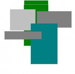
What about using paint? I''ve seen some interesting "art" created using shades of the same color...in your case maybe a sage green? I could see a vertical rectangle behind the TV with a couple of horitzontal ones on the sides. This is a very rough idea using paint. You could make it more or less busy. I would definitely use softer tones.

paintblocks.JPG
 
Thanks for the ideas gals!! I really like all of them, giving me some inspiration...

another idea i had re: color for the back of the TV...in our model of this house (the model house, not ours!) downstairs we have this huge really tall wall and all they did was paint 3 big huge rectangular canvases a beautiful red color and stacked them vertically. it was a great way to give the room color and add a visual, maybe i could do that with 2 thin longer vertical canvases or even 4 small ones and do them all in the same shade of green? it's a cheap way to give the room some complimentary color.

i do love the idea of a wall hanging or something behind too. i don't want to leave the big blank space because i always feel like there's already too much white wall space in our house. i am a nut for having it look 'cozy' and filled in.

oh and i love the idea of the shelf on the wall behind the tv, that's great...i love the thin PB shelves and i could do a photo collage on that with vases maybe too.

oh and yeah i need to do a bit more with the internal shelves in terms of groupings, that is just the stuff i had 'on hand' around the house to use in the center so far but i want to pick up a cutie set of 'eiffel tower' statues from ballard ($29 for a set of 3 and tallest is only 12") and also i saw something else in the PB catalog that i liked for a shelf decor that wasn't pricey either.
 
Mara can you get a Laura Ashley catalogue in the States or check out www.lauraashley.com? They have some wonderful knick knacks, sea grass boxes, vases, pictures, mirrors etc and all kinds of great stuff, might be worth a look.

ETA - they do have a USA page on the website, this might help give you some inspiration
3.gif
 
I think Greg needs a big new plasma TV to fill up that space!!!
31.gif
 
Sundial, girl...where are your priorities? Upgrade first THEN the plasma TV!!!
9.gif
 
You could paint the recessed walls behind the EC a darker hue of the same color you have the rest of the walls...and then some kind of cool scone wall lights. It would spice it up without really "adding" more stuff...
 
that's a good idea tawn, but where would the wall scones go? we have the walls a pale taupe now and we could take the paint into BM and have them go a shade or two darker..hmm.

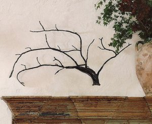
also what do you guys think of the PB bronze branch (see attached) for maybe behind the TV? too weird? it's 42x33 sizing so pretty big. i could maybe incorporate it into the collage of photos if we do that, or something?


bronze branchb.jpg
 
Actually, I think that''s perfect.
 
Okay so with my barely mediocre Photoshop skills I put this together...what do you guys think? I'm thinking the vases on the left from CB and maybe a vase with Cherry Blossoms like the ones I showed MMM last week on the right etagerie...maybe in a cooler vase (not glass) like a brownish one or a green or similar , and the bronze branch behind the tv (keep in mind the real thing will be 3d aka placed just slighly behind the TV..)...

Thoughts? I still do like the thought of doing some color on the wall...gosh decisions are so hard. This is why it takes me a YEAR to do anything! I swear.

Oh and I'm not adoring the cherry blossoms here but I think it's because the vase is too skinny, I think I need something that is more bulby at the bottom.


badly edited EC with new items.jpg
 
i passed on the cherry blossoms too...too much flower and too much pink...I got a more traditional urn vase (not what you want though) and put some very life like silk plant/flower things in it. looks great. Do you have a Michaels by you?

How about a modern glass vase with some dark colored rocks or the scent stones they have at restoration hardware? Don't sweat it. When you see it you'll know it. That 's how it usually works for me.
 
Mara:

The Entertainment Center looks great and your room already has a "PB" feel - - I love the wall color you selected, and I think an accent wall behind the TV (darker version of the same color) might also be perfect.

If you could find some of those type-set letters (an "M" and a "G", perhaps?) or one of those hand-carved inspirational words like "Imagine", "Dream" or "Believe" in black to casually place on one or a few of the shelves, that might just add the finishing touch.

I''ve seen the type-set letters finished in a hand-rubbed, antique black in the Ballards Design catalogue ... PB often sells them (and the inspirational single words, too).

But most often, I find them at Marshall''s (not sure if you have Marshall''s in CA).

Your place looks great - very casual and cozy!

Hope these ideas help! I''ll post some web-links if I find them.

BrownEyes
4.gif
 
My idea was to paint that area too, but I see that Tawn already said that
3.gif


I tried to find a picture of it online, but your unit looks exactly like what I had in my college apt but it was from a store called Room & Board. We had a plant on one end and then an arrangement of candles on the other (they weren''t all pillar shaped). I don''t know how much I like the branch, but I think the vases are definitely cute to put on top. If you did want a lamp, I''d put one of those lamps with a vase just because I don''t like the look of the two together up there...in terms of light though, how much are those really going to provide? Unless its more about the look than usefulness.
 
I personally don''t like the tree over your TV. I would find it really distracting when I was trying to watch TV. I think the painted canvas is a great idea if you want to just try it out without commiting. I think the fact that almost every posted mentioned painting the wall it MUST be a GREAT idea.
2.gif
 
personally, i''d take grass paper and wall paper the entire wall behind the unit....or perhaps paint it a different color from the rest of the walls.
i''d use the vases you posted.
and i''d add somehow some small accent lights behind the PB unit that might just point up the wall in two or three places to give some definition.

i think anything short of covering the whole wall behind the tv will look too busy. but that''s just me.


movie zombie
 
Date: 1/25/2006 6:02:48 PM
Author: Mara

what do you guys think of the PB bronze branch (see attached) for maybe behind the TV? too weird? it''s 42x33 sizing so pretty big. i could maybe incorporate it into the collage of photos if we do that, or something?

MAJOR DEJA VU ALERT ....That is SO crazy! I used to have a real tree branch almost that exact shape nailed to my wall behind my couch. Only mine was wrapped in x-mas lights & I used it as "mood lighting". I''d seen something similar done in a cafe and thought it looked cozy. My friend thought I was crazy chopping down a huge branch but everyone loved it when it was on the wall. (These days I''d skip the lights obviously - you know, I''ve (cough) matured).
 
Status
Not open for further replies. Please create a new topic or request for this thread to be opened.
GET 3 FREE HCA RESULTS JOIN THE FORUM. ASK FOR HELP
Top