shape
carat
color
clarity

Opinions on Current Setting

LittleRed

Brilliant_Rock
Premium
Joined
Jan 3, 2018
Messages
548
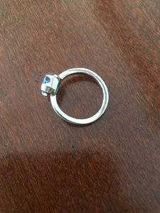
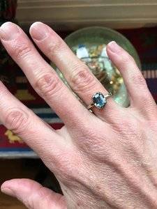
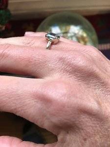
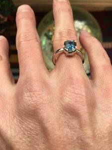
I’ve debated on resetting this ring for years. It is a 7x5mm aquamarine set in white gold. It was going to be bezel set but I asked if the sides could be “dug out” a bit to allow more light in. I’m no designer so I always question my decision on this.

I’d love to hear opinions on this setting. Do you love it? Is it modern, minimal, and unusual? Or is something off and a reset might be a good idea?

Thanks!
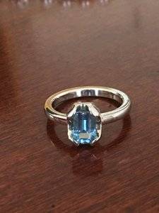
AAD5E36E-44DA-46DD-9D89-4834A7B30EFF.jpeg 69E88309-A05B-4A8D-9346-C70B0F0BF89E.jpeg A84A25D7-5A38-42AC-9065-4F26817FB3B7.jpeg B2ADBFB0-3088-4B5F-8765-E9F6EE68E078.jpeg 8E430C77-06C4-4590-BAEA-C55AB3F3FE9A.jpeg
 
Hmmm, not my style. But, everyone’s taste is different (and that’s good,)
For me, I find the setting “too heavy” for a light coloured gem (if that makes sense). With a dark, strong colour gem ie garnet, dark amythest or dark sapphire, a substantial setting balances the solid deep colour of a gem and provides contrast.
For lighter coloured gems, I feel finer settings suit better. I think they need more access “light” to display their beauty.
Your pretty aqua i feel is being overwhelmed by the setting and sort of “disappearing”.

Thank you! :)) This is why I decided to post. What you say seems exactly right to me and I hadn’t thought of it before. It’s like I’ve just put two and two together. It does indeed need a lighter setting.

I prefer traditional settings so this setting was already pushing my limits. I’d love to see the sort of setting you’d use or suggest for this stone.

Thanks!
 
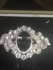
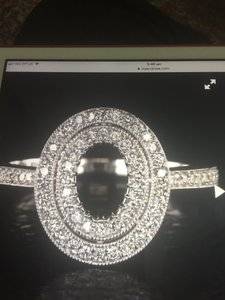
8C5714FD-2355-4ED3-812F-70977F9D5FBE.jpeg 908B37D8-BB19-4F4E-8E16-2806066ED0D0.jpeg 9F0099D8-A1E9-4119-9AE5-931063A3C2BC.jpeg I think it will really pop with some diamonds.
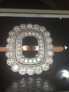
These ring mounts are from Ivy and Rose and they can set your gem too. They are in the US. I haven’t bought from them (yet) but a few other PS ers have and been happy with both the quality and the price.
They are all aroundabout $550 US.
 
  • Like
Reactions: T L
Hmmm, not my style. But, everyone’s taste is different (and that’s good,)
For me, I find the setting “too heavy” for a light coloured gem (if that makes sense). With a dark, strong colour gem ie garnet, dark amythest or dark sapphire, a substantial setting balances the solid deep colour of a gem and provides contrast.
For lighter coloured gems, I feel finer settings suit better. I think they need more access “light” to display their beauty.
Your pretty aqua i feel is being overwhelmed by the setting and sort of “disappearing”.

Lol, I feel the opposite way.I think heavy galleries and settings help lighter color gems, and that lightweight galleries and settings are better for darker stones since they let more light in.

Although I think the gallery is heavy on this particular ring, I think the stone may look more pale without it. Aquas are valued more for darker color, but if you want a paler stone, switch it out.
 
Last edited:
So, I'm going to say that I like it. Its funky, I like the lines of it. Its not a setting that will be to everyone's taste either.

So OP if you don't like it, switch it out. I think its probably helping the stone be more blue as TL said. MAYBE it would help the ring itself was brushed metal instead of polished? also, I would have went E/W with it, especially with the scoups and being a small stone and all...Just throwing that out there.
 
Excellent things to consider! Different opinions really help.

My biggest concern is if it’s “ugly.”
 
I'm personally not fond of it but I'm the type who halos everything so if you can imagine the opposite of this setting that's me! I see a bezel and I run a mile.

Personal tastes aside, if one is not a frufru kind of person then I actually think this ring is very nice. Don't know if I'm making sense but I feel like the ring is perfect for the kind of person who would have this aesthetic.
 
I will say that the setting is very protective of the stone. Aquamarines tend to chip very easily, it's my birthstone so I know this from personal experience. If you were to set it higher, and in a more dainty setting, it would probably be more damaged by now. however, if you don't love it in there, and you're having second thoughts, check out some other settings. I would just make sure I get one that's protective of the sides.
 
Last edited:
Hmmmm..... I think I’m in the middle of the two. Between halo and bezel.

Protecting the stone is very important.

Maybe my next stone should be set in something more neutral to balance this setting out.
 
I will say that the setting is very protective of the stone. Aquamarines tend to chip very easily, it's my birthstone so I know this from personal experience. If you were to set it higher, and in a more dainty setting, it would probably be more damaged by now. however, if you don't love it in there, and you're having second thoughts, check out some other settings. I would just make sure I get one that's protective of the sides.

A good thing to remember. What settings are considered protective? Bezel and halo? Or are there others?
 
A good thing to remember. What settings are considered protective? Bezel and halo? Or are there others?
A low setting in which the stone sits deep into the gallery. A halo can be this kind of setting, although some halos have the stone sit up very high above the frame of the halo, and that's not safe. I don't advise bezeling unless it's a highly proficient jeweler, because the process of bezeling can damage stones. I've even seen bezeling damage diamonds.
 
It looks antique. Old. Interesting.
 
I think it's a very elegant and contemporary setting. However IMHO it would look a whole lot better if the "prongs" were cut down to about half their width and more of the stone were exposed.

@LittleRed these words were not meant for you to like it less!!
 
GET 3 FREE HCA RESULTS JOIN THE FORUM. ASK FOR HELP

Featured Topics

Top