shape
carat
color
clarity

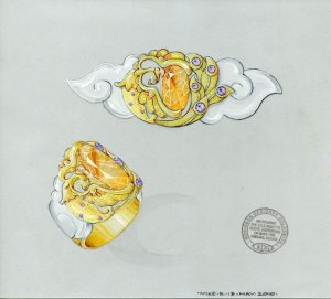
Phoenix ring design

klewis

Brilliant_Rock
Joined
Dec 21, 2008
Messages
871
This is the spessartite I bought from Richard Wise a couple of years ago as a gift to my SO. I was hoping to (try and) take some better photos of it but these two days have been wet and misty, so this is the best I have on hand and closest to its true colour.

DSC02438.jpg
 
We showed it and some of my other stones to Mike at RDG when I first approached them in connection with my tourmaline ring and Mike was very enthusiastic about this stone and, having met the intended wearer, came up with this design which we have yet to decide on.
It is a Phoenix design in white and yellow gold with yellow, orange and purple sapphires on the body/wings

I know how flamboyant & elaborate this looks and it's not something I could ever "carry-off". I know, it looks like it might have been designed for Liberace but SO is not all flamboyant, he has a very unique, almost austere style and is one of the few men I know that could actually wear this - I think Mike has hit the nail on the head, so to speak.
Having said all that, no decision has been made.

Feel free to comment, I won't be offended.
eta - design is posted with permission

KLEWIS.jpg
 
I like the phoenix concept, I just think that I would seek a more stylized design for it. I think it's heavy on detail so it's hard to tell what's going on. The detail level overwhelms the concept. I think I would seek other representations of the phoenix, not the traditional Chinese interpretation.

Have you seen the classical ancient Roman concept of a dolphin? Very curvy and odd, check with google. Today's representation of a dolphin is very sleek and stylized, as seen on every beach trinket. The concept of the dolphin is there in both symbols, but it's a quicker "read" on the modern stylization.

I don't like that many stones on a man's ring. I think it's too flamboyant. If you're sticking with the stones in the tail, I would push the concept further and use red and/or yellow stones to symbolize the fire that the phoenix has risen from. I think the purple is too much like a peacock.

If all this is to your liking, feel free to ignore me, you should buy exactly what you want.

However, if you like the design or not, I think I would ask the designer to use the actual proportions of the stone that you have. He drew a very long skinny stone, and yours is a fatter oval. Already, there is a communication/interpretation issue. Better stop it now, before it grows. I hope you will see a wax model at some point.

Who is RGD?

Richard sold you a fabulous stone, a more stylized design will focus more on the stone and not overwhelm it.
 
I am going to be honest but I hope you find my comments constructive.

First of all I ADORE the stone. It's simply gorgeous and that's what leads me to the following comments.

1. You say the ring is flamboyant (agreed!)
2. You say your SO is not flamboyant and more austere.
3. My first impression of the ring is the setting not the gemstone which appears to be lost in it.

For all those reasons (despite the fact that I like the phoenix concept), I would personally tone down the design so that the gem takes centre stage i.e. less metal more stone!

If SO is more austere how about an industrial look that lets the stone really show itself for the beauty it is?
 
Well I might be the minority here but I actually really like the design. I think when it is made in RL it will look much more striking and not so Liberace. the only thing i might change is the purple sapphires. I think i would do blue or green instead. but that is just more colors that appease me.
 
It''s Faaaaabulousss!!

But a little frooty, not that there''s anything wrong with that.

You say that it seems right to you despite the fruit. I''m inclined to say that you know best.
 
Date: 6/20/2010 6:13:17 PM
Author: iLander
I like the phoenix concept, I just think that I would seek a more stylized design for it. I think it''s heavy on detail so it''s hard to tell what''s going on. The detail level overwhelms the concept. I think I would seek other representations of the phoenix, not the traditional Chinese interpretation.


Have you seen the classical ancient Roman concept of a dolphin? Very curvy and odd, check with google. Today''s representation of a dolphin is very sleek and stylized, as seen on every beach trinket. The concept of the dolphin is there in both symbols, but it''s a quicker ''read'' on the modern stylization.


I don''t like that many stones on a man''s ring. I think it''s too flamboyant. If you''re sticking with the stones in the tail, I would push the concept further and use red and/or yellow stones to symbolize the fire that the phoenix has risen from. I think the purple is too much like a peacock.


If all this is to your liking, feel free to ignore me, you should buy exactly what you want.


However, if you like the design or not, I think I would ask the designer to use the actual proportions of the stone that you have. He drew a very long skinny stone, and yours is a fatter oval. Already, there is a communication/interpretation issue. Better stop it now, before it grows. I hope you will see a wax model at some point.


Who is RGD?


Richard sold you a fabulous stone, a more stylized design will focus more on the stone and not overwhelm it.

Thanks for your comments - If this were for me I too would prefer a slightly more steamlined representation of the Phoenix - I agree with you there. RDG is Robinson Designer Goldsmiths in NZ. Regarding the shape of the stone in the design- Yes it is more elongated than the actual stone and this preliminary design was not based on the stones actual dimensions and a wax would certainly be made. Thanks again.
 
Date: 6/20/2010 6:20:01 PM
Author: LovingDiamonds
I am going to be honest but I hope you find my comments constructive.


First of all I ADORE the stone. It''s simply gorgeous and that''s what leads me to the following comments.


1. You say the ring is flamboyant (agreed!)

2. You say your SO is not flamboyant and more austere.

3. My first impression of the ring is the setting not the gemstone which appears to be lost in it.


For all those reasons (despite the fact that I like the phoenix concept), I would personally tone down the design so that the gem takes centre stage i.e. less metal more stone!


If SO is more austere how about an industrial look that lets the stone really show itself for the beauty it is?

Thanks LD. I''m glad you like the stone. It''s eye clean and exceptionallly crisp IRL. I agree how overwhelming the design looks in comparison to the stone and one thing I really noticed when in their store was how pieces that I had previously only seen designs for looked so much more refined than drawings.
 
Date: 6/20/2010 6:25:19 PM
Author: Sarahbear621
Well I might be the minority here but I actually really like the design. I think when it is made in RL it will look much more striking and not so Liberace. the only thing i might change is the purple sapphires. I think i would do blue or green instead. but that is just more colors that appease me.

Hi Sarahbear. Glad you like it. There is an amazing Make Schneider ring design featuring a spessartite and tsavorites as side stones the two look so great together.
 
Date: 6/20/2010 6:39:45 PM
Author: VapidLapid
It''s Faaaaabulousss!!


But a little frooty, not that there''s anything wrong with that.


You say that it seems right to you despite the fruit. I''m inclined to say that you know best.


Vapid, - Ha ha ha! Are you sure you put enough A''s & S''s in your version of fabulous? lol!!
 
In case I was obtuse, let me just say that I like it. And considering that you are in Australia, it''s almost a conservative design! I actually like the purple sapphires with the orange and the gold, but you can always put a dementoid in the bird''s eye!
 
Date: 6/20/2010 7:10:31 PM
Author: VapidLapid
In case I was obtuse, let me just say that I like it. And considering that you are in Australia, it''s almost a conservative design! I actually like the purple sapphires with the orange and the gold, but you can always put a dementoid in the bird''s eye!

Your previous comment made me laugh. I''m in New Zealand and I would say we''re more reserved.
 
I like it and would not change the style of the phoenix. It looks very much like the ones to represent imperial China, which, with the cloud shape, makes me think that is what you are going for and making it modern or streamlined would ruin it.

I have to vote that I don''t love the purple in the tail, but I think with yellow gold and an orange stone, the contrast would make them pop out more than you would want.

I regularly look at art nouveau rings and the look for gentleman''s rings of the period were usually naked women, very detailed naked women, so this seems rather tame to me.
 
I always wanted to go to New Zealand! I''ve heard it''s very pretty there.

On the ring, I think one thing to consider is that you are not comparing apples to apples.

You are comparing the jewelers finished pieces with your drawing. I think you need to compare your drawing with some of his other drawings. If he still has some older sketches, take a look at those, really mull over and study them, then look at the finished piece. Is the finished piece what you expected to see after you had absorbed the drawing? Or was something lost in the translation? Was the finished piece as detailed as the drawing? Was the scale the same? Did the proportions look the same?

How true are his drawings to the finished piece?

With the level of detail you are considering, this is a very important consideration!
 
excellent stone.

i love the ring design.

just not together.

you have a fab spessartite that may get lost in all the design........

mz

ps richard does have an eye for spess, doesn''t he?!
 
brazen_irish_hussey (now that''s a difficult name to shorten!) I''m pleased you like it. Your point about the purple colour popping is worth considering too - thanks. The naked female figures of the Art Nouveaux era are so stylish and I saw recently a cigar cutter which incorporated a naked woman and the piece was really beautiful. These days we have the Kardashians!.
32.gif


iLander- Thanks for offering that advise but perhaps I worded it badly or still haven''t got hat you are getting at - I meant that I had looked at design drawings on RDG''s facebook page and then saw a few of those designs as finished pieces in their store and noticed then how much more refined the finished pieces were compared to the drawings of the same design. The ring I recently had made by them was very accurate when compared to the finished design

MZ Thanks for your opinion. You know once when Richard was commenting to me on the great colour of ''my'' spessartite he added something like.. it''s not quite a vivid as movie zombies.
 
The stone is lovely, and I personally think the ring is a bit too busy, and the stone doesn''t need so much embellishment. That being said, it appears much thought and effort went into the design, and it is unique, and as a lover of Asian art, I can see the influence.
 
The responses in this thread have me thinking about whether the ring should be in service to the stone or the stone in service to the ring and it''s overall design. Certainly there are rings that are little more than delivery systems for their stone and some stones that are so singularly impressive they cannot tolerate embellishment. Since every ring making impulse has it''s own motivation and intent behind it I think it is rude of some stones to demand the design be subservient to them.

In this design the spess gets a little lost in the orange gold bird. If the edge of the wings facing the stone were done in the white gold it would provide a break between the gold and the stone to set it off better. Diana Ross was nothing without the Supremes!
 
TL - thanks for your comments. The stone as painted in the design is considerably paler than it really is and I wonder if you compare my photo of the stone and imagine that in the setting, then perhaps it wouldn't look so overpowered?
Vapid - The ring that springs to mind when you mention stones being singularly impressive is the rockefella sapphire and it's seemigly simple setting. Diana Ross - an interesting analogy and one the Supremes would probably have agreed with.
 
I think the design is pretty awesome and looks great with the stone. However, I couldn''t imagine it actually being worn. I think it looks like a cool museum piece instead. It''s your call as to whether your SO would actually want to wear it.
 
I really dig it - the only thing I think to mention is really not important but just an fyi... the phoenix is the female symbol in yin/yang - the dragon being male.
 

It looks great; good colour and looks to be very lively. However, the design is very daring; it is definitely going to speak volumes and stand out wherever it goes. The setting also seems to overwhelm the ring so I don’t know what effect you are aiming for. I like the stone and I love phoenixes, but the two together just don’t mesh in this particular case. Perhaps, it might play out better in the real thing?

 
The stone is beautiful. However I don''t care for it in a this ring. I am wondering why so few people consider making a beautiful brooch out of stones. i would like this as a larger brooch.

The only one I have seen who put stones together ina key pendant is Freke . I wish we could see other types of jewelry.

Thanks,

Annette
 
Brooches aren’t as popular today as in the days past; they just seem more formal and most of the time, require a substantial sized gemstone to be able to pull it off without getting lost amidst one’s clothes. With the right outfit, of course, brooches can be worn today in a more casual fashion. The other disadvantage of wearing brooches, pendants and etc is that the wearer isn’t able to admire the stone and design themselves without the use of a mirror, reflective surface or major neck craning.
11.gif
9.gif
 
I love your spess and the pheonix design is very unique. Personally I thing the tails are beautifully designed but I would streamline the belly side of the bird. The imperial color of ancient china (I am Chinese BTW) uses very little purple. I would suggest that you get rid of the purple stones on the belly, and swtich the stones on the tails to green, that will make it pop! To balance, how about using bright red stone for the eye? That will be so cool!
 
Date: 6/21/2010 12:38:40 PM
Author: yingh
I love your spess and the pheonix design is very unique. Personally I thing the tails are beautifully designed but I would streamline the belly side of the bird. The imperial color of ancient china (I am Chinese BTW) uses very little purple. I would suggest that you get rid of the purple stones on the belly, and swtich the stones on the tails to green, that will make it pop! To balance, how about using bright red stone for the eye? That will be so cool!
Yingh,
I agree with your colour suggestion and LOVE it!
 
i really do love the ring design just as it is. but i''d buy a different stone for it. and i''d wear that ring! its unique, unusual, and goreous. my kind of ring.
however,
your spess is of very very high quality and those are very few and far between. i think would be imo a waste to have a lot going on around it. it can stand on its own.
but
if it would please your eye and you''re going to wear it, then do it. don''t be limited by our opinions. its your stone and your ring design.

mz

ps your mention of richard''s comment has motivated me to clean my spess: hate to admit it but its been a while and i wear it every time i leave the house.......
 
Date: 6/21/2010 12:45:52 PM
Author: Chrono
Date: 6/21/2010 12:38:40 PM

Author: yingh

I love your spess and the pheonix design is very unique. Personally I thing the tails are beautifully designed but I would streamline the belly side of the bird. The imperial color of ancient china (I am Chinese BTW) uses very little purple. I would suggest that you get rid of the purple stones on the belly, and swtich the stones on the tails to green, that will make it pop! To balance, how about using bright red stone for the eye? That will be so cool!

Yingh,

I agree with your colour suggestion and LOVE it!
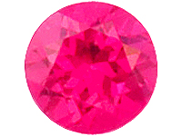
Very good point Yingh, and I tritto your recommendation.
9.gif
 
Hi klewis,

I definitely like the idea of a Phoenix to work with that beautiful orange spessie you have there. I think the design is beautiful, however I would be concerned that with all those features for the phoenix, that the width of the ring will be uncomfortably wide. Also since the stone is likely big, the ring will also have to be deep to accomodate, overall I know I''d not be able to wear such a large ring. What is the proposed ring size for this ring? I wear a size 7 but if its for a much larger hand, then perhaps the geometry might work... Oh and for the little accents, have you thought of little burmese red rubies or spinels? I think it would be better to stick with red/yellow/orange series of colors to keep with the fiery phoenix vibe...

http://www.multicolour.com/detail/?/details/spinel/ysp531aa/&1244716636

b_ysp531aa.jpg
 
The stone is a great colour and glows. I like the ring design, sure it''s elaborate but I think it would look awesome when it''s made.
 
GET 3 FREE HCA RESULTS JOIN THE FORUM. ASK FOR HELP

Featured Topics

Top