shape
carat
color
clarity

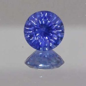
Photos of Richard Homer emerald cut and round blue sapphire

  • Thread starter Thread starter Lula
  • Start date Start date
L

Lula

Guest
Thanks to everyone who replied to my earlier threads on my search for a blue sapphire. I e-mailed Wink about two sapphires on Richard Homer's site:

1.67 Emerald cut
1.90 Round

and Richard sent them out. Richard photographs the stones on a dark background, and on my computer it's hard to see the detail of the stones. Wink's still photos and videos were immensely helpful.

Here are the links to the videos:
http://www.screencast.com/t/Mjg5ODg4M
http://www.screencast.com/t/YjlhNjQxZG

Here are the photos:
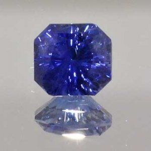
emerald and round sapphire.jpg

round.jpg
 
Re: Photos of Richard Homer emerald cut and round blue sapph

I could do without either. I don't think concave faceting does a darker toned stone, like a sapphire, any favors.
 
Re: Photos of Richard Homer emerald cut and round blue sapph

It’s a difficult choice; the round seems brighter but the octagonal seems to be a richer blue. What is Wink’s opinion on both?
 
Re: Photos of Richard Homer emerald cut and round blue sapph

I really like the colours.
 
Re: Photos of Richard Homer emerald cut and round blue sapph

Also, I thought the patches of less saturated color were in my head, but looking closely at the reflections I see substantial zoning in the pavilion that I think you can sort of sense in the face up view. Yuck, I don't like those stones.
 
Re: Photos of Richard Homer emerald cut and round blue sapph

They're quite pretty and a nice blue, the emerald shape seems to be a richer colour. What's the return policy like?
 
Re: Photos of Richard Homer emerald cut and round blue sapph

dzop said:
Also, I thought the patches of less saturated color were in my head, but looking closely at the reflections I see substantial zoning in the pavilion that I think you can sort of sense in the face up view. Yuck, I don't like those stones.

Very good point. I personally think, when buying sapphires, one should get a pavilion shot as well to see the zoning.
 
Re: Photos of Richard Homer emerald cut and round blue sapph

Thanks for your replies! I thought both stones are breathtaking in the videos. I loved the cut of the emerald cut, but the blue was a little dark for me. I love the color and vibrancy of the round, but I'd prefer a cushion or square shape. So I was stuck. Typically when I receive a video from Wink of something I'm considering purchasing, I know right away -- yes, that's for me! But this time I was undecided. I spent most of yesterday in a meeting imagining how I'd set the stones -- and I thought wow, how gorgeous that round would be in a three stone ring with diamonds. But then I'd think, I really love the cut of the emerald.

Back and forth, waffling like Brett Favre (a football analogy -- sorry).

Wink was all set to mail both stones to me so I could view them in person. But ultimately I decided that seeing them in person wouldn't change the fact that I thought the color of both stones was too deep (saturated I think is the correct term!) for me. This is an ongoing problem with me, as you know, if you've read my earlier threads.

I spoke to Wink on the phone, and, as always, he was such a gentleman and so understanding about my indecision. We talked for a long time about how I love the deeper blue colors "in theory" but in real life, they are too dark for my eye. The concave cutting definitely solves some of the problem -- I like the play of light on the facets. But in the end, I realized that I prefer lighter colors for my eye (even though I love admiring the photos of the beautiful Burma blues on this site!).

Certainly not the outcome I planned on! I am now looking at several other stones on Richard's site in lighter colors -- a topaz, a blue zircon, and two purple sapphires. The topaz and zircon are softer stones, so that's a consideration, but the colors are incredible.

But I think my experience may be of help to other newbies to the colored stones world. I expected this purchase would be a lot easier than it is! I know I love precision cutting, but I am still learning what I love in hue, tone, and saturation.

To be continued...

Thanks again, Wink and Richard, for your assistance!
 
Re: Photos of Richard Homer emerald cut and round blue sapph

Chrono said:
It’s a difficult choice; the round seems brighter but the octagonal seems to be a richer blue. What is Wink’s opinion on both?

Hi, Chrono -- Wink preferred the emerald cut -- both color and cut of the stone. But he agreed that the color may be too deep for me.
 
Re: Photos of Richard Homer emerald cut and round blue sapph

Lovinggems said:
They're quite pretty and a nice blue, the emerald shape seems to be a richer colour. What's the return policy like?

I believe it's 21 days (I could be wrong on that -- Wink, please correct me if I'm wrong).
 
Re: Photos of Richard Homer emerald cut and round blue sapph

I think you are concerned about the tone being too dark. Yes, if a stone is oversaturated, it can appear dark as well but in this case, I think you are looking for a bright blue that also pops, so perhaps a medium light toned stone with strong saturation?

I understand that some may disagree with me but coloured stones are “graded” face up so if the zoning does not appear face up, does it really matter?
 
Re: Photos of Richard Homer emerald cut and round blue sapph

Chrono said:
I think you are concerned about the tone being too dark. Yes, if a stone is oversaturated, it can appear dark as well but in this case, I think you are looking for a bright blue that also pops, so perhaps a medium light toned stone with strong saturation?

I understand that some may disagree with me but coloured stones are “graded” face up so if the zoning does not appear face up, does it really matter?

Yes! I think you've described it perfectly. I know the darker colors are more prized (but not so dark that they are navy-black) but to my eye they are just too dark.

For me, I am only concerned with the face up appearance of the stone -- I won't be setting it upside down!
 
Re: Photos of Richard Homer emerald cut and round blue sapph

Chrono said:
I think you are concerned about the tone being too dark. Yes, if a stone is oversaturated, it can appear dark as well but in this case, I think you are looking for a bright blue that also pops, so perhaps a medium light toned stone with strong saturation?

I understand that some may disagree with me but coloured stones are “graded” face up so if the zoning does not appear face up, does it really matter?


To my eye, less so in the video but still a little bit, and definitely in those photos (look carefully at the edges of the stone), the zoning shows up face up. Also, it depends how you define face up-- my gf has a sapphire with zoning that only shows up through the table if you're looking from one side of the stone, and only at a 35 degree angle or more...and you know what? People see it all the time.

Actually, I thought those videos were particularly useless...is it possible to show LESS of the stone in a 2 minute video than that guy did?
 
Re: Photos of Richard Homer emerald cut and round blue sapph

Is that zoning or the colour appearing less dark and saturated because of the edges being less deep than the center? To me, judging colour zoning from an angle is equivalent to calling a window tilt a true window, but I could be wrong. I do agree about the video though; I was expecting to see the stone being turned sideways, upside down and moved around a lot more to give us a feel that we are viewing the stone IRL.
 
Re: Photos of Richard Homer emerald cut and round blue sapph

Chrono said:
Is that zoning or the colour appearing less dark and saturated because of the edges being less deep than the center? To me, judging colour zoning from an angle is equivalent to calling a window tilt a true window, but I could be wrong. I do agree about the video though; I was expecting to see the stone being turned sideways, upside down and moved around a lot more to give us a feel that we are viewing the stone IRL.

Wink has made me several videos of diamonds, but this is the first video he's made for me of colored stones, so I honestly didn't know what to expect. I did ask him to take the stones into different lighting conditions and give me his impressions (you can hear his comments about it being darker or lighter in various lighting conditions). I was more concerned about the darker blue sapphires' tendency to "bleed" color so, while I can't speak for him, I can make a guess that that's what he was focusing on.

In the end, the photos and videos answered the question I had -- which was what blue is right for me. I leave the issues of zoning, windows, etc., to those of you who have way more experience than I do in these areas (right now I can't even find the right color for me!).
 
Re: Photos of Richard Homer emerald cut and round blue sapph

Here's what I am referring to-- I added an illustration in MS Paint. Tan sells badly zoned sapphs like this for $200/ct. Obviously, w/o the awesome cutting, but the point is that this is not the best raw material.

zoning illus.jpg
 
Re: Photos of Richard Homer emerald cut and round blue sapph

Thank you for the explanation about Wink’s intention in these videos which probably explains why he shot them that way. Sorry for the threadjack but I find it interesting and would like to know more about the issue of judging zoning although I guess we should start a new thread on it. :oops:
 
Re: Photos of Richard Homer emerald cut and round blue sapph

Chrono said:
Is that zoning or the colour appearing less dark and saturated because of the edges being less deep than the center? To me, judging colour zoning from an angle is equivalent to calling a window tilt a true window, but I could be wrong. I do agree about the video though; I was expecting to see the stone being turned sideways, upside down and moved around a lot more to give us a feel that we are viewing the stone IRL.


Here's my concern. I recognize this is a gross oversimplification and color and cutting depends on angles, optical properties, etc... But basically, if there's a colorless zone in the middle, I think this would tend to accentuate desaturation towards the edges b/c there a smaller fraction of the stone at the edges is colored compared to the middle. See oversimplified diagram below. In the below scenario, I would imagine that the edges would tend to grey-out b/c they don't have the colored material down at the cutlet to work with and b/c the layer of color at the top becomes "thinner" at the edges.
 

Attachments

Re: Photos of Richard Homer emerald cut and round blue sapph

Chrono said:
Thank you for the explanation about Wink’s intention in these videos which probably explains why he shot them that way. Sorry for the threadjack but I find it interesting and would like to know more about the issue of judging zoning although I guess we should start a new thread on it. :oops:

I'm in the Kenny school about threadjacks -- they can be interesting and informing -- so not a problem as far as I'm concerned.
 
Re: Photos of Richard Homer emerald cut and round blue sapph

I have seen a sapphire that was horribly zoned when viewed upside down yet face up, the colour is surprisingly even. I cannot recall which vendor had it in inventory but it was posted here once on PS when we were discussing zoning as well. With the right angles, as you’ve mentioned, colour zoning can be minimized or even “hidden” when viewed upfront. I’ve also seen situations where the lapidary was concerned a recut might make the zoning worse, probably due to the area of zoning being a larger percentage of the material once recut. I’m also sure the not only the size but location of the zoning will play a part in the end result. I hope a lapidary will jump in to discuss the details.
 
Re: Photos of Richard Homer emerald cut and round blue sapph

I quickly skimmed the replies and purposefully didn't dwell on any of them but did take a long hard look at the videos.

1. The round concave cut appears to be "smoky" in appearance. I don't think anybody else has mentioned this? It would annoy me greatly and I would constantly be wanting to clean the stone (not that that would make any difference at all though)! Beautiful cut and of the two the better colour considering that's the colour in a light box because I suspect it would darken slightly in other lighting conditions.

2. There's something about the cut of the emerald cut that looks slightly "off" to me. It's something to do with the culet BUT this could be the angle of the gem/the way Wink was holding it. It also has an inclusion that might be throwing me off! This stone I think would appear quite a bit darker than the other and will look more navy in colour. I'm also not sure if the colour difference is due to zoning or extinction. It's difficult to tell.
 
Re: Photos of Richard Homer emerald cut and round blue sapph

Chrono said:
I have seen a sapphire that was horribly zoned when viewed upside down yet face up, the colour is surprisingly even. I cannot recall which vendor had it in inventory but it was posted here once on PS when we were discussing zoning as well. With the right angles, as you’ve mentioned, colour zoning can be minimized or even “hidden” when viewed upfront. I’ve also seen situations where the lapidary was concerned a recut might make the zoning worse, probably due to the area of zoning being a larger percentage of the material once recut. I’m also sure the not only the size but location of the zoning will play a part in the end result. I hope a lapidary will jump in to discuss the details.

I don't mind minor zoning, but I have seen some sapphires that almost look colorless through the pavilion :shock: , but blue face up. One tiny band of color was giving the table all the color. The zoning was that stark!! That would bother me, but yes, if there was minor zoning, and it didn't affect the face up that badly, depending on the price per carat, it wouldn't be an issue to me. It might be to others though. I'm not a sapphire expert, so I'll defer to others. I guess I just wanted to point out that some sapphires have some major zoning going on.
 
Re: Photos of Richard Homer emerald cut and round blue sapph

dzop said:
Here's my concern. I recognize this is a gross oversimplification and color and cutting depends on angles, optical properties, etc... But basically, if there's a colorless zone in the middle, I think this would tend to accentuate desaturation towards the edges b/c there a smaller fraction of the stone at the edges is colored compared to the middle. See oversimplified diagram below. In the below scenario, I would imagine that the edges would tend to grey-out b/c they don't have the colored material down at the cutlet to work with and b/c the layer of color at the top becomes "thinner" at the edges.


Interesting conjecture and all of this is based on the idea that this sapphire is dramatically zoned by analyzing the color of a reflection through the side of the stone. What you are not keeping in mind is that sapphire is dichroic and always has more or less color on the A-B axes of the crystal than on the lengthwise C axis. Top sapphires are often more a lightly saturated, gray/blue to violet/blue on the A-B axes and so this is placed across the stones with the better, deeper blue color pointing face up. You are seeing a fine sapphire which was cut properly and which has the less attractive color placed in the best orientation for it. You are correct about the color graying out around the edges...BUT only if the stone is cut so shallowly that the light never travels along the length of the stone long enough to gain good color. With a crown of sufficient height and with steep enough angles this is never a concern because light will be directed farther into the center of the stone and traverse the length of the crystal for a long enough time to gain fine color. A similar effect is seen in "native" cuts with very deep pavilions, which are designed to save weight AND give a long light path along the most attractive axis.

The moral ? The stones shown are designed properly AND that any comments about color zoning are truly a guess...and probably a bad one at that.
 
Re: Photos of Richard Homer emerald cut and round blue sapph

Yup, TL, that’s exactly what I meant. I’ve also seen sapphires similar to what you described where only a small swath of blue is showing all the blue on the crown area. That would bother me too as I like to enjoy the side view of my stones.

Micheal,
Thanks for the reminder about sapphires being dichroic. I'd forgotten to throw that into the equation.
 
Re: Photos of Richard Homer emerald cut and round blue sapph

Michael_E said:
dzop said:
Here's my concern. I recognize this is a gross oversimplification and color and cutting depends on angles, optical properties, etc... But basically, if there's a colorless zone in the middle, I think this would tend to accentuate desaturation towards the edges b/c there a smaller fraction of the stone at the edges is colored compared to the middle. See oversimplified diagram below. In the below scenario, I would imagine that the edges would tend to grey-out b/c they don't have the colored material down at the cutlet to work with and b/c the layer of color at the top becomes "thinner" at the edges.


Interesting conjecture and all of this is based on the idea that this sapphire is dramatically zoned by analyzing the color of a reflection through the side of the stone. What you are not keeping in mind is that sapphire is dichroic and always has more or less color on the A-B axes of the crystal than on the lengthwise C axis. Top sapphires are often more a lightly saturated, gray/blue to violet/blue on the A-B axes and so this is placed across the stones with the better, deeper blue color pointing face up. You are seeing a fine sapphire which was cut properly and which has the less attractive color placed in the best orientation for it. You are correct about the color graying out around the edges...BUT only if the stone is cut so shallowly that the light never travels along the length of the stone long enough to gain good color. With a crown of sufficient height and with steep enough angles this is never a concern because light will be directed farther into the center of the stone and traverse the length of the crystal for a long enough time to gain fine color. A similar effect is seen in "native" cuts with very deep pavilions, which are designed to save weight AND give a long light path along the most attractive axis.

The moral ? The stones shown are designed properly AND that any comments about color zoning are truly a guess...and probably a bad one at that.

Michael,

Thank you for your thorough explanation of the dichroic nature of sapphire and how it affects the appearance of the stone from the side of the pavilion. While this gem does have some zoning, it is near one end of the stone and not at all near the area pointed out as being a huge colorless zone. Those colorless "zones" are the reflection from the mirror upon which the sapphire was placed for its photo.

The video was intended to answer questions from my client about how the stone looked face up and to tell her how the stone looked while being seen in different lighting. Knowing that it helped her to decide not to buy a darker blue colored gem I feel that I completely accomplished the task asked of me.

Concave faceting is very different from traditional faceting. I have clients that love it as much as I do, and I have clients who do not like it one little bit. These are taste issues and are not defendable or debatable, you like or do not like, either is a valid choice.

Thank you again for your thorough and even handed comments.

Wink
 
Re: Photos of Richard Homer emerald cut and round blue sapph

Michael,

Thank you for your thorough explanation of the dichroic nature of sapphire and how it affects the appearance of the stone from the side of the pavilion. While this gem does have some zoning, it is near one end of the stone and not at all near the area pointed out as being a huge colorless zone. Those colorless "zones" are the reflection from the mirror upon which the sapphire was placed for its photo.

The video was intended to answer questions from my client about how the stone looked face up and to tell her how the stone looked while being seen in different lighting. Knowing that it helped her to decide not to buy a darker blue colored gem I feel that I completely accomplished the task asked of me.

Concave faceting is very different from traditional faceting. I have clients that love it as much as I do, and I have clients who do not like it one little bit. These are taste issues and are not defendable or debatable, you like or do not like, either is a valid choice.

Thank you again for your thorough and even handed comments.

Wink

Dear Wink,

I read this thread with great interest(initially I was quite disturbed as I didn't see easily what others were referring to) to determine what can or cannot be judged from the photographs and video provided on these two sapphires. I find this thread a little disturbing thread because:

a) I don't think my eyes could tell when something has color zoning faceup or not easily.
b) I really can't distinguish between directional lighting effects and color zoning

I liked both stones color and am really wondering how much my untrained eye would notice about this zoning in real life.

Could you please describe when you turn the round or emerald cut upside down precisely in what region the gem has a much lighter tone and saturation?

How much color zoning do you see from faceup when you tilt the stones back and forth?
 
GET 3 FREE HCA RESULTS JOIN THE FORUM. ASK FOR HELP

Featured Topics

Top