shape
carat
color
clarity

Red meets pink (pic); photo techniques

Status
Not open for further replies. Please create a new topic or request for this thread to be opened.

raddygast

Shiny_Rock
Joined
Oct 20, 2004
Messages
179
For your enjoyment...

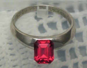
This stone is currently being examined by yours truly. It is a fantabulously cut, aesthetically shaped, uncharacteristically eye-clean Burmese red spinel.

I have had it appraised, and it did quite nicely. Mind you, it is not unfortunately the type of red I truly desire, but I have learned that spinel or not, that sort of perfection costs at least twice as much as I can pay. This stone is so beautifully cut and pleasingly shaped, to my eye, that I may be able to convince myself to accept the color.

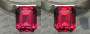
What do you guys think? I am posting a couple of pics here, of the stone leaned against a really cheesy tarnished silver ring I found in a drawer. The contrast is attractive. These pics were taken under an incandescent lamp (with lampshade to disperse the light) with my digital camera. I find that the color balance presets don''t work well enough: in most modes, the pictures are too yellowish/reddish. The light was indeed very warm, but not that warm, so I used a custom white balance card. Unfortunately that tends to bleed all the warmth away from the light (as I guess it is designed to do). I took the pics with that custom balance anyway, but I adjusted the color of the stone ever so slightly in photoshop to match what it actually looks like in incandescent.

With the custom balance (un-photoshopped) the color is more pink and nearer to what it looks like under halogen. I have not photographed daylight yet -- the daylight color is quite a bit different; a weird blend of pink and red, with some slight hint of copper and the color of wine near the lip of a tilted glass. Very attractive, if not exactly red.

So, opinions are welcome...
 
close to halogen-appearance

crop-orig.jpg
 
very close to incandescent-appearance

crop-adj.jpg
 
side-by-side (daylight attempts to follow later)

crop-twins.jpg
 
Any shade of color would be "wow" to me if saturation is great... red, red-ish, pink or what not. So this one is just great - and you surely must have had lots of patience to find one this nicely cut.

How about yellow gold? Red (ok, however you want to call that, it looks red to me) is supposed to look it's best in yellow gold, so you even get yellow prongs on platinum rings to hold red gems - sure you know that already
34.gif


'Guess you have seen this too:
iskew-ring11.jpg

Any plans for the ring ?
 
Well, it only looks that saturated in incandescent light; slightly less saturated under halogen. Forget about fluorescents -- they kill red gems, esp. spinels. Daylight color is just bizarre and I grow to like it more and more. Doesn''t have the same in-your-face saturation punch as under incandescent, but it has a totally different subdued mystique that is really attractive.

I thought about yellow gold, for sure. The only problem is, I once showed a ring to the woman as an example of a type of setting, and she immediately called it "eighties." After much prodding (recently) I have found out what makes something eighties is the combination of yellow gold with something that is not pure red -- that was a purplish red ruby, almost fucshia. I don''t want to risk setting this in yellow gold, because under some lighting conditions the stone is less blood red and more coppery-pinky-red.

Against the white metal I just like the contrast. There are two opposing schools of thought. You can set warm stones with warm metals (and cold with cold), so that the stone can draw warmth from the metal. On the other hand you can set opposites against each other, so that the stone will seem more red, for example, set against an icy white background.

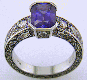
At the moment I am obsessed with bezels. What do you think about this one? Originally I wanted to set it east-west to be really contemporary, but I really love how the traditional north-south setting calls attention to the stone, and once I saw this bezel, I know it would be possible to have a semi-bezel with the sides (the length) open. I''m not a fan of the engraving, but just the general idea of the bezel w.r.t. the ring is cool here (from jewelryexpert.com)
 
It looks plenty red to me.
Nice spinel.
My tastes lean more towards orangish red but finding that in spinel and being able to afford it are another story.
 
North-south half-bezel (north and south closed)

NS-halfbezel.gif
 
One thing I love about colored gems is how different they can look under different lighting.
With some of them you will never see the same color twice.
I like that a lot and think its neat :}
I would see the changing mood of this one as an advantage not a downgrade.
 
I love that setting.
 
Hello Radigast!
So this is your spinel!
Well looks very nice to me. I hope than one of these days you will pass in Bangkok and show me this little wonder...
May be one day i will be able to bring you to Mogok or Namya, then you will love your stone even more!

All the best,
 
Thanks Mogok! I hope so too. I'd like to visit Bangkok someday for many other reasons as well, including the food. Since I plan on getting engaged, I guess I can't mention the women, but at least my eyes can wander... I'd love to check out the gem trade there. And I'm not much of the Indiana Jones-ride-on-elephants type, but visiting Mogok would be like some kind of miracle fantasy for me. Maybe some day...

strmrdr:

Your post about mood-changing colors really got to me. I've been thinking the same thing. It's really like getting a bunch of gems in one -- it's been 2 days of staring at it and I still haven't got bored yet. Today I discovered a totally new experience -- shaded daylight (through the blinds) makes it candy-red. But if I then keep my eye (and the orientation of the stone) constant, but lower the stone past the level of my side table against the wall with the window (i.e. plunging it into a darker area), it suddenly catches fire and sends out this wonderfully complex red with candy tones and a hint of "rose gold".

Can't wait till it's actually in a ring, then I can look at it all over the place.
 
It''s a really nice spinel. Sort of a raspberry red color maybe. I have a few in that color too and I really like them ( I think mine might become earrings). I can''t afford that bright red yet either.That setting with the blue stone in it would look great with yor spinel and I actually like it against the silver metal.
 
I think with a gold setting it might give it a more Asian feel. I guess I''ve seen a lot of photos of burmese spinels set in intricate gold settings.
 
Radagast, Radagast, Radagast,

Thats one beautiful spinel. If you want red/red buy a ruby. Spinel is almost never a truly red/red. Always has a strong orange secondary. But the fancy colors, pink, etc can be really beautiful and the finest examples are still underpriced. Forget fashion, look at the rock!

Happy New Year,

Richard
 
HI RG:

That stone exudes warmth. Sublime....................
Also the mount you posted is delightful in every particular.
I would welcome that combo in a heartbeat....................

cheers--Sharon
 
wow, that stone is just amazing!! reallly. and, i love the setting, very classy. well done!
 
Raddy -- finally, the masterpiece. It''s lovely. The cut is yummy and the proportions are truely fine. Only one suggestion -- with a beautiful cut and shape such as that, if you decide to keep the stone and set it w/half bezel, use a metalsmith with excellent skills and get as thin a bezel as you can to accentuate the shape and ensure that not one mm of that beauty is sacrificed to the metal.
 
Do you have anymore pictures of it to post? I''d love to see the outdoor photos you were talking about :)
 
Date: 1/23/2005 2:45:24 PM
Author: raddygast
strmrdr:


Your post about mood-changing colors really got to me. I've been thinking the same thing. It's really like getting a bunch of gems in one -- it's been 2 days of staring at it and I still haven't got bored yet. Today I discovered a totally new experience -- shaded daylight (through the blinds) makes it candy-red. But if I then keep my eye (and the orientation of the stone) constant, but lower the stone past the level of my side table against the wall with the window (i.e. plunging it into a darker area), it suddenly catches fire and sends out this wonderfully complex red with candy tones and a hint of 'rose gold'.


Can't wait till it's actually in a ring, then I can look at it all over the place.
Some day I want a strong color change gemstone that would be the ultimate mood-change stone.
As much as I love the red-red rubies and blue-blue sapphires Iv got to admit I think I love the stones with more charactor better.
Im even thinking about hunting down a colored gemstone with some neat looking inclusions, at one time I felt that if it wasnt eyelcean it wasnt worth having.

I guess you can say my taste in gemstones is evolving :}
 
Richard W, canuk-gal, belle: Thanks for the compliments! This stone actually does have a bit of orange in it but surprisingly I only end up seeing it in certain idiosyncratic fluorescent lights, like my "long-life" bulbs that are designed to emulate regular incandescents. Since they seem "warm", my guess is they are red deficient but not orange deficient. Under most other lighting (incl. natural daylight, direct or diffuse) and incandescent, even halogen, I only see red with varying degrees of pink tones.

Matata: good point. Funny you should mention it, but one of the only reasons I am considering bezels is the jeweller. She has the best bezels I have seen bar none. Almost everywhere else I see thicker, chunkier bezels, and esp. in the square shapes I notice that their symmetry is imperfect, especially in the corners. But her bezels are essentially the most a) symmetrical, and b) feminine that I've seen.

innerkitten: I didn't have any time to take any pictures of it yesterday. But I did take it with me (in my pocket, in a little plastic CompactFlash case) for a little spin and whirlwind tour of all the lighting conditions it's liable to be seen in. Most surprising to me was how gorgeous it looked actually outside. It was a very snowy, but overcast day. The sky wasn't so much grey as it was near-white, and all the snow on the ground made the lighting quite significant and yet very diffuse. Under those conditions it looked very "candy red" -- almost edible. Not quite the daylight color I described earlier, which seems to happen when the daylight is through a window or at least slightly more subdued (or maybe a different time of day?). But it was a different experience, and a real eye-opener. I love the candy red color, and the fact that the stone seemed to glow more from within than usual, so that a large majority of the gem was illuminated. It's a different look to the alternating colored and black facets that I like so much about EC's.

I will try to post some more pics tomorrow, and if I am not satisfied with any (because I really don't think color balancing works properly on digital cameras), I'll post one of the pictures from the original appraisal that comes very close to capturing one of its "daylight moods."

Thanks for the interest, all. I think I have a winner here.
 
Raddy,
Look, as far a lighting is concerned. Technology allows us to practically dial a spectrum. I use "duratest vitalight" flourescent in my lab. This is a full spectrum 5500 kelvin light that comes close to north daylight at noon which is the standard (5500-6000k). Some, including GIA prefer, a 6500 kelvin lighting enviorment.
(I cover this in some detail in my book.) In the old days you had dayllight and firelight. Just go with north daylight and view the other spectrums as interesting bonuses.
 
Raddy,

It looks like you are developing a real affection for this stone. It''s very pretty in the pictures. From your descriptions, it sounds like a pretty special stone. Would you mind telling us whou your vendor was, and who you are going to choose to make the mounting?
 
I was going to ask the same thing as Gale. I can see why you like the stone so much. I''ve only seen that one photo and everytime I look at it I like it more.
 
I should blush from all this interest!

Ok, so today I went and had this baby appraised in Toronto, by the Harold Weinstein lab. This lab is supposed to be the cream-of-the-crop gem and jewellery appraiser in Canada, at least in Toronto. All the fancy-schmancy jewellery designers over here (the ones with their own studios) recommend this lab, and it seems insurance companies are really happy with their work as well. So it was not just some unknown guy off the street. They are also known for colored stone appraisals.

Of course, I had already had it appraised, by none other than Richard Sherwood from this forum. I was absolutely delighted with his work and his responsiveness (I''ll post about that later, when the ring is done). The reason I had the second appraisal done was mostly for local purposes -- the designer I wanted to use is no longer poo-pooing about me bringing in my own stone, like before. Having seen the appraisal, her tune changed and she agreed it was fantastic and that she sees no problems in setting it. I also wanted to have an opinion on how much this thing would set me back in the Canadian jewellery market, which is in many ways different to the US one, so the second appraisal was worth it to me just for the replacement value estimate (and to make sure the stone wasn''t damaged in transport, etc.) Otherwise I didn''t expect Richard''s work to be surpassed.

Let me just say, the Canadian market seems to be quite different, as the replacement value HWL quoted me was something like 80% higher than that quoted by Mr. Sherwood (of course I converted currencies at today''s rate). Part of the problem is the ridiculous rarity of spinels of this quality, period. The other is the fact that all gems are more expensive here, due to the excise tax that importers must pay (10% on top of the regular 15% federal and sales tax). Finally, there must be some other wildcard factor, because an 80% discrepancy is insane. They assured me it was not an inflated value, and that it was at about the midpoint of retail replacement value (i.e. between the bargain-basement retail B&M and something like Tiffany''s).

Anyway, to make a long story short, while it was being appraised I stopped by next door to a photography store and bought an awesome little mini-tripod for $10. The guy said it''s mostly used by the guys next door (the jewellery building) to take macro jewellery photographs. So I''ll be playing with that tomorrow to try to take a few more pics (one in daylight, etc.).

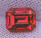
So, in the meantime, I''ve added two pics. The one posted in this message was taken by none other than Mr. Sherwood, whose photography skills with respect to color are way way beyond mine. This is actually fairly close to what it looks like in certain shaded daylight conditions. Outside, on a somewhat overcast but bright day, it is much more red, and almost glows with this slight candy-red-hint-of-pink undertone. But this pic is a good idea. Reminds me of watermelon, if you could turn watermelon into a gem.

The second pic is in my avatar. It was taken under direct incandescent from a 60W bulb at about 15 inches, by Mr. Gary Dutton of diamondexpert.com fame. He was the guy who finally came through for me! Can''t say enough about his contacts and his absurdly good service. He took a huge load of pictures for me when he received the stone from his supplier, and spent a good deal of time describing it to me, before I had it sent to Richard. The great thing is, we found the stone by going on a gut feeling, since he received numerous responses, but this response didn''t have an accompanying pic, just a description of how great the cut was. After talking to the supplier Gary''s curiosity was piqued and he suggested it would be worth having a look.

Anyway, more pics to follow.

As for the jewellery designer, I am almost definitely going to go with Linda Penwarden:


Her stuff really has high craftsmanship, and the main thing is I''ve never seen better bezel work. I await her sketches; should take a couple of weeks.

If anyone has any further questions, I''m glad to answer them. In fact, I feel I''ve become rather possessive of this stone. Has anyone ever read the Silmarillion? This jewel is beginning to take hold of my mind in much the same way... I am experiencing a "greedy love." I almost don''t want to give it away!


[/u]

daylight.jpg
 
The silmarillion is a great book... as Forgotten Tales, the LOTR and the hobbit!
I have learned english reading Tolkien and organising live role playing games in Tolkien''s world in France 18 years ago...
Take care about the fate of Feanor and his sons!

All the best.
 
Congratulations on finding such a fine spinel. The cut is exquisite and the color is superb. How long did it take you to find this winner? Thanks also for sharing your digital photography tips. I am playing around with macro digital photos of jewelry too, but have not quite mastered the technique yet. I am just curious, how much more would the stone have cost if it does not have a hint of pink?
 
Raddygast:

I THINK THAT STONE IS DROP DEAD, EYE-POPPING, MIND-BLOWING GORGEOUS!!!!

WOW
30.gif


Congratulations!!!!!!!!!

widget
 
Nice stone
30.gif


bTW did you know that pink is really the only color "modifyer" type word (that i know of) in english for describing a shade of a color (in this case red).

Can you think of another such word? Maybe only violet as a paler shade of purple - but really violet = purple.

Are there other color type examples in other languauges?
 
tan is a lighter shade of brown
beige is a lighter shade of tan

There are several others.
 
Status
Not open for further replies. Please create a new topic or request for this thread to be opened.
GET 3 FREE HCA RESULTS JOIN THE FORUM. ASK FOR HELP
Top