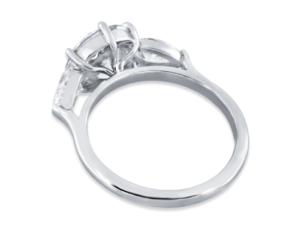
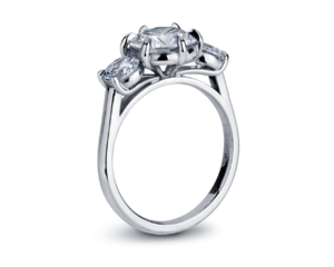
shape
carat
color
clarity

Round 2 of reset

KKJohnson

Brilliant_Rock
Premium
Joined
Aug 15, 2017
Messages
1,836
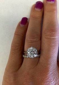
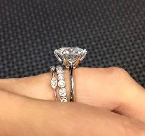
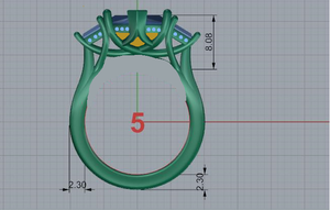
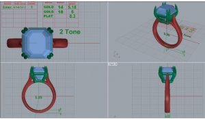
After wearing my reset DK ring, I have learned what I like and don’t like with the ring. David is wonderful enough to remake the ring for a fraction of the original cost, the direction I want to go is more slender and feminine. The redesign is much slimmer than the original and will be wire cast making it sturdier for 1.9mm thickness. Let me know what y’all think

Here is the original thread
https://www.pricescope.com/community/threads/dk-cad-assistance-needed.234335/
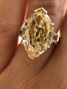
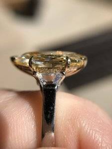
A2BA0FA2-816F-429B-A0C2-8F198911B30D.jpeg

0F85EA79-279C-45D7-A305-EE479732B99C.jpeg

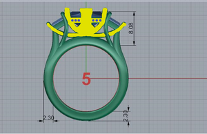
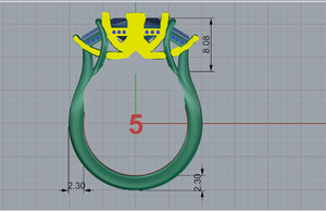
Here is what we have come up with so far, the only thing missing is the cup which I want due to the keel line or windowing occurring.

311EBB75-DBB4-4DDD-9CA8-93FBD13F3E65.jpeg

So I am thinking a half cup will work just fine for this, the marquise head will be 18k yellow gold
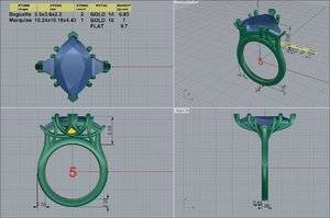
A55DEAFB-C0D8-47F6-B13A-19F53882714A.jpeg
 
Both settings are beautiful & different styles.

I wonder if it is worth making the V-tip look like a double-prong with twinned claw ends?

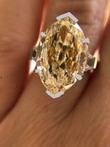
Nice to see your beautiful marquise again!
 
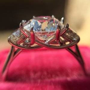
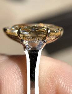
That side profile is beautiful!
I think you said earlier you needed the whole ring set higher to prevent the gallery from getting eaten away from the wedding band? This does look a bit higher from your previous CAD, is this the reason for the full 2.3mm height of the shank at the bridge? My opinion isn't worth much, but I'd thin that out and receive that needed height elsewhere somehow by altering the trellis design.
Has David given you his thoughts about how much the body color of the marquise is going to change from what it was before with the cup placement as it will be in the new CAD? Will the color from the cup be distributed somewhat evenly? I'm imagining the worst as it being like a reverse yellow bow tie effect? That's an extreme thought tho!
These may not matter to you - just dropping some thoughts.
Well wishes to you that this reset solves the issues from before and smooth sailing ahead!
 
I personally adore the current version of your ring - I love how the cup is seamlessly integrated as part of gallery and it really enhances the color of your stone, the profile is elegant, the underhalo is a beautiful accent and overall it’s a really gorgeous, gorgeous ring, one of my absolutely PS favourites! That’s said, you are obviously not happy with it and DK is indeed very generous to remake the setting for a fraction of the original cost. To me, the new design appears quite busier. A trellis, I find pretty without connecting to the shank. I wonder if it would be possible to simply increase the height without needing the trellis to rest on the shank which will still allow for a band to sit flush. I am not explaining it well, but something like the below:
F2017ACB-D918-4FD0-812B-FE3BF3F5FA3E.jpeg
I also recall that you were thinking about turning your ring into a five stone, perhaps, it’s a good time to think about adding two additional stones if a five stone is still something that you want.

I will let others who are better CAD readers comment. Maybe @rockysalamander & @Niel can provide their feedback?
 
A trellis, I find pretty without connecting to the shank. I wonder if it would be possible to simply increase the height without needing the trellis to rest on the shank which will still allow for a band to sit flush.

YES to the above.

I am quite sure the trellis can be made higher in more ways than one - perhaps also by arranging the prong wires to cross under the keel of the marquise. The gold backing of the marquise coud be a flowery object itself ...

2c
 
That side profile is beautiful!
I think you said earlier you needed the whole ring set higher to prevent the gallery from getting eaten away from the wedding band? This does look a bit higher from your previous CAD, is this the reason for the full 2.3mm height of the shank at the bridge? My opinion isn't worth much, but I'd thin that out and receive that needed height elsewhere somehow by altering the trellis design.
Has David given you his thoughts about how much the body color of the marquise is going to change from what it was before with the cup placement as it will be in the new CAD? Will the color from the cup be distributed somewhat evenly? I'm imagining the worst as it being like a reverse yellow bow tie effect? That's an extreme thought tho!
These may not matter to you - just dropping some thoughts.
Well wishes to you that this reset solves the issues from before and smooth sailing ahead!

The added height is to allow for clearance of a band, the previous design didn't allow for this and the bottom of the cup/prong was getting eaten into by the bands. The u prong eternity band I had made at the same time was very very low profile and that still dug into the main ring. DK said to allow a height clearance the 2.3 would work for allowing me alternate my bands, I will be sending him the bands I use so he can tweak it if needed.

This was the eternity band I am referring to
82BF8F05-D7BF-4216-88BE-477765D4ABE6.jpeg

The diamond itself doesn't have a bow tie, its an antique cut that was recut after one of the tips was broken so the stone unset doesn't have this. The cup will run vertically as opposed to horizontally and the marquise head will be yellow gold, I wouldn't think that would cause a bowtie effect but I can ask DK what he thinks.

This is what I am thinking for the yellow gold areas (the blue dots are diamonds, kinda like a hidden halo)
Untitled2.png
 
I personally adore the current version of your ring - I love how the cup is seamlessly integrated as part of gallery and it really enhances the color of your stone, the profile is elegant, the underhalo is a beautiful accent and overall it’s a really gorgeous, gorgeous ring, one of my absolutely PS favourites! That’s said, you are obviously not happy with it and DK is indeed very generous to remake the setting for a fraction of the original cost. To me, the new design appears quite busier. A trellis, I find pretty without connecting to the shank. I wonder if it would be possible to simply increase the height without needing the trellis to rest on the shank which will still allow for a band to sit flush. I am not explaining it well, but something like the below:
F2017ACB-D918-4FD0-812B-FE3BF3F5FA3E.jpeg
I also recall that you were thinking about turning your ring into a five stone, perhaps, it’s a good time to think about adding two additional stones if a five stone is still something that you want.

I will let others who are better CAD readers comment. Maybe @rockysalamander & @Niel can provide their feedback?


I was just going back over trellis settings last night looking at this and I agree 100% about the shank!
 
@SimoneDi has a better idea (and said it in a better way as well) about removing the bridge completely, rather than just thinning it down as I suggested.
I realize your diamond doesn’t have a bow tie. The additional bits you indicated to be in yellow gold should help distribute more even any color reflected than just what I was envisioning of just the cupped middle strip.
It will be lovely!
 
Last edited:
I personally adore the current version of your ring - I love how the cup is seamlessly integrated as part of gallery and it really enhances the color of your stone, the profile is elegant, the underhalo is a beautiful accent and overall it’s a really gorgeous, gorgeous ring, one of my absolutely PS favourites! That’s said, you are obviously not happy with it and DK is indeed very generous to remake the setting for a fraction of the original cost. To me, the new design appears quite busier. A trellis, I find pretty without connecting to the shank. I wonder if it would be possible to simply increase the height without needing the trellis to rest on the shank which will still allow for a band to sit flush. I am not explaining it well, but something like the below:
F2017ACB-D918-4FD0-812B-FE3BF3F5FA3E.jpeg
I also recall that you were thinking about turning your ring into a five stone, perhaps, it’s a good time to think about adding two additional stones if a five stone is still something that you want.

I will let others who are better CAD readers comment. Maybe @rockysalamander & @Niel can provide their feedback?

I completely agree with this. If there's some way to integrate a cup, without having a shank, that would be ideal. I love a trellis without a shank - way more elegant and feminine. And just less 'stuff' going on underneath. How this could incorporate - or even IF it could - I have no idea.
 
@SimoneDi something like this?

I should be working but instead I am playing with Paint :whistle:

Untitled2.png
 
@SimoneDi something like this?

I should be working but instead I am playing with Paint :whistle:

Untitled2.png
Something like this but you will need to have additional wires connecting from the shank to the basket for additional structural support (the middle yellow on your mock up). I also agree that if you are going all prongs, you might want to do double prongs at the marquise tips.

Is the five stone idea completely out?
 
If me - I’d be concerned about a big stone like this and how high it is (although it’s required and requested) and how open it is right above the finger of just how durable it is for everyday wear. Without flexing /torquing or loss of stone.
Don’t know if hand fab vs cast trellis would increase the integrity of the setting?
 
Last edited:
Something like this but you will need to have additional wires connecting from the shank to the basket for additional structural support (the middle yellow on your mock up). I also agree that if you are going all prongs, you might want to do double prongs at the marquise tips.

Is the five stone idea completely out?

I will leave the added support to DK to mock up as I have no idea how to make it work on paint. Yes, the 5 stone is out since I want the band so thin.

V tips seems to be what is recommended to protect the points and I also feel like it is a more secure option (he did scale them down from the original), I can ask him if he thinks doing prong tip will help reduce the protrusion of the tips as well since that should also help a band sit flush.
 
  • Like
Reactions: AV_
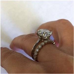
I love the new CADs... I'd make it at least 2.2 mm (1.9 is suuuuuper tiny, and your rock is suuuuuuper large). Just to show you, my bezeled band is 2.5 mm in the photo below:CVB Soli with bezel eternity.jpg CVB Soli with bezel eternity_1.jpg

A wire will appear even thinner.
 

Attachments

  • CVB Soli Stack_1.jpg
    CVB Soli Stack_1.jpg
    211.8 KB · Views: 18
I love the new CADs... I'd make it at least 2.2 mm (1.9 is suuuuuper tiny, and your rock is suuuuuuper large). Just to show you, my bezeled band is 2.5 mm in the photo below:CVB Soli with bezel eternity.jpg CVB Soli with bezel eternity_1.jpg

A wire will appear even thinner.

I understand but my hands are small, short and stubby. If I remember correctly David said the original reset was suppose to be 2.3 but all the CADs I have are 2.5, I cant seem to find any of my old emails (which is strange) but that is why I requested it to be 1.9. The only way for me to really know what the mm is would be to have it measured at by a jeweler
 
  • Like
Reactions: AV_
I understand but my hands are small, short and stubby. If I remember correctly David said the original reset was suppose to be 2.3 but all the CADs I have are 2.5, I cant seem to find any of my old emails (which is strange) but that is why I requested it to be 1.9. The only way for me to really know what the mm is would be to have it measured at by a jeweler

Gotcha... I feel like it seems thicker to you because the metal on the shank is very boxy and chunky (for lack of a better description). Maybe if the edges were softer and more rounded, it would appear and feel differently.
 
So DK said that he recommends a full cup like last time as a half cup might show the windowing/keel line and he suggested sticking with the V tips as it adds the extra protection since it is a large stone.
 
Or something like this and just have the cup gold and everything else plat, I really like the trellis detail and worry it might get lost since now it was recommended for a full cup. But then I worry I won't like the prongs if they aren't gold since that is what I am use to and they blend so well with the stone as is.

Untitled.png


A2BA0FA2-816F-429B-A0C2-8F198911B30D.jpeg
 

Attachments

  • Untitled.png
    Untitled.png
    243.4 KB · Views: 25
What are you trying to accomplish with this reset? TBH I have a hard time seeing the difference from what you have. And such a large diamond needs to be anchored to your finger with a good size base IMO, or its going to flop all around...
 
I won't like the prongs if they aren't gold

Since a prong wire is shared with a sidestone, the traps will end up with gold prongs too; I will not object o colourless diamonds in YG, unless you do.

Then again,

I am hardly seeing the traps in these pictures and they do contribute to the hefty feel of the ring; how about a trellis solitaire?
 
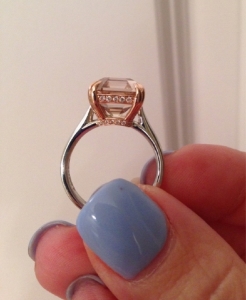
Why don’t you have DK do a good hard polishing to soften the edges of the shank, making them more rounded? The rounded edges will give the ring the illusion of appearing much thinner and give a more feminine look... the rest of the ring is perfect IMO - I wouldn’t change a thing about the basket or prongs. This is a very amateurish attempt to show you what I mean... not this severe, of course.
00054012-E267-4DC0-A2B0-F6A385A95A53.jpeg
 
Seriously, I would not remake this ring. I think it's the hefty look and feel of the shank that's bothering you.
 
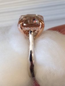
Notice how the edges of the shank are rounded off on this ring... very fluid and feminine.
upload_2017-9-20_22-3-23-png.594673
 
I posted this on your old thread, but I feel like it's pertinent here... as I had the same problem.

Okay, so I think @rockysalamander is referring to my old honey zircon asscher made by DK... I felt like it was too thick. In retrospect, I wish I'd had DK make the shank more rounded to accommodate the heft, instead of flat/thick.
 
I agree with much of what @msop04 suggested.
I kept thinking about your trellis design idea and I just don’t see how it can work with your stones. A trellis design IMO is beautiful when completely uninterrupted and in one metal because of the intertwined wires. I do think that for your re-design (if you really want to proceed with one) a basket style setting similar to what you currently have will be best. I wonder if you can just rework your current design a little bit to give you what you want without completely changing the aesthetics.

Maybe borrowing some design elements from the below two rings:
AE90A414-CBCF-459A-A171-3C913B5139E7.png F7D563A6-65D0-4FBB-86A0-4A601B511737.png

As earlier suggested, I don’t know if your center stone can be sufficiently supported without a donut. But perhaps you can increase the height of the donut, emphasize more the curve of the center stone basket to allow for a band to sit closer to your ring and maybe change the side stone design from bar set to prong set.
 
Notice how the edges of the shank are rounded off on this ring... very fluid and feminine.
upload_2017-9-20_22-3-23-png.594673
:love::love::love::love::love::love::love: but the split shank just under the main stone is different. What is the purpose of the split?
 
:love::love::love::love::love::love::love: but the split shank just under the main stone is different. What is the purpose of the split?
That’s just a ring sizing insert.
 
:oops::oops::oops:
 
Notice how the edges of the shank are rounded off on this ring... very fluid and feminine.
upload_2017-9-20_22-3-23-png.594673

WOW & XOX !

... noticing the small sides - just diamond extentions of the shank, & a double-prong at a tip/end.
 
Last edited:
GET 3 FREE HCA RESULTS JOIN THE FORUM. ASK FOR HELP
Top