shape
carat
color
clarity

Second-guessing Victorian Inspired Cluster Ring

JulieN

Super_Ideal_Rock
Premium
Joined
Jul 25, 2005
Messages
13,375
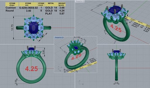
I've done a couple of rounds of CADs already and it is almost there! There's a few things bugging me that I'm waffling on, so I'm reaching out to PSers for advice.

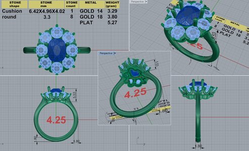
Center stone prongs: a typical 8 stone cluster would have 8 prongs on the center stone. I feel like 8 prongs often looks too prominent, so I asked for 4. Does it look weird in the CAD? Is there some other orientation that works better, or should I just ask for as delicate as possible 8 prongs?

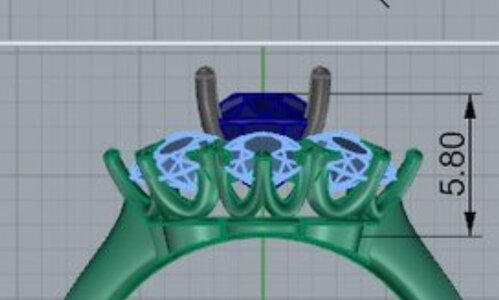
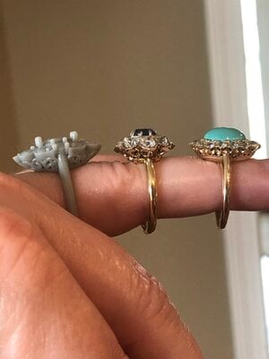
Sidestone setting: I got the 3D plastic model, and there are two issues that could be tweaked.
  • The angle between the shank and the gallery is larger than I'd like.
  • The prongs are not as swoopy as the inspo pic. I have already asked for more swoopiness once before and this is the improved version, so I'm not sure if this is the most swoopy it can go
I believe the donut should be made smaller in circumference to reduce the angle between the shank and the gallery.
Should the the sidestones slope away from the center a little, more like CvB designs?


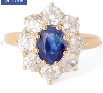
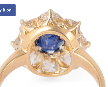
Original inspo pic:
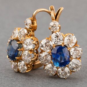
images.jpg

And here's the CAD:
DK 95435-QUAD-4.png

What do
 
He can do small prongs that will not overpower the center. I think the 4 prong placement is odd and I would swap it to 8

The halo diamonds are already set at an angle to the center diamond I don’t think they need to be angled more than that. I find the flair CVB does (not always but at times) to be a bit too much.

Could you elaborate on your issues with the shank. I don’t understand.

Dk has made two cluster rings for me so far.

My only comment would be that I find the shank a bit basic. It feels like it would benefit from a taper or a design or something. But that’s a personal preference. It’ll be lovely.
 
Is there any chance you’d considered changing the orientation of the ring? It might help with your donut issue Becuase he wouldn’t have to cut so much of the donut out at the north and south ends- make it a bit more even hight through the donut. Also with your finger size you could really take up a lot of real estate.

I’m sure you have this idea I’ll show myself out lol
 

Attachments

  • D1D895A8-F6E7-4916-B48B-8DD8B76FA209.jpeg
    D1D895A8-F6E7-4916-B48B-8DD8B76FA209.jpeg
    43.6 KB · Views: 30
I prefer 8 prongs. Not sure how to answer the other Qs! I am jealous, this will be lovely. I have always wanted a ring like this. What will the center stone be?
 
OMG. Fantastic!
 
I forgot to tag @mrs-b
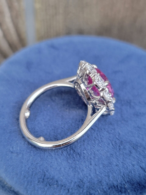
I've loved your DK projects for years. I just found this picture of your spectacular 7-stone. The sidestone baskets are perfect.

20210918_160244-jpg.853305
 
Last edited:
I think the baskets in the CAD you posted look a lot like the inspiration, but if you want them to look like the baskets in mrs-b’s band you might need a revision. The swoo is very open and u-shaped on the inspiration and the CAD whereas the swoops are a little more v-shaped and tucked around the stones in mrs-b’s band. The only thing is I think your diamonds are smaller which might affect how tight the metal can hug the stones?
 
I think the baskets in the CAD you posted look a lot like the inspiration, but if you want them to look like the baskets in mrs-b’s band you might need a revision. The swoo is very open and u-shaped on the inspiration and the CAD whereas the swoops are a little more v-shaped and tucked around the stones in mrs-b’s band. The only thing is I think your diamonds are smaller which might affect how tight the metal can hug the stones?
Thanks, this is a good description to help me word the revision. To get this look, I think I need to ask for the stones to be low-set, and to shrink the donut slightly?

Also, I need to trim down the fishtail/shared prongs significantly like this ring below, to give it less metal and more air space.

1705532794834.png
1705532833354.png
 
Also, I need to trim down the fishtail/shared prongs significantly like this ring below, to give it less metal and more air space.

1705532794834.png
1705532833354.png

Making the v prongs (or whatever they are called!) smaller like this image might be more difficult because your cluster stones are cushion shaped instead of round?

I love the cushion cluster stones - it’ll look fantastic! Do you happen to have a picture of those?
 
Making the v prongs (or whatever they are called!) smaller like this image might be more difficult because your cluster stones are cushion shaped instead of round?

I love the cushion cluster stones - it’ll look fantastic! Do you happen to have a picture of those?

DK will have the stones cut for this project. I would have loved real antiques! But don't want to deal with sourcing them myself.

Here's a CAD with 3.3mm rounds. I am leaning towards 3.2mm OECs to make the V prongs smaller.DK 95435-QUAD-2 (1).jpg
 
I like the proportions of these 3.3 stones. Do you happen to have any 3mm stones around? They are pretty teensy! And I bet those little v prongs will be smaller once it’s finished. They cast chunkier so they can polish them down. They are pretty tiny already. Like a tiny fraction of a mm. Everything looks so glaring when it’s all blown up.

Regarding communicating with DK I think it will be easier to send a picture of baskets they have done that you like and say “do this” rather than trying to put it in words.
 
Awww the cushion cluster idea was great but I can see the side view crown shape is important to you
So I won’t suggest different prong formation with smaller v-prong
Even tho Dreamer is right - they are pretty small already.
But I get it!!!! The small details matter and we want to get what we envision!

It’ll be lovely no matter what with your beautiful stone!
 
IMO one thing to consider is that your ring is sitting flat on the shank. I know that's typical with the style you want, but I'd consider either adding a knife edge or a slight cathedral to give it some lift. I think it looks a little "sqautty" or like a stick pin conversion without those elements.

Check out @elle_71125 's recent project to see what I mean.

1705584609165.png

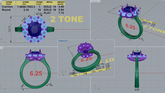
DK just did a similar project for me, but mine was a shared prong vs a victorian inspired cluster. Happy to post pics of CAD vs IRL if helpful. Here's my CAD - again, different but maybe helpful. (And my first CAD had the exact same thing as yours, it was sitting 100% flush on the shank and looked squatty to my eye)

DK 96979-QUAD-5.png
 
Thanks for the link, the handshots were so helpful. This looks like the amount of tilt I want, it looks great from every angle.
1eb98938-ab62-493d-93b4-b028956d6095-jpeg.889351

Since it’s the same vendor - I’m assuming -
If you tag elle and ask her to see her side view cad, it’ll be super easy to see the cluster stone tilt degree comparison between her cad and yours.
 
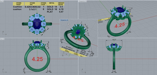
Latest update, I feel like I'm pretty close. I'm excited but anxious at the same time.

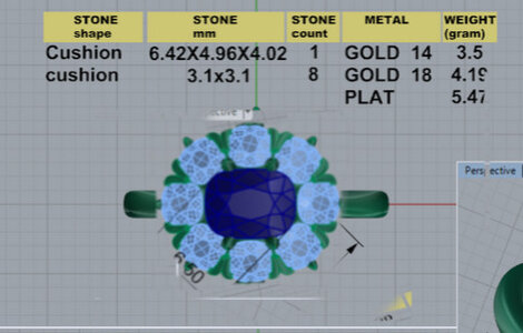
The prongs have been moved to the four corners, which squares up the outline.
The sides are not tucked as tightly near the center stone, due to the center prongs not being between the gaps of the sidestones; there's an air space.
The sides have slightly more outward tilt.DK 95435-QUAD-6.jpg

Are the diamond sides overwhelming the center?

I've asked for the donut to be shrunken smaller in the past, but it hasn't happened... not sure if they haven't done it because its not possible.

Opinions welcome! Just want to make sure I'm not overlooking anything
 
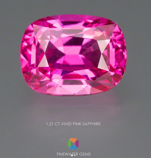
I’m not good at interpreting the smaller details in complicated CADs like this but I adore the look of diamonds with coloured gems and I think the saturation of your center stone can handle the larger side stones. They will be newly cut European style cuts right? Those are much less blingy than MRBs and so even less likely to compete. I love the proportions.

I also like the other changes you made in relation to the original. Not sure about the donut but seems to me if it was smaller it would change the angle of the halo baskets too… which may not be a good idea.
 
Considering the donut at its thinnest is like 1mm I don’t think it can or should get smaller. IMG_4904.jpeg
 
@JulieN -

I'm sorry I'm so late to the party!

If this window is still open - my suggestions would be:

1. I like my prongs equally spaced, and, for a cushion/radiant/emeberald shaped stone, I like them in the corners, as yours are on the latest CAD. So I'd be signing off on that.

2. I agree re pulling the donut in. Have you sent Amy a drawing of what you mean? Is this ring going to sit next to something? Because, if not, a smaller donut doesn't really matter, except for aesthetics. Just remember, from above you definitely won't see it either way. So maybe this is a non-issue? I am with you on this, tho.

3. Not sure how I feel about the air gaps between diamonds and center gem. I'd probably have to see it to know for sure. This could be a problem for me. Not sure how to get around it.

4. For me, tilt on side stones is E-VER-Y-THING! I like a big side tilt. I just think it grabs the finger better and looks more organic in its flow. Not fond of the 'flat pancake' look. Some people are, tho, so if you're one of those people, don't let anyone sway you.

And, in all likelihood.....do you already have it??

Again - my apologies for my lateness and this (probably useless, now) post!

Good luck!
 
I've asked for the donut to be shrunken smaller

Do you mean the height to be shrunken or the diameter of the donut?
878903

If it’s the diameter if the donut you mean, Like the middle ring opposed to the ring on the right?

Maybe if nothings been addressed to your request - it’s a verbal /written miscommunication and a picture/drawing is needed
 
GET 3 FREE HCA RESULTS JOIN THE FORUM. ASK FOR HELP
Top