shape
carat
color
clarity

Sometimes, simpler is better.

Status
Not open for further replies. Please create a new topic or request for this thread to be opened.

CBL

Shiny_Rock
Trade
Joined
Apr 14, 2009
Messages
172
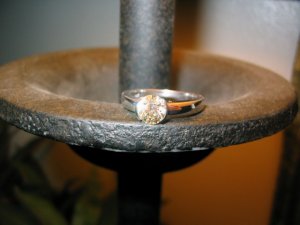
Well, this baby''s been through a lot in the past couple months. I had no idea that resetting would be such a PROCESS. I have definitely learned so much and ultimately, even though it got a little messy along the way, it worked out perfectly. I''m not going to elaborate on the twisty process that landed me where I am but I will say that Whiteflash customer service is truly top notch and I have something now that I truly love. I have to thank D&T for turning me on to the keystone setting....and I''m planning on getting a Danielle band (or a similar bezel band) soon to complete that amazing look!

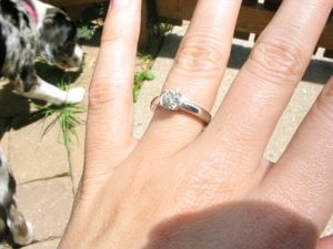
So without futher ado, here it is. Diamond is 1 ct European cut, vs, L in color (cheers to all the warm diamond lovers out there...I''m obsessed with mine!).
keystone74.jpg
 
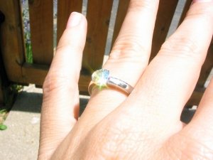
another

keystone73.jpg
 
:)

keystone76.jpg
 
and a little fire.

keyston75.jpg
 
Date: 6/26/2009 1:19:49 PM
Author: CBL
and a little fire.
WOW!!!! Lovely stone. Love the setting as well. Could you please take a picture that really show the color of this diamond? I am sooooooooo curious about how warmth color really look in a white gold setting. Could you plsssssss???
35.gif
 
Honestly that first pic, where the stone is under a yellow light, is the warmest picture I''ve gotten. Outside and in normal lighting it faces up fairly white to me, and if anything I would say it''s sort of ''creamy'' in color. I think the white gold accentuates the creaminess and I love that. I will try to take some more pics that show the color.
 
Oh, wow - your ring is simply stunning! Congrats!
 
Date: 6/26/2009 1:26:38 PM
Author: CBL
Honestly that first pic, where the stone is under a yellow light, is the warmest picture I''ve gotten. Outside and in normal lighting it faces up fairly white to me, and if anything I would say it''s sort of ''creamy'' in color. I think the white gold accentuates the creaminess and I love that. I will try to take some more pics that show the color.

Wow!!! Its gorgeous. Its like the stone has some yellow gold that sparkles from within. Wow!!! Lovely!!!
 
Ooooooh! I really love to combination of the old cut stone with the modern style setting. I had always wondered how that would work, and it''s just stunning.
 
36.gif
Oh wow I love it! It shows off your beautiful stone so well!
30.gif
 
Date: 6/26/2009 2:19:06 PM
Author: Snicklefritz
Ooooooh! I really love to combination of the old cut stone with the modern style setting. I had always wondered how that would work, and it''s just stunning.
Ditto! What a great combo. I
30.gif
your ring!
 
WOW!! Definitely agree with you on this!! It''s stunning! The warmer old stone in a super polished white metal and sleek setting! Love it!
30.gif
 
That''s beautiful.
I''d love to see a profile shot please!!
 
This may be my new favorite ring on Pricescope!
It''s truly gorgeous.
 
awwww - thanks for the shout out CBL
1.gif
Your Keystone is absolutely gorgeous! it looks incredible in white and your diamond looks amazing in it! does not look like an L at all!
 
I so agree with your title.
2.gif


Just beautiful!
 
What a gorgeous sparkly stone! Love the fire shot. Congrats on the reset. I think the Danielle would look great with your ering.
 
wow!!! i''ve always loved old cut diamonds and i ADORE yours! it''s just beautiful...absolutely STUNNING!
30.gif
what a great setting...
36.gif
 
Wow! I just love how your ring turned out! It really is stunning!
 
So pretty!!!!!!!!!!!
 
Wow, thanks so much everyone for your sweet compliments, they are SO appreciated. After everything it took to get here it makes me feel really happy to hear that others like it!!

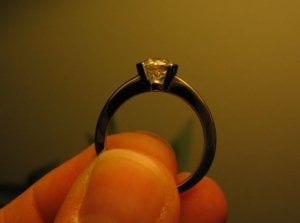
Below I am attaching the Whiteflash pics, because they kind of show the profile, and then I''ll attach another shot I took of the profile. I think it is one of the most stunning aspects of the ring. I love that it''s semi bezel but it''s so open and you can see so much of the diamond. Whiteflash did a lovely job with this setting.

As far as the old cut/modern setting...it just kind of happened. I was trying to get into the vintage thing because I thought that might look better with the stone, but the sleek and minimalist nature of this setting just really appealed to me--plus, it''s a little ''heftier'' which is great because I''m just not a very dainty girl (hence the beginning of this saga, when I cracked the old setting). And, it just really showcases the stone. No prongs or anything to detract, and I love that.

Ok, so here is the profile shot.

CaitKeystone2_062409.jpg
 
Best I could get of the profile myself...

caitkeys39148.jpg
 
You can really see the warmth of the stone in that one, although the lighting does make a difference.

Also, SO sorry for my hideous/summer/I-wash-my-hands-all-the-time cuticles.
 
That is GORGEOUS!!!
3.gif
3.gif
3.gif
I just got an L modern rb and I looooove
30.gif
it. It will go to Leon as soon as he gets back from vacation. Congrats!!
 
Wow, I LOVE it! The setting, the stone...everything! It is truly gorgeous-wear it in good health!
 
Beautiful!
 
Your ring is beautiful!! Can''t agree more with simpler is better!
36.gif
 
Status
Not open for further replies. Please create a new topic or request for this thread to be opened.
GET 3 FREE HCA RESULTS JOIN THE FORUM. ASK FOR HELP
Top