shape
carat
color
clarity

Stack or set sapphire?

scarsmum

Brilliant_Rock
Premium
Joined
Jul 22, 2017
Messages
893
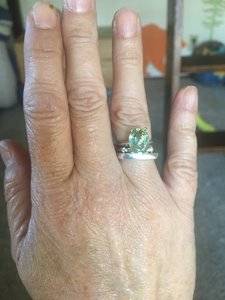
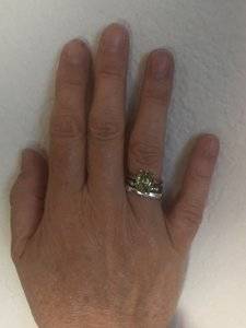
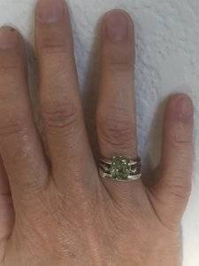
9D1F3FF0-0452-4EF0-9852-54E805E92F7D.jpeg 9B1D5EE3-4EB1-4361-A9CB-A25960250D1A.jpeg 78942BCF-DC8B-4A84-9CBC-EC5D08CF7C3B.jpeg Hey gem lovers! I’m going to try to get some advice even though I’m pretty sure I take the worst selfies in the world. I tried to sell my green sapphire but didn’t have any interest so I decided to love it instead. It is really beautiful but a bit windowed. It’s really not too poorly cut. It is about 10 by 8. I decided to set it for now in an ultra cheap setting and have been trying it stacked with a couple of other rings. It does look really. I’ve next to diamonds and I’m wondering whether I should come up with a more elaborate setting for it or leave it as is and stack it. So my questions are, would you pay for a diamond setting for a less than optimal cut stone? And does it look best in the simple knife edge setting? Thanks for any input or setting suggestions.

 
7CE9850F-4D41-4877-A873-AF82B91F26F1.jpeg One pic on its own
 
Let me say that I like this stone. Its pretty. looks like its got a fun personality.

I might not be the one to ask considering I have a 5 dollar stone in diamond settings... (it kinda just worked out that way):whistle:

What I will tell you is this; Buy what you will wear. If you're certain you're going to wear this stone, then buy the setting that works best for you and your budget.

IMO budget should be based on the overall project, not really just its parts. If you have some different types of metals around, maybe pictures against each could help you figure out what color metal will work best.

THIS is perfect advise!!
 
Some great advice from Arcadian.

Can you share what you like about the stone and what you don’t like?

Personally, for me, only beautiful standout stones can be set in a simple solitaire. If not, it’s easy for me to nitpick their flaws. I do think a nice setting and some side stones takes the burden off the centre stone and makes it more about the overall ring.

But if you don’t love the stone because of its cut, how about a recut?
 
I love that color, and I think it’s very fresh and happy and looks great on you, so it doesn’t need a fancy setting to balance it. This is just me, but I really enjoy good geometry and the window would bug me. I would spend the money for a recut. It’s plenty big to lose some spread for the sake of the sparkle.

Everybody is different...I’m more tolerant of inclusions and not “ideal” colors than some, but I’m a fan of more precise cutting. But ultimately I hope you’ll go with what you’ll enjoy most. It’s definitely a beautiful stone and deserves to be loved and worn often!
 
Some great advice from Arcadian.

Can you share what you like about the stone and what you don’t like?

Personally, for me, only beautiful standout stones can be set in a simple solitaire. If not, it’s easy for me to nitpick their flaws. I do think a nice setting and some side stones takes the burden off the centre stone and makes it more about the overall ring.

But if you don’t love the stone because of its cut, how about a recut?

I have inquired with Gene about a recut. It seems the sapphire may be cut too shallow to improve it without losing 1/3 or more. I’m reluctant to do that as Montana sapphires if this size are rare. I do like it, quite a lot, but I find myself ruminating on wanting a deeper more saturated color, either blue or green. I would ideally like to set it with four diagonal carre cuts N/S/W/E and pave in between, to represent the southern cross. For this, a dark green would be more representative of New Zealand or a deep blue to represent space. That’s my ambivalence. The idea arose a little after I acquired this particular stone.

I love that color, and I think it’s very fresh and happy and looks great on you, so it doesn’t need a fancy setting to balance it. This is just me, but I really enjoy good geometry and the window would bug me. I would spend the money for a recut. It’s plenty big to lose some spread for the sake of the sparkle.

Everybody is different...I’m more tolerant of inclusions and not “ideal” colors than some, but I’m a fan of more precise cutting. But ultimately I hope you’ll go with what you’ll enjoy most. It’s definitely a beautiful stone and deserves to be loved and worn often!

Thank you, I am not too familiar with cuts for colored stones, and I cannot easily tell the difference between a precision, native or just poor cut. The window is a little irksome, but it’s also not glaring. Unfortunately, not easily improved. It’s the kind of window where you can vaguely see writing through the middle of the stone, but the color is still strong through the middle. I think I will have to sit on this one for a while.
 
Maybe it’s better to sit on this one a little longer and let the ideas marinate. You do already have it set and can enjoy it while you think. I love your idea of a Southern Cross but I see your desire for a darker green. What about a dark green halo? Also, can I suggest rose gold? It would make this green pop and look minty.

FWIW, I do not think the window is bad. I have to stare at it before I can see it. The size of this stone is great for a pendant, have you considered it? I find that as pendants dance around and catch the light that I do not mind windowing as much.
 
GET 3 FREE HCA RESULTS JOIN THE FORUM. ASK FOR HELP

Featured Topics

Top