shape
carat
color
clarity

Stars, and other questions

Kim N

Ideal_Rock
Premium
Joined
Oct 6, 2005
Messages
6,840
Could someone please explain why the stars of the top stone appear, on average, larger than or at least equal in size to the stars of the bottom stone?
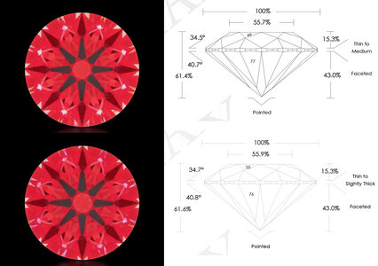
stars.jpg

Secondly, what causes the extra contrast at the base of the arrows in the 2nd and 3rd stones here in the computer-generated ASET images? Can it be fully explained by the two parts 30 degree and one part 40 degree obstruction?
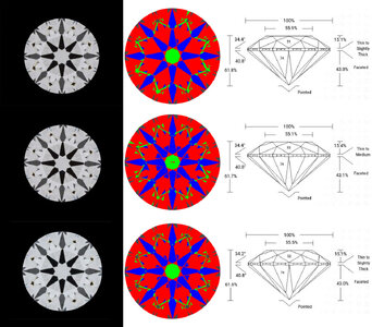
ASET AGS.jpg

@Karl_K @Texas Leaguer @John Pollard
 
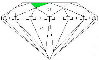
Star% is the % of the distance between the table and the girdle that the star facet covers.
In the second image the stars cover a greater % of the area between the table and girdle.
It is subtle, which is why the star% effect on the upper girdle facet angles is its largest effect.
 
Star% is the % of the distance between the table and the girdle that the star facet covers.
In the second image the stars cover a greater % of the area between the table and girdle.
It is subtle, which is why the star% effect on the upper girdle facet angles is its largest effect.

Got it, thanks, Karl! Could you also explain the extra contrast in the AGS ASET images?
 
Got it, thanks, Karl! Could you also explain the extra contrast in the AGS ASET images?
I think its just something with ags's ray tracing software.
Someone else may have a better answer.
@Garry H (Cut Nut)
 
Secondly, what causes the extra contrast at the base of the arrows in the 2nd and 3rd stones here in the computer-generated ASET images? Can it be fully explained by the two parts 30 degree and one part 40 degree obstruction?

ASET AGS.jpg

@Karl_K @Texas Leaguer @John Pollard
Pertaining to your second question, your suspicion may be correct. There are potentially three different face up ASET maps on an AGSL report. The single map report (and the one on the new GIA/AGS Ideal Report) are rendered at a cone of obscuration of 33.5 degrees. As you point out 2 parts 30 one part 40 since the ray tracer analyzes the diamond through that full range. The subsequent "advanced ASET" maps such as those on A CUT ABOVE Platinum reports are rendered at 30 and 40. ASET maps rendered at 33.5 and 40 can be expected to show more contrast (blue) than one rendered at 30.
 
Secondly, what causes the extra contrast at the base of the arrows in the 2nd and 3rd stones here in the computer-generated ASET images? Can it be fully explained by the two parts 30 degree and one part 40 degree obstruction?

ASET AGS.jpg
In answer to your bolded - yes.

This is an analysis of subtended angle. Think about this... It's night and the full moon is out. You close one eye. Keep the other eye open. And bring your fingertip up really close to your one open eye, and you can block the whole moon out. Now move your hand away... The further you move your hand from your eye, the less of the moon your fingertip blocks out.

For this imagery... The diamond is your open eye. And the scope is your fingertip. The closer the scope is to the diamond, the more blue contrast the diamond "sees". Only instead of actually moving the scope, the software is minimicking changing the angle of subtend to calculate how much more blue you'd see. The image at 30 degrees emulates the scope being a wee bit further away from the diamond. The image at 40 degrees emulates the scope looming right up close over the stone. (The hand-held ASET scope you can buy shows obstruction/contrast at 30 degrees when bottom of scope is level with diamond girdle plane - to emulate 40 degrees you'd have to hold the diamond up actually inside the scope).

But there's a catch. The real photos vendors take, the CG imagery produced for the report - it's all assuming one eye. Most of us have two eyes and most of us use both eyes to look at our diamonds! The concatenation of those two independent images (what each eye sees separately) isn't going to be exactly the same as *either* the real photo or the CG image on the report.


Re. stars - can you circle exactly what you're questioning? (Cause the stars look def look longer in the second pic to me)
 
Pertaining to your second question, your suspicion may be correct. There are potentially three different face up ASET maps on an AGSL report. The single map report (and the one on the new GIA/AGS Ideal Report) are rendered at a cone of obscuration of 33.5 degrees. As you point out 2 parts 30 one part 40 since the ray tracer analyzes the diamond through that full range. The subsequent "advanced ASET" maps such as those on A CUT ABOVE Platinum reports are rendered at 30 and 40. ASET maps rendered at 33.5 and 40 can be expected to show more contrast (blue) than one rendered at 30.

In answer to your bolded - yes.

This is an analysis of subtended angle. Think about this... It's night and the full moon is out. You close one eye. Keep the other eye open. And bring your fingertip up really close to your one open eye, and you can block the whole moon out. Now move your hand away... The further you move your hand from your eye, the less of the moon your fingertip blocks out.

For this imagery... The diamond is your open eye. And the scope is your fingertip. The closer the scope is to the diamond, the more blue contrast the diamond "sees". Only instead of actually moving the scope, the software is minimicking changing the angle of subtend to calculate how much more blue you'd see. The image at 30 degrees emulates the scope being a wee bit further away from the diamond. The image at 40 degrees emulates the scope looming right up close over the stone. (The hand-held ASET scope you can buy shows obstruction/contrast at 30 degrees when bottom of scope is level with diamond girdle plane - to emulate 40 degrees you'd have to hold the diamond up actually inside the scope).

But there's a catch. The real photos vendors take, the CG imagery produced for the report - it's all assuming one eye. Most of us have two eyes and most of us use both eyes to look at our diamonds! The concatenation of those two independent images (what each eye sees separately) isn't going to be exactly the same as *either* the real photo or the CG image on the report.

@Texas Leaguer and @yssie, thank you so much for the explanations. They're incredibly helpful.

Re. stars - can you circle exactly what you're questioning? (Cause the stars look def look longer in the second pic to me)

I had thought previously that the stars were the hot spots between the arrowheads--I asked the question because it appeared as though the hot spots in the second pic were not larger than the ones in the first pic. I understand better now from Karl's post that I need to be looking at the distance covered rather than the size of the hot spots. If I'm still missing something, please do clarify!

I do have one more question: why do the AGS reports in the second set of photos not show the star % on the facet I've highlighted, as they do in the first set of photos?

star facet.jpg
 
I do have one more question: why do the AGS reports in the second set of photos not show the star % on the facet I've highlighted, as they do in the first set of photos?

star facet.jpg
Are the report dates far apart?
They may have fixed it at some point and moved it to the star facet, or the reverse they could have made it wrong at some point and moved it off the star.
 
@Texas Leaguer and @yssie, thank you so much for the explanations. They're incredibly helpful.


I had thought previously that the stars were the hot spots between the arrowheads--I asked the question because it appeared as though the hot spots in the second pic were not larger than the ones in the first pic. I understand better now from Karl's post that I need to be looking at the distance covered rather than the size of the hot spots. If I'm still missing something, please do clarify!

I do have one more question: why do the AGS reports in the second set of photos not show the star % on the facet I've highlighted, as they do in the first set of photos?

star facet.jpg

I think the measurement does pertain to the star length, although it is written on the bezel facet (a bit confusing!). I do not remember ever seeing that before. I will see if I can get clarification. My guess is that it was done for legibility.
 
Are the report dates far apart?
They may have fixed it at some point and moved it to the star facet, or the reverse they could have made it wrong at some point and moved it off the star.

No, all the reports were dated within the last 4 months.
 
Are the report dates far apart?
They may have fixed it at some point and moved it to the star facet, or the reverse they could have made it wrong at some point and moved it off the star.
I think the measurement does pertain to the star length, although it is written n the bezel facet (a bit confusing!). I do not remember ever seeing that before. I will see if I can get clarification. My guess is that it was done for legibility.

The second set of reports are for lab diamonds, but this still doesn't explain why they've done it that way.
 
The second set of reports are for lab diamonds, but this still doesn't explain why they've done it that way.
Well, in the computer geek world when something is done in a weird and random way and never the same twice and makes no sense,,, You shrug and it say its Microsoft or That they are just imitating Microsoft.
So the answer is that they are just imitating Microsoft.
Or the other possibility is that it's a grand conspiracy to annoy you :}
 
GET 3 FREE HCA RESULTS JOIN THE FORUM. ASK FOR HELP
Top