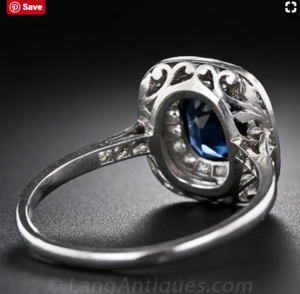
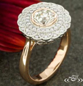
shape
carat
color
clarity

Thoughts on David Klass CADs for oval double halo ring

meely

Brilliant_Rock
Premium
Joined
Jan 2, 2014
Messages
1,859
IMG_1432.jpg IMG_1433.jpg IMG_1434.jpg IMG_1435.jpg IMG_1436.jpg
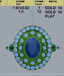
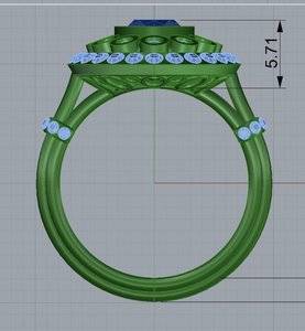
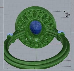
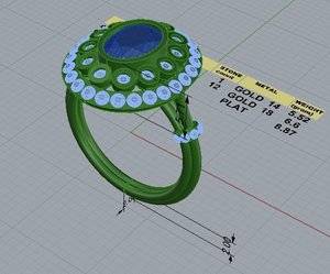
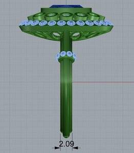
I would really appreciate some input on these CADs that I received earlier from David Klass.

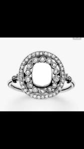
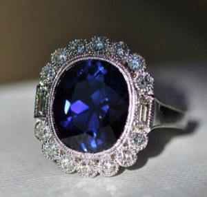
I have posted about it in some of my other threads but this is what I requested - a double halo on a tri wire shank with diamond 'cuffs' at the shoulders. The inner halo will consist of larger bezelled rounds. It's Edwardian inspired but I don't want it to be antique looking so it will have a matt finish, no milgrain.
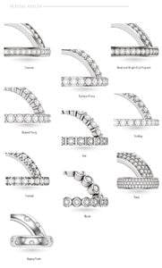
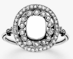
The photo with missing centre stone is the inspiration, the mock up on my finger gives an idea with an oval (although this is a different stone with slightly different proportions) and the gallery photo shows how I want the tri wire shank to work.
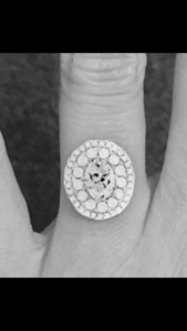
IMG_1419.PNG
IMG_1421.PNG
IMG_1423.PNG
I'm pleased with the first round of CADs, I've asked for the tri wire to be redone like the inspiration where it curves to join the donut.
I am concerned about the proportion of the halo relative to the centre stone, I've asked if bezels can be slimmed down/outer halo melee reduced in size.
Also the outer row of diamonds are currently pave set rather than bezelled I can't work out if this is the right way to go or if it will look disjointed?!
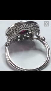
David has designed a gallery using ovals & circles which I suggested but I'm not sure about it, it's nice but the gallery in the inspiration ring is lovely but obviously distinctly Art Deco which I don't want. Anyone have any other ideas for something decorative yet contemporary?
Does anyone have any other thoughts?
 
Pretty ring inspiration.
I like the change you've already requested where the tri wire meets the donut.
if it were me - I would not want the outer halo to be bezeled like the inner halo. I like the inspiration photo where it's bead/bright set pave. But I'd confirm with the bench that's the pave style they'd use.
This is assuming the inner halo bezels are not made "bold", as to look modern. Then I think it would be pretty contrasting. I can't read the cad well enough to tell the intention.
As for the gallery - I don't think it's terrible, but I think it could be tweaked more elegantly.
 
Thanks for your kind comments @Rfisher I find myself getting really confused with the different types of pave I thought that was channel set. But I guess there are no prongs in channel set?! To clarify I would not want to individually bezel all the outer diamonds I'm just not great with the terminology and differences. It's just a question of either making it like the inspiration or making it pave, David said either pave set prong or u-pave would look nice - I am so confused!
I don't think the gallery is terrible it is pleasing to my eyes I guess I just want the wow factor.
Can you clarify with your comment regarding the inner halo bezels potentially being made 'bold' to look modern - I'm not quite sure what you mean by that. Bigger/flatter/sharper springs to mind?!
 
ask DKJ to show you real life pictures of the different types of pave. I've seen types called different names at different places. Names aside- just as long you two are on the same page is what matters.
Again- I'm probably reading the cad incorrectly with the inner row of bezels looking (to me) a bit 'thick" in comparison to the rest of ring.
Hopefully someone with more extensive experience chimes in!

As for proportion, the cad shows you exact measurements. I'd follow one measurements and cut a true to size paper version so I could see in real life. If you ask - for a charge- I'm sure he'll send you a wax model to see as well.
 

Attachments

  • IMG_0743.JPG
    IMG_0743.JPG
    96.1 KB · Views: 137
What are the different sizes of the stone for the inner and outer halos? Your hand drawn ring looks like there is quite a big difference. The CADs dont look like the difference is very big.

You dont want the outside halo bezeled if you want the look of your inspiration ring. They look like bead set to me. Definitely not channel!
 
Last edited:
@Rfisher thank you, I have asked him what the overall measurements are at the moment. I take your point regarding the inner bezels, now I look again they do appear chunky.

@tyty333 I have asked him what the halo stone sizes are, I think the outer halo stones need to be smaller. My hand drawn picture didn't allow for the bezel of the inner halo so each circle represents bezel and diamond, which I think makes quite a visual difference. (Plus it isn't the same stone I think that one was .2mm shorter) I think from memory there are 13 in drawing and 12 in the cad but a lot more outer halo diamonds in the drawing than in the CAD, which also makes the whole halo thicker as the larger diamonds obviously have greater widths. With regard to that outer halo, I don't feel a need to necessarily follow the inspiration ring. As I don't wish my ring to look period something more modern might work well but for whatever reason I find it all very confusing.:doh:
 
The diamonds in the CAD almost look the same size to me in both halos now I look again?! There is too much bezel as well.
 
I agree, the stones in the outer halo should be smaller than the CAD shows them to be.
 
For me, the overall proportion of the halo is too larger compared to the center. In your inspiration, the halo (post finishing) is 3/4 the width of the center stone. In the DK CAD, the halo is that same width of the center stone.

To allow the halo to narrow, what if the inner diamond halo was not a full bezel, but a half bezel? This would save quite a bit of space. Then, you can use tiny diamonds bead set to make the outer halo. This would allow you to maintain the large/small halo diamonds of your inspirations, but retain the overall proportion. Also, this would feel more contemporary to me.

Example of half bezel inner halo

upload_2018-1-27_4-37-7.png
 
@rockysalamander thanks for your thoughts. I think you are right about the width of the halo it is definely too big compared to the inspiration photo. Regarding the half bezel idea it's a good idea and I can see it would work but I don't find it to my taste. I will see if the outer halo size can be reduced first and go from there. It may be I have to rethink but I want to see if they can be reduced along with the bezel sizes of the inner halo first. I guess it is hard to know until he gets back to me and confirms the current melee size.
 
What size stone is the inspiration ring meant to hold?

DK has this ring posted. If the inner bezel were about this size of the stones at NESW and that close to the center, then the outer bezel would have room to be a row of tiny bead set pave. That kind of proportion might work. You can ask the measurements of the center and those 4 bezel diamonds and then work out how that would translate to your stone. If what looks like thick bezel on the CAD ends up thin like these after finishing (a question to ask), that might help you determine how best to interpret the CAD.

upload_2018-1-27_7-23-32.png
 

Attachments

  • upload_2018-1-27_7-20-12.png
    upload_2018-1-27_7-20-12.png
    164.5 KB · Views: 22
  • upload_2018-1-27_7-28-54.png
    upload_2018-1-27_7-28-54.png
    250 KB · Views: 26
  • upload_2018-1-27_7-34-19.png
    upload_2018-1-27_7-34-19.png
    215.3 KB · Views: 22
IMG_1448.jpg @rockysalamander thanks for the photo that's useful. That is the kind of bezel I would like. It reminds me of the beautiful delicate bezel that gypsy had on her engagement ring think Steven kirsch did that one. Regarding the inspiration ring it was on pinterest and I managed to track it down to an auction house but there was no information on the listing regarding measurements and it's long since sold.
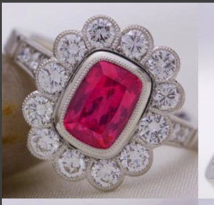
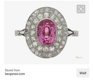
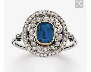
This pink sapphire ring was another ring I loved proportion wise and is closer to my oval. I decided not to go for this type of design because I felt with a diamond it would just read as a a massive cluster ring but the proportions are perfect for me. The stone is a similar size I think it says 5/6mm by 7/8mm.

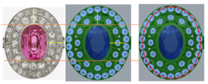
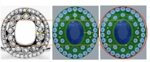
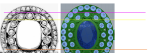
That's terribly useful! Ok. I took the pink sapphire and your CAD and made the two stones the same length (orange lines). Then, I used yellow lines to show the distance from the stone to the edge on the pink one and pasted those on the CAD. Finally, I took the outline of the pink one and layed it on the CAD. So, you can see that the CAD is wider and taller, but more wide than tall. Its very subtle, but I think if it is slimmed in width, it will more correctly follow the oval outline. To keep the proportions of the ring you posted, I would personally reduce the size of the outer halo stones to be tiny and then have him narrow it a bit from EW (it may mean slightly smaller stones on the long sides; you can see that they did that on the sapphire. They are either smaller or set tighter to the bezel on the E). I think the overall proportion of the sapphire is a bit easier to replicate as it is closer in shape.


upload_2018-1-27_8-52-49.png

Same thing on the setting inspriation.

upload_2018-1-27_8-59-18.png
 

Attachments

  • upload_2018-1-27_8-59-4.png
    upload_2018-1-27_8-59-4.png
    210.3 KB · Views: 22
I don’t like the inner bezeled halo. I think without milgrain it will look like metal overload
 
@rockysalamander thanks for all your work this is very useful (totally beyond my abilities) and the idea of slightly different proportioned stones might be just the ticket. I will send DK an email later with some of the thoughts from this thread.

@Tophat1 I agree it's too much metal at the moment but if DK can really slim the bezels like in the photo rocky posted earlier I think it would look good?
Glad. Hope it is useful.

One more visual. The yellow line is going through the center of bezel around the center stone. The purple line is aligned with the edge of the bezel for the cushion halo. So, this again shows that the bezels on the CAD are too far away from the center....that said, they need enough metal to burnish over. So, these are just to help you ask questions of DK.

upload_2018-1-27_10-35-34.png


Can't wait to see the next round!
 
@rockysalamander thanks for all your work this is very useful (totally beyond my abilities) and the idea of slightly different proportioned stones might be just the ticket. I will send DK an email later with some of the thoughts from this thread.

@Tophat1 I agree it's too much metal at the moment but if DK can really slim the bezels like in the photo rocky posted earlier I think it would look good?

DK can make those bezels REALLY slim and nice. However, I do think they'll need very delicate milgrain. When he did my triwire RHR, the milgrain is EXTREMELY delicate... same for my three stone. I think it needs just a tiny bit of texture to soften the look and make it less metal-y.
 
The good news is that he can't make the ring and then send you pics. You can decide on the milgrain at the very end.
 
I would also take the diamonds off of the cuffs... IMO, it's too much going on. With a very busy double halo with bezels, it's a distraction, interrupting the flow. Just my $0.02. :)
 
Just wanted to say excellent work rockysalamander! Your drawings help to put everything in to prospective (literally).
 
Yes thank you @rockysalamander
DK has suggested sand blasting it -texture enough @msop04 ? Not sure on the cuffs I am rather set on those but I will think on it (should say I am a more is more kind of gal!!)
What about the gallery? Any ideas?
 
I adore the inspiration ring, and I have nothing to add regarding the design that hasn’t already been said. I do agree that both halos are too large for the center stone.

I may have missed this, but are you planning to wear a band with this? It’s going to be pretty much impossible without a redesign making the gallery not so low.
 
Just wanted to say excellent work rockysalamander! Your drawings help to put everything in to prospective (literally).

Thanks! hope its helpful. I can't wait to see the next rendering.
 
I adore the inspiration ring, and I have nothing to add regarding the design that hasn’t already been said. I do agree that both halos are too large for the center stone.

I may have missed this, but are you planning to wear a band with this? It’s going to be pretty much impossible without a redesign making the gallery not so low.

Yes I agree too, proportions are off at the moment.

I would like to wear a band but thinking I might do one Blake Lively stylie. I think it's just really loose on her and that's how she's working the whole jaunty angle thing but maybe there is something else going on?!
 
Yes thank you @rockysalamander
DK has suggested sand blasting it -texture enough @msop04 ? Not sure on the cuffs I am rather set on those but I will think on it (should say I am a more is more kind of gal!!)
What about the gallery? Any ideas?

Maybe make them less pronounced? I really feel like they are throwing off the aesthetic of the design as is... Re sandblasting, I'd lightly milgrain to eliminate such a metal-y look.

ETA: I adore the inspiration ring. It is perfect to my eyes. I'd go with that, and if you need to change anything, change up the gallery design.

Here is the original ring (I blanked the sapphire out to envisage it with a plain stone and that was to hand when I posted). It is described as Belle Époque c.1910 French IMG_1449.jpg
 
Here is the original ring (I blanked the sapphire out to envisage it with a plain stone and that was to hand when I posted). It is described as Belle Époque c.1910 French IMG_1449.jpg

This... is perfection. I'd have him do this exactly as is.
 
He doesn’t have the shoulder element right..the part that goes from the cuff to the halo or gallery can’t just be that single wire.
 
not sure quite what you are referring too?
 
Here is the original ring (I blanked the sapphire out to envisage it with a plain stone and that was to hand when I posted). It is described as Belle Époque c.1910 French IMG_1449.jpg
I can see the beauty. I think with the changes you are working through, you'll get a better match to this while letting your ovals outline shine.

For the gallery, I like your inspiration more than the simple oval and rounds.

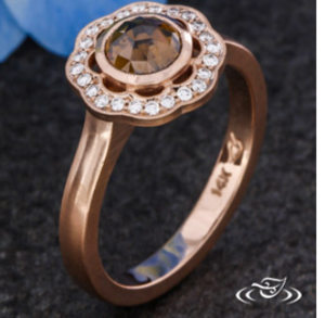
I'm a little worried that all the lovely details you like make this very very antique, but you said you want something more modern. So, I think the shoulder might be an area to bring a more modern feeling. Are you completely attached to the triwire and wraps? Maybe a cleaner split shank (looking for pic now) would provide better balance and bring some of that modern cleanliness or even a clean simple shoulder. I've posted an example of an intricate halo, but do you see how that clean shoulder works to make it more modern? It may not work for you, but I think the top ring without milgrain and a simple shoulder does not feel vintage -- even though it is truly vintage inspired. I think the other thing that helps this is the balance of negative space.

I don't want to throw a spanner into your design, but a few little tweaks can push this to a cleaner and modern aesthetic if that is what you want.

upload_2018-1-27_14-43-21.png
 

Attachments

  • upload_2018-1-27_14-31-1.png
    upload_2018-1-27_14-31-1.png
    315.7 KB · Views: 20
  • upload_2018-1-27_14-43-52.png
    upload_2018-1-27_14-43-52.png
    181.3 KB · Views: 29
GET 3 FREE HCA RESULTS JOIN THE FORUM. ASK FOR HELP
Top