shape
carat
color
clarity

Thoughts on This ASET and Stone Line-up??

Rons Wolfe

Shiny_Rock
Joined
Sep 21, 2020
Messages
386
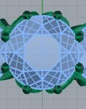
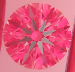
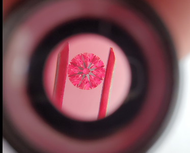
I know my pics really bite, but can you tell enough to bless this stone? Or do I throw it back and start again?
1679683016255.png


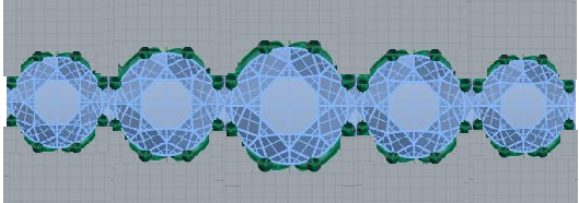
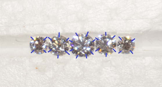
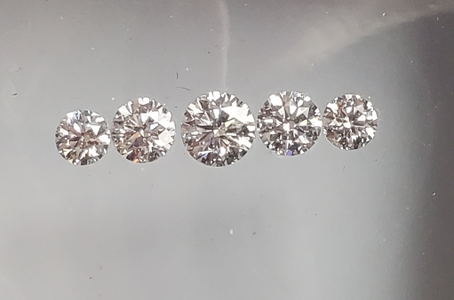
Next, what do you think of this stone line-up for my 5 stone ring? Should I go bigger or smaller for the center stone? The sides are 4.7 and 5.4, the center is 6.25. They're all D and E color.
1679683243968.png
 
FYI...not an ASET image (ASETS are the Red, blue, and green images). I believe this is an H&A image and you really need the pavilion
side to look at the hearts image. The stone is also tilted.

Who is providing the stone?

I like the proportions in the line up...this will be quite a lot of bling!
 
The center stone looks great in that pic - have you seen it in-person? I imagine it'll be really bright ::)

I like those proportions. I think they give you a lot of flexibility - you can tweak the "visual graduation" with prong orientation... The more extreme the stone size graduation the less flexibility you have in terms of prong arrangement (in terms of using prongs to tweak the visual graduation I mean)

Quickie examples - if you put N/S prongs on the centerstone you end up adding quite a bit of extra apparent vertical size to the centerstone, so it makes the graduation look a bit more extreme... Whereas if you don't have N/S prongs on the center you could minimize the visual graduation... It's actually easier to see if you step way back from the screen so you just see the outlines of the prongs

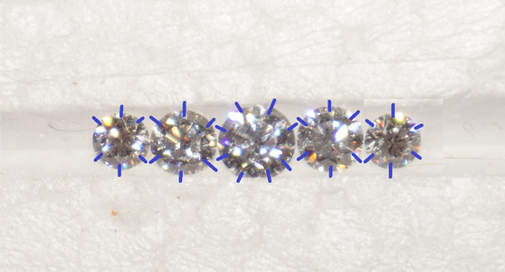
I'm very partial to N/S prongs, there's something about what they do to the side view that I can't get enough of ::) You could do 8 prongs with N/S/E/W, too, if you wanted the N/S prongs but also wanted more than six. I saw a vintage five stone that had 8 prongs on the center, 6 on the first pair of sides, and 5 on the end stones. Very prong-ey but managed very charmingly!

1679701874147.png

Love the staggered prong setup in the middle!!
 
One think I told Klass was that I liked was the 8 tiny prongs on the center diamond, and want to do that on all the stones if possible. Might have to do less on the 36 pointers, though.

1679714662272.png
 
What I had in mind was a little along this line, except to rotate the prongs on the middles sizes stones.

1679715777865.png


OK, so maybe have to go to 6 prongs on the smaller stones....

1679716387318.png
 
Last edited:
The center stone looks great in that pic - have you seen it in-person? I imagine it'll be really bright ::)


1679701874147.png

The center stone is the one with the ASET that I'm trying to get reviews of in my first post.
 
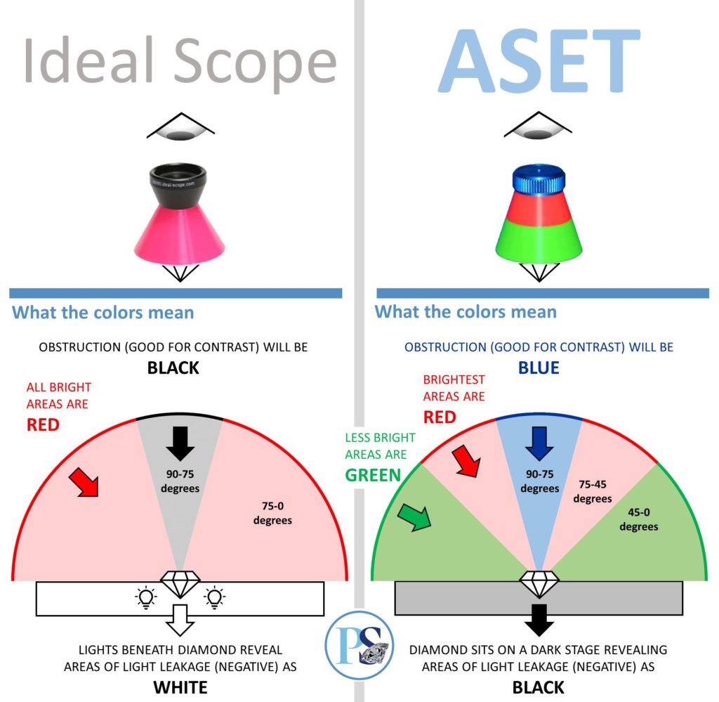
Respectfully, you keep saying ASET but the image you posted does not appear to be an ASET image. ASET images will show up as red, green & blue. Idealscope images show up as red (sometimes pinkish) & black.

https://www.pricescope.com/education/diamond-cut#ideal-scope

pricescope-education-005-diamond-cut-ideal-scope-aset-AB-e1615240503891-1024x999.jpg


ASET example
AGS104105671003-1-411-G-VS2-HA-round-aset-light-5cfad66f44b8ec89cde9ca3c.tif


Idealscope example (same stone)
AGS104105671003-1-411-G-VS2-HA-round-idealscope-ckhnrxukt12495rwjvn9mlrp5.tif


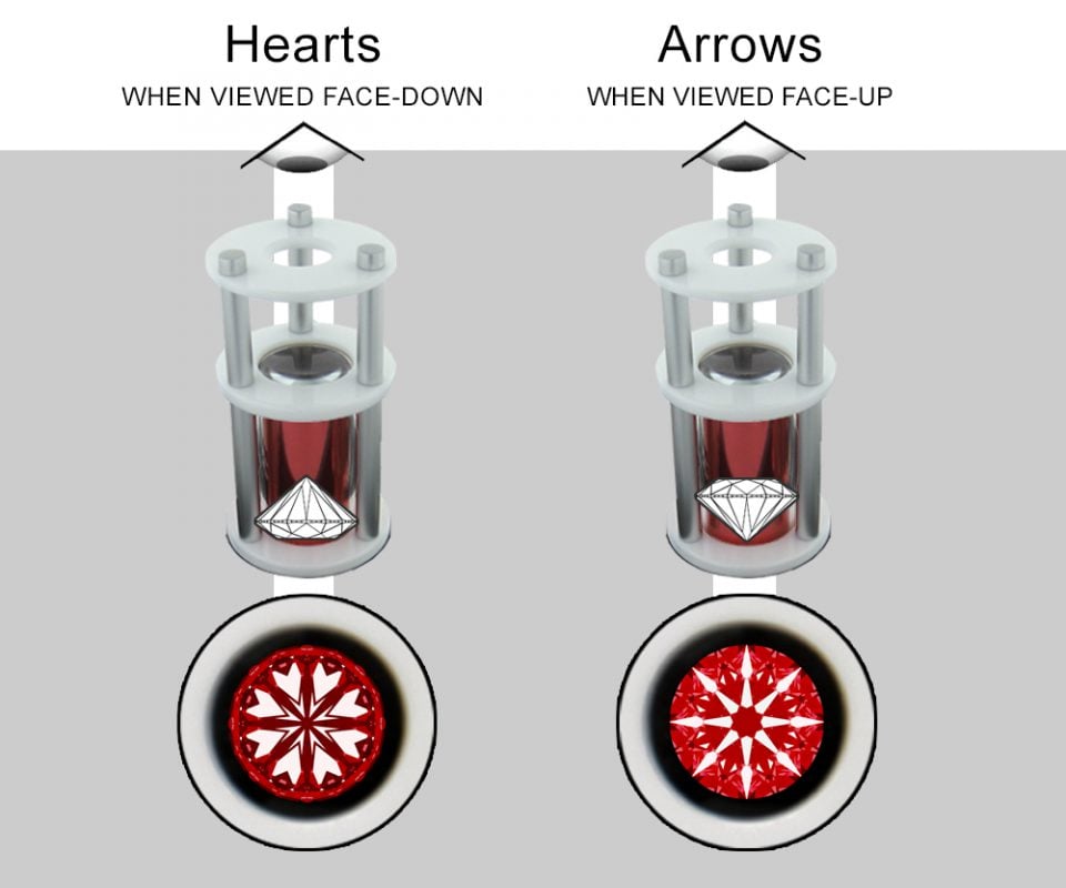
While arrows images taken with red scopes look similar to idealscope images, you can see the arrows patterns show up as white, as opposed to black in the idealscope. Also the other areas that show up as leakage (white) on the idealscope show up as black.

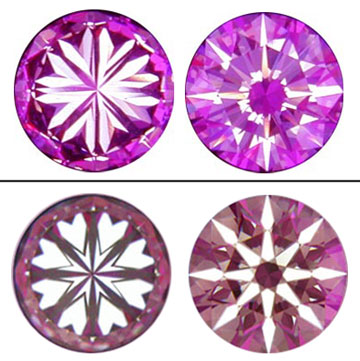
FYI, H&A viewers can be purchased in an array of colors. Red is very popular, but I've seen orange, blue, purple, etc.

Arrows example (same stone)
AGS104105671003-1-411-G-VS2-Hearts-Arrows-Diamond-Arrows-ckhnry5i212605rwjbp1xcnev.png


Hearts example (same stone)
AGS104105671003-1-411-G-VS2-HA-round-hearts-5cfad67b44b8ecfe4ae9ca3d.tif


Overview of H&A viewer works
pricescope-education-505-cut-quality-hearts-and-arrows-views.jpg


Other examples of H&A images (in different colors)
HnA-Ex-Sym.jpeg
 
Respectfully, you keep saying ASET but the image you posted does not appear to be an ASET image. ASET images will show up as red, green & blue. Idealscope images show up as red (sometimes pinkish) & black.

Yeah, I used the wrong term, it's an Ideal Scope. Got any thoughts on the diamond?
 
Yeah, I used the wrong term, it's an Ideal Scope. Got any thoughts on the diamond?

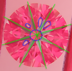
It's tilted which throws off things a bit. You can see how the arrows on the left side are darker and look shorter than on the right. Consequently, there are some dark shadows in the table there.

However, symmetry appears pretty good. Also, when reviewing idealscope, if you use the center as a control point (circled in blue) then it helps identify weaker areas. Anything that is lighter than the center is leakage/weaker light return.

It's not perfect but I don't think it's bad. I'd be more interested to see if the tilt is over exaggerating the other areas. Not sure if you can manage to get a better picture but it may help.

Do you have a lab report on the stone you can share? Black out the number if you haven't purchased yet.

image1a.png

image1.png

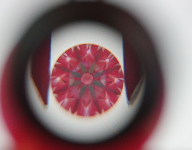
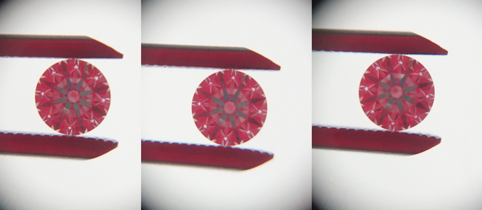
I took another crack at the pic, this is harder than I expected! What do you think now?

1679735190139.png
 
Do you have a link to the GIA report? Plus any link to up close video provided by the vendor. This image looks like it is showing
leakage but wonder if its the way the picture was taken. Hopefully, will get more input from @sledge .
 
Do you have a link to the GIA report? Plus any link to up close video provided by the vendor. This image looks like it is showing
leakage but wonder if its the way the picture was taken. Hopefully, will get more input from @sledge .

I feel like it's definitely showing leakage, but it's hard for me to be sure since it might be just the pic angle
 
Also, i like less prongs. And whatever configuration you pick I’m not a fan of the NS.
 
The light escape E/W is due to some optical asymmetry and it’s slight, it won’t be visible IRL once set and with two eyes. You can see it in the original pic too, 8o’clock and 2o’clock. If you paid for a H&A stone then pass. If you paid a fair price for a non-H&A then IMO it’s a very nice stone.

I personally prefer a stone with a pale pink under-table - a touch less (quantity) of light return can change the type of light return. You’ll see more coloured light output across a variety of lighting environments from this stone than another with more light return from the under-table.

First of all, I want to thank you for coming into my thread with your wealth of knowledge. I didn't pay H&A price for it, in fact it was pretty reasonably priced IMO.

I'm questioning my ability to get accurate pics, though. This is a .60 CBI, and we know those are nice.

1679777855282.png
 
The center stone looks great in that pic - have you seen it in-person? I imagine it'll be really bright ::)

I like those proportions. I think they give you a lot of flexibility - you can tweak the "visual graduation" with prong orientation... The more extreme the stone size graduation the less flexibility you have in terms of prong arrangement (in terms of using prongs to tweak the visual graduation I mean)

Quickie examples - if you put N/S prongs on the centerstone you end up adding quite a bit of extra apparent vertical size to the centerstone, so it makes the graduation look a bit more extreme... Whereas if you don't have N/S prongs on the center you could minimize the visual graduation... It's actually easier to see if you step way back from the screen so you just see the outlines of the prongs

I'm very partial to N/S prongs, there's something about what they do to the side view that I can't get enough of ::) You could do 8 prongs with N/S/E/W, too, if you wanted the N/S prongs but also wanted more than six. I saw a vintage five stone that had 8 prongs on the center, 6 on the first pair of sides, and 5 on the end stones. Very prong-ey but managed very charmingly!

1679701874147.png

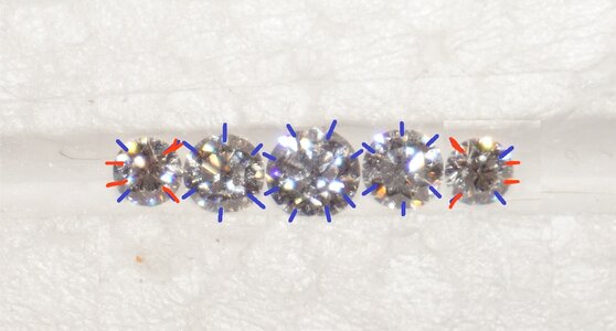
I was thinking about this, and the stones I'd want to increase the size perception of are the .60's. I wish the .36's were just a little smaller, but the only smaller stones I have are a pair of .50TCW that I wear once in a while. So I came up with a couple ideas, what do you think of these?

1679779451129.png

1679779512770.png
 
I would love to help you create a jewel that makes you smile ❤️

Well, those CBI photos settle any debate, you have a very nice and bright stone. Depending on exactly what IS scope you’ve got, whether it’s coloured plastic… Or the cardboard sheet sort that may not be fully flush with the holder… And how far you’re holding the scope from the plane of the girdle… Nuances.

If you want to maximize the visual size of the bigger pair of sides I think this one’s your winner:
1679797410013.png

And to minimize the size of the littles - do you like the look of three prongs on end-stones? Or maybe four prongs but with the two end-prongs closer together -
B7902641-3FC4-4AB8-8AB3-7608C73CEBFC.jpeg

I do think this the best way to go about a custom ring by the way. That is, sorting out the face-up that you want first. And then design the gallery to work with that face-up. It’s tempting to start with gallery design but I’ve ended up cornering myself doing that, because the design I love won’t work with my preferred prong arrangement, and… Well, you see your ring face-up 99% of the time, you gotta love what you see from that angle first and foremost…

Hmmmmmmmmmmm.............
While my OCD doesn't love the idea of the offset prongs, it does work with the rest of what I want. One of the things I've added to my design is some sort of leaves off the end of the last diamond to sort of blend it into the shank, like in one of my inspirations here. I'm not terribly worried about minimizing them, since they'll be away and at an angle when I'm looking straight down on the ring, but a nice treat when the ring is tilted.

The IS I have is the one you can buy on this site for $25, but I don't have the plastic tray. I had the stone in tweezers, with the IS just above it.

1679803414923.png
 
Sorry been running most the day. Agree that the stone you found isn’t perfect but very good. As long as you paid appropriately for it I think your wallet and eyes will be equally happy.

In regards to good photos, it’s a bit of a slippery slope. Here’s a fun video that @Garry H (Cut Nut) threw together that may be helpful.


What's with that hair?!?!?!? :lol-2: :lol-2::lol-2::lol-2::lol-2::lol-2::lol-2: :lol-2:
 
Do you have a link to the GIA report? Plus any link to up close video provided by the vendor. This image looks like it is showing
leakage but wonder if its the way the picture was taken. Hopefully, will get more input from @sledge .


It appears Ritani deletes the links once a stone sells, so I don't have it now, unfortunately. The pavilian and crown angles, depth and table are all in what's considered best on this forum.
 
GET 3 FREE HCA RESULTS JOIN THE FORUM. ASK FOR HELP
Top