shape
carat
color
clarity

WF Butterflies Ering Upgrade

ellekay

Rough_Rock
Joined
May 16, 2019
Messages
96
Hi everyone! After a few years with my lovely ACA princess upgrade, I decided I really want the lightshow only a MRB can offer, so I'm doing a second upgrade just in time for our 15th anniversary.

I had the opportunity to go to Whiteflash in person, and I had a lovely time. I had settled on the butterflies setting years ago, and when I started perusing diamonds online, I found myself gravitating to stones around 2.5 cts. My biggest concern was color; I've only ever had E colored stones (mostly by chance), but my budget necessitated getting an I or lower. I didn't know how color sensitive I was, and I was really worried that a lower colored stone would look yellow to me or others when I was used to an icy E. It turns out I am not very color sensitive or inclusion sensitive, which I'm relieved about.

Here's the stone I was initially considering: https://www.whiteflash.com/loose-di...olor-si1-clarity-round-ideal-cut-sku-a4013664
And here is the stone I ended up deciding on: https://www.whiteflash.com/loose-di...olor-vs2-clarity-round-ideal-cut-sku-a4521940
I also looked at this stone, which was a little bigger, but I felt like the 2.5 was plenty big: https://www.whiteflash.com/loose-di...olor-si1-clarity-round-ideal-cut-sku-a4457040

I had the two of the 2.5s side by side without knowing which was which, and I picked the J because its sparkle seemed a little superior. I could not tell a difference in color between them. I even had Liza bring out a G stone to compare in different lighting, and I couldn't tell much difference. (My husband was also partial to the J, partly because his name starts with J, which I thought was endearing.) I would have preferred to get an SI1 instead of a VS2 for the cost savings, but it's fine.

Production hasn't started yet, and I have a few questions/concerns and would love your input.

1- I do still harbor some worries about color, even though I've seen the stone in person. I'm worried it will show color in certain lights and that it will bother me. I can always trade up in color later, though I'd prefer not to. I've gotten a lot of comfort from many posts here showcasing gorgeous diamonds with "lower" color ratings, but I won't know for sure I'm okay with it until I can observe it throughout the day in real life.

2- Thoughts about the stone?

3- I wear a size 3.5, and I'm a little worried the stone is too big. I didn't worry until I saw @Shannon72781's gorgeous new solitaire, but now I'm concerned that a 2.5 will be too big in a 3 stone--I want the side stones still on top of my finger, not coming around the sides/impinging on neighboring fingers, if that makes sense.

4- Here are the side stones: https://www.whiteflash.com/loose-diamonds/compare/?idnos=4428804,4454688

I chose this size to get similar proportions to @soxfan's butterflies which I fell in love with years ago.

5- Prongs: I kept waffling between petite claw and round; I want whatever is smallest/daintiest. I told them petite claw but I don't know if that's the right choice.

6- I like lower-profile rings, and the sample butterflies had the stone set quite high. I requested the stones be set as low as possible, so I'm hopeful the culet will be close to the bottom of the basket.

7- Anything else I should consider?

Thanks for reading! Here are a bunch of pictures from my visit. To be honest, I can't even remember for sure which diamonds I took pictures of, but most of them are probably of the J, and they were all very similar in size/color regardless.

Here is the butterflies sample. I believe the center is 1.5 ct equivalent and the sides are .25s. Note how the diamond seems a bit high set in the profile shot.
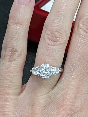
PXL_20230331_222713605.jpg PXL_20230331_222705307.MP.jpg

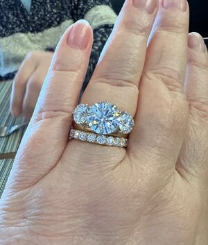
This is a similar setting (Trois) with a 2.25ct comparable center and .25 sides. (This ring size was too big for me, so it's a little slanted on my finger.)
PXL_20230331_220423031.jpg


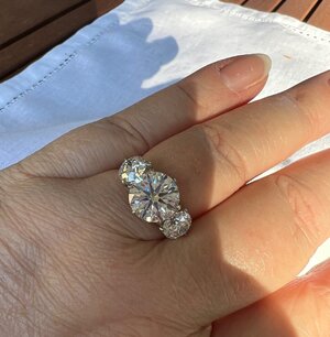
Here's the three stones. Center is the 2.66.
PXL_20230331_215602971.jpg


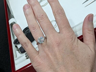
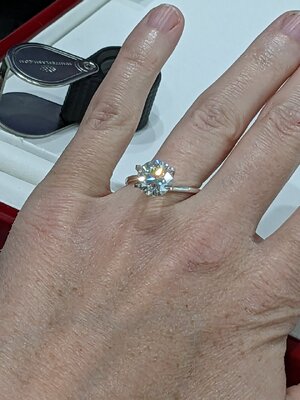
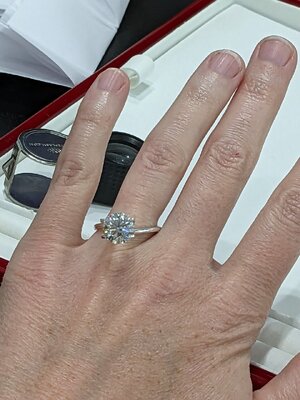
Fun hand shots in the ring holder:

PXL_20230331_220710475.jpgPXL_20230331_221900212.jpgPXL_20230331_221906917.jpg
 
After reading this I feel you are not ready to go through with it because you are uncertain about the color choice, the size of the stone, and the height at which the stone sits in the mounting you selected.
I think you will see the color. I can see a difference just from their face up view on their linked pages. 2.5ct in a J will show tint regardless that it is an ACA. You were in a room setting with amazing lights. A center stone of 2.5ct on your teeny, tiny ring size is already a lot… then to add in side stones… you should talk to them about where the sides will fall on your finger. As for the height of the center, it seems to be the design of the ring to have it sit a bit higher… if you want a low-set ring this isn’t it. Maybe it is just nerves but from reading this I wonder if you should take a step back. I think perhaps you got caught up in all the excitement of being there and the upgrade and seeing all the beautiful diamonds and after you left these various concerns came to mind.
 
Hi everyone! After a few years with my lovely ACA princess upgrade, I decided I really want the lightshow only a MRB can offer, so I'm doing a second upgrade just in time for our 15th anniversary.

I had the opportunity to go to Whiteflash in person, and I had a lovely time. I had settled on the butterflies setting years ago, and when I started perusing diamonds online, I found myself gravitating to stones around 2.5 cts. My biggest concern was color; I've only ever had E colored stones (mostly by chance), but my budget necessitated getting an I or lower. I didn't know how color sensitive I was, and I was really worried that a lower colored stone would look yellow to me or others when I was used to an icy E. It turns out I am not very color sensitive or inclusion sensitive, which I'm relieved about.

Here's the stone I was initially considering: https://www.whiteflash.com/loose-di...olor-si1-clarity-round-ideal-cut-sku-a4013664
And here is the stone I ended up deciding on: https://www.whiteflash.com/loose-di...olor-vs2-clarity-round-ideal-cut-sku-a4521940
I also looked at this stone, which was a little bigger, but I felt like the 2.5 was plenty big: https://www.whiteflash.com/loose-di...olor-si1-clarity-round-ideal-cut-sku-a4457040

I had the two of the 2.5s side by side without knowing which was which, and I picked the J because its sparkle seemed a little superior. I could not tell a difference in color between them. I even had Liza bring out a G stone to compare in different lighting, and I couldn't tell much difference. (My husband was also partial to the J, partly because his name starts with J, which I thought was endearing.) I would have preferred to get an SI1 instead of a VS2 for the cost savings, but it's fine.

Production hasn't started yet, and I have a few questions/concerns and would love your input.

1- I do still harbor some worries about color, even though I've seen the stone in person. I'm worried it will show color in certain lights and that it will bother me. I can always trade up in color later, though I'd prefer not to. I've gotten a lot of comfort from many posts here showcasing gorgeous diamonds with "lower" color ratings, but I won't know for sure I'm okay with it until I can observe it throughout the day in real life.

2- Thoughts about the stone?

3- I wear a size 3.5, and I'm a little worried the stone is too big. I didn't worry until I saw @Shannon72781's gorgeous new solitaire, but now I'm concerned that a 2.5 will be too big in a 3 stone--I want the side stones still on top of my finger, not coming around the sides/impinging on neighboring fingers, if that makes sense.

4- Here are the side stones: https://www.whiteflash.com/loose-diamonds/compare/?idnos=4428804,4454688

I chose this size to get similar proportions to @soxfan's butterflies which I fell in love with years ago.

5- Prongs: I kept waffling between petite claw and round; I want whatever is smallest/daintiest. I told them petite claw but I don't know if that's the right choice.

6- I like lower-profile rings, and the sample butterflies had the stone set quite high. I requested the stones be set as low as possible, so I'm hopeful the culet will be close to the bottom of the basket.

7- Anything else I should consider?

Thanks for reading! Here are a bunch of pictures from my visit. To be honest, I can't even remember for sure which diamonds I took pictures of, but most of them are probably of the J, and they were all very similar in size/color regardless.

Here is the butterflies sample. I believe the center is 1.5 ct equivalent and the sides are .25s. Note how the diamond seems a bit high set in the profile shot.
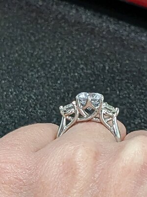
PXL_20230331_222713605.jpg PXL_20230331_222705307.MP.jpg

This is a similar setting (Trois) with a 2.25ct comparable center and .25 sides. (This ring size was too big for me, so it's a little slanted on my finger.)
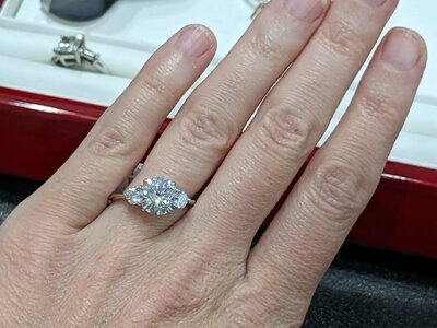
PXL_20230331_220423031.jpg


Here's the three stones. Center is the 2.66.
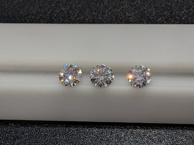
PXL_20230331_215602971.jpg


Fun hand shots in the ring holder:

PXL_20230331_220710475.jpgPXL_20230331_221900212.jpgPXL_20230331_221906917.jpg

Oh, wow, this is exciting!

Ok, taking these in turn:
1 and 2: color is so personal. A J can be too tinted for one person and perfect for another. Did you try to see it in natural light? Was there a window? That makes a huge difference. I just did a post with a ton of color examples (some in different light) if that might be helpful to you. Note that none of the stones in my post are ACAs, and the more well cut a stone is, the more light it will return, so the better it will tend to hide color.

https://www.pricescope.com/community/threads/an-upgrade-journey-…-from-a-research-perspective.277780/

As for how *you* will handle the color, that’s so difficult. One possibility would be to have WF either send you the loose stone so you can see if it works for you in your environment, OR select a temp mounting and have them set it so you can wear it and see if it will work in your environment. I like that option for you (the temp setting) because you could really get clarity on the center stone before adding sides and the Butterflies mount. Yes, you could swap out your center later if it was too warm, but then you’d also have to deal with the sides (would you leave them as Js or swap those as well? Would you be able to find a pair that would be the right size for your Butterflies or would you eat the cost of the setting?), and that’s a lot of headache if you could avoid doing it on the front end.

As for thoughts on the stone you picked—it looks gorgeous! All ACAs are going to be beautiful, and I particularly like the high crown on this one. It looks insanely fiery! I also love the clarity. An eye clean VS2 is so nice for mind-clean purposes. (I’m currently doing a custom cut and went with VS1 because I didn’t want to risk an inclusion under the table, but VS2 would be awesome if I could pick).


3–size of stone. So….I’m an admitted bling-ho. I think it will be fantastic. Tagging @mrs-b because she is the 3 stone guru and can probably guide you better.

This thread might be helpful.


5–prongs. I’m in prong analysis paralysis myself. Who’s your WF SA? I would ask them what will be smallest on this design.

6–height. I’m with you there. I would want it as low as possible. However, if you don’t want the side stones to wrap around your finger at all you may need some height.

7. Other things to think about—tagging @yssie as she was the creator of Butterflies. If I’m remembering correctly she had suggested modifications.
 
No one can tell you any better about the color than your eyes did seeing it in real life. All diamonds will reflect the colors around them so it will look different in various lighting environments. Cut is the biggest factor and you were looking at three ACAs. You chose the J because you liked the sparkle better but maybe the I would suit your color needs better? Maybe you should ask them to take pictures of the diamonds face down (which is the way they are color graded) to see if you are bothered by the color of the J from that point of view. Might give you a better idea of what the diamond would look like viewing it from the side.
 
Thanks for your clear eyed assessment, @headlight! I did let myself get a little stream of conscious-y in my post.

After reading this I feel you are not ready to go through with it because you are uncertain about the color choice, the size of the stone, and the height at which the stone sits in the mounting you selected.

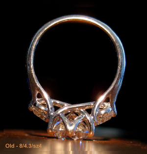
Totally fair! I feel like I've done everything I can possibly do prep wise, though, and I overall feel good about moving forward. If I was super worried (instead of mildly concerned) about any of these things, I'd completely agree with you. But I've seen the stone in person, in various lighting, compared to other stones, and the color didn't bother me. It's true I haven't seen it in my house or my daily life, which is where the uncertainty comes in. I did talk to Liza re: concerns about the size being too wide with side stones, and she thinks it will be fine. I even sent pictures of what I like and what I think is "too wide." And I based my desire for a lower set diamond on @yssie's picture of the same setting, so I think being lower set is possible (hope it's okay I stole this picture!):
yprofile (1).png


I think you will see the color. I can see a difference just from their face up view on their linked pages.

So I initially fell in love with the 2.502 I stone months ago, partly because its face up still shot was so so white, but I honestly think they either used the wrong image or it somehow caught the light in just the right way because it does not look that white in real life (Liza actually confirmed this--that it looks more tinted than the still image--long before I saw it in person). If I look at the "brilliance" videos and compare them when they are both in side-view, I can't really tell the difference between them (I'm sure others can, but I can't).

Thanks for taking the time to share your input! I absolutely love the rings in your avatar--they are stunning.
 
I had the opportunity to go to Whiteflash in person, and I had a lovely time. I had settled on the butterflies setting years ago, and when I started perusing diamonds online, I found myself gravitating to stones around 2.5 cts. My biggest concern was color; I've only ever had E colored stones (mostly by chance), but my budget necessitated getting an I or lower. I didn't know how color sensitive I was, and I was really worried that a lower colored stone would look yellow to me or others when I was used to an icy E. It turns out I am not very color sensitive or inclusion sensitive, which I'm relieved about.

Here's the stone I was initially considering: https://www.whiteflash.com/loose-di...olor-si1-clarity-round-ideal-cut-sku-a4013664
And here is the stone I ended up deciding on: https://www.whiteflash.com/loose-di...olor-vs2-clarity-round-ideal-cut-sku-a4521940
I also looked at this stone, which was a little bigger, but I felt like the 2.5 was plenty big: https://www.whiteflash.com/loose-di...olor-si1-clarity-round-ideal-cut-sku-a4457040

I had the two of the 2.5s side by side without knowing which was which, and I picked the J because its sparkle seemed a little superior. I could not tell a difference in color between them. I even had Liza bring out a G stone to compare in different lighting, and I couldn't tell much difference. (My husband was also partial to the J, partly because his name starts with J, which I thought was endearing.) I would have preferred to get an SI1 instead of a VS2 for the cost savings, but it's fine.

Production hasn't started yet, and I have a few questions/concerns and would love your input.

1- I do still harbor some worries about color, even though I've seen the stone in person. I'm worried it will show color in certain lights and that it will bother me. I can always trade up in color later, though I'd prefer not to. I've gotten a lot of comfort from many posts here showcasing gorgeous diamonds with "lower" color ratings, but I won't know for sure I'm okay with it until I can observe it throughout the day in real life.
Photos that aren’t side-by-side colour comparisons can be really tough to interpret, between camera settings and lighting environment -changes. Even side-by-side colour comps can be challenging! And of course everyone sees differently - it’s easy for photos to lead you to an impression that won’t match your visual perception.

But you’ve seen your stone in-person! And that makes all the difference. You examined your stone yourself, you compared it to a higher colour, you determined in-person that your eyes don’t mind a little body tint. I would for sure encourage you to start out by trusting yourself ❤️ You can always upgrade to a higher colour if you find that you’re becoming more sensitive (or more opinionated) over time! Which, yeah, that can and and does happen for some people.

The one thing that I would say is that smaller stones will always look whiter than larger stones, if faceting is the same. And that difference is only exaggerated when there’s an actual body colour difference. So it‘s great that you’re starting with lower coloured sides!

But I should say, if you were my real world friend, I’d actually suggest an inexpensive temporary mount until you’re totally sure about your centerstone, and save Butterflies for when you’re sure about your stone! Because with the setting plus the sidestones, if you do end up wanting to upgrade your center due to colour preference specifically - you might end up needing a new mount to maintain fit of center and sides, and then in this case you’d likely want new sides as well, and that’s not a trivial expense!

2- Thoughts about the stone?
Picture perfect.

3- I wear a size 3.5, and I'm a little worried the stone is too big. I didn't worry until I saw @Shannon72781's gorgeous new solitaire, but now I'm concerned that a 2.5 will be too big in a 3 stone--I want the side stones still on top of my finger, not coming around the sides/impinging on neighboring fingers, if that makes sense.
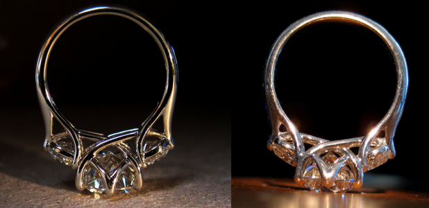
So one of the challenges with a larger stone spread on a smaller finger is exactly what you pointed out - the curvature… When I had mine remade (2.7 center and 0.43 sides on a size 4.25, so reasonably similar scaled to yours) I was dead set on having all three stones fit on the top of that one finger. No overhand at all. The only way to achieve that was to set the stones a bit higher and “fake” a less severe finger curvature, but that diminished the tulip-bulb-head look of the profile… I’m going to have this mount remade one day and I’ll be asking for center and sides to be set as low as possible, with sidestones tucked well under the center and severely angled. Because I want that tulip-bulb-head shape back.

Left is my second incarnation (2.7ct center, 0.43 sides, with all stones set “higher”). The photo you posted earlier - right - was my first (2ct center, 0.3 sides, all stones set as low as possible). I prefer the head shape of my first, what you posted earlier!!
CCFBD23E-EB6D-4894-8578-21D521C37EE0.png

4- Here are the side stones: https://www.whiteflash.com/loose-diamonds/compare/?idnos=4428804,4454688

I chose this size to get similar proportions to @soxfan's butterflies which I fell in love with years ago.

5- Prongs: I kept waffling between petite claw and round; I want whatever is smallest/daintiest. I told them petite claw but I don't know if that's the right choice.
that’ll be fine! What most people really react to most strongly IRL isn’t actually small prong size so much as precisely-shaped prongs. Which WF can do!

6- I like lower-profile rings, and the sample butterflies had the stone set quite high. I requested the stones be set as low as possible, so I'm hopeful the culet will be close to the bottom of the basket.

7- Anything else I should consider?
Have WF send you photos to approve, once the ring is manufactured, before they ship out to you. Gives you an opportunity to catch any issues without the hassle of return shipping. They’ve always been more than amenable to doing this for their customers.

Thanks for reading! Here are a bunch of pictures from my visit. To be honest, I can't even remember for sure which diamonds I took pictures of, but most of them are probably of the J, and they were all very similar in size/color regardless.

Here is the butterflies sample. I believe the center is 1.5 ct equivalent and the sides are .25s. Note how the diamond seems a bit high set in the profile shot.
PXL_20230331_222713605.jpg PXL_20230331_222705307.MP.jpg

This is a similar setting (Trois) with a 2.25ct comparable center and .25 sides. (This ring size was too big for me, so it's a little slanted on my finger.)
PXL_20230331_220423031.jpg


Here's the three stones. Center is the 2.66.
PXL_20230331_215602971.jpg


Fun hand shots in the ring holder:

Suffice to say that I am always always always thrilled when someone chooses this mount!!! :love:
 
Last edited:
1. Re color, I am always on Team Colorless, especially if you wear Es and Ds, but what matters is personal taste. I like the idea of buying the J, setting it in as cheap of a temp setting as you can, and then wearing it in real life. You will see the side view all the time and if the side view bugs you, at least you have WF upgrade policy for when you are ready for the 3-stone.

3. & 6. You probably will have to sacrifice one for the other — low setting vs. big diamonds. You can fit a bunch of big diamonds into one ring if the designer smooshes them up so that they are lifted and rest across the top of your finger. One of my three-stone rings does not have big diamonds but it does have a halo + metalwork. I wanted it low set, so it is designed low, resulting in the sides touching my other fingers. I love the ring but wear it less often than others. From personal experience, if it bugs you, it will bug you. So you might have to choose.

5. Some petite claw prongs are so well done that they disappear so those would by my recommendation.
 
I also have 3.5 finger and my solitaire is 2.57ct. I feel like if I added two side diamonds, they would rub against my neigbouring fingers. I also could not care less about the color, so mine is an I but I am very selective about the clarity so mine is VS1. In your case, I would be curious about the fit/comfort of the two side stones, if you had not done so already.
 
Hi there, @ellekay! Exciting project!

Starting at the beginning - I don't think a 2.5ct center stone will be too large. More a case of - lucky you!

Re the color - no one can help you on this. If you're happy with an I or a J - have at it! Some people can't see the tint - and some people can - and actually love it. It's all just taste and visual sensitivity. If the J is working for you - then you're good to go!

I'll leave all comments on the Butterflies setting up to those who know more about it than me, but please don't take my lack of comment on that particular style as a negative; I've just never seen it in real life and you're already getting the best possible advice on this style from Yssie.

I have, however, seen the Trois, and came very close to getting that style some years back. I love the way all three stones are closely bunched together. Generally, on the Trois (and the Butterflies, I think) the center stone is raised to allow the side stones to slide in under its edges. It puts more emphasis on the center stone and softens the impact of the sides. It's a good way forward if you want less of a traditional 3 stone look, and more of a 'solitaire with detail' appearance. I LOVE that look and find it to be very elegant. Given your finger size and your center stone size, it's also probably the right way forward for you.

Re the center stone being raised, given how much larger your center will be from your sides regardless of which style you choose, the center stone will have to sit above your sides, unless you want your sides on the same level as the center - at which point they'll be dangling in the air. You then end up with a lot of air/negative space beneath the sides - between their culet and your finger - which I, personally, don't think is a good look. The only alternative to having a lot of empty space beneath your sides is to drop them down...and find a design that can work with the pronounced difference in depth between your center and your sides. I feel that the Trois definitely does that.

Normally, I like my side stones very angled, but I *don't* like diamonds between the fingers (like - what's the point?) and I don't like diamonds all set at the same level - and straight. Someone once described that look to me a "a stick laying across your finger"; it's stayed with me ever since and I tend to agree with that read of it. I like a more organic look than that - so your ring looks like it's hugging your finger. HOWEVER - if you go with very small sides, the angle becomes less of an issue (or a non issue if the sides are very small and tucked in), and that bunched-in look appears very natural and makes sense, visually.

So all that considered, I like the proportions of the Trois you shared - the 2.25ct with .25ct sides, tucked in, all set as low as suits you. I like the simplicity of its design in profile, and I think it would look killer on your finger.

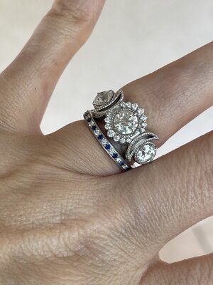
And just in case you're interested in a whole different feel - even if just to confirm in your own mind that you like what you've chosen better, and this is NOT the sort of thing you want - here's my 3 stone: Beloved, 4.05 H VS1 ACA center with 1.12 and 1.13 H VS1 ACA sides, heavily angled, and all still on top of my size 7 finger.

IMG_2686.jpg

IMG_1681.jpg
 
Last edited:
I just wanted to say THANK YOU to everyone who has so generously weighed in thus far. I am reading your responses and poring through your linked posts. Things have been crazy with company for Easter, but I hope to respond to everyone individually soon (and give an update when I decide what I'm doing).
 
Oh, wow, this is exciting!

Did you try to see it in natural light? Was there a window? That makes a huge difference.
I did walk the stones over to the window and observed them in full sun and diffuse daylight/shop lighting. At least in that setting, the tint didn't bother me. Which is interesting, because usually I'm very much a cool-tones kind of gal--I like grays and blues, not beiges or yellows, in all my decor/paint/etc. I just assumed "warmth" in a diamond would turn me off, but at least in that setting, I was totally fine with it.
https://www.pricescope.com/community/threads/an-upgrade-journey-…-from-a-research-perspective.277780/

I can't tell you how helpful your thread was! Thank you so much for linking it. What a fantastic primer on size, color, shape, and scale. I love the decision you made, and I cannot wait to see what your final product looks like!

As for thoughts on the stone you picked—it looks gorgeous! All ACAs are going to be beautiful, and I particularly like the high crown on this one. It looks insanely fiery! I also love the clarity. An eye clean VS2 is so nice for mind-clean purposes. (I’m currently doing a custom cut and went with VS1 because I didn’t want to risk an inclusion under the table, but VS2 would be awesome if I could pick).

Thank you! I don't know much about the nuances within ideal cuts, so I didn't realize the crown is a bit high compared to at least the other two stones I was looking at. It was just a bit more sparkly to me, which is why I chose it. I'd love to learn more about that someday!
3–size of stone. So….I’m an admitted bling-ho. I think it will be fantastic.

Bling-ho :lol:. I love it.
5–prongs. I’m in prong analysis paralysis myself. Who’s your WF SA? I would ask them what will be smallest on this design.

Liza is my SA, and she's been great. After talking to her today, I'm going to stick with the petite claw, and if I don't like the look in the pictures, I'll have them shave them down to get more of a ball look. She said it's easier to go from claw to ball than ball to claw, and I like to keep my options open. Plus, the claw has just a little more style to it, which I think is fun.
6–height. I’m with you there. I would want it as low as possible. However, if you don’t want the side stones to wrap around your finger at all you may need some height.

This is something I hadn't considered, but you're completely right that height could potentially mitigate some of the crowding issue I'm concerned about.

Anyway, thank you SO much for your detailed response, for tagging in other MVPs, and for linking me to those threads! It has been so helpful.
 
No one can tell you any better about the color than your eyes did seeing it in real life.
This is a really good point.

All diamonds will reflect the colors around them so it will look different in various lighting environments. Cut is the biggest factor and you were looking at three ACAs. You chose the J because you liked the sparkle better but maybe the I would suit your color needs better? Maybe you should ask them to take pictures of the diamonds face down (which is the way they are color graded) to see if you are bothered by the color of the J from that point of view. Might give you a better idea of what the diamond would look like viewing it from the side.
I did look at them from the side, and I couldn't tell a difference between the I and the J. Even in their videos online when looking from the top/back, they look pretty similar with tint to me (honestly, the J looks a little less tinted to me in the videos, but that's probably just my eyes).

I talked to Liza today, and she said the important thing isn't whether I'll notice tint sometimes (because it's there and I probably will in some contexts), but whether I like the stone and the way it looks. I think I, like many people, get caught up in higher grades for color/clarity being "good" and lower grades being "bad," but they're just different. It was a nice reminder on priorities for me.

Thank you so much for your advice, MGR! And I've long been a huge fan of your three stone--it is gorgeous.
 
This is a really good point.


I did look at them from the side, and I couldn't tell a difference between the I and the J. Even in their videos online when looking from the top/back, they look pretty similar with tint to me (honestly, the J looks a little less tinted to me in the videos, but that's probably just my eyes).

I talked to Liza today, and she said the important thing isn't whether I'll notice tint sometimes (because it's there and I probably will in some contexts), but whether I like the stone and the way it looks. I think I, like many people, get caught up in higher grades for color/clarity being "good" and lower grades being "bad," but they're just different. It was a nice reminder on priorities for me.

Thank you so much for your advice, MGR! And I've long been a huge fan of your three stone--it is gorgeous.

I totally get it all. You go look, make a decision then come home and second guess it all. It is an important and expensive decision. Or wake up at 3:00 am and think about it until 5:30 and then have to get up at 6:00! I would just try to focus on your original assessments. The diamond can always be traded or switched which is the beautiful thing about dealing with Whiteflash! Even with a D or E diamond, it will reflect the colors that it is surrounded with so having a diamond that is totally white all the time is a bit of a misnomer. I was once told years ago that the best place to determine color is outside, but even at that, it can reflect blue sky! Your paint colors and indoor lighting can affect what you see in your diamond. However, having said all of that, always and forever the cut is THE most important. Watching the sparkles and flashes can just be mesmerizing and usually will always trump color. You have chosen an ACA and performance wise, they don’t disappoint! I hope that after speaking to Liza (who is just a complete doll as I am sure you know) you are feeling a bit more comfortable with your choices. It should be beautiful and I can’t wait until it is on your hand! Goes without saying that we will need a bazillion pics! Big hugs to you!
 
I did walk the stones over to the window and observed them in full sun and diffuse daylight/shop lighting. At least in that setting, the tint didn't bother me. Which is interesting, because usually I'm very much a cool-tones kind of gal--I like grays and blues, not beiges or yellows, in all my decor/paint/etc. I just assumed "warmth" in a diamond would turn me off, but at least in that setting, I was totally fine with it.


I can't tell you how helpful your thread was! Thank you so much for linking it. What a fantastic primer on size, color, shape, and scale. I love the decision you made, and I cannot wait to see what your final product looks like!


Thank you! I don't know much about the nuances within ideal cuts, so I didn't realize the crown is a bit high compared to at least the other two stones I was looking at. It was just a bit more sparkly to me, which is why I chose it. I'd love to learn more about that someday!


Bling-ho :lol:. I love it.


Liza is my SA, and she's been great. After talking to her today, I'm going to stick with the petite claw, and if I don't like the look in the pictures, I'll have them shave them down to get more of a ball look. She said it's easier to go from claw to ball than ball to claw, and I like to keep my options open. Plus, the claw has just a little more style to it, which I think is fun.


This is something I hadn't considered, but you're completely right that height could potentially mitigate some of the crowding issue I'm concerned about.

Anyway, thank you SO much for your detailed response, for tagging in other MVPs, and for linking me to those threads! It has been so helpful.

You are so very welcome. I’m thrilled it helped you!

And *this* thread is just wonderful. You’re getting great advice. I am so excited to see your ring!
 
But you’ve seen your stone in-person! And that makes all the difference. You examined your stone yourself, you compared it to a higher colour, you determined in-person that your eyes don’t mind a little body tint. I would for sure encourage you to start out by trusting yourself ❤️

These words have been running through my head since I read them. You're right--I should trust myself more. Thank you for that reminder.


The one thing that I would say is that smaller stones will always look whiter than larger stones, if faceting is the same. And that difference is only exaggerated when there’s an actual body colour difference. So it‘s great that you’re starting with lower coloured sides!

I have perused a lot of threads here, and "pick same color (or even one shade darker) side stones" is a lesson that's been deeply ingrained!

But I should say, if you were my real world friend, I’d actually suggest an inexpensive temporary mount until you’re totally sure about your centerstone, and save Butterflies for when you’re sure about your stone! Because with the setting plus the sidestones, if you do end up wanting to upgrade your center due to colour preference specifically - you might end up needing a new mount to maintain fit of center and sides, and then in this case you’d likely want new sides as well, and that’s not a trivial expense!

I really took this advice to heart, and I called Liza to request the stone be sent to me loose with a ring holder or to explore the option of having it set in a "temporary" solitaire so I could be sure about it before I pulled the trigger. But Liza told me that I have 30 days after I receive the final ring to make any changes I want, including being refunded for the side stones, including scrapping the three stone and switching settings. She suggested that it made more sense to stick with the setting I knew I wanted so that I would be able to see the diamond in the right context, plus be able to evaluate the spread of the three stone on my finger. I didn't know they had such a generous return/exchange policy, so I agreed to keep the order as-is so I can evaluate everything at once and still have the option of sending it back if it doesn't work.

Re: new sides, you're right it's not a trivial expense, although the stones I picked are certified and thus upgradeable under WF's upgrade policy, which is awesome and helps defray the cost.

So one of the challenges with a larger stone spread on a smaller finger is exactly what you pointed out - the curvature… When I had mine remade (2.7 center and 0.43 sides on a size 4.25, so reasonably similar scaled to yours) I was dead set on having all three stones fit on the top of that one finger. No overhand at all. The only way to achieve that was to set the stones a bit higher and “fake” a less severe finger curvature, but that diminished the tulip-bulb-head look of the profile… I’m going to have this mount remade one day and I’ll be asking for center and sides to be set as low as possible, with sidestones tucked well under the center and severely angled. Because I want that tulip-bulb-head shape back.

Left is my second incarnation (2.7ct center, 0.43 sides, with all stones set “higher”). The photo you posted earlier - right - was my first (2ct center, 0.3 sides, all stones set as low as possible). I prefer the head shape of my first, what you posted earlier!!
CCFBD23E-EB6D-4894-8578-21D521C37EE0.png

I hadn't seen your second incarnation of butterflies--thank you for showing it here! I agree that I prefer the low set aspects of the first, but the second is still gorgeous. Did you end up keeping it awhile, or did it not work for you? Were you successful in not getting overhang? I think you're right that the proportions are going to be very similar to mine. Would love to see more pics if you have them!

Have WF send you photos to approve, once the ring is manufactured, before they ship out to you.

I'm planning on it; I confirmed this again today with Liza. Thanks.
Suffice to say that I am always always always thrilled when someone chooses this mount!!! :love:

Please tell me more! Did you design this setting??

Thank you so much for weighing in! Your eye and your jewelry collection are both phenomenal.
 
You sound like you've got every i dotted and t crossed!! I'd forgotten about the upgradeability of your sides - but of course, that helps defray the risk a ton!! And that's fantastic re. the thirty day mount trial! I'm so excited for you, I hope you love your stone and your mount :bigsmile:

Butterflies was my first ever custom design :love: And I loved it so much I had it remade for my first upgrade, but with bigger stones. My second upgrade took my stone to a size where sidestones just weren't feasible with my finger size (I wear a 4.25-ish, a little larger than you), so I opted to just rock the solitaire. But even though I've got a soli - I'm a three-stone girl at heart. Always will be. Another Butterflies with something pink on my wishlist :love:
 
1. Re color, I am always on Team Colorless, especially if you wear Es and Ds, but what matters is personal taste. I like the idea of buying the J, setting it in as cheap of a temp setting as you can, and then wearing it in real life. You will see the side view all the time and if the side view bugs you, at least you have WF upgrade policy for when you are ready for the 3-stone.
I always figured I'd be on Team Colorless too--I love that icy look. But in person, at least on that day in that place, the tint didn't bother me. All I saw was sparkle.

I called WF today to request to do what you suggested (either have just the stone shipped with a holder or get a cheap soli), but Liza said I have 30 days after I receive the ring to make any changes I want--including swapping out stones, returning side stones, or switching settings. That was a huge relief because it means I can try the setting that I want risk-free, and if it doesn't work, I'll reevaluate (probably with much angst on this forum, lol).
3. & 6. You probably will have to sacrifice one for the other — low setting vs. big diamonds. You can fit a bunch of big diamonds into one ring if the designer smooshes them up so that they are lifted and rest across the top of your finger. One of my three-stone rings does not have big diamonds but it does have a halo + metalwork. I wanted it low set, so it is designed low, resulting in the sides touching my other fingers. I love the ring but wear it less often than others. From personal experience, if it bugs you, it will bug you. So you might have to choose.

I would love to see a pictures of your low-set three stone if you have them handy! I think you're right about having to choose between low-set or too wide. I will send another message to WF to say that my priority is to have a narrower spread than low set stones (though I'd prefer both).
5. Some petite claw prongs are so well done that they disappear so those would by my recommendation.

Thanks so much for weighing in! I really appreciate your input.
 
I also have 3.5 finger and my solitaire is 2.57ct. I feel like if I added two side diamonds, they would rub against my neigbouring fingers. I also could not care less about the color, so mine is an I but I am very selective about the clarity so mine is VS1. In your case, I would be curious about the fit/comfort of the two side stones, if you had not done so already.

Thank you for the input! Yes, when I saw how substantial a 2.5ct is on someone else's 3.5 finger, I started wondering if maybe I went too big for the three stone look I want. Do you have any pictures of your ring? I'd love to see it. I looked through your posts but didn't see a thread about it.
 
I always figured I'd be on Team Colorless too--I love that icy look. But in person, at least on that day in that place, the tint didn't bother me. All I saw was sparkle.

I called WF today to request to do what you suggested (either have just the stone shipped with a holder or get a cheap soli), but Liza said I have 30 days after I receive the ring to make any changes I want--including swapping out stones, returning side stones, or switching settings. That was a huge relief because it means I can try the setting that I want risk-free, and if it doesn't work, I'll reevaluate (probably with much angst on this forum, lol).


I would love to see a pictures of your low-set three stone if you have them handy! I think you're right about having to choose between low-set or too wide. I will send another message to WF to say that my priority is to have a narrower spread than low set stones (though I'd prefer both).


Thanks so much for weighing in! I really appreciate your input.

Sounds like you have a plan. Can’t wait to see the first iteration.

Here is my three stone. Diamonds are not as big as yours but the melee and the metalwork make the ring spready.


A467EF3D-71B2-4A9B-862A-50ABCF5467A1.jpeg
86635AF1-2AAE-48D9-AF04-821D4674148E.jpeg
 
GET 3 FREE HCA RESULTS JOIN THE FORUM. ASK FOR HELP
Top