shape
carat
color
clarity

Which Save the Dates do you like better?

Status
Not open for further replies. Please create a new topic or request for this thread to be opened.

sunnygirl

Shiny_Rock
Joined
Apr 9, 2007
Messages
342
My goal is to send Save the Dates out be the end of this month/beginning of next...

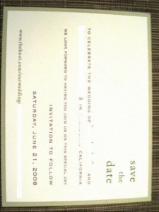
I was thinking of DIYing with material from Paper Source and basically doing something similar to the following save the date. There are two layered cards - my background card would be some sort of pink or orange (our colors). I like how the names of the bride and groom are in the background card color (which you cant really see b/c I whited out the names). I also like how simple this design is and how it doesn''t really incorporate a theme but is just really classic but modern.

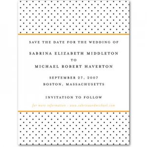
I also found a Save The Date on weddingpaperdivas that i like: it is the mini dot card. Now, I LOVE polka dots but I am not sure if it goes with our wedding. We don''t really have a theme so i don''t know. I like the dots and I like that I wouldnt have to spend time DIYing!

What do you gals think?
 
Here is the first:

SaveTheDate5.jpg
 
Here is the second:

polkadotsavethedate.jpg
 
My vote''s for the first one. It''s classic and has a "cleaner" look, in my opinion ... Can''t find the word I''m thinking of ...

The second one is cute.
 
I vote for #1 too. although, I like the polka dots if you plan on carrying it through to other wedding stuff too.
 
if you are doing evening very formal i would choose #1, but if you are doing evening or day semiformal I would choose #2.....I really like the polka dots too!!
 
My vote is for #1. Love it better than the polka dots.
 
I like them both but I thought that STDs should match or be in the same theme with your invitations, no? Perhaps you should select the invite first, and then design the STD to match it? They''re both nice, but very different. Surely one is more "you", yes? Which one???

ETA: Someone today EMAILED me their STD. I cant tell you how "bleh" I felt looking at a cheesy STD email. It''s just so wrong. So kudos to you for putting out a non-email STD! I just needed to vent about that!
 
I think both are great, but I love the polka dot one! It just seems a bit more fun and whimsical. Of course, if you are having a super formal wedding, as someone mentioned above, I don''t think the polka dots would work.

Also, I am pretty sure the STDs don''t have to match the invitaitons, but I''m sure you could go either way!
 
Thanks for the opinions! Keep ''em coming!

I am a total DIY novice - what knid of program do I need to design the writing for the first one? Does it have to be a real graphic design program or can I use something like Word?

Also, any advice on the best way to glue two cards together like that? Glue dots?
 
I like the polka dot one. Its fun. I don''t (personally) think your STD have to match your theme. Mine won''t, when I get around to making them...
2.gif
 
I personally like the first one best...I think it is very clean and elegant looking. I think it would look lovely in your wedding colors!
 
I like #1. #2 is nice but a little "cutesy".
 
sunnygirl, I like them both. I''m a fan of matching stationery, so I''m wondering what the invitations look like. I think that if you''re still undecided on the rest, then go with the first option.
 
i really LOVE LOVE LOVE the second one.
the first one seems so blah.
 
the second! by leaps and bounds!
 
I like number 1!
emthup.gif

BTW and totally off topic, I LOVE your ring!
30.gif
36.gif
 
I prefer the first, no doubt!

And yes, that ring is divine!!
30.gif
 
I love the design on the second one, but the text layout is much nicer on the first one (better heirarchy). Overall I would choose the first one.
 
I''m loving the polka-dot one, and definitely don''t think that the Save the Date has to ''match'' the rest of your wedding.

The first one is lovely too though! Maybe flip a coin?
3.gif
 
Thanks for your votes everyone!! I love PSers! And thank you for the compliments on my ring. :) Sometimes I catch myself staring at it at work and then I feel all embarrassed and hope nobody saw me! I am leaning toward the first one because I have no idea what we are going to do for invites and because I don''t know if I am going for a "cutesy" look.

Has anyone used papersource letterpress for their invites?
 
I really love the polka dot one....its fun and classy at the same time. the 1st one is very pretty, but for std its really formal.
 
hey sunny - I know I have seen it before, but could you share where the 2nd, polka dot one is from?

I am still undecided on STDs but I love that polka dot one!
 
At first I liked #1. But then I realized I like fun STDs, so I picked 2. Hm.

And I agree that they don''t have to match your invites. Maybe you should indeed flip a coin!
 
I love the first one!
 
Date: 1/13/2008 10:03:05 PM
Author: surfgirl
I like them both but I thought that STDs should match or be in the same theme with your invitations, no? Perhaps you should select the invite first, and then design the STD to match it? They''re both nice, but very different. Surely one is more ''you'', yes? Which one???

I thought the same too. If you don''t know what your invites are then I''d pick number one.
 
Status
Not open for further replies. Please create a new topic or request for this thread to be opened.
GET 3 FREE HCA RESULTS JOIN THE FORUM. ASK FOR HELP
Top