shape
carat
color
clarity

Which setting for 3ct lab emerald

Which one?

  • Setting 1: https://www.stuller.com/products/build/71673/10900567/?groupId=121067&recommendationSourc

    Votes: 17 68.0%
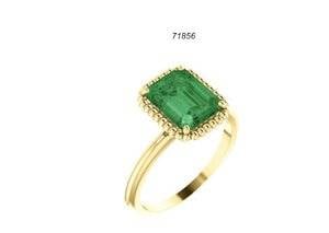
  • Setting 2: https://www.stuller.com/products/build/122705/11811970/?groupId=125555&recommendationSour

    Votes: 8 32.0%

  • Total voters
    25
I LOVE the first one so much. I don't know anything about the durability of 10K gold though
 
I like the 1st one. I wouldn't heritate to use 10k on a "fun" ring. Whatever you choose will be great with that pretty green :)
 
I'm apparently in the minority, but I voted for the second one. I love the face down view of #1 but I don't like it much from any other angle. I think the second one is very attractive from all angles and will nicely compliment your emerald. (It is listed as a best seller so I am guessing it must look pretty good IRL). Your stone is really pretty!
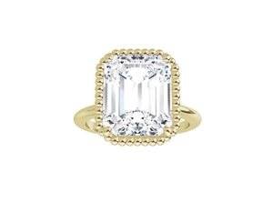
 
I love the first one. I love a chunkier yellow gold solitaire setting for a huge emerald!
 
I'm apparently in the minority, but I voted for the second one. I love the face down view of #1 but I don't like it much from any other angle. I think the second one is very attractive from all angles and will nicely compliment your emerald. (It is listed as a best seller so I am guessing it must look pretty good IRL). Your stone is really pretty!

Hmm. That’s a really good point...
 
Hmmm... I'm torn. I love the concept of a big emerald in a gold bezel, but the construction of this setting looks a bit heavy in the renderings. I imagine it would be even more so with a big stone.

The second one will really let the emerald shine (as it already has quite a presence in just the ring holder) and looks beautiful and delicate. BUT it does read rather e-ringy to me. Maybe it won't so much with a colored stone...

I tentatively vote #2?
 
I voted for #2. I like the simplicity of it, while still providing eye pleasing elements (like the twisty shank). :love:
 
I like number 2!
 
I thought it might help to see the two settings you picked with a green center. :D

C3D5125C-51DF-4D74-B901-329AD58C3A49.jpeg DC605795-0830-4729-8FAB-CF7FE640036D.jpeg

Oooo, thanks!!
When you see it like that I think setting number 2 looks better, I think the swirly vine design goes well with the green. Sort of a romantic forest theme?
 
Also I forgot how price efficient stuller settings are! For setting number 2 my jeweler quoted me 375$ including setting and finishing and resizing in 10k. My last two custom settings were both over 1k!
 
You sorta get used to paying those custom setting fees. :lol:
I can’t believe this will come in under $400. I really need to start using stock settings.
 
You sorta get used to paying those custom setting fees. :lol:
I can’t believe this will come in under $400. I really need to start using stock settings.

Yeah part of why I was excited to snag this emerald was that it's 3ct and pretty close to the standard 9x7mm (it's 9 x 7.3mm which my jeweler said should be fine)
 
Yup. It tarnishes more quickly I think. But I’m ok with the occasional polish
I had a 10K class ring and I don't remember it tarnishing. But, my girlfriend wore it most of the time. LOL
 
Decided on setting 2 after all after much chatting with my jeweler and measuring of my finger diameter lol.
Will start a thread when it’s done :)
 
Decided on setting 2 after all after much chatting with my jeweler and measuring of my finger diameter lol.
Will start a thread when it’s done :)

Can’t wait to see how it turns out. :dance: You’re making me want to set my emerald now, now, now!
 
:eek2: I am dismayed to find that the first setting is still winning in the polls! I find the gold beads on the first one to be too large and a little gaudy looking, not at all like a milgrain effect. The second setting is simpler and more elegant, and if I may say so, fits in with the aesthetic of your other two rings more. The leaf motif in the gallery is lovely and makes me think back to your abstract lotus ring.
 
:eek2: I am dismayed to find that the first setting is still winning in the polls! I find the gold beads on the first one to be too large and a little gaudy looking, not at all like a milgrain effect. The second setting is simpler and more elegant, and if I may say so, fits in with the aesthetic of your other two rings more. The leaf motif in the gallery is lovely and makes me think back to your abstract lotus ring.

I ordered the second one :)
 
Pick up on Wednesday. I can’t wait to see it! Squee!
 
Don't forget to post pictures!
 
Excited to see your pics and hear your comments MTG!
 
GET 3 FREE HCA RESULTS JOIN THE FORUM. ASK FOR HELP
Top