shape
carat
color
clarity

Which setting?

which setting looks best with this stone?

  • #1

    Votes: 10 21.7%
  • #2

    Votes: 3 6.5%
  • #3

    Votes: 10 21.7%
  • #4

    Votes: 3 6.5%
  • #5

    Votes: 9 19.6%
  • #6

    Votes: 6 13.0%
  • #7

    Votes: 5 10.9%

  • Total voters
    46
  • Poll closed .

MAC-W

Brilliant_Rock
Joined
Sep 28, 2009
Messages
671
Need your opinions.

Which of these settings look best with this stone?

(please forgive my poor photoshop skills)
 
Ooops. Struggling to add photos - bear with me.
 
Number 1

MAC_Spinel_Option1.jpg
 
Number 2

MAC_Spinel_Option2.jpg
 
Number 3

MAC_Spinel_Option3.jpg
 
Number 4

MAC_Spinel_Option4.jpg
 
Number 5

MAC_Spinel_Option5.jpg
 
Number 6

MAC_Spinel_Option6.jpg
 
.
 
Number 7

MAC_Spinel_Option7.jpg
 
Ever since seeing Freke's ring with the grey spinel I've want one.

I know this is not of the same standard but I think it will satisfy my craving for a while.

Which setting do you think compliments this stone the best? and why?
 
Forgive me for not replying immediately to your posts but is now very late (midnight) here in AU and its waaaaaaay past my bedtime.

I promise to respond tomorrow.
 
I like the Harry Winston style setting (the butterfly setting) the best because I like the idea of a lot of white metal around this stone, and this is different than the traditional halo. I like the white metal offsetting the slate grey of the gem. It's a nice contrast, kind of like black diamonds in a white gold piece.
 
I voted for #3. I think the halo best shows off, or maybe I should say highlights, the color of the spinel.
 
I'm going to vote for #7, but I also like #6. I think #6 is very unique, and it reminds me a bit of an eye (which might be a negative thing, depending on your point of view). But I think this setting is very dependent on the length of the stone. If it's too long then you don't get the whole halo effect, but if it's not too long then it would look good on the finger.

As far as #7 goes, I think this stone would do well without a halo, but I think it's still nice to have diamonds nearby. I guess I just like this setting.
 
#1
Looks lyrical to me

I love the butterfly setting, but would rather see
a different colored stone in it than the grey, JMO
 
Very pretty stone!

1st choice #1
2nd choice #7
3rd choice #5
 
1st-3rd
2nd-5th :)

Both goes well with the stone, if I gotta choose one I will go for the halo, it looks more classy with the grey stone:)
 
I voted #6. I like the E/W orientation, and the diamonds seem to sweep around it as if on a breeze. Gorgeous!
 
While in general I don't like halos, this spinel fits setting nr 3 perfectly. Maybe the contrast between the diamonds and the stone...
 
I voted #1. It's the one I'm always drawn to as I scroll back and forth.
 
1, 4, 7 and in that order.

MoZo
 
I prefer setting #2. Not everyone is going to like the grey spinel, though I do. It seems like the other settings play up the image of poor pitiful grey spinel, needs something to make it shine. While setting #2 is quite obvious that the spinel is the star and you're bucking the whole system. :lol:

I like setting #5 but it seems too butterflies of death, silence of the lambs moth, gothic looking; unless that's what you're going for.

so I like #2 and then #5

Those are just my personal opinions though, Lord knows I ain't right so take 'em with a grain of salt. :D
 
movie zombie said:
1, 4, 7 and in that order.

MoZo

Yes, I agree. There is something modern about the grey of the spinel and I like it paired with the most simple modern setting. I like the white metal with the stone, too, more than the diamonds in most of the other images.
 
#1. THE setting for this stone.
 
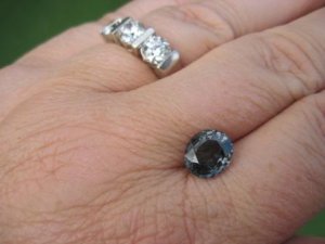
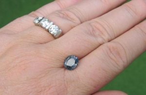
here are some real life photos of my 'grey' stone.

Its actually more blue than I expected from the pictures, so I'm not sure about it any more. I really wanted a pure grey, plus it seems to have a bit of a window - will that close up on setting?

What do you think of the stone?

Should I set it or try again to get a better grey?

And if your choice is to set it would you still pick the same setting?

All thoughts will be gratefully recieved, cos I just dont know what to think right now.
Spinel_Grey_010.JPG

Spinel_Grey_012.JPG
 
MAC-W said:
here are some real life photos of my 'grey' stone.

Its actually more blue than I expected from the pictures, so I'm not sure about it any more. I really wanted a pure grey, plus it seems to have a bit of a window - will that close up on setting?

What do you think of the stone?

Should I set it or try again to get a better grey?

And if your choice is to set it would you still pick the same setting?

All thoughts will be gratefully recieved, cos I just dont know what to think right now.

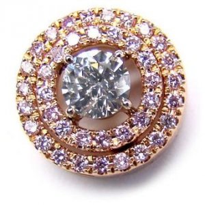
I think grey pops the most in rose gold. Here's a grey diamond in rose gold. I don't see much blue in your stone. With a grey stone, I would be concerned more about sparkle than the lack of a hue. I think it's certainly grey enough, but that's for you to decide. Does it have decent sparkle? I saw a fabulous almost grey spinel online, and I don't believe it's available anymore, but it had excellent cutting, and very light tone, which really enhanced the sparkle factor. For your stone, I would probably concentrate on a lighter tone and better cutting if you want a grey, but if you want dark grey, that's up to you.

greydiamondhalo2.jpg
 
GET 3 FREE HCA RESULTS JOIN THE FORUM. ASK FOR HELP

Featured Topics

Top