shape
carat
color
clarity

Would anyone like to help me choose a gallery design for my pink spinel reset?

CBianco

Brilliant_Rock
Joined
Nov 25, 2021
Messages
658
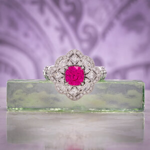
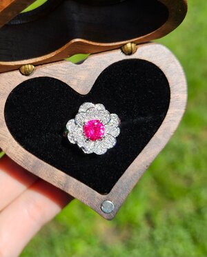
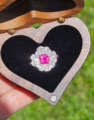
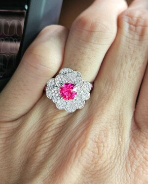
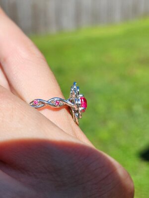
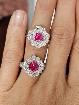
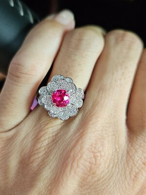
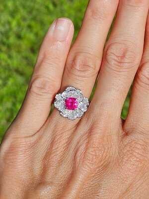
Yes, I'm resetting my pink princess. She's too similar to my other newer rings and I don't reach for her as much anymore. (Not that the new desgin is any less blingy):lol-2:
Coco-1.jpg

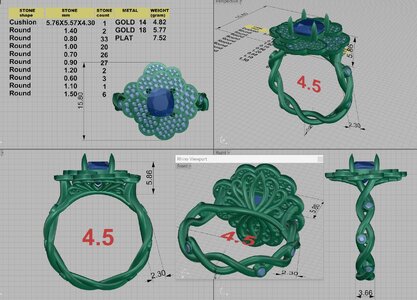
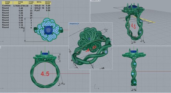
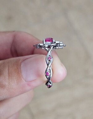
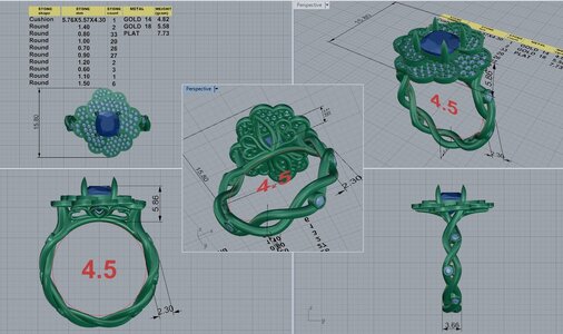
So I am a little stuck between these two gallery choices. I really like the "hearts" version but does it look a little strange from the side with the gaps? Or is it just because of the CAD? I've already went through too many versions and feel ashamed to bother DK for more lol so please share your opinions on which one you prefer, the "hearts" or the "crown" as I'd like to call them =)2 Thank you!DK 105517-QUAD-9.jpgDK 105517-QUAD-10.jpg
 
Last edited:
I like both, I have no issue with the gaps at all. The hearts are beautiful.
That being said, the 'crown' fits the design more cohesively as it mimics tendrils/leaves base of the flower coming up from the stem/shank. It looks purposeful.
It really could go either way.
 
I am absolutely useless with design but popped in to say your princess is so beautiful!
 
Either is lovely.

I wonder if you have considered angling the petals of the flower/halo slightly so that it is less flat from the profile?
 
I like both, I have no issue with the gaps at all. The hearts are beautiful.
That being said, the 'crown' fits the design more cohesively as it mimics tendrils/leaves base of the flower coming up from the stem/shank. It looks purposeful.
It really could go either way.

Thank you! I'm having that thought too, that the crown looks a little more organic.

I am absolutely useless with design but popped in to say your princess is so beautiful!

Thank you!=)2
 
I don’t see a problem with any gaps. If you like the hearts better, go for them.

For me, personally, it’s the crown. But that’s just me. And besides, I still find the hearts perfectly beautiful.
 
Either is lovely.

I wonder if you have considered angling the petals of the flower/halo slightly so that it is less flat from the profile?

Thanks! I have actually, the first version (out of probably 10 lol!) had it angled but it messed with the look from the top. I think I'm okay with the sleeker side view, makes it easier to wear as well. I had a similar opalescent sapphire ring in the past with more angled petals and while it was lovely, it didn't make or break the ring for me, if that makes sense=)2
 
I don’t see a problem with any gaps. If you like the hearts better, go for them.

For me, personally, it’s the crown. But that’s just me. And besides, I still find the hearts perfectly beautiful.

Thank you! So it's crown 2-0 as of now:lol:
 
I like the hearts but they could be angled up a bit more.
 
Okay so here is the latest CAD, I asked DK if it's possible to nudge the petals to be slightly more angled/3D while keeping the top looking same, after giving more thoughts thanks to @Dreamer_D's observation. This is legit the 11th CAD (although a few were minuscule changes), I feel so ashamed:lol-2: He did reassure me that it's okay lol!
DK 105517-QUAD-11.jpg

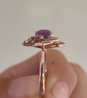
The only down side is the "cup" being a little more visible now, and I don't think that can be removed as it's structural and all the petals are attached to it. Maybe cover that with some hidden pave that's only visible from the side but not from the top? I think that should be possible:think:

Screenshot_20240828_163736_Gallery.jpg

I forgot to mention before, that the bezels on the shank would be with jedi spinels, almost matching the center stone:dance: I had thought about sprinkling some on the top too but I wanted all the attention on the center spinel.
 
Where is the cup you are taking about? I like the subtle change the the petals they look very organic now in a good way.
 
Where is the cup you are taking about? I like the subtle change the the petals they look very organic now in a good way.

It's just part of the setting that the stone sits in, cup probably isn't the best way to describe it. I've circled the areas in the photo above. I'm aware of it because of a previous ring that I've mentioned in an earlier post. 20221029_093501.jpg
You can see the metal next to the prongs, I'm fine with how it looks but I think some pave there might make it even better, if it's invisible from the top of course. I asked DK already so we'll see what he thinks, whether it's possible or not.

Update- He just responded that the metal is very thin, he'll see if he can sprinkle some diamonds on there but there might not be enough metal.
 
Last edited:
Yeah I think you won't notice that at all and really, seeing some metal is not a big deal. But maybe you prefer it the other way so that part shows less! I don't think there is like a big loser between these choices lol.
 
Yeah I think you won't notice that at all and really, seeing some metal is not a big deal. But maybe you prefer it the other way so that part shows less! I don't think there is like a big loser between these choices lol.

Yeah I probably wouldn't, that metal didn't bother me in the other ring so I don't see why this one will:lol:
I will definitely share when it's finished!
 
I have to say you are making me giggle with this reset, which is going to be so lovely, but is still very similar to the original in overall shape and proportions! Lady knows what she likes!
 
GET 3 FREE HCA RESULTS JOIN THE FORUM. ASK FOR HELP
Top