shape
carat
color
clarity

2nd set of CADs

familynurse

Rough_Rock
Joined
Jul 4, 2011
Messages
83
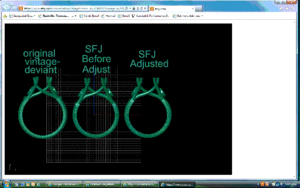
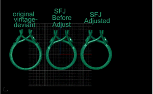
I'm back with a comparison of the original inspiration ring, my first set of CADs and the new version. I asked Caren and Micheal if they could make the proportions of the ring similar to the inspiration ring( Natsplat on pricescope).

I think the side stones should be slightly smaller. The cuffs also do not look even--the rt cuff looks to be closer to the side stone.

What do you all think? I really would like your opinions/imput before I respond to Caren. You all are so knowledgeable and design savvy, and have been a great help.
https://www.etsy.com/conversations/image?convo_id=57369111&image_id=18199107&image_type=full
 
Hi FN, That link does not work.
 
Can you post the cads alone? That link doesn't work.....for me anyway :(
 
Well darn. I was so proud of myself for figuring out how to post the link from my I- Pad. I'm currently at a conference,so it will be later this afternoon before I am home. The link worked when I looked at it in the preview. Sorry, I will try again later.
 
I think the link worked for you because you were logged into Etsy, and it looks to be a conversation with you and the vendor? So, I don't think anyone else *would* be able to see it, because it's an image in a private convo :)

Hope you get a chance to post the image later!
 
Hi again-

I sure hope this link works- I am very computer illiterate. My son is the computer nerd and can usually walk me thru any problem. His biggest putdown to someone is ,"Even my Mom knows how to do that!" :wink2:
Since he is currently unavailable, I was on my own.
It only took me about 4 hours to figure out how to convert an MHT file to a jpg file and then fiqure out how to save it to my desktop. I feel very proud of myself for finally learning how to do this :bigsmile:

Any way - please look at these pictures and let me know your thoughts.

CAD.gif

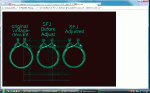
CAD.gif
 
The pictures posted twice and they are small. I will try and post larger pictures, but it may take me another 4 hours. :roll:
 
cads2.gif

These are just slightly better.
 
I don't know why, but I find these CADs really hard to read...
 
It's impossible to comment on whether the side stones or cuffs are right/wrong because these CADs don't show enough detail or the stones together. What I see is that the CAD on the right has been squashed downwards that has widened the basket. This would make me worry because it looks like the basket is a significantly different size to the first one and presumably you only have one centre stone? The swoopiness of the basket has also been negatively affected by this change IMHO.

The CAD on the left is far more aesthetically pleasing (to me). It will sit higher on the finger but to me it looks more elegant and in better proportion.

It also doesn't help because the image is flipped in the middle and right images so will always look different from the left one. :loopy:
 
LD|1339925718|3218118 said:
It's impossible to comment on whether the side stones or cuffs are right/wrong because these CADs don't show enough detail or the stones together. What I see is that the CAD on the right has been squashed downwards that has widened the basket. This would make me worry because it looks like the basket is a significantly different size to the first one and presumably you only have one centre stone? The swoopiness of the basket has also been negatively affected by this change IMHO.

The CAD on the left is far more aesthetically pleasing (to me). It will sit higher on the finger but to me it looks more elegant and in better proportion.

It also doesn't help because the image is flipped in the middle and right images so will always look different from the left one. :loopy:

LD- When you say the CAD on the right - do you mean in comparison with the middle CAD or the inspiration ring(the 1st one). The first one - the inspiration ring had a round stone in the center, mine has an oval, so the basket will be shaped differently. Once I am happy with the placement of the cuffs and side stones, I will ask for further pictures.
I am not sure I understand what you mean about the image being flipped in the middle. These were CADS of 3 different rings, were to help me compare the inspiration ring proportions with the CADS for my ring. Thank you for taking the time to loook and comment.
 
Hrm, I think I like it better when the cuffs are further down the shank. In the 3rd picture all the elements look squished together.
 
Ok, so the choice is between the middle and right cad? I like the one in the middle the best - and I think the alignment of the cuffs is ok, because if you follow the lines on the grid the cuffs match up. I think the cuffs of the one on the right are ever so slightly off.

The side stones are slightly bigger too, but I think it looks fine. I guess it's up to you if you would like them smaller. The bezels on the middle and right are a little thicker than the inspiration (stick out more)- I think I like the thinner bezel (less metal).
 
I prefer the middle CAD as well. I like the shoulders lower, so the 'swoop' is more evident.
 
This is why I never have anything set (or rarely) because I can hardly see the difference. I'm amazed at all your eagle eyes!
 
I like the middle one, but want the wires that end up on the "inside" to have more of a curve to them so they are more obviously concave (i.e. more swoopiness).
 
I can't make anything out other than that I much prefer the original design. ;( I'm better at reading the simulated 3D style (where it looks like an actual ring, instead of a true ACAD dwg style drawing). The one on the far right looks squashed and fat, and with intense squinting, I can see the cuffs.
 
Thank you all for the advice and comments. I think that this design is a bad idea for an oval stone. I had no idea that switching a round stone for a center one would make such a big difference. However, it does appear to change the look of the ring.


minousbijoux|1339968076|3218356 said:
This is why I never have anything set (or rarely) because I can hardly see the difference. I'm amazed at all your eagle eyes!
I agree with you minousbijoux- I don't think I will try and have a setting made again. Obviously the artistic side of my brain doesn't work-its extremely difficult for me to visualize how something will look.

Chrono
I also like the original ring the best. I am not a big fan of these pictures either- but I think they were sent so that I could compare the spacing /proportions of the rings. I had asked that the cuffs be moved a little higher and asked if they could make the spacing more like the orginal ring. The 3rd ring represents these changes.

Thanks again for everyones help. I have learned an incredible amount from all of you.
 
FN,
What are you going to do now? Are you going to scrap this design and go with something else, or continue to try to tweak this design?
 
Chrono|1339983923|3218437 said:
FN,
What are you going to do now? Are you going to scrap this design and go with something else, or continue to try to tweak this design?

Chrono,
Not really sure what I am going to do. :? I have sent a message to Caren asking for her opinion as to whether I should keep tweaking the design or just go with a gold band- no split shank, no side stones and mount the spinel up high with pointed prongs similar to Natsplats'.
 
Have you thought about looking at the CAD by itself instead of comparing it side by side to Nat's? This ring will be different, it has a different size center stone, different ring size, different shape center stone, etc. I'm sure that the original correspondence was along the lines of "I want this ring, but I want this oval stone in it instead of the round one that was in the original." So I'm wondering what would happen if you just look at the new CAD on it's own merits and stop comparing it to Nat's. It's never going to look exactly the same.

I typically don't post projects before I do them. Once you post them, and you hear what other people think, it's really hard to remember what you want and what the original vision was.
 
FrekeChild|1339992286|3218516 said:
Have you thought about looking at the CAD by itself instead of comparing it side by side to Nat's? This ring will be different, it has a different size center stone, different ring size, different shape center stone, etc. I'm sure that the original correspondence was along the lines of "I want this ring, but I want this oval stone in it instead of the round one that was in the original." So I'm wondering what would happen if you just look at the new CAD on it's own merits and stop comparing it to Nat's. It's never going to look exactly the same.

I typically don't post projects before I do them. Once you post them, and you hear what other people think, it's really hard to remember what you want and what the original vision was.


Thank you for your kind words At work I am secure and know what I am doing and therefore would not need help. Never having designed a ring or looked at CADS before I felt that I needed to hear what others had to say. The others made it look so easy- I know now that its not. But you are right I need to stop comparing and decide how the ring would look with my stone and then decide if its what I want.Thanks again.
 
If I were in your shoes, I would take a day or two to get the CADs out of my head. Then I would think about what drew me to Natsplat's ring in the first place. Try and think - was it the color? The split shank? The proportion of the center stone to the sides? The cuffs? I think that in the moment, with the pressure of the CADs and all the detail, it is easy to lose sight of the key elements that you loved to begin with. For me, I would say that the things I love about her ring are the colors of the metal and the main stone, and the graceful proportions of the cuffs to the side stones and on up to the center stone. Think about it if you can, and come back in a day or two and tell us what it is that drew you to her ring... =)
 
GET 3 FREE HCA RESULTS JOIN THE FORUM. ASK FOR HELP

Featured Topics

Top