shape
carat
color
clarity

A new Durnell pink sapphire project

mpc

Rough_Rock
Joined
May 4, 2009
Messages
80
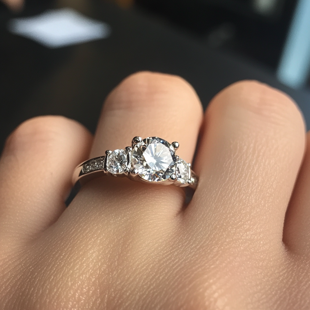
I'm a very infrequent poster but regular visitor to PS. A month ago my husband had a business trip to LA and I decided to tag along. On one of his days off we decided to go visit Bridget Durnell, who made my engagement ring, but whom we had never met in person. I had no real intention of getting anything but upon seeing so many gorgeous things in her studio, I started dreaming :loopy: . Our one year anniversary is coming up and somehow I let slip that it would be so cool if I got another custom Durnell piece- a RHR featuring a pink sapphire. And somehow my husband obliged :bigsmile: Within a few days the project started. I have been trying to take a crash course in colored stoned via PS but I still feel inadequate. Anyways Bridget has been super accommodating and helpful (as always) and has sourced 10 pink sapphires for me. Of the ones she found, she should be sending me 5. And here is where I am stuck. I don't have the stones yet, but just from staring at the pictures, I am overwhelmed with indecision. I was hoping some of you CS experts could weigh in. Thank you in advance for any comments/opinions you might have! Now onto the pink sparklies!

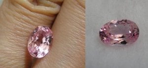
A) 2.09 ct unheated padparascha- from the pictures, this is exactly the color I had in mind, but of course will have to judge the color (and cut) in person. If I get an oval, I'm thinking of setting it east-west with a halo.
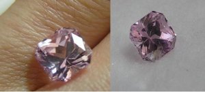
B) 2.53 ct heated radiant. The color of this stone in real life is described as that of a light pink diamond. My main reservation is that the stone is heated, which I know many people are ok with. I just am not sure how I feel about it.
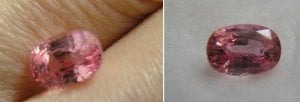
C) 1.97 ct heated oval. Another lighter pink stone (you can see I told Bridget I wanted light pink). Same reservations about heat treatment.
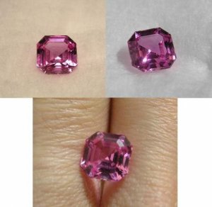
D) 1.90 ct unheated asscher. I know the picture looks purple but I've been told it is an artifact of photography and is bright pink. Although I originally didn't want a hot pink, I like that it is unheated and something about this stone intrigues me.
E) 2.05 unheated padparascha. Supposedly this stone has more vivid saturation and is a pretty salmon color. It is slightly over our budget but I thought I'd throw it in the mix to contrast stone A).

My questions are- if it were up to you, which of these stones would you choose? Without opening up a can of worms, would you let heat treatment be a limiting factor? Also take into consideration that these photos have not been photoshopped and may not reflect their true colors. I should be able to take my own photos once I receive the stones, but I was hoping to get some initial reactions/opinions. Thanks again for any help!
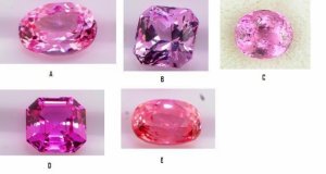
pinksapphires.JPG
 
That's a great dilemma to have. I really like D and E.
 
I prefer A, D or E....I can't wait to see your new ring!
 
Hi, I have no experience of gem buying and new to PS, but I like C.

Looking forward to seeing your pics and real life description as I tooam looking for a pink gem, though prob a spinel rather than sapphire.
 
I vote D and E too.
 
What an exciting project! I like D and E the best, but if you prefer a lighter colored stone and don't want heat treatment, I think you should feel ok sticking to your guns about that. And should be able to find one that is lighter and untreated.

Also, love Durnell's work and cannot wait to see more of what you come up with! I think her gorgeous lines would be fantastic with asscher D.
 
Another vote for D or E! What a fun project :wink2:
 
mpc|1303018662|2898229 said:
My questions are- if it were up to you, which of these stones would you choose? Without opening up a can of worms, would you let heat treatment be a limiting factor?

Pink and orangey pink sapphires are some of the most common diffused colors, so yes, I would worry about heat treatment, unless I had a very small budget, and didn't care. I hope that whatever you buy, they come with reputable lab reports with the full extent of treatment (especially if you're spending a significant amount).
 
E, D, A, in that order if as TL says they have proper lab reports and really are untreated. It is hard to imagine being unhappy with any of those.
 
VapidLapid|1303056420|2898435 said:
It is hard to imagine being unhappy with any of those.

I agree, as they are all pleasant saturations and tones. In this case, if the photos are truly accurate in color, it would be a matter of asking about the color shift on them, and treatment, of course. Some may not look as pleasant as others in various lighting. However, if all things are equal, fine orangey pink sapphires are the most valuable, but it is a matter of taste.
 
Hm... I like D but that's because I like pink tones such as this against my skin. I also like E, but pink/orange colors don't play as nice on me so it would not be my first choice. You'll have to see how each of them "feels" to you once you hold them in your hand.

They all look wonderful - what a fun project!! :appl:
 
HI: D & E. I would not characterize A as a pad as at least from the pic it looks mainly pink. I second TL's concern about diffusion and the need to have certs, as the brightness and intensity of color displayed in the majority of these stones is similar to the color when treated. However, since some stones achieve this intensity naturally, they shouldn't be automatically ruled out.

Oh, just one comment about shape - as I'm sure you know, ovals are the most common shape - ascchers, especially with that color intensity, are a much rarer treat.
 
Hi, My first post, just found this site. I have been a cutter for over 35 years and from the pictures I would not call A a padparasha, it appears to be pink with peach tones, but gemstone photography is tricky, and even when you get it right, it can look totally different on another monitor. All of them are beautiful. That being said let me weigh in on treatments, there is nothing wrong with it as long as it is disclosed.

Truth is, heat treating is so common, I just accept that most stones have some heating, it's what makes a zoisite into a tanzanite, purifies the blues of aquamarine, and clarifies the silk in corundum. As long as there isn't any surprise then I have no problem with it, but it's a personal thing. You hardly ever see a difference in heated stones from their unheated counterpart, except in their price. Let me ask you, do you choose pure white cotton/silk/satin or do you choose pretty colours/pastels/prints? Treatments have justification depending on your point of view.

Best of luck on your project.. :)
 
D and E. Fun project.
 
Hello all, thanks so much on your feedback! Yes I definitely need to ask for certification to make sure the stones that are unheated really ARE since there is a price premium. Seems like stones D and E are crowd pleasers. At this point I guess I just have to wait to actually have the stones in hand to see how they are in real life. Will definitely keep you all posted!
 
D and E for me too. Should be interesting to see how well E does in IRL. I have an oval pad and I love the color, but I do get a lot of head obstruction, and since my hair is black, it means the middle often reflects my dark hair. Of course, this happens when I want to stare at the stone. ;( But when I'm just wearing it, it shows very prettily. Just keep that in mind when you really look at option E.
 
E for definite.

To my eyes, A is not a pad sapphire... it's pink.

Oh, and with pads I would definitely want unheated - normally I don't have an issue with heat at all, but when it comes to pads there are just too many diffused stones out there.
 
The stones arrived on Friday, and then began the daunting task of trying to take pictures. Of the ~100+ pictures I took, these were the few that turned out best, and they're still not that great, especially since the sun literally disappeared in the middle of my photoshoot :confused:

Stone D (asscher) definitely jumped out as the most vibrant and saturated stone of all of them. The stone includes a GRS certificate stating it is unheated. It does shift a bit from a softer, rosier (?) color in the evening (left) to a hotter pink in the daylight (right), despite looking purplish in these pictures. So I am going to move forward with this choice! Yay! I'm excited!

That said, I thought I'd go ahead and post pics of the other stones too...

Stone E and A (ovals) were also beautiful in person and came with GRS certification as unheated. Stone E was clearly more vivid and saturated in color. But in both cases, I think I loved looking at the stones more than I liked the way they looked against my skin tone. I know other people have commented that orangey-pinkish/peachy stones aren't for everyone. And certainly for the price of these two stones, I much prefer the asscher which really popped on my finger.

Stone B (radiant) - even though I thought I wanted a paler pink stone, the color (once again) just made the stone blend into my finger. Very sparkly though.

Stone C (heated oval) was far inferior to all the other stones (visible inclusions, etc) so I didn't even bother photographing it because I was tired :cheeky:

Anyways, my one recommendation to anyone who thinks they want a paler pink or a peachy/pinkish orange stone is that they try it on their finger! You might be surprised how non-distinct it looks. Next up - I will send all the stones back to Bridget and the setting/ring should be finished within a few weeks. Will post when I get it. Thanks for everyone's feedback!

P230942B.JPG

P230952A.JPG

P120394D.JPG

P101023E.JPG
 
You definitely made the right choice in terms of the way the stones look against your skin! I have had the same experience with pink gemstones: how they look against your skin is totally unpredictable, and you may love the color, but not the way it looks.

And the asscher-style cut is very, very special. I'm looking forward to seeing what Bridget Durnell comes up with.
 
I'm an asscher girl so I had my eye on that one from the beginning. I like it EVEN BETTER in your pix. Great choice!!!!!!! Please come back to show us the finished product!!
 
:love: :love: :love: :love: :love: I missed this thread earlier and was routing for D, so glad that the asscher stood out. Can't wait to see the final project!!!
 
Asscher, asscher, asscher...! You did the right thing :love: Its great when you fall in love and just know when you see it. Congratulations!
 
Good choice! I really like the asscher.
 
It does appear that D is best with your skin tone. The colour of the stone itself is pretty and with the cert stating it is untreated, is a good choice.

A little off topic since you've made your decision, but I'm another in the camp who cannot understand how stone A is advertised as a padparadscha since it looks almost 100% pink on my monitor.
 
Yay! Glad you all agree with my choice! To Chrono and others who question the validity of calling Stone A a 'padparascha' given it's pink color - I guess I can't answer that question because I'm not an expert. But having seen the stone in person, it did have ever so slightly more peachy tones than say, Stone B, and more so in certain lights. And maybe it was advertised as a pad based on occasional faint salmon tones and because the stone is from Sri Lanka? Is that where pads are mined? I'm not sure. That said, compared to Stone D, it was a far cry from being what I would consider 'textbook pad' in my mind. So I would call it more of a pad wannabe :cheeky: Anyways, it would be a very pretty stone in it's own right, but I wouldn't want to pay 'pad prices' for it. I should get the ring in a few weeks!
 
YAY for the Asscher! How are you going to set it?!?
 
Good choice. Asschers are awesome.
 
GET 3 FREE HCA RESULTS JOIN THE FORUM. ASK FOR HELP

Featured Topics

Top