shape
carat
color
clarity

Benjamin Moore Paint Crisis!!! Please Help!

Status
Not open for further replies. Please create a new topic or request for this thread to be opened.
Dem: Do you have upholstered furniture, or anything else with color or a pattern in the large downstairs room? It would be a great to choose one of the accent colors from an upholstered piece of furniture as your main paint color ...

Our recently-renovated sunroom sounds like your new room, with red-oad hardwood floors, french doors and painted white trim. The furniture we chose is an upholstered floral sofa, loveseat and chair with ottoman. After bringing one of the accent pillows with me to the paint store for comparison, I chose a spicy terra cotta/coral color from one of the flowers in the fabric as our wallcolor - - it looks fantastic and the room is warm without being overbearing.

I actually would suggest NOT commiting to a paint color until you've finalized your furniture selection. I made that mistake when our sunroom was first completed and the room was still empty - - we painted the walls a seemingly neutral shade of taupe, which looked great against the white trim. THEN, I fell in love with the upholstered furniture, and the wall color was all WRONG! Fortunately, we still had contractors in the house who could re-do the walls before the new furniture arrived.

When I go home tonight I'll try to post some photos of our sunroom and I'll also look-up the name of our wall color which I believe is a Benjamin Moore paint. (P.S. Darker, more vibrant paint colors look awesome against white colonial trim ... )

Mara: We also used a really soft sage green paint color in my daughter's new bathroom, which has a distinct pottery barn feel (including white beadboard on the walls and brushed nickel fixtures ... ). I'll try to look-up that paint color and post photos of that room, too.

In the meantime, I hope these suggestions help.

BrownEyes
4.gif

 
Dem-

A friend of mine used Navajo white in her formal living room and foyer- very sunny rooms- and it is a very pretty creamy beige color, and all of the trim, doorjams,etc are a bright white...if you are looking for a clean look, beige-ish shade, check it out!
 
Date: 2/12/2006 6:03:56 PM
Author: BrownEyes
Dem: Do you have upholstered furniture, or anything else with color or a pattern in the large downstairs room? It would be a great to choose one of the accent colors from an upholstered piece of furniture as your main paint color ...


Our recently-renovated sunroom sounds like your new room, with red-oad hardwood floors, french doors and painted white trim. The furniture we chose is an upholstered floral sofa, loveseat and chair with ottoman. After bringing one of the accent pillows with me to the paint store for comparison, I chose a spicy terra cotta/coral color from one of the flowers in the fabric as our wallcolor - - it looks fantastic and the room is warm without being overbearing.


I actually would suggest NOT commiting to a paint color until you''ve finalized your furniture selection. I made that mistake when our sunroom was first completed and the room was still empty - - we painted the walls a seemingly neutral shade of taupe, which looked great against the white trim. THEN, I fell in love with the upholstered furniture, and the wall color was all WRONG! Fortunately, we still had contractors in the house who could re-do the walls before the new furniture arrived.


When I go home tonight I''ll try to post some photos of our sunroom and I''ll also look-up the name of our wall color which I believe is a Benjamin Moore paint. (P.S. Darker, more vibrant paint colors look awesome against white colonial trim ... )


Mara: We also used a really soft sage green paint color in my daughter''s new bathroom, which has a distinct pottery barn feel (including white beadboard on the walls and brushed nickel fixtures ... ). I''ll try to look-up that paint color and post photos of that room, too.


In the meantime, I hope these suggestions help.


BrownEyes
4.gif


Thanks for the info, BE. Problem is we don''t have anything for the downstairs and probably won''t for quite a while. We have to "recover" a bit from the renovations before committing to any furniture. Don''t even know what I WANT to do down there. It''s sort of an odd space. Part of the room will be my husband''s office area and the other part will be a sort of den/living area. It''s quite a large space. I think at this point, we''re just going to have to commit to these colors and hope they''re neutral enough to work with what we end up getting (whatever and whenever that is). I have to keep reminding myself that of all the things one can change in a room/house, paint is the easiest. Ugh! I hate being so stressed out about this. I was less stressed about putting in the wood floors which are much more permanent and cost about 10 times as much as the paint job!
 
3.gif
Dem
... I know you don't have any furniture selected yet (can't blame you - - renovating can be so expensive!), but for what it's worth, our sunroom walls are painted with BM's Sante Fe Pottery against white colonial trim (chair rails, crown moulding, etc.) and french doors. You can actually see this color (and many more) by using the Personal Color Viewer at: www.BenjaminMoore.com .

I don't have any blank CDs to upload photos right now but maybe another time ...

In the meantime, a few weeks back when I had a 'photo shoot' with my new ring, I happened to take a few photos of the ring in my daughter's bathroom where I thought the light was better ...

So, for Mara, I've attached a photo taken in my daughter's bathroom - - the walls of which are painted with Benjamin Moore's Saybrook Sage with white beadboard trim ... sorry that you see so much more of the ring than the colors of the room ... OOPS! the back wall looks much greener than it actually is - - probably 'cause I had all the lights on at the time!
3.gif


Again, for what it's worth, you can go to www.BenjaminMoore.com and use the Personal Color Viewer to see how different paint colors actually look in different rooms ... this was an invaluable tool for us and we actually wound-up purchasing the Benjamin Moore CD which included samples of all available colors.

If nothing more, the Benjamin Moore interactive website (where you get to "paint" room after room) can provide hours of entertainment on a snowy evening ... Continued good luck with your renovations!

Hope this helps!

BrownEyes
4.gif


SolasferaProfile.MorgansRm.jpg.jpg
 

Thanks for the pic BE. Nice ring!

5.gif


On my monitor that color is showing like a bluish greenish gray, accurate? or it doesn''t sound right?


Dem and I were actually playing around with the BM color wheel online the other day, it seemed terribly inaccurate because she had a color she LOVED in her master bedroom i think, and when we saw it on the wheel online she said it looked nothing like it. Also you can do the ''paint the room'' on the BM website with the color you like and the color in the paint the room looked 1000% different than the paint swatch they were showing. It was like okay which is which?


I know it''s hard to see colors online....so I just have to get into a store soon and pick up some swatches and get this handled!!
 
I am so lost when it comes to choosing paint colors! I''ve never even attempted to paint any wall in any place I''ve lived! When we bought our first house, in which we reside currently, the decision-maker for me was actually the paint colors within!!! The house was built in 1948, but the previous owners had totally restored it, right down to the beautiful paint inside. The living room is a cool sage green with a faux finish, with semi-gloss white trim and crown moulding, the dining room is also a faux finish/white trim with a cheerful yellow, the second bedroom is the same yellow, and the master bedroom is a sand/khaki which goes well with our duvet cover, which is shades of sage green/browns. I fell so much in love with the color scheme inside that I absolutely had to have this house. Of course we''re happy with other features and the location, but I always tell people this same story!!! Amazing how colors can make or break a decision so big.
 
Ann I have a question, since you have the color wheel and are familiar with BM colors....how accurate do you feel that the color wheel swatches are to the room color when the painting is done? I know that light and all that has to do with it, but I am the WORST with picking a color from the color swatch and then painting and having it look sooo different. Any tips on how to get the most realistic color from those swatches?

One other Q..in looking at some of the sages that you posted for the bathroom potential color, would it be ''designer feasible'' if we painted the bathroom a light sage to use a darker version of the same color for a closeby room (aka just as an example if we did Ivy Lane 523 for the bathroom could we do 525 for the office which is not the room right next door but one room over)? Would it look funny like we were trying to match it but it didn''t quite work? Also could we get away with doing something like the Ivy for the bathroom, a warm gold like the California Hills for the guest room (right next door) and then have the office tie it all together with the darker green and mahoganies in wood? Or would that be ''funny''.

As you can tell I am SO full of ideas but who knows if any of them actually work together..
5.gif
 
Date: 2/11/2006 2:55:31 PM
Author: Mara
Lucky I am dying for a good sage green color to paint our upstairs office in...we have a dark PB desk and filing cabinet set so I think that a sage would set off the brown in a great way....please let us know if you do find that out!!

Choosing paint colors is very hard for me too, they are SO misleading with both the paper swatch AND a patch on the wall...when will someone come up with a good way to choose paint colors and know what they will look like once all walls are painted?!?!?!?!?? The virtual room things that these paint companies have setup are not even a good option because color depends on how you have your monitor set and our eyes see things differently in person. Bah!
Do you have a Restoration Hardware store near you? They have some really nice green colors in paint. They actually paint the interior of their stores with the different colors they have so you can see what they look like. I have a sage color in my living room from there.
 
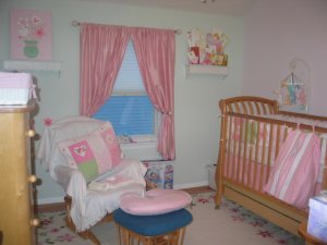
I am posting a picture of the light sage color we used in my daughter''s room, but I have to say, it looks really bright in this picture, but I think that is because of the flash, because there is no way I would have used a minty green at all.
And for reference, if you look at the picture of the crib set, the green in the crib set is sage green, so you can see that the colors just came out all wrong.
Another wierd thing is that the "pink" on the opposite walls are not pink, but Frosty White.
Very strange indeed.

By the way, is it just me, or doesn''t every single paint color come out darker once you start painting?
2.gif


130_3018.JPG
 
Oh tulip that's a great idea, I didn't know RH did paints??

Lovely room Kayla....the picture doesn't seem quite right on my monitor though either, it seems very mint green! It makes it very hard to choose colors when the pictures just don't do them justice. Who can I complain to? hehee.
 
Date: 2/12/2006 10:24:20 PM
Author: Mara
Ann I have a question, since you have the color wheel and are familiar with BM colors....how accurate do you feel that the color wheel swatches are to the room color when the painting is done? I know that light and all that has to do with it, but I am the WORST with picking a color from the color swatch and then painting and having it look sooo different. Any tips on how to get the most realistic color from those swatches?

One other Q..in looking at some of the sages that you posted for the bathroom potential color, would it be ''designer feasible'' if we painted the bathroom a light sage to use a darker version of the same color for a closeby room (aka just as an example if we did Ivy Lane 523 for the bathroom could we do 525 for the office which is not the room right next door but one room over)? Would it look funny like we were trying to match it but it didn''t quite work? Also could we get away with doing something like the Ivy for the bathroom, a warm gold like the California Hills for the guest room (right next door) and then have the office tie it all together with the darker green and mahoganies in wood? Or would that be ''funny''.

As you can tell I am SO full of ideas but who knows if any of them actually work together..
5.gif
Mara,

Actually I think the color strips are fairly accurate. I have had times when I would walk in and see the paint on the wallls and swear it was wrong, only to pull out my strip and find yeah, it is the one. But there is another factor that makes a difference. If you use "Flat" paint, it will appear different than "Eggshell" paint in the same color. I had a client once who insisted on eggshell finish because it is easier to clean, I told her we needed to redo samples, she didn''t want to, you can guess the outcome. We had to repaint. The eggshell produced a slightly darker look on the wall.

When putting samples on the wall, use a large enough sample to really see the effect of the color. I also use sheetrock squares about 30" x30" or larger if I can get them, so that the color is mobile around the room. (tape off those edges of the sheetrock so you don''t have a mess)

Yes, you can use different colors in close spaces, but be careful of too many colors. You will have color overload and get a choppy look. I always strive for continuity, but I do allow for a punch of color in special areas I want to highlight. You don''t want every room a different color. That is my opinion, but I know some folks just want the color. When I am designing a spec house (large executive homes, 4,000sq.ft and up), I usually use 1 predominate color throughout and then use something darker/different in the dining room and/or study, depending on the layout of the home. In the kitchen, if the cabinets are painted, I''ll use a darker glaze to repeat the darker color, maybe do this in the powder also. I am not a huge fan of faux painting, simply because it takes a true professional to pull off a first class job. When you see a great job, you''ll never accept mediocre again. I use granite to add some drama and additional color to the counter tops. I love selecting lighting and hardware, in typical PS fashion, I call it the jewelry of the home!

You know the story of the cobbler with no shoes - well, I need to update my own home. I need paint, new door hardware and new ceiling fans. But have I done it - NO! Too many choices and options, and I see so much.
 
I can relate to this topic!

My husband and I decided to tear down our awful bathroom wall paper 15 months ago. We underestimated how hard it would be to make a decision and the time to get something else on the wall. I had decided on a color called Golden Den in a sand effect texture. I did a large place on the wall and it sounds so similar to the other comment. It really looks like an ugly "poopy" color. We have a large bathroom with high ceilings, a large frosted window that provides a lot of light, ivory crown molding (which we can change if we need to) and standard off-white tile and cabinets, doors and countertops that we are not interested in investing in for additional changes at this time.

I saw Decatur Buff in an HGTV bathroom and from what I could see online it looked great. Any thoughts on how this color would look in a large well-lit bathroom? Or other suggestions for a light to medium neutral tan with a little gold?

I had a painter suggest going with an off-white stucco-like texture but it seemed to be too neutral.

He did not like the idea of the sand effect paint in the bathroom and thought that we may have problems with it because of the moisture. Any thoughts on this type of paint? I liked the idea of texture and the idea of a sandy effect with tan sounded good. Is this a "dated" style?

Thanks for any ideas! I''m going to need to take a risk soon, anything has to be better than primer.

Lynn Lyon
 
Ann,

What colors are you using for that Tuscan look? I have an attached home with a rather open floor plan. There is a great room (on a smaller scale) with a bay window and a slider...the ivory/cream marble fireplace is in the middle with glossy white moldings around it. The floors are a cherry-ish hardwood. I like wrought iron accents, pottery, my copper bowl fountain/chime...that sort of thing. I''m going for warm and comforting, but I don''t want the room to look smaller.

I think I''d like a sage color in the guest bathroom. The dining room, which is open to the foyer, needs color. The same color as the great room/all of the flowing/open walls? Then there''s the kitchen with very tall cabinets that match the floors. I have a very cool Domain distressed table and chair/bench set in there.

In my bedroom with its very high, vaulted ceiling, I''d like a very pale blue...maybe a shade or two up for the ceiling. I''m not sure what to do with color in the master bath...creamy tile. Maybe back to whatever is downstairs.

I appreciate your time if you get to this. I am a good therapist, but design freaks me out!!! LOL

Thanks,

lawmax
 
We bought a new condo last year. The model they showed us had this gorgeous BM color called Bleeker Beige. It is a medium beige color, no pink tones. We used it in our condo and so did 3 other units in our 8 unit building. Love it, Love it, Love it!!! Everyone that comes over compliments us on it - its such a neutral it goes with any furniture colors. We also used Lighthouse yellow by BM for our bathroom which is very light, almost the color of a post-it note but not as bright if that makes any sense.

Restoration Hardware''s paint colors are amazing but we put the Shore Blue in our bedroom and the paint texture is awful. I think it is kind of like a latex, it peels off in strips.

Pottery Barn - if you go to their website they have teamed up with BM to create paint colors that go with PB''s decor. Some really nice subtle colors you may be interested in. I think one is a grayish beige.

Hope this helps.
 
I love Benjamin Moore paint! Every room in our house is a different color from BM. As far as neutral, I really like Bradstreet Beige, which is a light coffee color and in our den room. We also have a sample called Lighthouse, which is a cream color.

Our great room is DaVinci's Canvas, which is a goldish, yellow color. What I've found is that lighting makes all the difference as to how a color will look. We have a house with a lot of natural light. I've done that Color Viewer on BM's website, but the colors look brighter in our house because of how bright the light is.

I love the historical colors from BM. Our master bedroom is Hollingsworth Green. It's NOT sagey, but a light green color.

Our master bathroom is Homespun Charm, a mauvey color.

Our spare bedroom is two-tone, with Odessa Pink above the chair rail and Somerville Red below (a burgundy color).

Our garage is Harvest Moon, a pumpkin color. My husband picked this.

Our hallways are Hathaway Peach.

Our spare bath is Palladian Blue (light blue-gray).

I also really like Castleton Mist, which I would do if we ever repaint. It's a neutral color. I saw it in a finished room on Trading Spaces once, and it had a greenish tint, although it's kind of a cream color.

Good luck! Let us know what you decide.
 
I have my BM fan in front of me...

Goldish Tuscan;

Princeton Gold
Summerdale Gold
Blair Gold
Wilmington Tan (I have used this over and over at spec homes, great color)

Some people like the more orangey, yellow Tuscan look. I can''t use it for a spec home, so I use the Wilm. Tan, it works with so much. If your trim is stark white, you will have a hard time getting the right look. Your trim needs to warmer.
 
Thank you! That is excellent information. Right now, all I have is ugly, marked-up builder''s paint! It''s awful.
 
Status
Not open for further replies. Please create a new topic or request for this thread to be opened.
GET 3 FREE HCA RESULTS JOIN THE FORUM. ASK FOR HELP
Top