shape
carat
color
clarity

Best CS's for ECs?

SB621

Ideal_Rock
Joined
Aug 25, 2009
Messages
7,864
This might be more of a personal opionion but I thought I would ask as you rarely see colored stones in step cuts, especially emeralds. I have a "vision" for a RHR ring project but it absolutely must be an emerald cut stone. I prefer to stay away from green as I already have a green RHR. My question is would certain colored stones look better in an emerald cut then others? Jeff is at Intergem so I'm hoping to catch him before he leaves with a want list for this project.

Thanks!
 
I was going to say Emerald and then read the whole of your post :oops:

Personally I like slightly darker, fully saturated stones, in an Emerald cut. The only time I would go for one in a normally lighter coloured stone (like an Aqua) is if it's incredibly saturated.

Interestingly, there are not a huge amount (compared to ovals for example) on the market in any particular stone, so I'd look around at all CS in general and see if one jumps out of the screen. Sorry I know that's no help :nono:
 
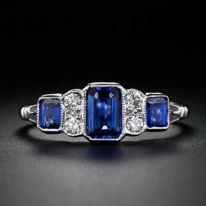
Thanks LD! I know I do tend to lean towards gems with a more subtle or pastel color but for this project I really need strong saturation. YOu can see my inspiration picture in the link below. I'm leaning towards something med blue, pink, yellow or a reddy/purple.

http://www.langantiques.com/products/item/30-1-4971
 
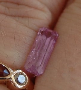
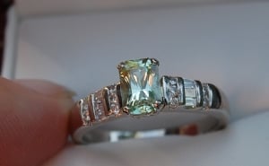
Sapphires! The pink stone is a topaz and the yellow-green is chrysoberyl. The chrysoberyl is radiant cut but I think it would look nice in a step cut too.
1309998114_30_1_4142__1_of_4_.jpg
kiz-pinktopaz3.jpg
kiz-chrysoring1.jpg
 
Beryl and tourmaline are more likely to be step cut by nature than other gem types due to the way it grows. Still, it is not commonly cut that way due to the lack of brilliance and it doesn't enhance saturation as well as a different cut design. In terms of colouration, darker coloured gems look better as a step cut as opposed to a lighter gem. There is a lot of flash or brilliance in a simpler step cut as opposed to a modified brilliant cut, so the stone has to have very rich colouration to stand out.
 
I have a modified step cut 6 (or 8) carat garnet ring. It's round instead of square or rectangle.

I didn't realize how soft garnets were. Glad I don't wear it that often. It's beautiful tho!

I agree that most darker stones would look great.
 
I was roaming Roger Dery's site earlier & saw some nice step cuts.

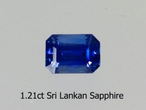
Sapphire (this particular one might be a little dark IRL):


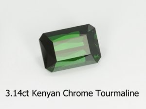
Chrome Tourm:


He has others of various gem species -- I think the sapphire is especially nice cut that way, might be worth looking for something along those lines. Have fun!

--- Laurie

lg-sapphireblueem-cut1_21ct.jpg

lg-tourmchromeemcut3_14ct.jpg
 
Oh Sarahbear, you know that I just love that ring don't you? We have such similar tastes in Art Deco pieces. It's just yummy! :love:

I was looking at the ring and I think that for the central stone you need something blue, red or purple (I've excluded green because I don't think you want that). I hate to say it but cornflower blue, ruby red or regal purple. So, depending on your budget, how does a sapphire or ruby sound? If going the purple route, I'd love a purple sapphire in this but (depending on the size you're looking for) it may be something you could be searching for for days or years!

If budget doesn't stretch to a blue sapphire, how about tanzanite if this isn't going to be an every day ring? I don't think I'd go with amethyst for a substitute purple though.

A different look might be a Turkish Diaspore. It's like a rich apple green in daylight but then in the evening is a rosy peach colour. What made me think of that was the 3rd photo posted by Kismet. I have one just like this in Diaspore and almost the same cut which would look very different and elegant (although may be too pale).
 
LD|1360007484|3372097 said:
Oh Sarahbear, you know that I just love that ring don't you? We have such similar tastes in Art Deco pieces. It's just yummy! :love:

I was looking at the ring and I think that for the central stone you need something blue, red or purple (I've excluded green because I don't think you want that). I hate to say it but cornflower blue, ruby red or regal purple. So, depending on your budget, how does a sapphire or ruby sound? If going the purple route, I'd love a purple sapphire in this but (depending on the size you're looking for) it may be something you could be searching for for days or years!

If budget doesn't stretch to a blue sapphire, how about tanzanite if this isn't going to be an every day ring? I don't think I'd go with amethyst for a substitute purple though.

A different look might be a Turkish Diaspore. It's like a rich apple green in daylight but then in the evening is a rosy peach colour. What made me think of that was the 3rd photo posted by Kismet. I have one just like this in Diaspore and almost the same cut which would look very different and elegant (although may be too pale).

I'm excluding green as I already have a green RHR that I wear so that is why I'm X'ing that color off my list. I also have a large oval ruby ring that while I love I dont' wear so I sort of want to stay away from red unless it has a pink hue to it. Purple would be the most budget friendly but it has zero appeal to me. I guess I really am stuck with a blue sapphire unless something else floats by boat down the road. Jeff posted a med. pink EC a while ago on facebook and I thought it was stunning. However, I'm not so sure it it would be too pastel for this ring? I"m looking for something large around 3cts. More fatty EC then narrow. LD I might ping you for your opinion on colors once I hear back from a few places!

And I had a feeling you would love it. I think we both lean towards the classic art deco with subtle lines- at least that is how I describe it :lol: I would love to get the stone now and then have it set later this year along with my aqua. I saw this ring on Pinterest and it blew me away. I love that it is a halo but not your regular HW or tiffany legacy inspired version. It just screamed at me when I clicked the link. Now just have to talk to DH to let me have a little bling budget back!
 
Absolutely agree with your thought process. It sounds like you may be leaning towards a more pastel colour? If so, the only thing I would say is that you have to make sure that the cutting is wonderful (like the Tourmaline(?) Kismet posted - not the chrome one).

I'm going to love watching this process coming together!
 
I saw a raspberry EC spinel at Graff on Saturday - to die for! About 7 carats with trillion sides. Yummy yum yum.
 
Rosebloom|1360013613|3372199 said:
I saw a raspberry EC spinel at Graff on Saturday - to die for! About 7 carats with trillion sides. Yummy yum yum.
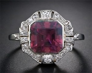
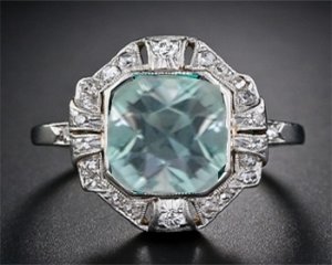
Oh I do have a large asscher from Tan that I could maybe :?: work for this ring? It is 4.28cts and honestly I love the color. Very saturated dark red/purple. I'm not sure if this would work for an asscher though. I was talking about this with my DH and I showed him the inspiration ring. He thinks my antique cushion aqua would also work....once again I think both shapes would look nice but I really do like the look of an emerald cut with the deep saturated color. I'm stuck between wanting to set gemstones that I already own or sourcing new ones that fit into the vision I have for this ring. :sick:

Is anyone fantastic with photoshop?
 
I am useless with photoshop but a rich reddish purple asscher cut stone fits perfectly with the design you have in mind!
 
Chrono|1360032317|3372424 said:
I am useless with photoshop but a rich reddish purple asscher cut stone fits perfectly with the design you have in mind!


You think Chrono/ I guess my only draw back was that I really had my heart set on an EC for this project. However it really makes sense to use the gemstones I have that arent' set. I have sold off a large portion of my collection and I'm trying to just stick with pieces that I truly love and would pass down to my kiddos. Perhaps I will put up a thread in RT and see if I can grab some photoshop help on this one!

thanks again chrono!
 
I wouldn't use the Asscher SarahB. It's not cohesive with that the style of ring. I don't know why but I always think of the asscher as a modern cut (I know it's not) but it just doesn't "feel" right somehow.
 
LD|1360071700|3372664 said:
I wouldn't use the Asscher SarahB. It's not cohesive with that the style of ring. I don't know why but I always think of the asscher as a modern cut (I know it's not) but it just doesn't "feel" right somehow.


I think you are right. I love the setting because of the width vs. lenth ratio. With an asscher or the cushion I think it will be much more squareish then I want. I still put up a thread in RT asking for photoshop help. I have a feeling if someone can do it I will see the PS'ed results and know that it won't work for this particular style.
 
I can't remember who they are but there are 2 people on here who do Photoshop really well. Start a thread on here with Photoshop Help in the title and I'm sure they'll pop along. What they'll need is a photo of your Asscher and the setting. Like you, iIt's the square bit that I don't think will work. ALSO, I don't think the facets are right. If you think about it, the emerald cut facets mirror the length/straightness of the setting. With an Asscher the facets are all diagonal and so the focus is immediately drawn away from the setting - does that make sense?
 
ALMA over in RT was able to assist. What are your thoughts. I really like the color contrast with the garnet but the shape is not rocking my world. Plus since it is an asscher it is cut fairly deep so I think the ring would sit high and be akward for finger coverage. I"m on the fense with the antique cushion.....

_3542.jpg

_3543.jpg
 
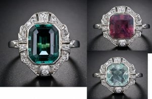
I'm not feeling the love for either of them Sarah. They're a bit squareish. The original design is elegant and really asthetically pleasing. These two look bulky and fat. A bit like the "before" picture in a get slim advert! ;)

I'm even more convinced about the facet placement after seeing this. Interestingly, when I first looked at your link to the ring, I really didn't look too hard at the setting and was looking at the picture overall but actually it's very badly made isn't it? I'm assuming if you had this made you'd tighten up the lines and make it less sloppy? I know you would so it's a silly question really!

comparison_for_sarahbear.jpg
 
LD|1360081583|3372791 said:
I'm not feeling the love for either of them Sarah. They're a bit squareish. The original design is elegant and really asthetically pleasing. These two look bulky and fat. A bit like the "before" picture in a get slim advert! ;)

I'm even more convinced about the facet placement after seeing this. Interestingly, when I first looked at your link to the ring, I really didn't look too hard at the setting and was looking at the picture overall but actually it's very badly made isn't it? I'm assuming if you had this made you'd tighten up the lines and make it less sloppy? I know you would so it's a silly question really!


I think I'm going to agree and give this one up for a current stone. I'm now on the hunt for an EC but open to different variations of color.

And yes the ring is quite badly made. :D I like the overall look of it. I will get quotes from SS, SK, 23rd st, and ERD to see about making a version of it. This will be the inspiration only. I think those vendors will be able to turn out a beautiful piece at the end.
 
Neither stones are doing it for me. The asscher is way too dark while the aqua's cut and colouration is off. It definitely needs a step cut though.
 
GET 3 FREE HCA RESULTS JOIN THE FORUM. ASK FOR HELP

Featured Topics

Top