shape
carat
color
clarity

CAD Opinions Invited!

JewelFreak

Ideal_Rock
Joined
Sep 3, 2009
Messages
7,768
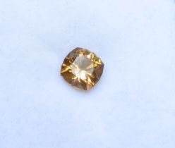
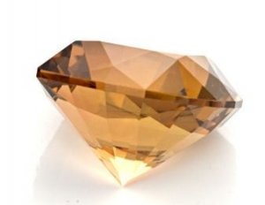
This tourmaline has been waiting patiently for a setting for a few years since I adopted it from Westview Gems. I've taken, honestly, about 80 photos of it & it's impossible to capture its real color. Even Steve's vendor photos don't do it justice. It is not orange at all, no brown in it, but a beautiful pure copper with flashes of peach. Very neon -- I love holding it in the kneehole of my desk to watch it turn on its own lightbulb, incredible.

I was inspired by Daniel M's Trellis Setting & asked Dan & Caren if they could modify it a little for this stone. Ok -- the tourm. Use your imagination, I can't describe the color well:


Edit -- oh yeah, forgot: the stone is 8.9 x 8.9 x 608, 3.04 ct.
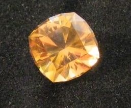
_6886.jpg

_6887.jpg

_6888.jpg
 
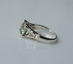
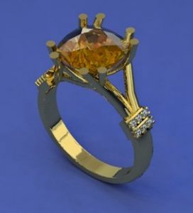
So I asked if they could do the Trellis Ring in 14K yellow gold, without the bezeled diamond accent, and with melee where the milgrain would be.

Here's the original:


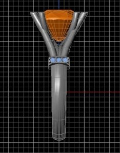
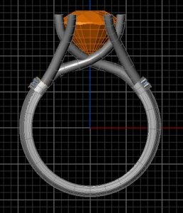
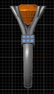
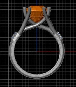
Dan sent CADs last night & I LOVE them. Need to choose between one row of melee or 2 rows. I like 2 rows better, but am not sure if it would be uncomfortable on the next-door fingers. What do you think?


--- Laurie

il_57.jpg

2_rows2.jpg

one_row2.jpg
 
This is my first posting, but I love reading all the custom threads, especially the DanielM ones, and hope to afford my own custom ring one day :) I think the ring looks wonderful in gold and definitely prefer two rows of pave. Personally I think it would look better if the two rows were moved up to when the split shank meets. Then I think they would be comfortably above the fingers, plus be on display better.
 
Do you have a side view CAD?
 
Just drawings, Freke. Here they are:

One Row Melee


Two Rows Melee


Welcome, PC, thanks for the suggestion. In the drawings the melee looks like it's right up where the shank splits, not so much in the photo-like CAD.

What do you think, Freke or anyone?

--- Laurie

one_row1.jpg

one_row_side2.jpg

2_row_side2.jpg

2_rows_side.jpg
 
I think I prefer one, but it's not by a far margin...
 
I can't decide! I liked 2 a lot better at first, but the more I look at it, the less I'm sure. Help!

All those views & no comments? Er, is it that bad?

--- Laurie
 
Definitely one row, looks better to me.
 
one row. but if the shank is round or oval the row could wrap. in the cad it looks to be a squareish profile
 
One row!
 
Ok I would do one row but do just slightly larger melee. I think that will be a good compromise for getting rid of 2 rows, but still having some subtle bling in there. Besides that I love the design!
 
Laurie,
Do you have CADs from the top?

What about a single melee of 2 stones, but larger sized?
If you're into two rows, you could also play around with different sizes - one row of smaller stones than the other?

Man, I wish we could see the true color of the stone - the cut and color intensity look excellent :)
 
my vote would be one row of melee. I think it would make it look more delicate than the 2 rows - which works with the open, airy look of the trellis design.

It's a great design you've chosen and will be beautiful with the YG/Tourmailne combination!
 
Thank you everyone. Think I agree with you, one row is better. Needed to sleep on it.

I wish so much that I could take a decent picture of the color. Have tried over & over at different times, in different lights & backgrounds, but it just does not register on my camera -- or apparently, Steve Wallner's. I guess a special setup is needed & a camera more sensitive than my little Canon. I've groaned & sighed & said things I can't write here every time I try! :angryfire: Very frustrating, when it's so well saturated & such a distinct hue & tone IRL.

Anyway, thanks again for your help. Pics coming when it's done!

--- Laurie
 
I like one row better. Still it will come to what you like and prefer. Good luck!
 
GET 3 FREE HCA RESULTS JOIN THE FORUM. ASK FOR HELP

Featured Topics

Top